Recent works.
Contests and requests – keeping me on my toes by stretching my normal artistic fare.
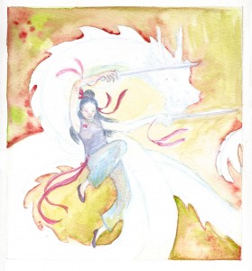
My entry into the AVCon 2011 T-shirt design comp:
I’ve started taking character illustration requests for the Kingdom of Loathing again:
A sample picture (this is my Disco Bandit character ‘Silks’ from my old comic)
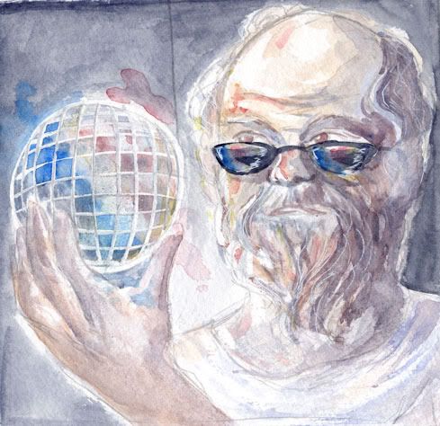
A painting for a player named ‘Brocrates’:
A painting for player ‘Ereinion’:
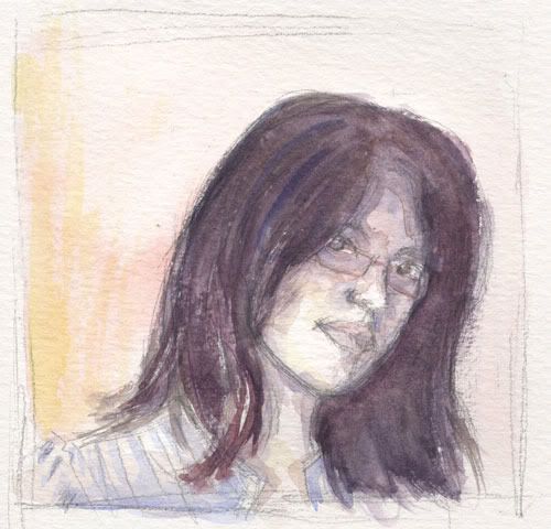
Simple Self Portrait
I was inspired after attending the ACSA’s 2010 graduate exhibition. Today was the last day of the exhibition so I was glad to catch the show before it ended.
Since I’ve been dabbling in watercolours lately, the watercolour portraits by Ruby Chew were really awesome to see. When I’d caught glimpses of the graduates putting up their work I had no idea that there would be her 52 marvellous mini portraits included alongside her large canvas paintings.
With Ruby’s works fresh in my mind I thought about restricting my palette to just the three primary colours to depict myself. I’m no master in watercolours or portraiture, but this was a fun exercise that I’ll probably try out some more over the weekend.
Grey.
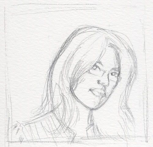
Oops, been a bit quiet again. Here’s a quick-sketch I lined up a while ago to appear here…
I think I was lazy with the shape of the face and traced the outlines so that I could move onto practising the shading. I wanted to spend some more time on rendering noses and lips – and it shows, because other areas feel a bit flat. But as a quick drawing exercise I think this turned out okay.
The Cutting Room Floor
Yesterday I completed the more-difficult-than-expected task of selecting a number of images to feature in my portfolio. I set a limit of ten images and tried to gather a set of images that gave a rounded representation of what I can do.
While trawling through work recent and old, I found a number of pictures that never got the chance to see the light of day. Here’s a few that I rather like.
There’s plenty more! When I started this blog I had an idea of diving into old work to examine what I’ve been doing in the past. Maybe this is the start of bringing that idea to life.
Tetris Earrings
They’re a little heavy – the beads are glass – but I’m pleased with the outcome.
Unfortunately the people I bought the beads from didn’t have two shades of blue in the right bead sizes. I made do with clear for the light blue – and put pieces of blue paper between the glass so that from certain angles it refracts the colour. You can see hints of it in the above photo but it’s definitely most effective viewed longways.
I am thinking of making a necklace to match. My housemate suggested putting the blocks on tiers so they look like they’re falling. To go with that I had an idea of making a matching t-shirt design, so it would look like the blocks were falling into the t-shirt… hmmm, ideas!
Oddities.
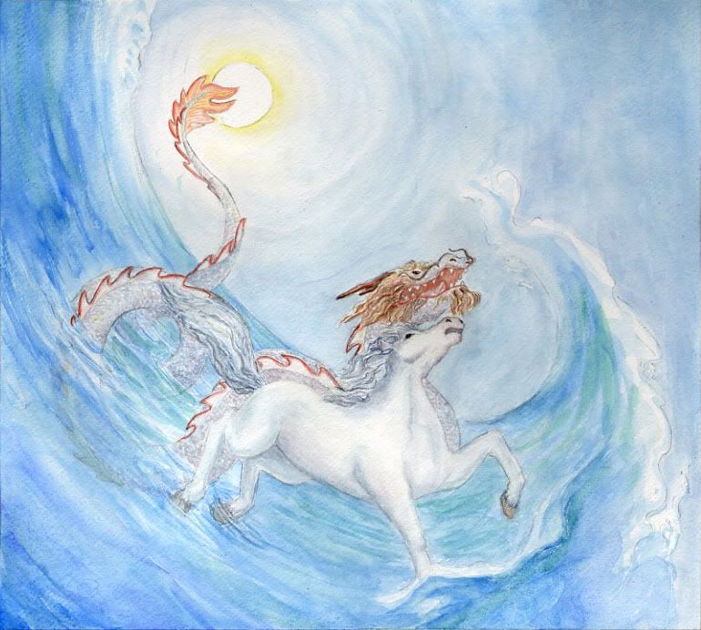
Last week’s homework was to create two images that were hybrids of two objects that were randomly assigned to us. Each image needed to have one of the objects stand out as more dominant than the other.
Here are my attempts. Can you tell what the objects are, and which is supposed to be the dominant one in each image?