As promised
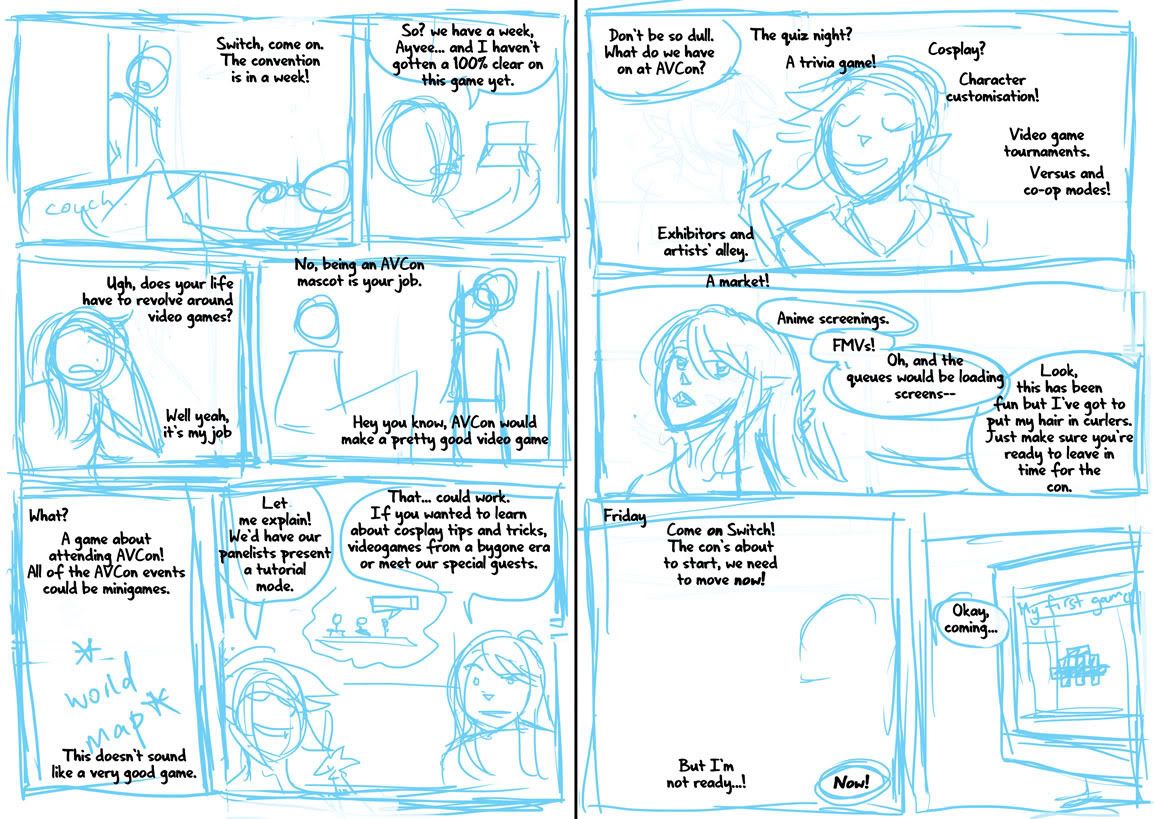
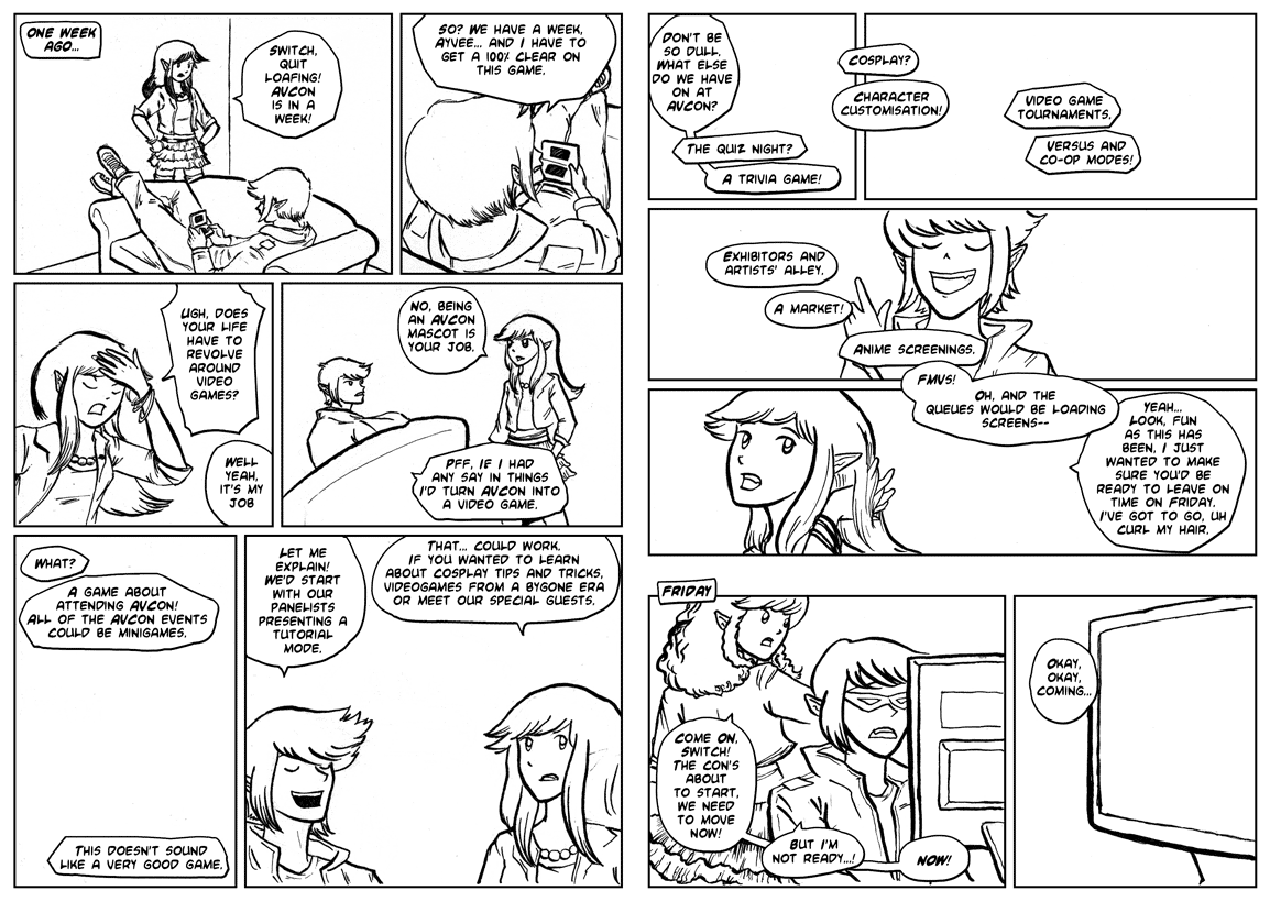
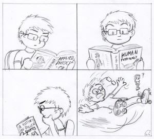
The ditched first-attempt page. I’d gotten too far into the art without thinking about the script and the pacing, but eventually tore myself away from it to start over. I liked the angle of the second panel but it couldn’t fit the dialogue I wanted.

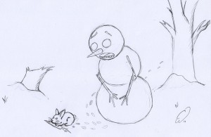
Today’s post was also going to have art from my class last night but I forgot to take photos. Have some photos of my lunch instead.
The AVCon Booklet Comic: The Making Of
A step through of the creation of the booklet comic.
Step 0: I write a script. It starts from a bit of stream of consciousness as I play around with what the characters would say. I then split the script into scene and dialogue transitions – working out the pacing. Where would be the best spot to move the panel focus? How do I fit all this text onto the page? My original script gets sliced in a way that needs four pages. I revise and re-revise on this, now that I have an idea of the tone of the comic.
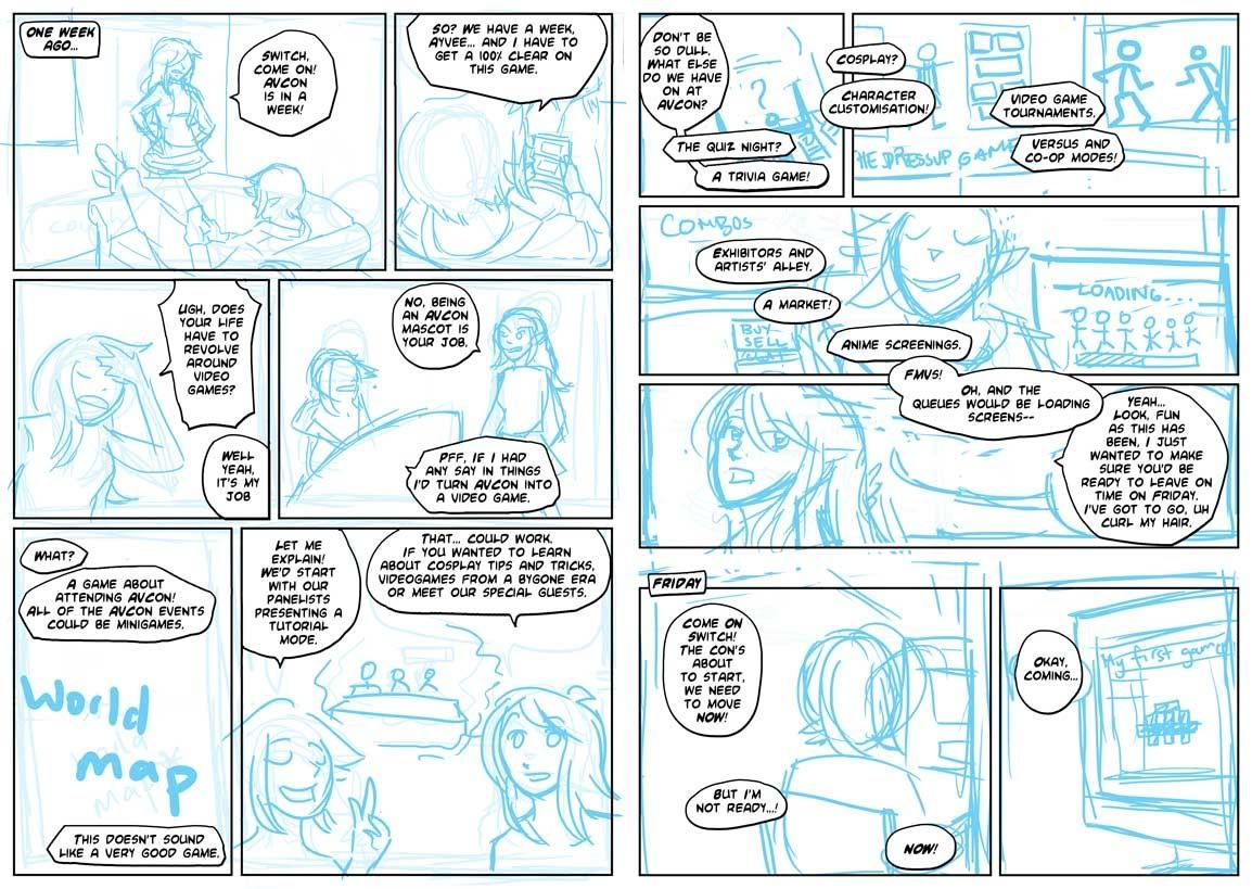
Step 1: Once I’m happy with the script (ie, once I realise that time is short and there’s no point in rehashing it if I’m not going to be able to draw the comic by the print deadline), I rough the panels. This really happens in tandem with step 0, as sometimes it isn’t clear how the dialogue is going to work and how the characters are going to feel on the page without doing some thumbnails.
I drew myself into a corner on my first attempt at the comic exactly because I’d failed to take into account the dialogue when initially imagining my panels. I’ll put up the failed page tomorrow.
Step 2: I’m fiddling with the speech bubble style. I want to give off a bit of a manga feel, so I do some font-hunting and find one that looks good in all caps and has a lenient publishing/royalty policy. I also put some thought into the design of my word balloons – instead of going for perfectly rounded ones I emulate the dynamic shapes seen in manga. I also choose tall word balloons where possible, like those used to accommodate the vertical dialogue in Japanese works.
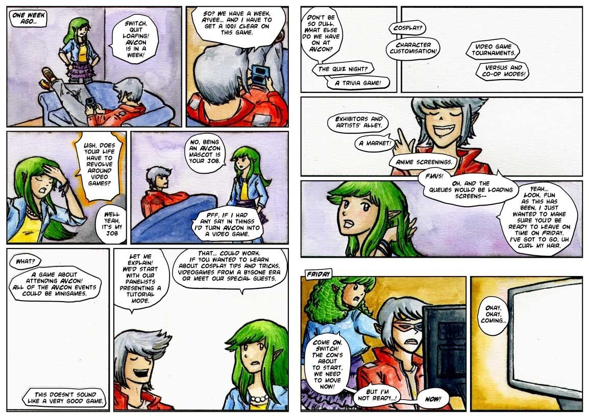
Step 3: Inking. I’ve taken the blue roughs, printed them onto watercolour paper, and inked over them using a dip pen. I enjoy using the dip pen to create the lineart as it’s easy to manipulate line weights and I get a really crisp line. I’m also coming up against time – so my choice to go with real media is to force myself away from obsessiveness about perfection. There are flaws in this lineart, but at least I’ve gotten it done.
Step 4: Corrections. Errors and untidy lines are tweaked in Photoshop.
Step 5: I’ve printed out the new lineart again. The mistake? Doing it on my inkjet printer, which I’d previously found to be acceptably waterproof when working over light print like pale blue, but which has obvious bleed issues when using black ink. I’ve also lost a fair bit of detail in the lineart.
I’d used my inkjet to save time and because I’d had other issues with painting on laser printed lineart in the past. The answer is probably to just work on the one piece of paper from start to end, but I did need to make corrections throughout this piece so it wouldn’t have been the right solution in this case either. Perhaps I should do colours first and lineart last?
Initial colour choices here. The important one was making the distinction between the first and second scenes. My panel layout shows a passage of time through the wide gap between the third and fourth rows of the comic in the second page. The colours serve to further emphasise that the characters are in a different setting.
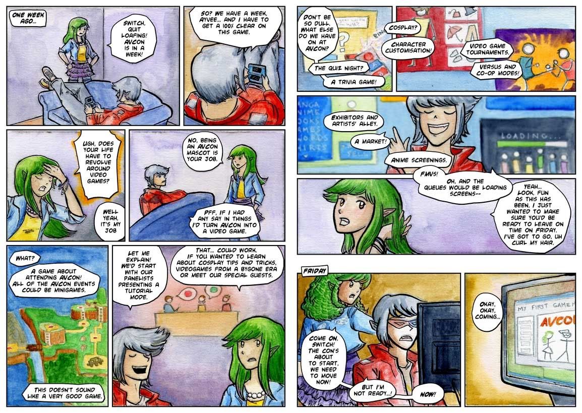
Step 6: I’ve finished most of the colours, and this isn’t so much a step as an experiment. Here I’m trying to restore the original lineart that got ruined by the poor print quality and the bleeding of the inks that happened when I was watercolouring over them. I’ve done some Photoshop magic to try fill the blacks in based on the colours around them and have laid the original lineart over the top. It looks crisper, but the colours that were evident where the colour meets the black are lost, and many areas appear washed out or to have a weird rim around them.
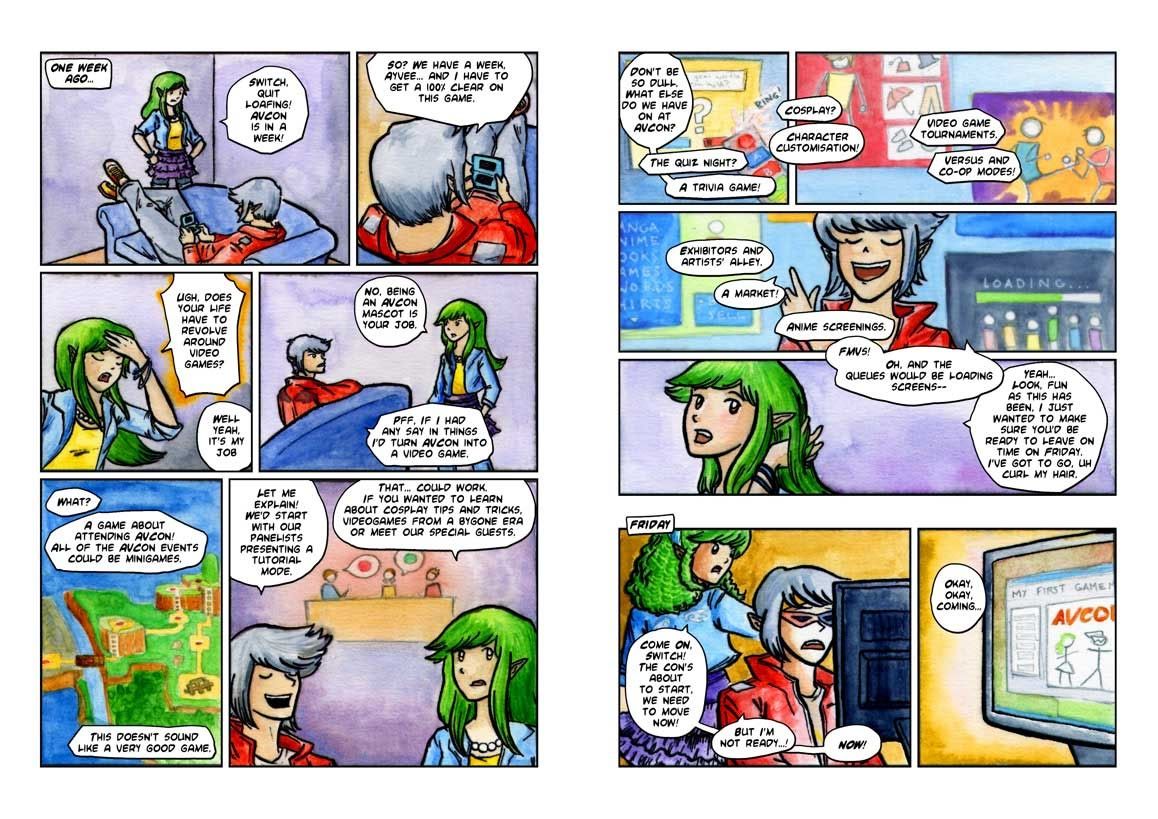
The finished comic
I decide to not bother with a perfect lineart restoration as some areas where the colour meets the lineart actually rather appeal to me. I focus on cleaning up the areas of highest detail and where the restorations are easier. Also, I’ve added Ayvee’s bow in the second-to-last panel digitally, making sure to get the texture of the colouring consistent.
An Introduction to Watercolours, Part 1
Based on the panel I put together for AVCon. I had kinda wanted to make the presentation come from the point of view of a beginner learning about the medium but I didn’t have quite enough time to lock down the tone and focus of the presentation. Still went pretty well and I had an interested, engaged audience. Let’s get straight into things.
Advantages of Watercolour:
Watercolours are a surprisingly versatile medium and produce a range of beautiful results. The transparency of the paint means that watercolour paintings often have a light, bright or effortless feeling to them.
There’s also a charming unpredictability about floating pigment in water. While in an acrylic, oil or even digital image you can get a lot of expressiveness into the painting through brush strokes, expressiveness in watercolour paintings is often about walking the line between controlling the medium and letting the unexpected happen.
I enjoy watercolours because they are a tidy medium. All I need is my box of colours, a brush and some water and I can dive straight into a painting. Watercolours are also teaching me discipline and are encouraging me to make careful choices about colour and what I commit to paper. Often there’s no taking back something once it’s put down, which leads to the next section…
Challenges
Watercolour can be quite unforgiving. One of the great skills required by watercolour artists is being able to leave the whites of an image untouched. This way, the white of the paper serves to provide the highlights. Although there is often white paint included in watercolour sets, you will never achieve the same effect as leaving the paper clean. I think of a painting as one that is drawn without white available at all. In short, with watercolours you cannot paint white over your picture like you might do with acrylics, oils, pastels or in a digital image.
Layering colours can also be tricky as the transparency of the paint usually means that the colour beneath is evident. Again, if you have painted over a section in the wrong colour you will have difficulty restoring it and painting over it likely won’t work well. On the other hand, if you’re glazing an area to give it a hint of a new colour, you must be careful to use a thin wash. Although the colour below may be evident even with a thicker wash, details can be lost. A painter also has to be careful to not disturb the pigment that is sitting on the paper on layers of paint they’ve previously applied.
Finally, working with a wet medium of course means dealing with different behaviours as the paper or paint have different wetness. Painting onto a wet sheet of paper will give a vastly different result to painting on a dry sheet. This means that the watercolour painter must learn to gain familiarity with the way that the paint acts. They must also learn patience!
Some art links demonstrating what is possible with watercolour:
- Reuben Negron – Realism in Watercolours!. Beware most of his gallery is NSFW, but the linked image is fine
- Stephanie Pui-Mun Law – I love the fantasy art of this artist. An inspiration. She readily shares works in progress and shares her knowledge on her blog
- Levi Dansam – A recent discovery. The art feels thoughtful, perhaps because of the blend of finely controlled forms and areas where the paint just flows.
- Cari Corene – Another recent finding. I wonder if her art gets much digital enhancement… but does it matter? The colours here, even if do they appear duller in real life, are superb
Next up: materials.
Contours
Alright, so time for an explanation.
In late July I was challenged to a blog-war. Blog-off. Blogfest. Blagofest even. The challenge was for each blogger to set a posting rate for themselves and to commit to it for the month of Blaugust. Uh, August.
Most of you probably know this already because you likely follow my comrades and rivals. You can find these fiends at the following places:
Leaflocker, home of the curious Thom, instigator of this blog challenge. Head here for all your miscellanea needs.
Telling Stories, John’s writing blog.
Jp’s Lab, James P’s blog that we’re all surprised is updating at all, considering he was somewhat reluctantly roped into the challenge. Primarily a coding hub.
M Dev Blog, The volatile blog of James F. We all wait with baited breath to see if this fascinating swirl of words and ideas will remain standing until the end of the month.
My commitment is to provide three posts per week of hopefully art things. Readers may even be graced with bonus updates from a guest poster. ie, someone that I couldn’t convince to start a blog, but did feel that a once-weekly commitment to do stuff sounded like a good challenge. While we’re on the topic, if you’d like to start a blog or website and lack hosting space, a) that’s a pretty lame excuse and b) I’d be happy to take on more people under the ‘chenonetta’ umbrella, provided you don’t find the domain name too silly. Let me know and we’ll discuss your needs.
Right, “Where’s the art,” you say? Here it is!
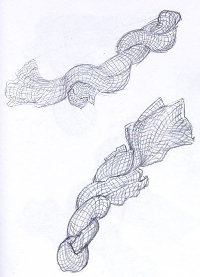
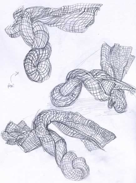
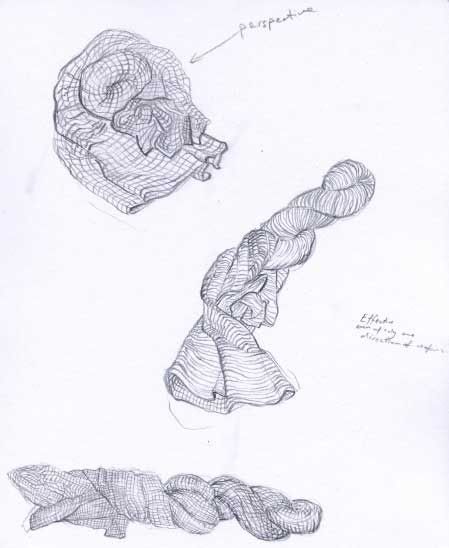
Homework for my life drawing class. We were to take a piece of cloth, like a dishcloth or something and twist it up. The aim is to portray the surfaces of the object using contour lines. Think of topographical lines or a wire frame model. I found it helpful to imagine a grid design printed on the dishcloth that I had to draw.
My first attempts are hurried and shaky. I can kinda follow the idea in the trailing ends of the cloth but lose the rhythm along the twists of cloth where I’m unsure about whether to be following the folds and curls or to try to simplify the mass into a simple sausage shape.
My last few are a bit better, probably also because I slowed down and thought about the problem a bit more. I’m quite pleased with the progress shown between the first attempts and the last ones.
Until I blog again,
Ale
Comikaze24 2011
Australia’s 24-hour comics day has passed!
Check out the great entries here.
This is the first year I’ve participated since 2007 when I did a quick 8-pager. This year I did an 8-page story on Saturday and a 24-page story on Sunday. As always, there’s some really superb stuff created for the challenge so I recommend you have a read of them all!

