Proairesis

Find Me On…

  • Facebook
  • tumblr
  • deviantArt
  • Storenvy
  • Home
  • About

process

Watercolour Splatoon 3DS XL Cover Plates

Posted on August 4, 2016 1 Comment

18

Apparently I haven’t yet posted about these here!

I painted these cover plates as a personal project after a commission fell through. I had been wanting to create a Splatoon themed cover plate for a long time but it took a while to come up with an idea and composition that I liked.

concept

Here’s the initial concept sketch. As always when I create cover plate designs I try to ensure the top and bottom plates are appealing designs in their own right, as well as working together to create a scene.

conceptcolour

After getting the lineart worked out, I put in some basic colours. I had an idea of a rainbow of ink lines. I then had the idea to add some fireworks in the top panel. Don’t worry, they’re not exploding squids!

1

I then print out the lines and transfer them to the cover plates. Here’s the various steps of the process.

Top left: blank cover plate
Top right: printed lineart. I scribble over the back of the piece of paper with pencil so that the graphite can be transferred
Bottom left: lineart which has been traced over while stuck in place on the cover plate
Bottom right: the transferred image, traced over with pencil a second time to better define the linework.

Now onto painting!

3

Starting to apply the washes of colour. The yellow splotches that are visible on the top plate are globs of masking fluid. The masking fluid protects the white of the surface as I paint over it. Masking fluid has also been applied to the fireworks.

4

The masking fluid has been removed and the firework colours have been added.

6

More work on the fireworks, some white added to the ink trails to define the movement of the jumping squids.

9

Putting in colours on the bottom plate. I decided for an eclectic background with lots of ink patches.

10

Adding skintones. More white highlighting on the inkling on the top plate.

11

Almost done! Just some extra highlights to add.

Here are some glamour shots of the cover plates being modeled on my not-new 3DS XL.

1312

Posted in: Uncategorized | Tagged: 3ds, blaugust, cover plates, fireworks, new 3ds, process, splatoon, squid jump, watercolor, watercolour

Doubt – Concepts and Experiments

Posted on August 4, 2012 Leave a Comment

Saturday is concepts/walkthroughs day!

Here are the sketches and scribbles that went on to become the painting I posted on Wednesday.

The original concept was all about the raaaage in the foreground character and didn’t focus so much on the background pair.

A first play with the ink.

Building on the composition and the characters.

Final thumbnail.

Some different style experiments.

Posted in: Behind the Art, Watercolours | Tagged: acsa, homework, life drawing, process

“Kai” (after Lucian Freud)

Posted on August 19, 2011 3 Comments

For our life drawing classes, we’ve been given a term-long project – reproduce a Lucian Freud work. The image that I am aiming to replicate is below:

The aim of this exercise is to learn about using line direction like contours – finding the planes of the face and so forth.

My progress as of yesterday is below. Curiously the image I was given to replicate is a flipped version of the image that I seem to be able to find online. It’s possible that one is of the original etching and the other is from images taken off that etching? Who knows?

Posted in: Line Drawings, WIP | Tagged: acsa, black and white, process

Wedding Blogging (Guest Post #3 by Connell Wood)

Posted on August 16, 2011 3 Comments

Oops, didn’t have stuff ready for today. But luckily, Connell has put together an extra-special guest post this week! I feel really excited and privileged to be able to share this with you all.

So, today I thought I’d share with you the creation of the wedding cake for myself and my lovely wife Helena. We’ve been married 3 months already! Time flies when you have an awesome wife~

So, our wedding was very geeky in theme, but not to a degree that it overshadowed the importance of the day. But for the cake, we knew that traditional was not going to cut it. Looking online, we quickly fell in love with the many Mario cakes that people have made over the years. The idea we had was to make a custom wedding topper made to look like us, and place that on top of a cake where each tier had the appearance of a Mario level.

The initial design for the topper was Helena and I high fiving, which we thought would be a very cute idea. To account for our rather amusing height difference, Helena was to be standing on a Mario item box:

We have a friend who makes his own toys, and had hoped he’d be able to hook us up with someone who could make a specific resin toy of this design. Sadly, for size we wanted, it was going to be expensive and time consuming, and instead, we found a local cake topper designer who uses wooden pegs and makes custom clothing for each topper, which all looked incredibly cute. We sent her descriptions of our clothes (including Helena’s wedding dress, so I didn’t get to see the topper until the night of the wedding), and I designed faces to look closer to my art style than hers:

With this being made, we had to find a cakemaker who would be up to the challenge of making our cake. A local cakemaker Helena found showed some pretty amazing talent, and once we’d met her and tasted her cake (oh my god her cakes) we knew we had the right cake craftsperson.

So, I had to design the thing. I wanted each tier to be unique, and thought it would be cute if each level was as if they were connected via pipes, making the entire cake effectively one Mario level. Firstly came a basic planning stage, the cakemaker and I had to come to an agreement on what was feasible based on the limitations of icing. Here’s the sketch we started with:

Initially it was only two tiers, but the cakemaker recommended a third (who can say no to more cake?). With that, the top tier was also going to be a cliff rather than the sky and trees I settled on. While the top tier could have been made with a darker brown, it really wouldn’t have been as unique as I wanted.  From those decisions, an overall cake plan was determined:

With that worked out, I searched for as many Mario images as I could find. I ended up chosing the look of New Super Mario Brothers, the colours in that game have an almost… sugary feel to them already (for want of a better, more correct phrase). The first step was to create the building blocks that I’d be needing for all the tiers: blocks, goombas, pipes, pirhana plants, and so on:

And once that was done, I started building Mario levels, which was actually kind of fun! I made sure to keep in as many nods to classic Mario level design as possible. The final designs are quite large, as I designed to scale, so they’re linked below.

And with that, the planning was complete! And the result was completely and utterly worth it:

Video Link

In the end, the cake designer took some liberties in the design, but that was to be expected. I loved how the colours came out, and of course, the taste… As for the topper, I think it is so damned cute.

Helena and I still have the top tier with the topper on it kept in a case – the actual tier is Styrofoam, and the sugar icing will keep for a very, very long time. Best wedding cake ever? I think so.

Thanks Connell! I hope you’ll provide another post about the other awesome cakes that made an appearance on the night, too! Every table was graced with its own original cake and an accompanying story. Our table especially enjoyed our Pikmin themed cake, but I couldn’t resist sneaking over to the Tetris brownie table and playing some pretend Tetris… I mean, uh, congratulations to you and Helena!

Posted in: Behind the Art, Colour, Crafts | Tagged: cake, connell, connell wood, fan art, geek, mario, process, video games, wedding

The AVCon Booklet Comic: The Making Of

Posted on August 11, 2011 Leave a Comment

A step through of the creation of the booklet comic.

Step 0: I write a script. It starts from a bit of stream of consciousness as I play around with what the characters would say. I then split the script into scene and dialogue transitions – working out the pacing. Where would be the best spot to move the panel focus? How do I fit all this text onto the page? My original script gets sliced in a way that needs four pages. I revise and re-revise on this, now that I have an idea of the tone of the comic.

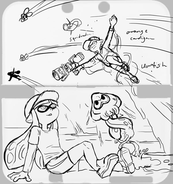
Step 1: Once I’m happy with the script (ie, once I realise that time is short and there’s no point in rehashing it if I’m not going to be able to draw the comic by the print deadline), I rough the panels. This really happens in tandem with step 0, as sometimes it isn’t clear how the dialogue is going to work and how the characters are going to feel on the page without doing some thumbnails.

I drew myself into a corner on my first attempt at the comic exactly because I’d failed to take into account the dialogue when initially imagining my panels. I’ll put up the failed page tomorrow.

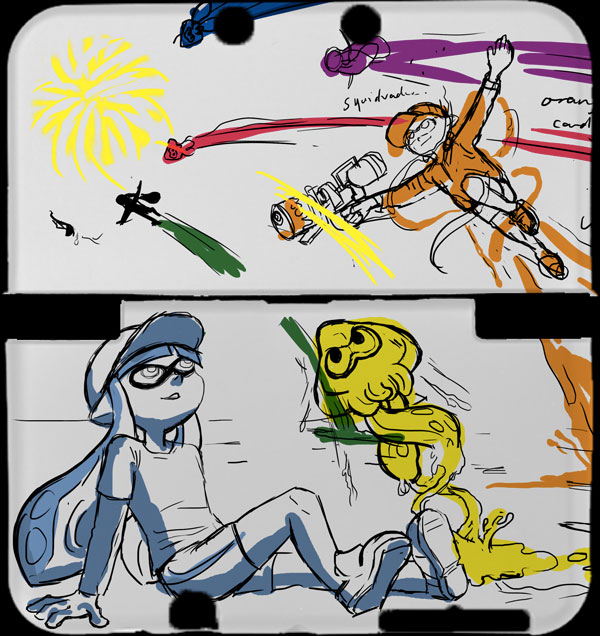
Step 2: I’m fiddling with the speech bubble style. I want to give off a bit of a manga feel, so I do some font-hunting and find one that looks good in all caps and has a lenient publishing/royalty policy. I also put some thought into the design of my word balloons – instead of going for perfectly rounded ones I emulate the dynamic shapes seen in manga. I also choose tall word balloons where possible, like those used to accommodate the vertical dialogue in Japanese works.

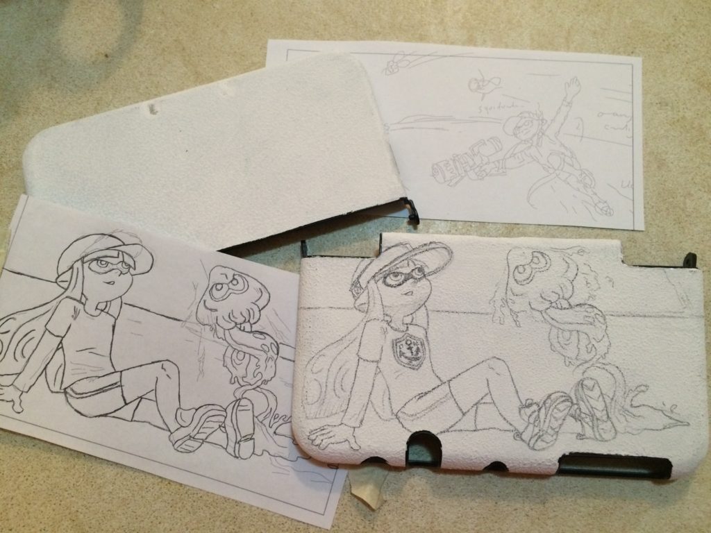
Step 3: Inking. I’ve taken the blue roughs, printed them onto watercolour paper, and inked over them using a dip pen. I enjoy using the dip pen to create the lineart as it’s easy to manipulate line weights and I get a really crisp line. I’m also coming up against time – so my choice to go with real media is to force myself away from obsessiveness about perfection. There are flaws in this lineart, but at least I’ve gotten it done.

Step 4: Corrections. Errors and untidy lines are tweaked in Photoshop.

Step 5: I’ve printed out the new lineart again. The mistake? Doing it on my inkjet printer, which I’d previously found to be acceptably waterproof when working over light print like pale blue, but which has obvious bleed issues when using black ink. I’ve also lost a fair bit of detail in the lineart.

I’d used my inkjet to save time and because I’d had other issues with painting on laser printed lineart in the past. The answer is probably to just work on the one piece of paper from start to end, but I did need to make corrections throughout this piece so it wouldn’t have been the right solution in this case either. Perhaps I should do colours first and lineart last?

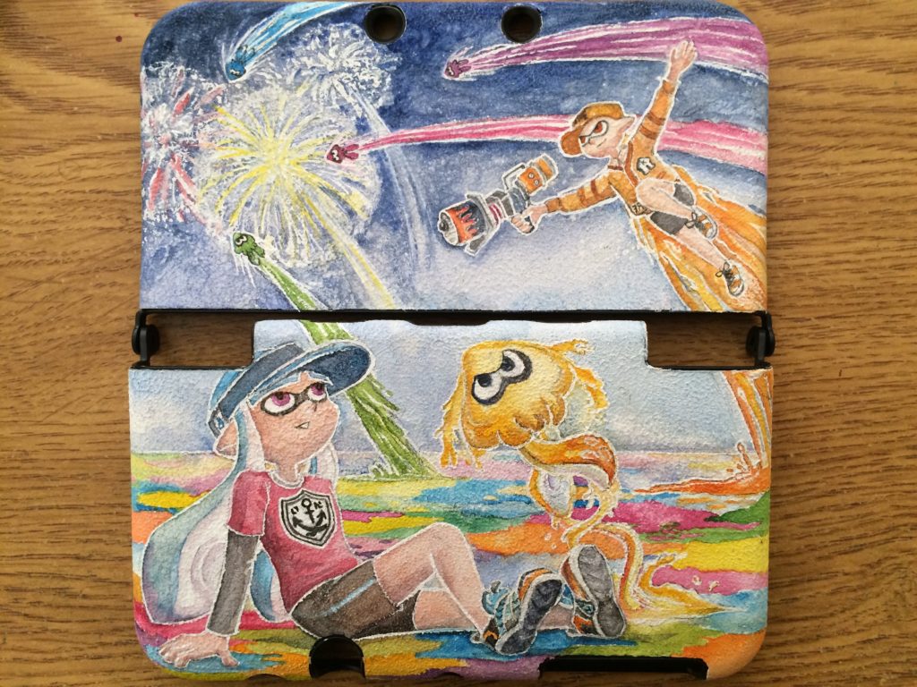
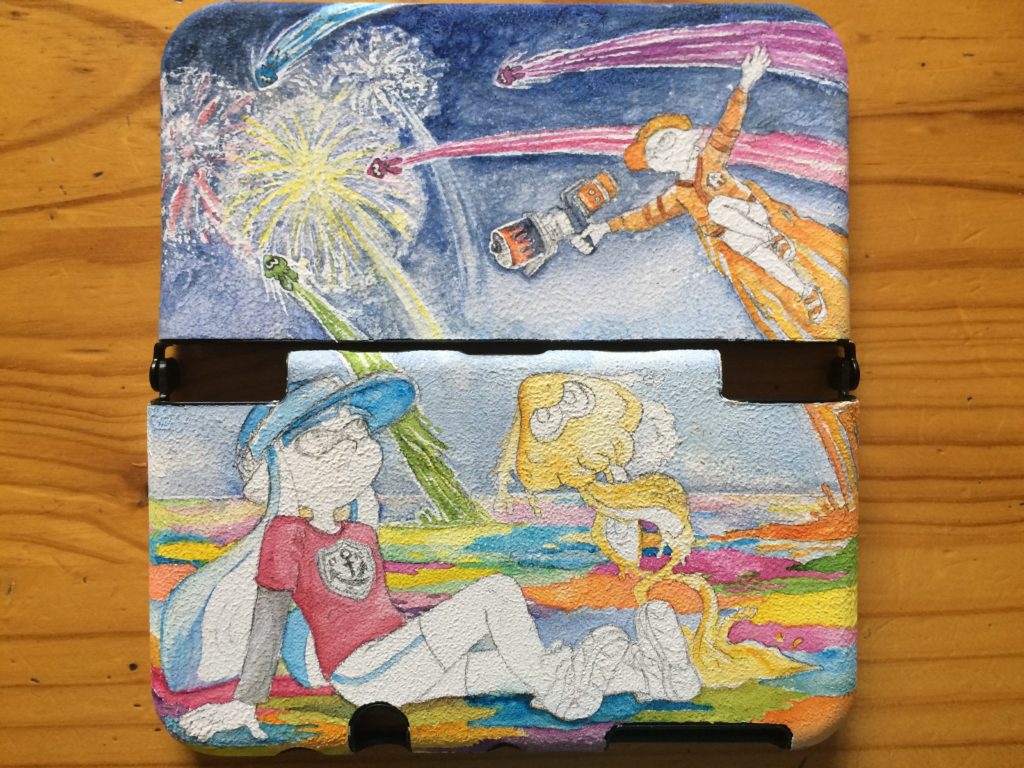
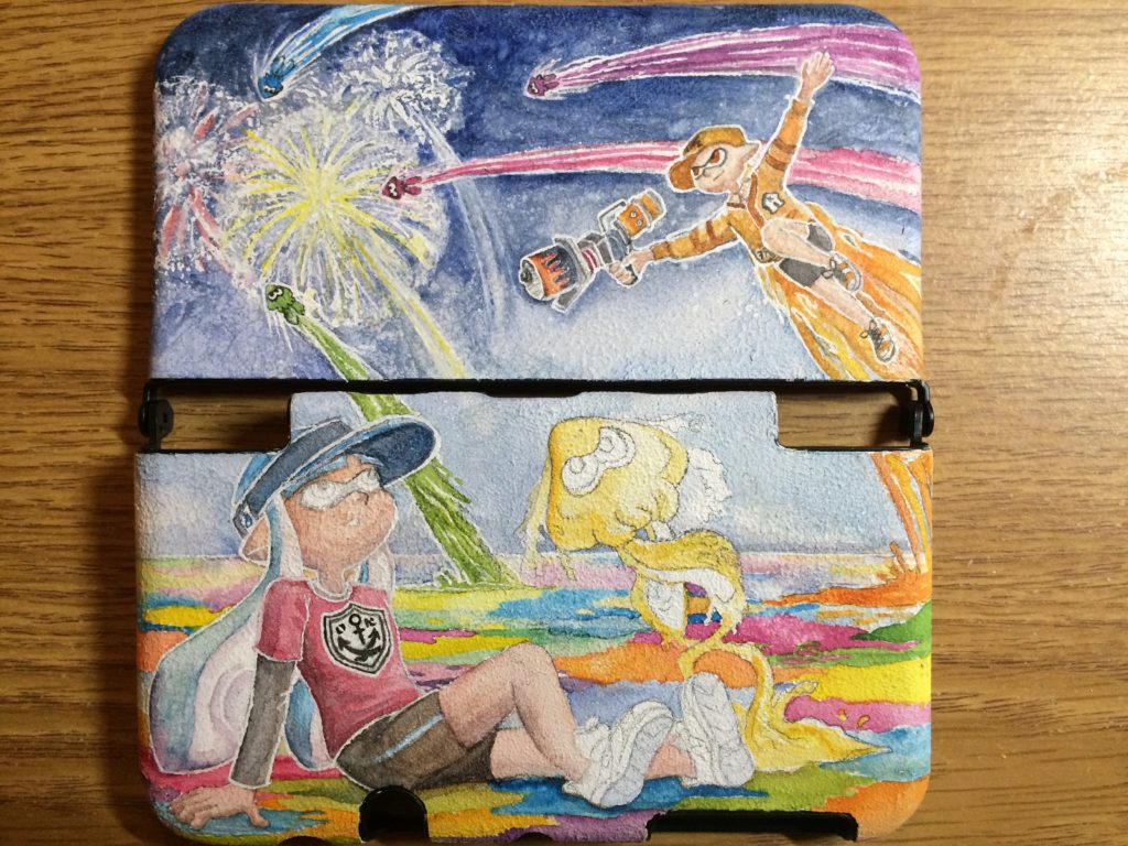
Initial colour choices here. The important one was making the distinction between the first and second scenes. My panel layout shows a passage of time through the wide gap between the third and fourth rows of the comic in the second page. The colours serve to further emphasise that the characters are in a different setting.

Step 6: I’ve finished most of the colours, and this isn’t so much a step as an experiment. Here I’m trying to restore the original lineart that got ruined by the poor print quality and the bleeding of the inks that happened when I was watercolouring over them. I’ve done some Photoshop magic to try fill the blacks in based on the colours around them and have laid the original lineart over the top. It looks crisper, but the colours that were evident where the colour meets the black are lost, and many areas appear washed out or to have a weird rim around them.

The finished comic
I decide to not bother with a perfect lineart restoration as some areas where the colour meets the lineart actually rather appeal to me. I focus on cleaning up the areas of highest detail and where the restorations are easier. Also, I’ve added Ayvee’s bow in the second-to-last panel digitally, making sure to get the texture of the colouring consistent.

Posted in: Behind the Art, Watercolours, WIP | Tagged: avcon, process, watercolor

Contours

Posted on August 4, 2011 2 Comments

Alright, so time for an explanation.

In late July I was challenged to a blog-war. Blog-off. Blogfest. Blagofest even. The challenge was for each blogger to set a posting rate for themselves and to commit to it for the month of Blaugust. Uh, August.

Most of you probably know this already because you likely follow my comrades and rivals. You can find these fiends at the following places:

Leaflocker, home of the curious Thom, instigator of this blog challenge. Head here for all your miscellanea needs.
Telling Stories, John’s writing blog.
Jp’s Lab, James P’s blog that we’re all surprised is updating at all, considering he was somewhat reluctantly roped into the challenge. Primarily a coding hub.
M Dev Blog, The volatile blog of James F. We all wait with baited breath to see if this fascinating swirl of words and ideas will remain standing until the end of the month.

My commitment is to provide three posts per week of hopefully art things. Readers may even be graced with bonus updates from a guest poster. ie, someone that I couldn’t convince to start a blog, but did feel that a once-weekly commitment to do stuff sounded like a good challenge. While we’re on the topic, if you’d like to start a blog or website and lack hosting space, a) that’s a pretty lame excuse and b) I’d be happy to take on more people under the ‘chenonetta’ umbrella, provided you don’t find the domain name too silly. Let me know and we’ll discuss your needs.

Right, “Where’s the art,” you say? Here it is!

Homework for my life drawing class. We were to take a piece of cloth, like a dishcloth or something and twist it up. The aim is to portray the surfaces of the object using contour lines. Think of topographical lines or a wire frame model. I found it helpful to imagine a grid design printed on the dishcloth that I had to draw.

My first attempts are hurried and shaky. I can kinda follow the idea in the trailing ends of the cloth but lose the rhythm along the twists of cloth where I’m unsure about whether to be following the folds and curls or to try to simplify the mass into a simple sausage shape.

My last few are a bit better, probably also because I slowed down and thought about the problem a bit more. I’m quite pleased with the progress shown between the first attempts and the last ones.

Until I blog again,
Ale

Posted in: Line Drawings | Tagged: acsa, black and white, homework, process

Juri, continued…

Posted on September 20, 2010 2 Comments
Juri Flies

It's coming together now!

This was why I was redrawing the image with pencils – it’s going to be a watercolour painting. Here’s most of the flat colours down and some areas in a near complete state – I will probably leave those until the image is closer to completion. Uncompleted bits include most of the purples and pinks. These will get deepened with progressive layers of pigment. I’ve also yet to start trying to detail her face.

It’s kind of interesting to note that when I work digitally I feel as though I should start the image with some pencil scratchings to get into the groove. Similarly, when I want to do a painting or drawing I often want to play around digitally to get a feel for the image. Really I think it’s all about finding a happy medium 🙂

Posted in: Watercolours, WIP | Tagged: colour, fan art, juri han, process, street fighter, video games, watercolor

Pencils

Posted on September 19, 2010 Leave a Comment

Wait, pencils now? What’s going on here?

Juri Pencils

Sketched out again.

Posted in: Line Drawings, WIP | Tagged: fan art, juri han, process, street fighter, video games

The prototype

Posted on March 23, 2010 2 Comments

Last December, I started making a plushy version of everyone’s favourite crazy clump – the Katamari. To summarise the Katamari games in a few words, “you roll around a ball, picking up anything and everything in your way”.

The Katamari ball is basically a truncated icosahedron (fun fact, “truncated icosahedron” was briefly my nickname in year 5 as I was too nerdy to be a “square”). If you don’t know what a truncated icosahedron is, think of a soccer ball. In the Katamari, the faces that are pentagons become the knobbly nodes. To make my Katamari, I created a truncated icosahedron net based on one from Wikipedia, as my truncated icosahedron would exclude the pentagons.

Cutting the material for the Katamari

The two net halves

After cutting out the two main sections of fabric, I started sewing furiously! It took most of the day, but I was able to sew together the nets, and add ten of the twelve knobs.

Me and my Katamari

Me and my Katamari

After getting that far, I left it. I wanted to add magnets, but had none on hand. The Katamari went to the back of my mind, and I was lazy in finding where to get magnets from. Anyway, last Thursday, I finally ordered some magnets and have put them in the Katamari. The result is quite satisfying!

Tidying up in a messy way

Tidying up in a messy way

The Katamari can hold the scissors pretty well! It takes two magnets to hold them quite firmly, but the weight of the scissors can make the Katamari tend to fall over. This might behave a bit better when I add the final two nodes. For objects that it has trouble holding onto with magnetic forces, the nodes are distributed fairly evenly over the surface, so objects can be balanced quite comfortably between them (as is the case with the box of staples in the image above). Objects can also be balanced on ones that are stuck on, like the brush. So there are a few ways to make the Katamari hold objects, and the overall effect is exactly what I was aiming for. The Katamari makes a great pincushion!

There is still some troubleshooting left to go. I will have to think about how to colour the Katamari – whether to use a variety of coloured materials, or to use fabric paints. I will likely have to glue the magnets to the insides of the nodes. And I will have to work out how to get the last two nodes onto the Katamari neatly. After I get those things sorted out, I’ll probably make a number of Katamari and maybe even some Team Fortress 2 Sticky Bombs.

Posted in: Behind the Art, Crafts | Tagged: craft, katamari, process, prototype, sewing

Recent Posts

  • Laser-cut Nintendo Switch Webcam Rig
  • Using the USB connection to drive Squid Beakon colours
  • Personalised Splashtag nametags
  • QArt Code Signature Blocks
  • Blogs, Portfolios and Challenges

Archives

  • January 2023
  • December 2022
  • October 2022
  • August 2022
  • May 2022
  • April 2022
  • November 2021
  • September 2021
  • August 2021
  • August 2020
  • September 2019
  • August 2019
  • August 2018
  • May 2018
  • September 2016
  • August 2016
  • October 2015
  • September 2015
  • August 2015
  • April 2015
  • February 2015
  • October 2014
  • August 2014
  • July 2014
  • April 2014
  • March 2014
  • February 2014
  • September 2013
  • August 2013
  • July 2013
  • April 2013
  • March 2013
  • January 2013
  • December 2012
  • October 2012
  • September 2012
  • August 2012
  • July 2012
  • May 2012
  • March 2012
  • January 2012
  • December 2011
  • November 2011
  • September 2011
  • August 2011
  • June 2011
  • May 2011
  • March 2011
  • January 2011
  • December 2010
  • November 2010
  • October 2010
  • September 2010
  • August 2010
  • April 2010
  • March 2010

Copyright © 2023 Proairesis.

Theme by themehall.com.