This will be my second Blaugust 2023 entry, pretend I posted it before midnight.
Some days I can craft from nothing to some pretty complex shapes, and then there’s days like today, where I spent four hours to make what is a laughably simple shape. But it’s setting up things for further progress, and if I’d balked in advance at the time I would be spending to get this step done, then I’d never finish the project at all.
With any luck, I’ll have a new lamp design finalised this week, and this is the prototype of its socket.
Motivation
Oh no we’re jumping the shark really early this year if we’re talking about motivation on day 2.
There’s a lot going on this month, and I often find that having multiple interesting things on the go at once means I can bounce between them. I’m also aware that most of these challenges are self imposed so I’m not going to be stressing about missing any days. Still, it’s a fine balance between kindly letting myself off the hook once, and slipping out of the habits entirely.
Daily Habits
So, here’s something I’ve made no secret of – I cheat on some daily habits. I know that the sin of moving around the clock is worth it because losing a streak is demotivating, and the only person I’m cheating is myself (ok, maybe there’s people on the Duolingo leaderboards that would feel cheated but that’s really small change). And really, the accounting works out more favourably ultimately; by fudging the calendar a bit, I invest in the motivation for myself to get back on track the next day. This worked really effectively for my Ring Fit streak until two missed days in a row put a nail in its coffin. It’s extra hard to get back in the saddle after that… but I’m mostly sanguine about it now and about acknowledging that fitness isn’t a priority right now.
Anyhow, I’m backdating this blog post. And I’m going to be turning back the clock to do today’s Wordle. And hopefully I’ll return to both tomorrow with fresh enthusiasm.
Oh boy, let me take you down the rabbit hole that keeps sneakily stealing hours of my life from me.
We’ll start with a topic I’ve covered a few times before:
Seals
I’ve written before about my mock sinograph signature – a pseudo Chinese-character sequence that I use to sign my artwork with.
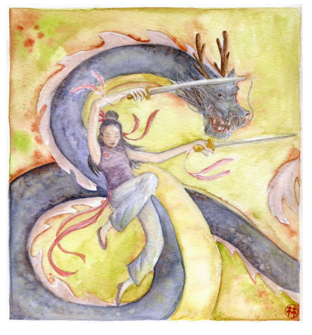
Inktober piece with the latest version of my calligraphic sinograph
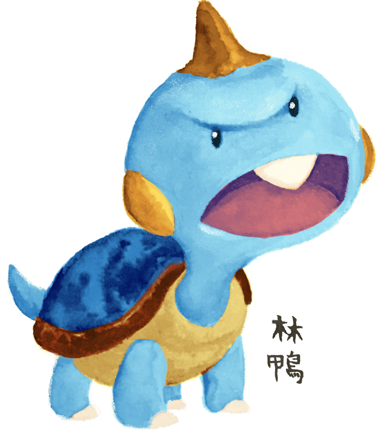
I have also signed my work in the past with a signature stamp that I picked up at a dollar store in Japan, that simply contained the character of my surname.
The first artwork I can find that uses the 林 stamp.
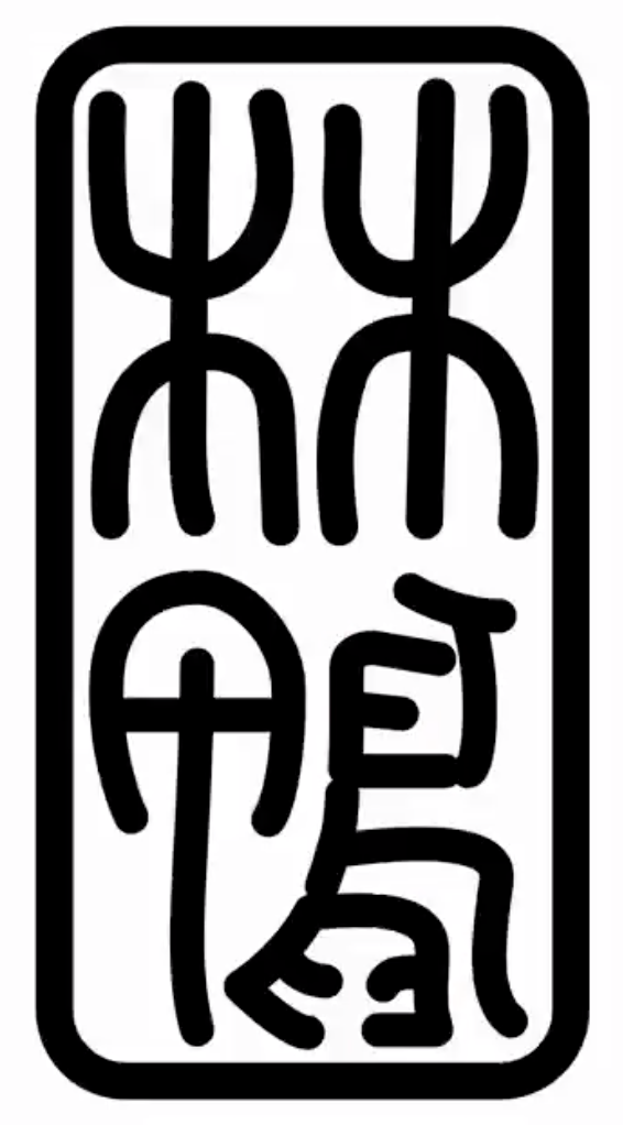
In the intervening times, I’ve experimented with laser engraving seals of my sinograph, and modifying its design. I briefly hit on a design I absolutely adored that incorporated “Alethea” into the character 鴨 (duck), which when put together with my surname 林 would have correspondingly given me “forest duck” as my signature. This would allude to the name of the chenonetta jubata in Chinese, nicely tying all of my identities together.
Seal script version of 林鴨
Unfortunately, a Mandarin-speaking coworker cautioned me against using 鴨 as a pseudonym. They informed me that when referring to people, “duck” is sometimes used as a euphemism for a male prostitute. So with that knowledge, I decided to fall back to my made-up characters.
Only a couple of pieces were signed with the calligraphic version of this signature before I reverted to my older signature.
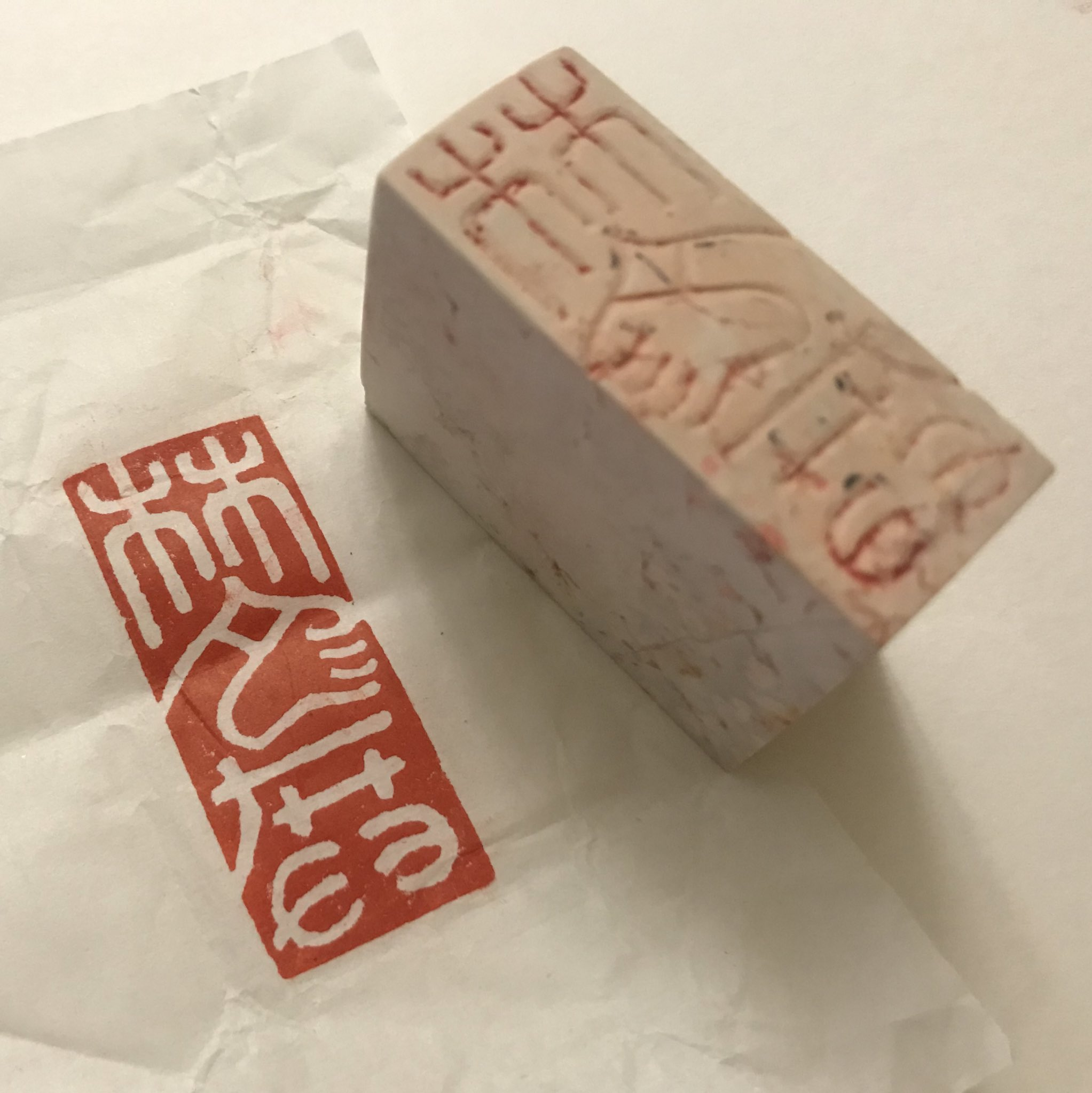
When I made the most recent revision to my signature, I decided to get it professionally carved into soapstone, and had the company confirm that I wasn’t going to run into any similar embarrassing misunderstandings with the design. The actual seal carving ended up being very expensive (considering I could have just laser engraved it myself), but I valued the peace of mind that came with having someone knowledgable vetting it. Experiencing how the seal design transferred so cleanly with good quality seal paste (the ink used to stamp the blocks with) also unlocked the next step in my journey.
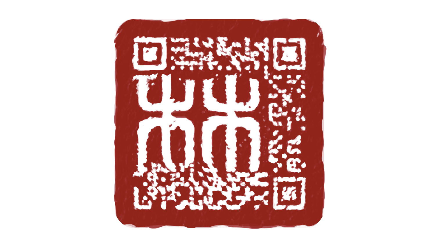
Soapstone chop and the stamped design
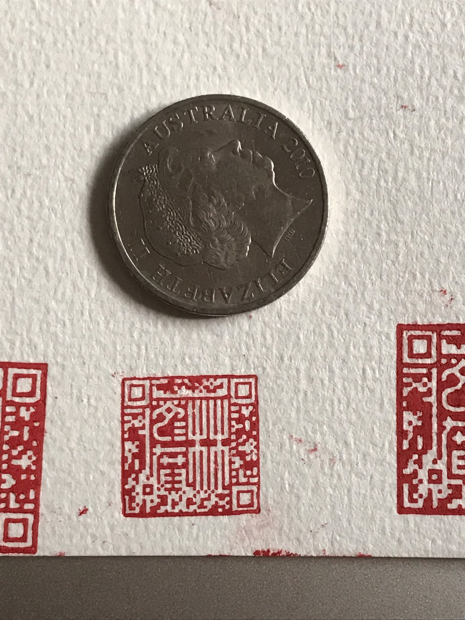
QArt Codes
Some time ago, I read this blog post about embedding images into QR codes. As a tl;dr, QR codes are made to be tolerant to damage. Most QR codes that contain logos in them just cover the data contained in the code and take advantage of the error-correcting algorithm to ensure the right values are read out. “QArt Codes”, on the other hand, use a provided image to generate a URL that naturally encodes to something that resembles the source image.
I can’t remember what led me to the article initially, it was a looooong time ago. I may have been working on a puzzle hunt for AVCon that used QR codes to log people’s progress and I wanted to embed the AVCon Invader logo into it (so some time around 2014). But the puzzle hunt, and QR codes in Aus generally didn’t catch on so the idea just got relegated to the back of my mind.
Still, QArt codes are super neat and I’m surprised I haven’t seen them in the wild more. Actually, I think the page that generated the codes was down during the rise of QR codes in the pandemic, so there was a bit of a missed window. But the page is back now, and you can play with making your own! Or if you want to play with the code there’s a standalone version you can run locally.
(Side note, when I was researching game-parsing screen readers to work on Ikalog stuff, I ran into this blog post by Up Banking. That’s the only QArt code that I’ve recognised in the wild to date)
Adding 2+2…
This is the post that lit the lightbulb in my head.
What do you guys think about the possibility of artists using small QR code’s as watermarks to link back to the artist? pic.twitter.com/9gk3a6GHhK
I mean, having hit this point in my post it’s pretty obvious what we’re gonna do, right?
QArt Chopping and Changing
“So how did you lose hours of your life to this? There’s a page that generates them, you just put your picture in there and you’re done, right?”
Well, to start off with, as I mentioned above the page that generates them was actually not available for some time, so I had to mess around with the original QArt source code (with a few headaches) and then later had the fortune of running into the standalone version.
After that… I lost time to the search of perfection.
Here’s my first draft of a painterly QArt signature. The output of the QArt generator still had a lot of noise, so I used painterly brushstrokes to make the noise look more appealing. At this point I still only superficially appreciated the stuff in the article and while I knew about some areas that were more important to preserve than others I was mostly just drawing willy-nilly with the understanding that “QR codes can repair damaged data”.
It’s neat but it’s off-centre, it contains only my surname and it probably won’t scan properly when scaled down for overlaying on art.
I was satisfied for a while with the proof of concept, but later I started thinking about laser cutting myself a new signature chop anyway, as the soapstone one I’d purchased was too large to use on A4 and smaller art (the majority of my pieces!)
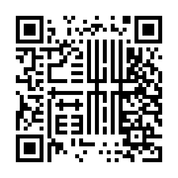
So I looked at the QR codes and realised that I should provide a source image that wouldn’t need to scale. I want to control the pixels of the code so I should provide a pixel art version of my signature.
Something like this. The QArt generator will try to respect the original colours of the pixels, but it almost always has to make compromises. The generator will put priority on preserving areas with full alpha, and will relegate its manipulations to transparent areas in the source image.
This provides an okayish output – it’s a good basis on which to paint over parts to arrive at a more aesthetically pleasing version.
I did do some test runs with this kind of “corrected” design and to my delight they did scan when stamped.
The seal paste that I originally got with my soapstone seal proved an excellent transfer medium for the design
However, I anticipate that the stamping process can be error prone and therefore it will be impossible to perfectly transfer the design. So I keep returning to these QArt codes to try to minimise the errors. First by lowering the amount of modifications that I make to the generated code…
Here’s a really tiny version where did some painting over the generated code but compromised a bit towards the lower area of the design.
Then, by changing the generation of the code itself.
One strategy was to reduce the area of the QR code that must be dedicated to my URL. I chose not to use a URL shortener. I intend to keep the chenonetta.com domain into the forseeable future but I can’t control what happens with any URL forwarding services.
I also opted to include the full http:// prefix in the URL. I did some playing around with readers and some automatically open pages if the URL starts with www. or ends with a .com but I didn’t want to rely on that behaviour. I kept the ale subdomain but that’s the least defensible decision and I might change my mind on it in the future.
So how to save space if I’m not shortening the input data? The original QArt coder uses byte encoding for the main part of the URL. This uses 8 bits per character. I modified the generator to create the URL in two parts – an alphanum encoded section for the main URL and then byte encoding just for the # that joins the URL and its throwaway anchor. Alphanumeric encoding uses 11 bits for every two characters. Overall I did still save a little space, even with the extra stuff needed to define the single-character byte encoded section.
I also played with manually specifying the masking strategy (the mask is a pattern that gets XOR’d over the generated QR code – read the original QArt code article for details).
After a lot of iterating, this is probably the closest I’ll get for now. I think this is technically still a damaged code but the areas that I drew through are part of the instructions about how to read the code, not the data. Like the data itself, there are some redundancies for the instructions so the codes still scan ok. Most of the time I’ve spent on these codes has been spent in the cleanup and tweaking stages – what can I get away with without introducing errors?
This is supposedly an error free code according this debugging website – though the scale of the source image definitely affects its assessment of whether the code is error free or not. The site also doesn’t recognise flipped QR codes (even though other readers seem to be fine with them)
Working on the flipped design is kind of convenient because it’s how the plastic will be engraved for printing.
Being forced to make compromises on the final outcome always keeps me coming back to tweak things again and again – can I change the orientation so that I don’t have to use a flipped code? Can I rebalance the density of noise around the main design so that it doesn’t distract from the centre as much? Can I smooth the curves in the image more? I’ll just keep searching and searching for the ideal version of this design…
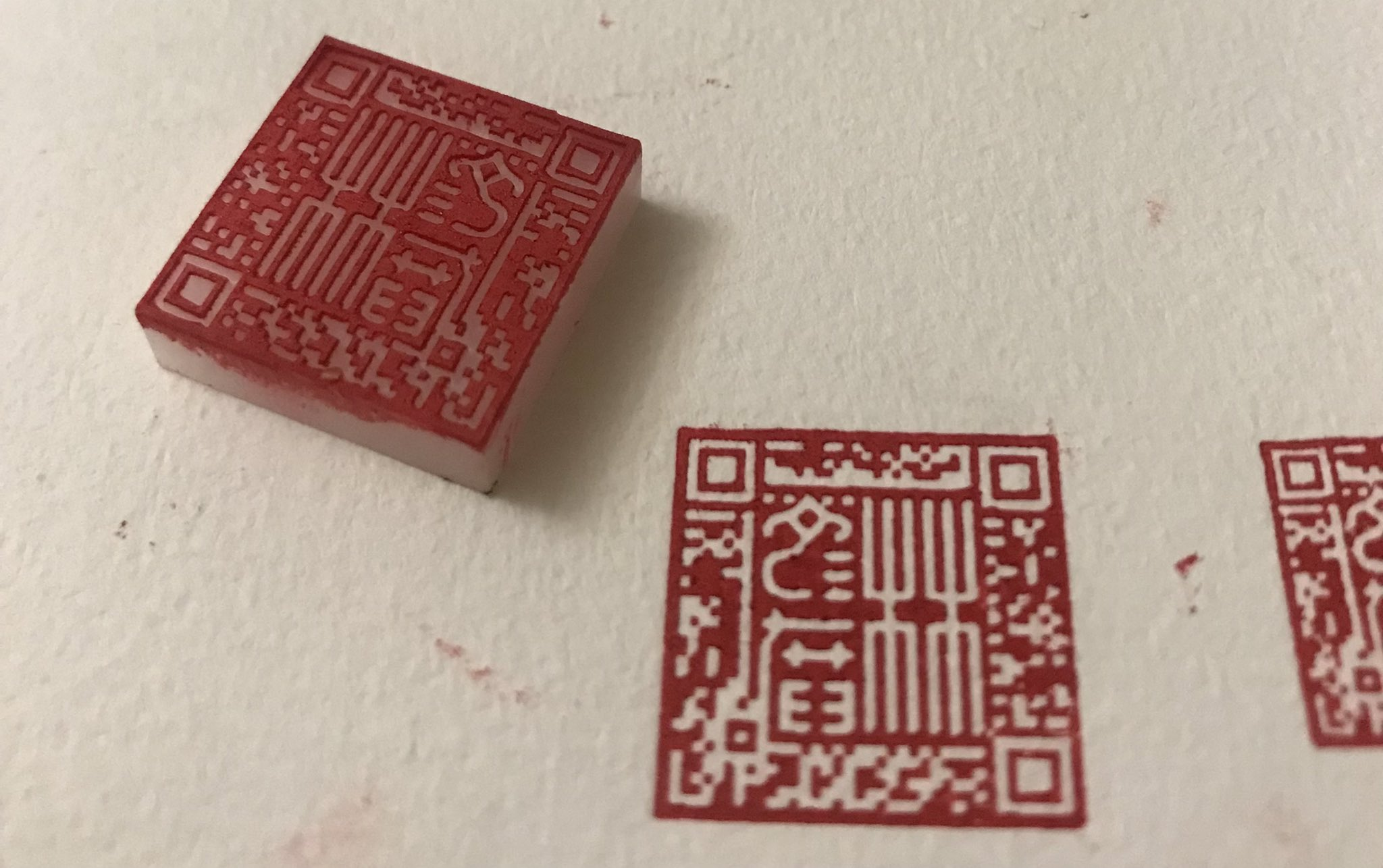
To wrap up, here’s the current setup I use for transferring the print to paper. I’ve been experimenting with moving to block printing ink instead of seal paste, because the latter is oil based and takes days to dry. So far I haven’t had a high success rate with the new ink but I think I’m learning. Sometimes a dodgy print can be recovered with a little bit of hand editing, though it requires some deft brushwork!
The seal, the artwork and a folded piece of kitchen paper are clamped to a table.
It’s the festive blogging month of Blaugust, during which netizens all over challenge themselves to post regularly to their blogs.
I’ve actually posted more than once to my blog in the previous year so I’m actually ahead of the usual batting average that I have heading into Blaugust. Which is why I feel a little less pressured to output content for said challenge.
I’ve also had a lot less “WIP” stuff, or at least, WIP stuff that I’d want to document with more than just an image itself. It leads me to ask, what’s the purpose of this blog now? With Twitter being my primary outlet for just throwing out the little nascent ideas and WIPs, this blog’s purpose feels less meaningful.
Speaking of Twitter, I’ve been spreading out quite a bit on social media of late… I’ve revived my deviantArt account – my longest living portfolio of work. It’s not comprehensive, but when I look at it I think it has a lot of the main beats of what I’ve worked on over my internet-faring lifetime. I also hid the link to my “art” page on the main ale.chenonetta.com landing page, since it’s such old art, and not a great representation of what I do now.
I’ve started focusing on posting my finished pieces to http://twitter.com/chenonetta rather than my personal feed (which still gets the WIPs) in the last couple months, and a few days ago started posting to http://instagram.com/chenonetta. I don’t “get” Instagram but since August is also the month of the #AvianAugust challenge I figured I’d try and get involved with festivities there.
So! It’s Avian August. Last year I sort of cheated my way through Blaugust by posting all the birds here. But I’m not really sure that’s necessary this year. I’ll post them to my dA and insta accounts instead where they can pad out my portfolios and maybe expand my “social media cred,” or something along those lines. I will admit, I am looking for an audience at the moment, as I’ve just launched my latest online store. But I’m not trying too hard – for now I’ve resolved to selling the art stuff while it’s fun. It’s not going to be replacing my day job any time soon.
But… if you do want to monetarily support me in the extracurricular activities, I did also spin up a Patreon! I’ll credit the Patreon with actually making me do a couple blog posts this year (which were mirrored there and on this blog) but maybe I need to think about what direction to take that in, too.
Anyhow, that’s it for me for now. Please check out the #AvianAugust2022 tags on both Twitter and Instagram to support all the artists participating in the challenge. And good luck to all the brave Blaugustines !
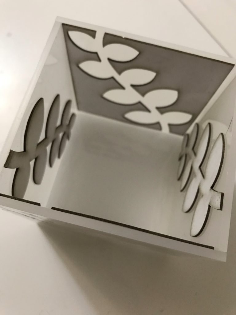
Lately, my dad has been making beautiful carved wooden lamps. And every now and then, he asks me to cut some mirror acrylic on my laser cutter to place into his lamps.
Tonight was one such occasion, and since I was going to head to my parents’ place for dinner, I thought I’d take the opportunity of the laser machine being spun up to also make a lamp of my own and test it out with the LEDs that dad has been using to test his lamps. This is the result.
This is a real speed build. While I’ve been wanting to do something like this for ages, I hadn’t ever managed to bring it to fruition because of the little decisions required. What size should it be? Should I cut tabs for a better piece alignment? What opacity of acrylic should I use? What should the silhouette design feature?
With a tight turnaround time imposed, I threw all those questions aside and went with a simple design. I realised I could also speed up the prototyping by using both the positive and negative shape of the silhouette for the adjacent faces, thus cutting down on wasted test material. The design was drafted on the bus trip home from work, and the light box was test-assembled using sticky tape. It’s very shoddy but proves the concept!
I was planning to use 2mm white acrylic for the leaf shapes, but it turned out I didn’t have a large enough sheet. By chance, I had a bit of cardboard on hand AND I guessed the correct settings to cut it on my laser cutter. The cardboard does the job fine!
From here – I guess I should properly glue up the box and work out how the light will be positioned and how it’d turn off and on; but I suspect that those questions may be left hanging for a while.
I recently discovered a Twitter art prompt that will be taking place over August – Avian August! There are birds allocated to each day of the month. This may solve my “what to post for Blaugust” woes!
Two paintings inspired by “A Short Hike” – one from last year, one from more recently. I really love this game and recommend it wholeheartedly! Maybe at some point I’ll draw Claire doing something other than sitting and taking in the sights.
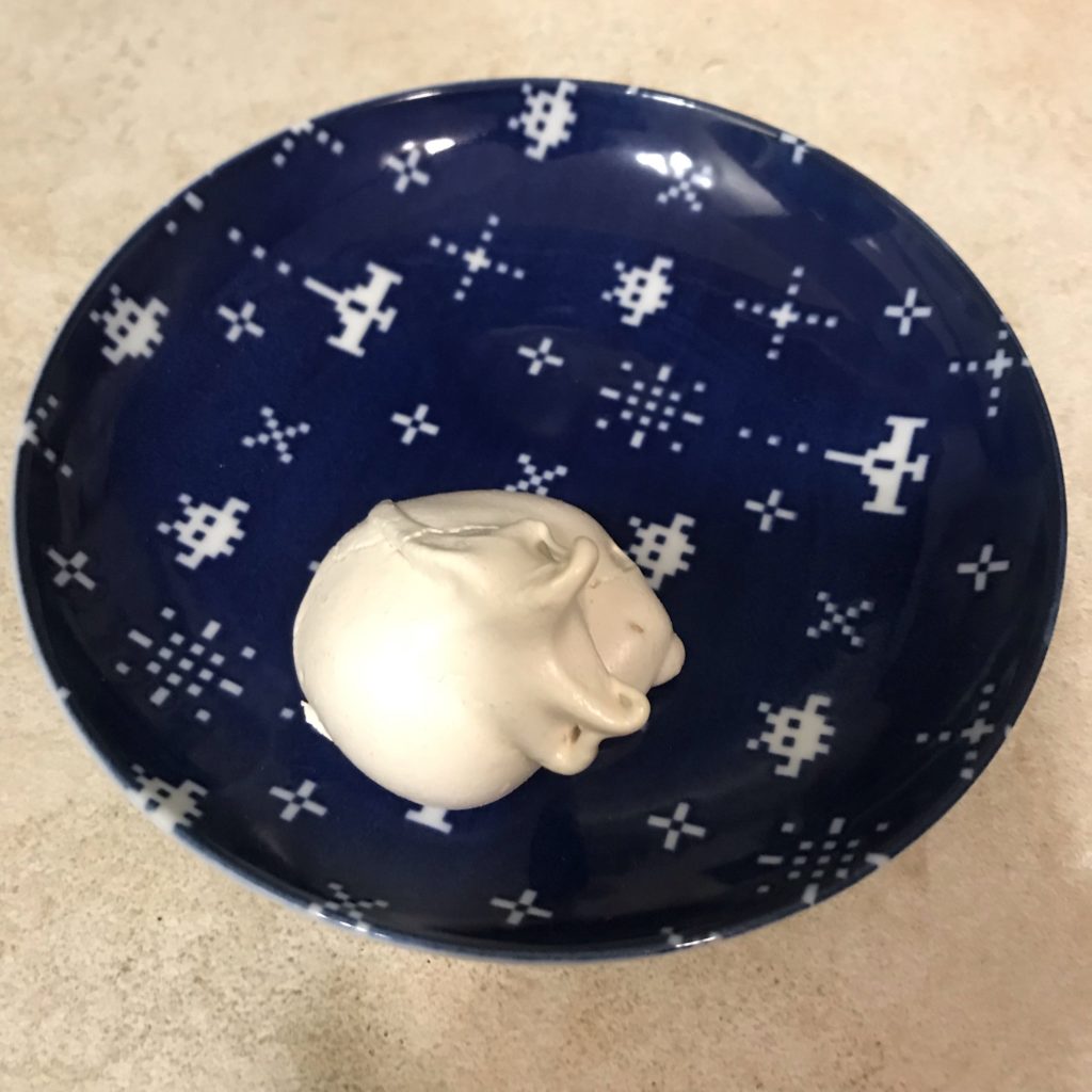
Took my first crack at making meringues (or at least, the first try in my adult life). The rest are currently sitting in the oven (recipe says to let them sit in the oven as it cools) but I couldn’t resist grabbing one to try now.
What started as a flippant remark turned into a little project! Thanks to Toad for inspiring this undertaking.
The suits are: Eggs, featuring golden eggs from Salmon Run. This is a nice, simple substitute for the original “coin” themed suit. Bamboo,featuring the old-men of Splatoon. While Captain Cuttlefish is represented via only his bamboozler gun, DJ Octavio stands in proudly as the 1-bam. A traditional Chinese set would depict a sparrow perched on a branch; here Octavio holds a stalk of wasabi. A Japanese set would more commonly depict a peacock – I enjoyed working some of the concentric circle details that might normally go into the peacock’s tail into Octavio’s helmet. Snails, featuring my morphed rendition of a sea snail, doing its best to look like the character è¬ – ‘myriad’. (Toad said it initially struck him as being a boat – I guess as a nautical theme it works, though it doesn’t scream “Splatoon”). The character suit represents currency increments of 10,000 – when I was thinking about high-value stuff in Splatoon, sea snails sprang to mind!
I think these suits give us a nice little tour around some of the main areas of the game.
A super sea snail – a source of inspiration for one of the suits
It took a bit of brainstorming to work out the dragon tiles but John suggested tying them into their loose suit associations – the green dragon is most often associated with bamboo because of the green hand, which leaves the red dragon paired with characters and the white dragon to go with balls. Luckily by the time he suggested this I had revised the eggs suit to contain more blue, so the colour association was present when he made the suggestion – though now I want to make them even more blue!
Dragons as they may appear in a traditional mahjong set.
Following the colour patterns, John suggested a Steel Eel could be used to depict the frame of a white dragon. He also suggested using Inklings and Octolings for the remaining two suits – while I took an inkling for the red dragon, I decided to try something different for the green.
With the bamboo suit being inspired by the rivalry between Captain Cuttlefish and DJ Octavio, I preferred the idea of giving a little more limelight to Cuttlefish rather than a generic Octoling. In addition, the Octolings you encounter in Octo Canyon tend to be red, so I didn’t really feel right making them green.
Cuttlegear Logo
I decided to play with the Cuttlegear logo and hint at that while also attempting to mimic the 發 character. The left side of the character is meant to represent one of Captain Cuttlefish’s medals. I’m not totally happy with the current draft but it’ll do for now.
The winds are currently placeholders – I think that my handwriting is a bit ugly. I’d like to think of some thematic stuff to replace them with – so far I’m dwelling on thoughts of locations in Inkopolis Square… or something with the great Zapfish, since it got bumped from being one of the dragons…
Finally it might be fun to include a few extra tiles – perhaps the idols as season/flower tiles? Though I’m not sure how well I’d be able to pull them off with this colour palette.
3 egg yolks 300ml thickened cream 3 tablespoons yuzu syrup Pinch salt Sugar to top
Note: my tablespoon was probably a little closer to 25ml than the 20ml Aussie standard…
The recipe is designed to nicely scale – 1x egg yolk, 1 spoon yuzu for every 100ml cream. Feel free to experiment with the quantities to suit your own preferences!
Heat 300ml thickened cream in saucepan on the stove with a pinch of salt. As soon as it appears slightly frothy, remove from heat. Do not let the cream boil.
While the cream comes to heat, separate 3 egg yolks. Whisk together the egg yolks with 3 tablespoons yuzu syrup
Pour warm (not boiling!) cream into the yolk mix, stirring to combine. Take care to not cook the eggs! I recommend using a spatula to scrape up the yolk mix from the base and sides of the bowl so it can be entirely integrated.
Evenly portion the custard mixture between teacups/ramekins, place the filled containers in a deep dish/roasting tin
Pour boiling water into the outer dish until it is 1.5cm from tops of the teacups/ramekins. The custards will be cooked in this water bath
Transfer the custards in the water bath to the oven – cook for 30 mins or until tops are slightly darkened
Remove the custards from the water bath and allow to cool before transferring to a fridge to set
Before serving, top custards with sugar. Spoon half a teaspoon of sugar over the top of the custard, and then rotate it gently to distribute the sugar over the surface. Caramelise the sugar with a kitchen blowtorch
Where to get yuzu
I got my syrup from Mountain Yuzu – they are an Australian grower of yuzu, and they also import a number of yuzu products. Using the syrup makes the recipe really easy – because there’s already beet sugar in the syrup I skip adding any sugar to the custard mix.
My first experiments with this recipe used Yuzu Tea – I was lucky enough to snag the last jar they had in stock at the time. While I ended up deciding that the syrup was easier to use, the yuzu tea has proven itself a tasty accompaniment with toast, cereal and as a drink. I also finally decided to give this Yuzu Ice Cream recipe a shot despite not owning an ice-cream machine, and it came out great!