Proairesis

Find Me On…

  • Facebook
  • tumblr
  • deviantArt
  • Storenvy
  • Home
  • About

Tone

Momentum

Posted on August 17, 2019 Leave a Comment

The most important element of most Blaugusts that I’ve “succeeded” at has been momentum. Last week our household was struck with illness. Woefully curled up in bed with an awful cold, I took last Monday off from blog posting, and that snowballed quickly – even though I worked from home on Tuesday and was back in the office on Wednesday, I was still moping around not feeling like putting a blog post up.

This topic ties into a meta-Blaugust post that I’ve been wanting to write, but I think I’ll keep that in the back pocket for just a bit longer because what I want to do today is get back into the swing of drawing on the daily.

I signed up to a a free online course run by the University of Newcastle, which started this week. The course is “Natural History Illustration 101” and is focused on the discipline of drawing subjects from nature. It’ll run for the next 6 weeks so I hope the course content dribbling in will give me some continued ideas to draw from. This week we’ve been given a bunch of introductory videos to understand what natural history illustration actually is, which has been a lovely source of cool inspiration (butterflies, birds and plants, oh my!)

In addition, registrants to the course have been offered a login to the Global Plants website, which is apparently a really huge repository for plants.

Today’s sketch is thus a Money Plant. The reference picture is actually from wikipedia, as I didn’t like any of the reference material on the global plants website. I had a recent conversation with John in which I mentioned this plant but he wasn’t familiar with it.

Rendering this was really difficult. For a start, I haven’t done any representational artwork in ages, so those skills are all rusty. But secondly, the tones and patterns on the actual seed pods of the plant made it really hard to convey them in a way that made sense. One seed pod in the photo was really shiny. Others were mottled. They’re actually really flat discs, and I don’t think that’s apparent from my sketch at all.

Anyway, it was good to draw just for the sake of it. Here’s to getting back a bit of momentum.

Posted in: Sketches, Tone | Tagged: blaugust

Rooted in the Stars

Posted on August 19, 2018 Leave a Comment

I was a little stumped last night for art ideas. There were a lot of random concepts floating around my head – we’d played some silly translation of Pokemon Silver that could have made for lots of interesting material. One idea came from the translation of “Vine Whip” as “Bean” and that made me want to draw vines and beans and Beanslingers.

But there was another pull, to draw the stars. And I couldn’t really settle. So with my sights on the stars I pulled out my tarot deck, the Tarot of the Silicon Dawn (Some cards are NSFW, individual cards I link should be fine) for guidance.

I haven’t looked at this deck at ages, and I didn’t want to rifle through the cards and overwhelm myself with concepts. So I shuffled and drew a card – the Ace of Wands

“The Root of the Powers of the Earth”. Honestly I glossed over the title of the card (though it might have stuck in the subconscious) and skipped to the description. I chuckled and rolled my eyes at “Here’s the blank canvas sitting in front of you”. The sketch followed soon after, a magnificent vine, rooted in a murky smoke of ink.

But I had trouble with it. It wasn’t quite right. I had trouble rendering the vine, and one mistaken leaf became a bunch of mistaken leaves. Things bloated into a mess of brushstrokes.

It was time to step back. I doubted the strength of the concept. So I pulled another card from the tarot deck. The next card I pulled from the deck was Vulture Mother (did I mention this was an unconventional deck?)

I wasn’t really sure how to apply the concept of the card into the illustration, but the idea of scavenging for the right thing seemed to apply in this search for direction in the image itself. I decided to stick with the idea and start over.

This time I worked carefully, drawing an arc of the night sky around a halo for my vine. I painted in the shape of the vine faintly first, before committing to dark tones. But for the night sky I went straight to undiluted ink, letting it flood the page with more certainty than the first draft.

Finally, splatters and small details in white complete the image.

With the painting done I took the time to rifle through the deck. I feel this isn’t too far from the Princess of Wands illustration actually. I doubt this is what I’d have ended up with if I’d pulled that card though.

Ok that’s me caught up for Friday, time to see if I can wrangle any more ideas for Saturday and Sunday posts!

Posted in: Tone, Watercolours | Tagged: blaugust, ink, stars, tarot, tree

Mambray Creek

Posted on October 18, 2012 Leave a Comment

We spent the last weekend camping up at Mambray Creek. It’s the first time I’ve been camping in a long while, and it was such a lovely place. The wildlife was a highlight.

Although I took my paints with me, I forgot to bring my usual brushes! That caused a bit of panic, but I found that I had a Chinese calligraphy brush on me. I usually only use the calligraphy brushes with black ink, so I decided to make the best of matters and create a painting in greyscale.

When I finished the above painting I realised that I’d probably done myself a favour by forgetting the other brushes. Working in just black ink meant that I didn’t need to juggle the complexities of colour. I was able to work things up in tones, and if I got something in the wrong spot I was able to water it down or build up the things around it in order to make up for the mistake. That would be much harder to correct if I put the wrong colour down!

My suspicions were confirmed when I made an attempt at painting a vista scene over the hills using my watercolours. I ran into problems of managing colour, depth of field, and the problem of picking subject matter that didn’t have well defined forms. I abandoned that painting after not too long.

On Sunday I felt a desire to draw rocks.

At first I started this painting with a view straight into a wall of rock, and not long in I was going a little crazy. John however pointed out this view, just facing a little further up the track from where I was seated, which made for a much easier composition. With the shape of the left tree and the negative space around the rock edges it made it much easier to work out what I was looking at when I looked up and down between my painting and the reference.

Overall, a fun weekend with some nice art to boot. And I might even be convinced to go out and walk and enjoy the great outdoors more often now that I have some confidence that I can get some worthwhile paintings done.

Posted in: Tone, Watercolours | Tagged: watercolour

Breathing space

Posted on August 22, 2012 Leave a Comment

A homework piece from life-drawing. We were asked to consider composition and the impact this has on the way an image is interpreted.

Posted in: Tone | Tagged: acsa, homework

Collage

Posted on November 21, 2011 Leave a Comment

A project for life drawing this term was to use collage techniques to create an image. The term’s work has consisted of less representational drawing work and more exploration into extrapolation of form and figure as well as different materials and techniques.

Here’s the reference ‘sketch’ I made:

And here’s the completed collage:

One of the things that struck me about the source image was the striking light and the contrast between highlights and shadows. When choosing materials for my collage I chose to go with bright colours, reflective surfaces and contrasted them against a black background. The hi-vis material was pretty fun to work with.

Posted in: Colour, Crafts, Tone | Tagged: acsa, collage, life drawing

Grey.

Posted on December 13, 2010 Leave a Comment

Oops, been a bit quiet again. Here’s a quick-sketch I lined up a while ago to appear here…

Reference from a fashion magazine, I think.

I think I was lazy with the shape of the face and traced the outlines so that I could move onto practising the shading. I wanted to spend some more time on rendering noses and lips – and it shows, because other areas feel a bit flat. But as a quick drawing exercise I think this turned out okay.

Posted in: Digital, Tone | Tagged: black and white, face

Light and shade

Posted on April 5, 2010 1 Comment

Some things I’ve learned about depicting objects using tone:

  • Work from light to dark, covering the whole image with each layer of tone.
  • Use circular movements to apply pencil strokes, so that the direction of the strokes don’t interfere with the shading.
  • The human brain is capable of filling in lots of information. There’s no need to use a line to define an edge when the viewer can imagine it.
  • Squint! Let the shapes blur into each other and then work out what the main tones throughout the piece are.

Here are my last three homework pieces, all focused on practising the correct application of tone:

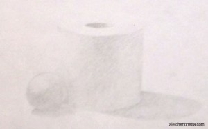
Tone Homework 1

A polystyrene ball and toilet paper roll. Glamorous stuff.

Quite a light application overall, but the shapes are still readable (though my camera might try to convince you otherwise). It was a bit light in the room when I did this one, but it might have been that I was using an HB pencil that resulted in the lightness.

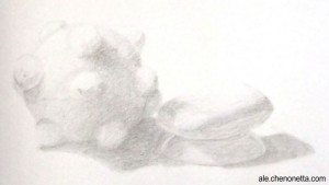
Tone Homework 2

Katamari, soap and mini-dish

Well, my prototype Katamari was an excellent matte white object to draw. Part of me wishes that I composed this differently, with all the objects stuck to the Katamari, but I think this turned out really well. The Katamari was described as a “mutant tennis ball” during last week’s homework review, and other than the soap appearing to tilt upwards a bit (I wasn’t able to erase the pesky lines in the back corner), I got a good response for this one.

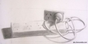
Power!

Powerboards in charcoal

I like the composition in this one. It has a little more narrative than random objects put together. The plug caused me lots of troubles and the sockets were no walk in the park either! After taking this photo I tweaked the far left shadow and the shape of the top power block. Taking a step back from things really helps to point out errors and inconsistencies. I’m eagerly waiting to hear my art teacher’s critique tonight!

Posted in: Tone | Tagged: acsa, black and white, charcoal, homework, katamari, Tone

Recent Posts

  • Laser-cut Nintendo Switch Webcam Rig
  • Using the USB connection to drive Squid Beakon colours
  • Personalised Splashtag nametags
  • QArt Code Signature Blocks
  • Blogs, Portfolios and Challenges

Archives

  • January 2023
  • December 2022
  • October 2022
  • August 2022
  • May 2022
  • April 2022
  • November 2021
  • September 2021
  • August 2021
  • August 2020
  • September 2019
  • August 2019
  • August 2018
  • May 2018
  • September 2016
  • August 2016
  • October 2015
  • September 2015
  • August 2015
  • April 2015
  • February 2015
  • October 2014
  • August 2014
  • July 2014
  • April 2014
  • March 2014
  • February 2014
  • September 2013
  • August 2013
  • July 2013
  • April 2013
  • March 2013
  • January 2013
  • December 2012
  • October 2012
  • September 2012
  • August 2012
  • July 2012
  • May 2012
  • March 2012
  • January 2012
  • December 2011
  • November 2011
  • September 2011
  • August 2011
  • June 2011
  • May 2011
  • March 2011
  • January 2011
  • December 2010
  • November 2010
  • October 2010
  • September 2010
  • August 2010
  • April 2010
  • March 2010

Copyright © 2023 Proairesis.

Theme by themehall.com.