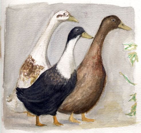
Ducks
Pretty much complete, will probably do some tweaking and fix up the foliage on the side.
Character development and design:
EDIT: Very first draft added.
I wanted to make her a blonde bimbo but apparently being cliche is dull.
Missing one image here actually, I’ll edit it in later if I can find it.
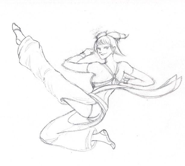
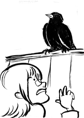
A quickish sketch done on my very speccy new toy.
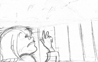
Drawing faces from low angles is tricky – in some ways the cartoon style amplifies the trickiness because direct photo reference isn’t as useful. Also I did kind of change gears halfway through so the face styles are different.
I really like her foot on the right… but I ruined it when I connected it to her leg. A few hits and misses throughout this picture – all part of a learning experience.
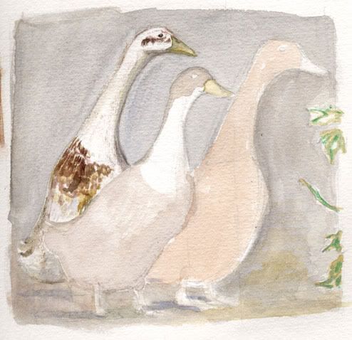
Trying out some new watercolour paper – Rains by Montval, I think it was…
Reference found via Google Image Search.
Despite the title, this is a post to announce I’m going to attempt to update more frequently.
Committing myself to a long pretentious post to blab about my mostly mediocre art often feels too troublesome to feel worth posting at all. So hey, I’ll just stick up WIP stuff and scraps without any explanations! Whoo.
Feel free to comment and ask stuff, readers. I mean, Tom. Maybe now I’ll only blab on about things you want to know about.
Started drawing a few of these last year, have continued at a slower pace this year. As you can see, I’ve started with the obvious: Eeveelutions, a bunch of starters (Cyndaquil and Totodile to come), Pikachu and Meowth, and uh, a duck. I like ducks, okay?
I’m hoping to print these off as fridge magnets. As soon as I can fill a page of them. (For reference, these are currently filling about a third to a half of an A4 page). They’re going to be totally rad and will stick to your fridge.
Each critter is inked digitally, then the lineart is enlarged by running it through a bitmap-to-vector converter. Some simple colours are thrown on, and voila! It’s done.
Since I’m planning to do more, I’d love to hear suggestions of which other Pokémon I should try. Let me know in the comments!
Some things I’ve learned about depicting objects using tone:
Here are my last three homework pieces, all focused on practising the correct application of tone:
Quite a light application overall, but the shapes are still readable (though my camera might try to convince you otherwise). It was a bit light in the room when I did this one, but it might have been that I was using an HB pencil that resulted in the lightness.
Well, my prototype Katamari was an excellent matte white object to draw. Part of me wishes that I composed this differently, with all the objects stuck to the Katamari, but I think this turned out really well. The Katamari was described as a “mutant tennis ball” during last week’s homework review, and other than the soap appearing to tilt upwards a bit (I wasn’t able to erase the pesky lines in the back corner), I got a good response for this one.
I like the composition in this one. It has a little more narrative than random objects put together. The plug caused me lots of troubles and the sockets were no walk in the park either! After taking this photo I tweaked the far left shadow and the shape of the top power block. Taking a step back from things really helps to point out errors and inconsistencies. I’m eagerly waiting to hear my art teacher’s critique tonight!
I’m painting butterflies!
Inspired by butterflies created by Danielle Corsetto of Girls With Slingshots. Something that I’d always thought would be neat to do but didn’t really twig onto how to manage until I saw her versions.
The last time I attempted to draw a butterfly accurately was in year 7, and I found it pretty hellish then. This time, it’s been a real breeze, and painting them has been heaps of fun. When I did my research for the Ulysses swallowtail I realised that the tops and bottoms of wings could be quite different and interesting, so now I’m attempting to get the top and bottom sides of the wings relatively accurate. I’m not being pedantic, but it’s nice to have a grounding in reality.
These don’t take too long to make so I hope to be doing lots more. I’ve found lots of pretty butterfly and moth patterns and I’m hoping to do justice to them all.
Last December, I started making a plushy version of everyone’s favourite crazy clump – the Katamari. To summarise the Katamari games in a few words, “you roll around a ball, picking up anything and everything in your way”.
The Katamari ball is basically a truncated icosahedron (fun fact, “truncated icosahedron” was briefly my nickname in year 5 as I was too nerdy to be a “square”). If you don’t know what a truncated icosahedron is, think of a soccer ball. In the Katamari, the faces that are pentagons become the knobbly nodes. To make my Katamari, I created a truncated icosahedron net based on one from Wikipedia, as my truncated icosahedron would exclude the pentagons.
After cutting out the two main sections of fabric, I started sewing furiously! It took most of the day, but I was able to sew together the nets, and add ten of the twelve knobs.
After getting that far, I left it. I wanted to add magnets, but had none on hand. The Katamari went to the back of my mind, and I was lazy in finding where to get magnets from. Anyway, last Thursday, I finally ordered some magnets and have put them in the Katamari. The result is quite satisfying!
The Katamari can hold the scissors pretty well! It takes two magnets to hold them quite firmly, but the weight of the scissors can make the Katamari tend to fall over. This might behave a bit better when I add the final two nodes. For objects that it has trouble holding onto with magnetic forces, the nodes are distributed fairly evenly over the surface, so objects can be balanced quite comfortably between them (as is the case with the box of staples in the image above). Objects can also be balanced on ones that are stuck on, like the brush. So there are a few ways to make the Katamari hold objects, and the overall effect is exactly what I was aiming for. The Katamari makes a great pincushion!
There is still some troubleshooting left to go. I will have to think about how to colour the Katamari – whether to use a variety of coloured materials, or to use fabric paints. I will likely have to glue the magnets to the insides of the nodes. And I will have to work out how to get the last two nodes onto the Katamari neatly. After I get those things sorted out, I’ll probably make a number of Katamari and maybe even some Team Fortress 2 Sticky Bombs.
A few weeks ago, I bought myself a new set of watercolour pans. My old set, a Van Gogh 12-pan set, (really great for travelling with!) has served me well for many years, but it recently dawned on me that with the limited colours provided, there would be hues that I’d never be able to achieve in my paintings. I first tried supplementing my paints with some old tubes, but having worked with pans for so long it felt inconvenient to deal with tubes.
So I started researching. I was lead to the Winsor & Newton Cotman range, watercolours designed as affordable alternatives to the high end artists’ colours. I narrowed my choice down to two kits, the Cotman Studio Set, and the Cotman Half-Pan Studio Set. The decision came down to – less colours with larger paint cakes, or more colours?
I chose the half-pan set, which includes every colour in the Cotman range. Many watercolour artists will use, and advise use of, a handful of colours for all of their paintings. This is something I was aware of before making my purchase, so why did I go for the larger set?
Well, I suppose after using only twelve colours for so long, I felt like spreading out a bit. There are colours in this set that can be mixed fairly closely, but that would rely on me mixing them accurately each time, and often the mix feels less lively than a straight colour. My hopes are to use watercolours in my comics – and being able to reliably produce the same colour on the fly seems like a great advantage to me.
Eventually, I figure that I’ll find that I’m using certain colours more than others, and those colours may eventually form my working palette. For now, I’m learning about the new colours I have and the way they behave. I also made myself a colour chart to help me remember what appears where in the set!
Getting these new colours has been a great experience. From learning what was available, to shopping around online to get the best price (I paid less than $60 for the set), to the anticipation and excitement, waiting for it to come to my mailbox… and finally, being able to paint with them! I’ll be posting art soon, I promise!
Finally, I’ll just mention this kit contains five repeat colours. In my pre-purchase research I was unable to find out what they were. Now that I have the set, I can inform that the colours are: Alizarin Crimson, Ultramarine, Yellow Ochre, Ivory Black and Chinese White.