Chenonetta Creations

Find Me On...

  • deviantArt
  • Twitter
  • Mastodon
  • Instagram
  • Facebook
  • Bluesky
  • Home
  • About
  • Selected Works
  • Shop

Digital

Cricut Hacks #2 – Template frames

Posted on April 10, 2025 Leave a Comment

Last time on Cricut Hacks we took advantage of Cricut’s scaling calibration to cut our graphics at a larger size than they were actually designed at in Cricut Design Space.

This time we’re going to use a template with registration marks to tell the Cricut where to perform cuts on a separately printed sheet of paper.

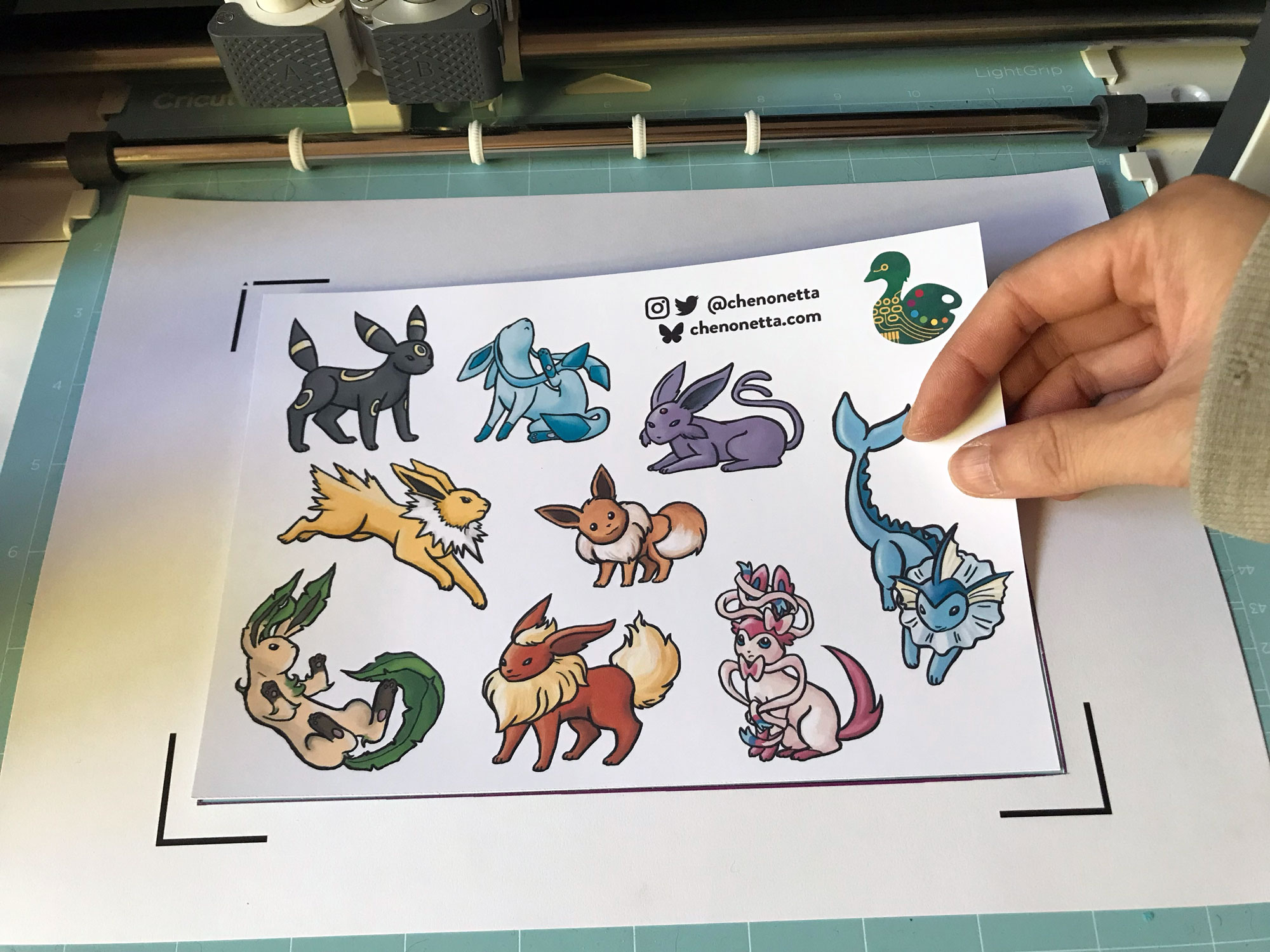
If you’re familiar with your Cricut, you probably see the below photo and have an immediate intuition about how to go about this hack! But I’ll share my method regardless.

Why?

Once again, we’re trying print larger than Cricut wants us to. This time, our reason for doing so is to avoid having to lose as much material to the registration marks as Cricut demands we sacrifice. It’s nearly 2cm around each edge, and if your printer already can’t print borderless-ly, you’re losing so much material!

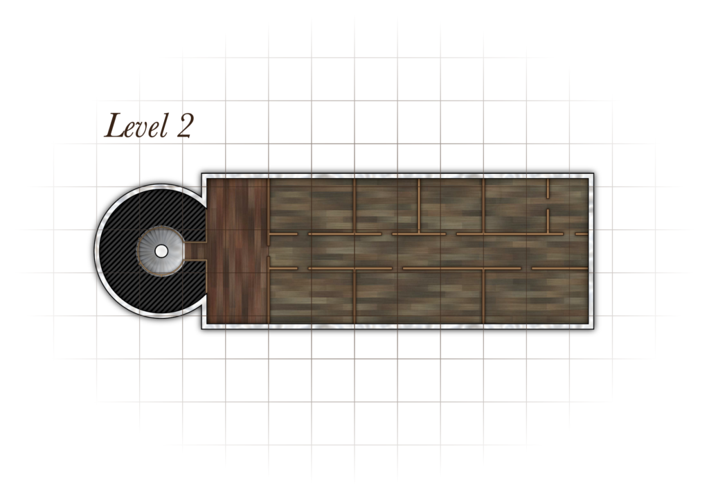
Practically speaking, if you want to make A6 sticker sheets, you’d fit two on an A4 page, and if you wanted to make A5s you’d fit one, as shown in the diagram below.

Diagram showing the margins and measurements when using the Print and Cut feature for an A5 graphic

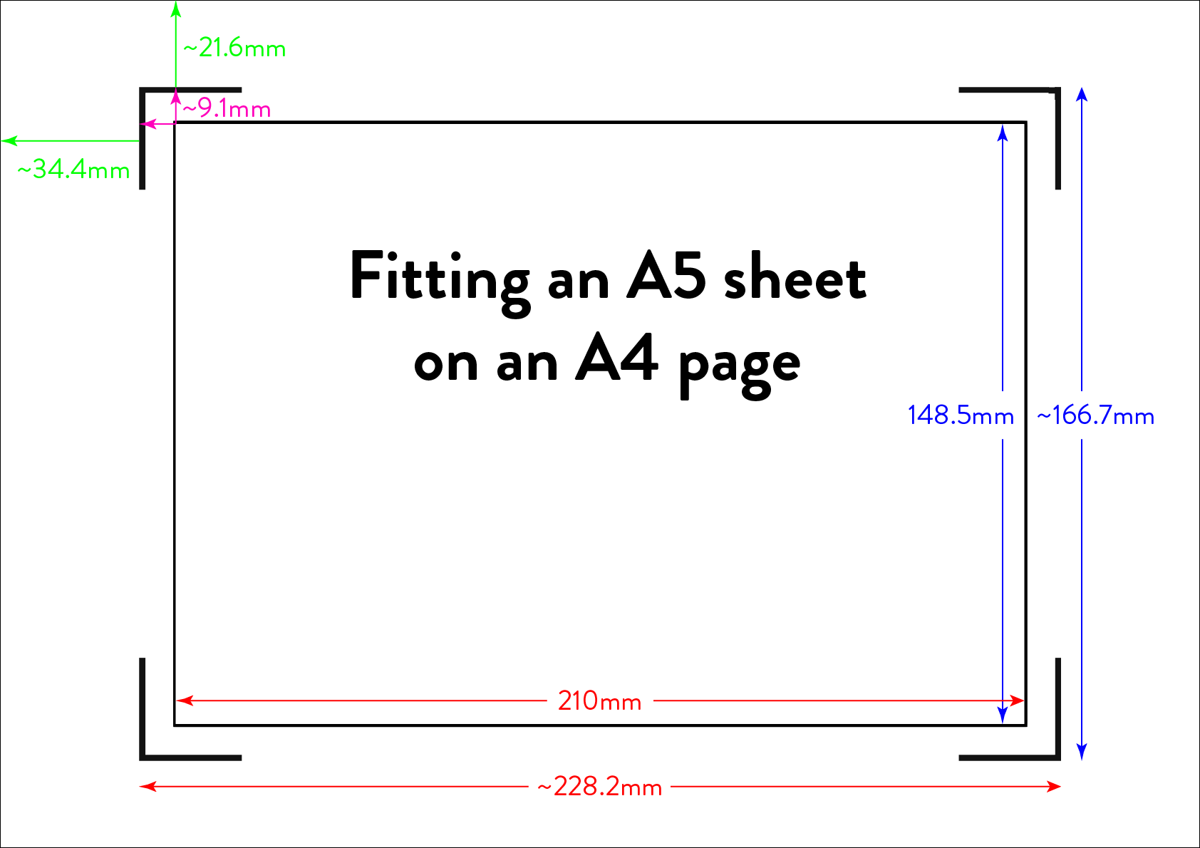
I’m willing to reduce my sticker sheet to 200⨉140mm, but Cricut still won’t let me fit two of those on a page. So let’s get hacking.

Drawbacks

Before we launch into the method, here’s some things to keep in mind:

  • You’re no longer going to get perfectly aligned cuts, as the manual alignment introduces room for error.
    • If your printer has a skew, this will become particularly noticeable as you might be rotating graphics in a way that exacerbates the skewing.
  • You’ll have more manual overhead for preparing your sheets.
    • I’m pretty fast at preparing my files now, but you still need to cut out each sheet to give to your cutting machine, which feels a little silly because the machine was meant to take that work away from us.
  • You need more software than just doing everything in Design Space.
    • I mention Adobe Suite software here, but others will be able to do most of this fine! I’m just indentured to Adobe. Don’t be like me, learn your hotkeys and workflows in the Affinity Suite and support perpetual licensing in software!

Method

Step 1: Prepare your sticker graphics

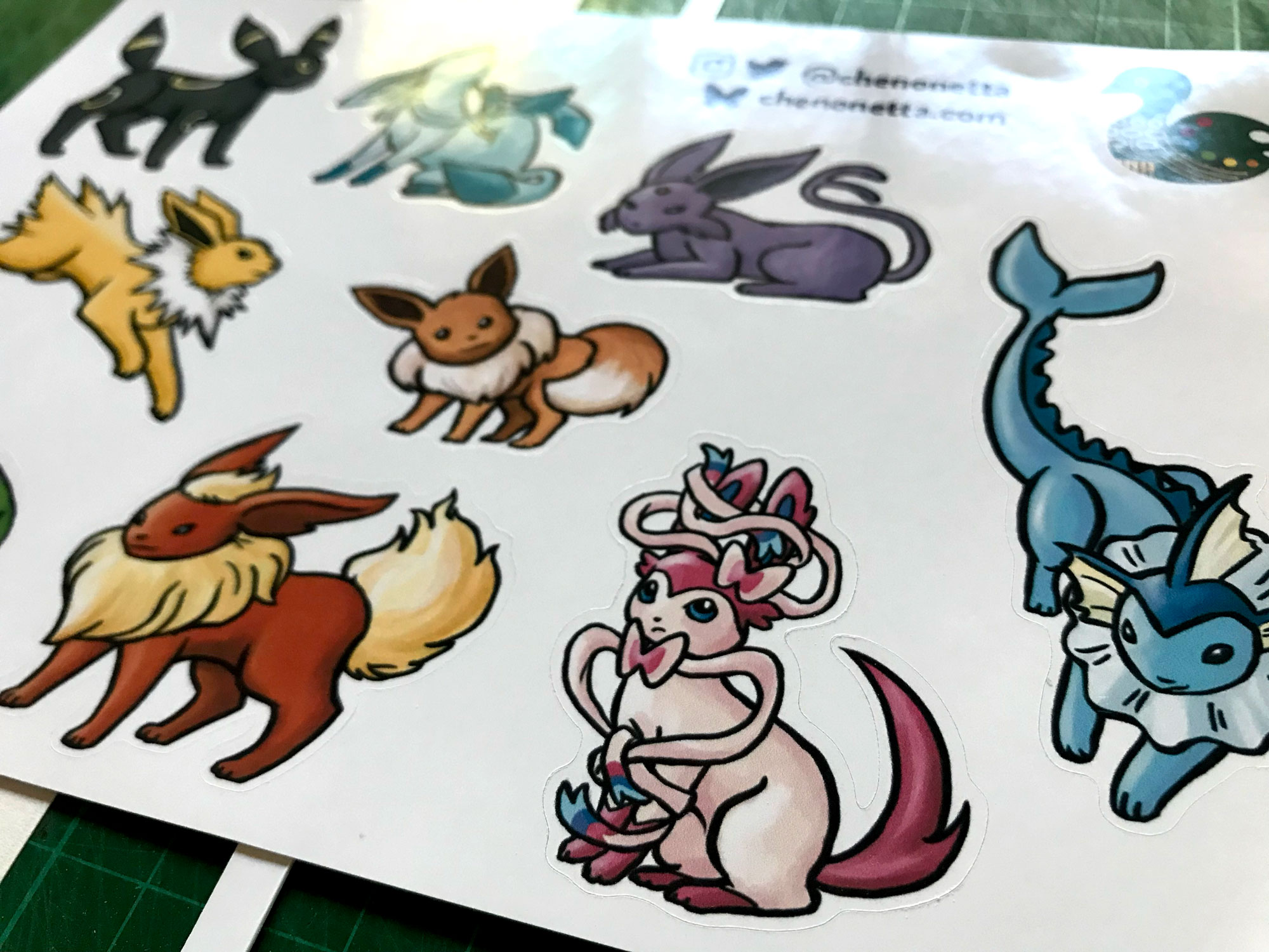
I prepare my images and vector cutlines outside of design space. This means I can have areas of the sticker sheet that aren’t cut out, like my logo and social media links.

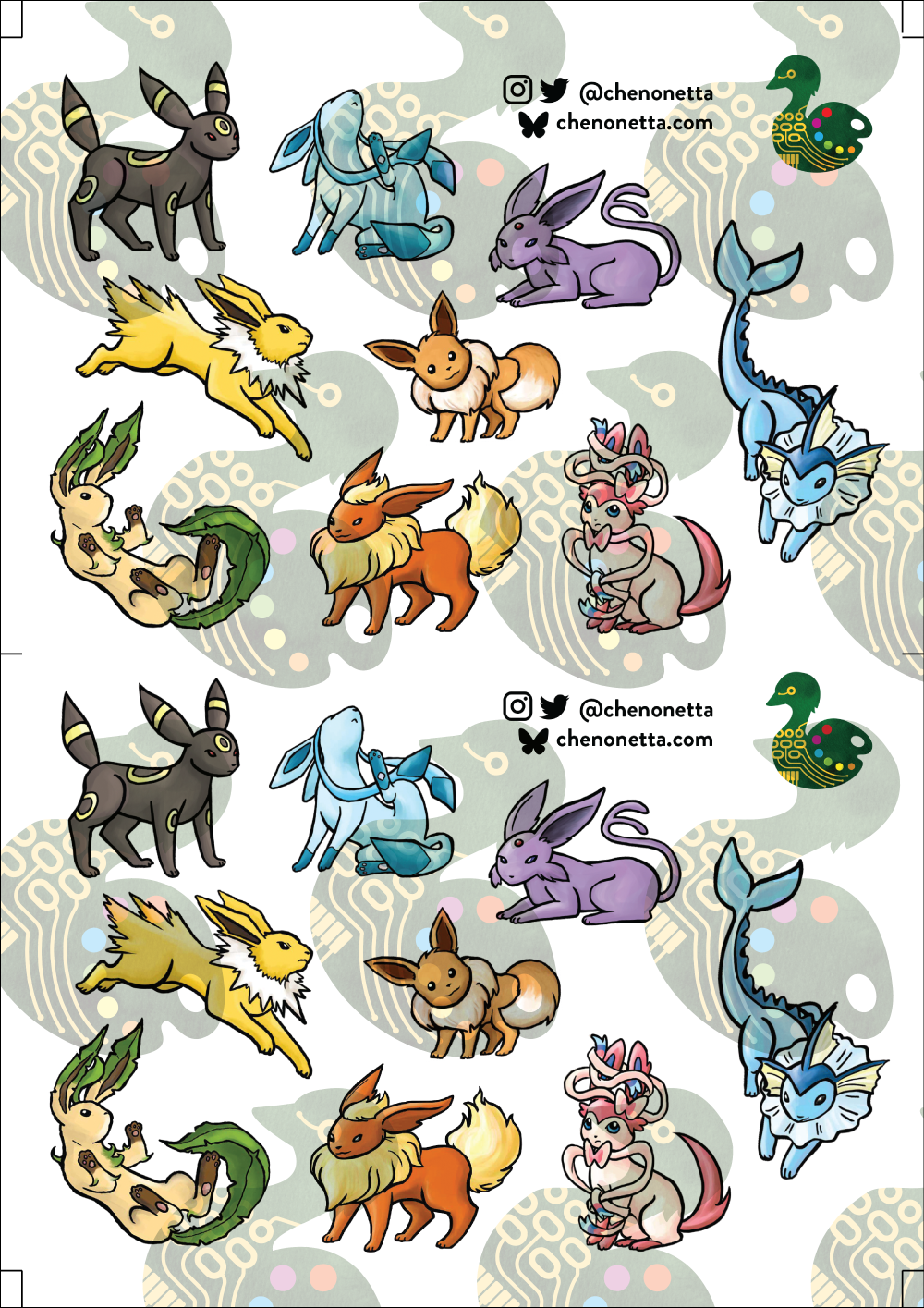
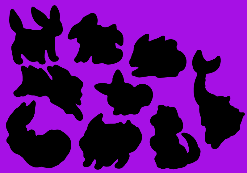
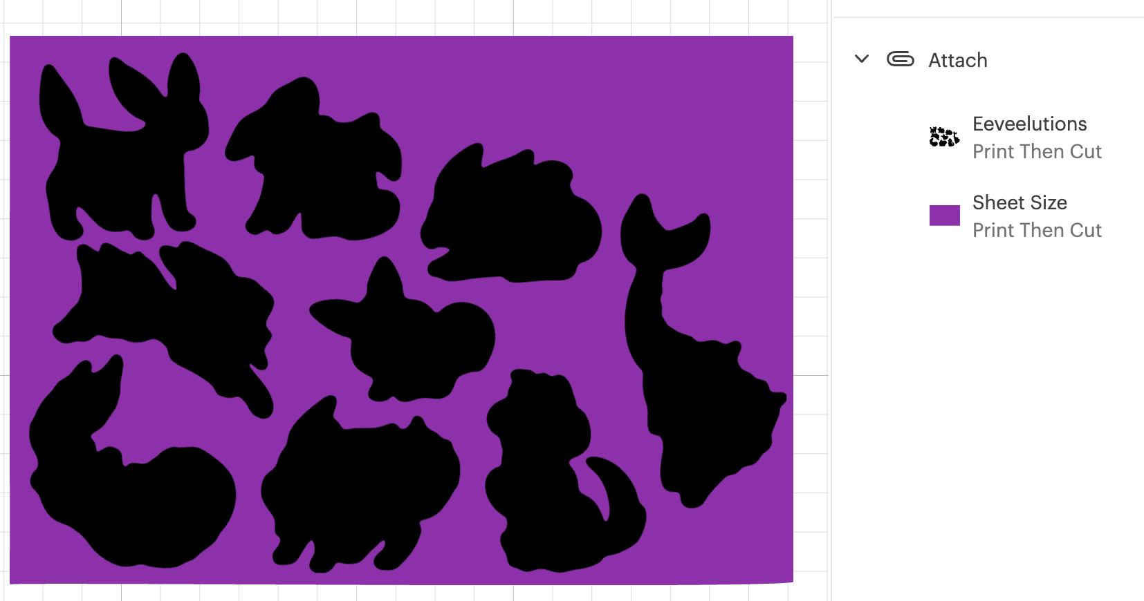
The first file you need is the one you’ll be printing. Repeat your design on your page as many times as you can fit, and then also place some marks for manual trimming. Here’s my example file (sorry about the watermarks). Notice the black lines in each corner of the page, and the lines in the middle of the page.

Print this file at 100% scale. Your printer might try to automatically scale your graphics to comply with your printer margins. Make sure that doesn’t happen!

Step 2: Prepare the cutlines

I generate the shape for each sticker by selecting the character in Photoshop, then use the Select => Modify => Expand menu item to add a border. I usually go with 20 pixels, which is a little more than 1.5mm at 300dpi.

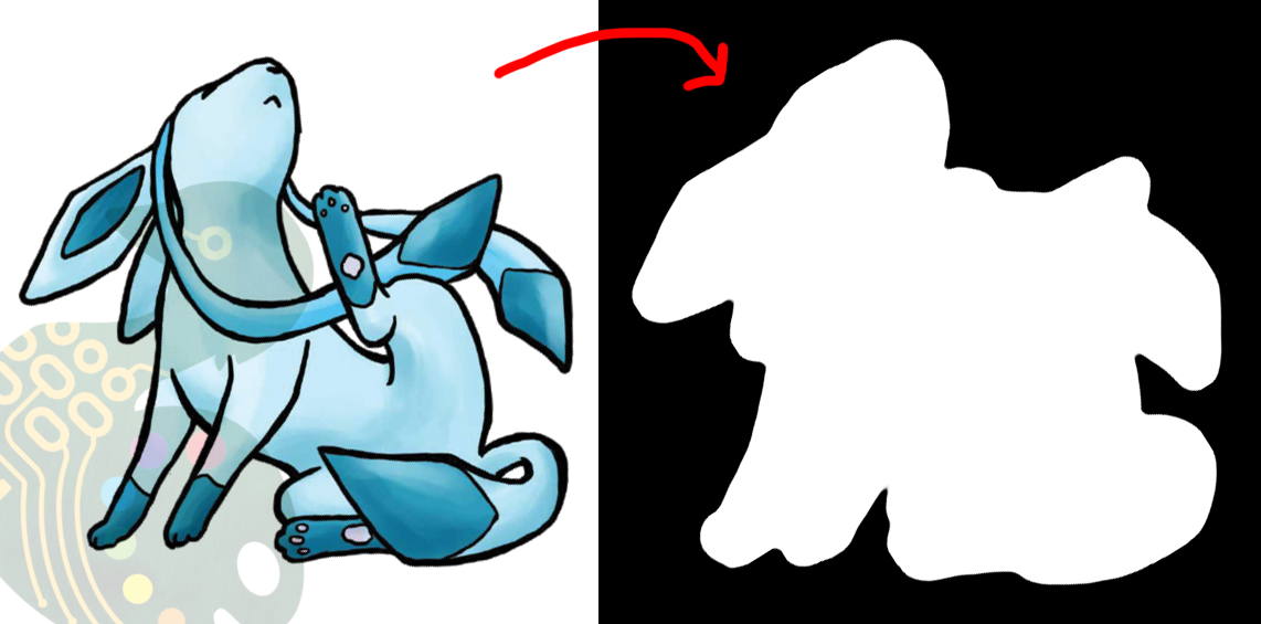
I then pull the black and white shapes into Illustrator and use the Image Trace tool to generate the vector outlines that will be used for cutting. I generally use the “Silhouette” preset, and then apply some smoothing to the lines (Object => Path => Smooth…).

Make sure to have the outline rectangle for your graphics as a separate image object as the rest of your graphics (you may need to “release compound path” or delete the outline and replace it with a rectangle, this will also get rid of any wibble that might have come from the image trace)

After these tweaks, I have a file ready to import into Design Space. Export it as an SVG (In my experience, the scale will be accurate if you use the Export menu item rather than the Save As, but other methods can cause scaling issues so just check the size once imported)

Step 3: The Template

Import your SVG into Design Space. Then, make sure all objects are grouped in an “Attach” group so that they’ll print and cut with your pre-prepared arrangement, and mark them all as Print and Cut.

Screenshot of Cricut Design Space showing silhouetted black blobs against a purple background

Click Make, but we’re not going to be sending this file to your Cricut yet.

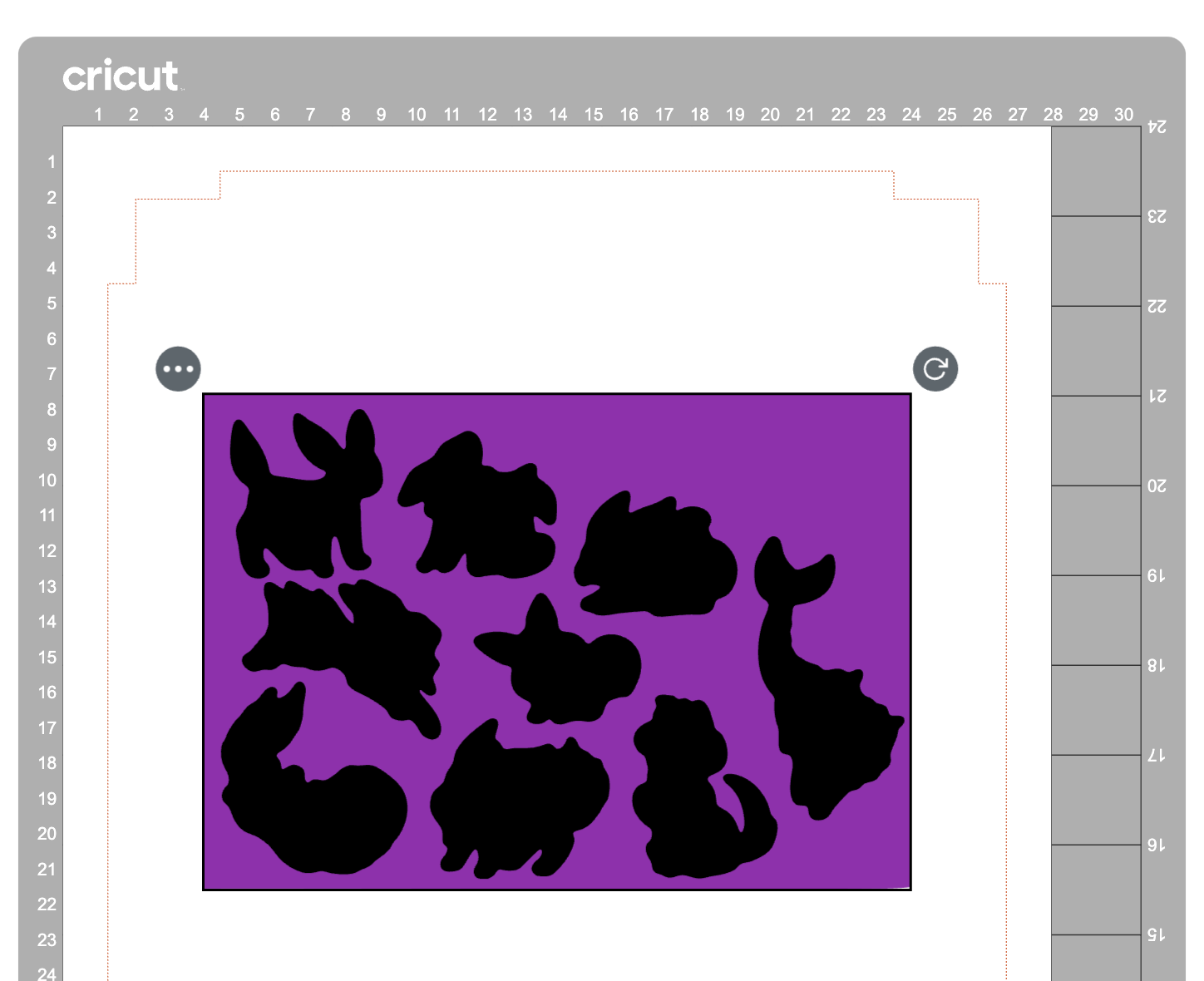
In the alignment page, move your graphic about 3 inches down the page, which will be enough clearance so that you can place and remove the sticker sheets into the templates without needing to unload the cutting mat.

Then in the “Send to Printer” dialog, choose to “Add Bleed” and “Use System Dialog”. The system print dialog will pop up (or under, if you’re on macOS – drag the Cricut window away to find it) and you can print your file to a PDF.

Open your PDF in a graphics editor and make a white rectangle in the middle that matches your sheet size – in this case 200⨉140mm.

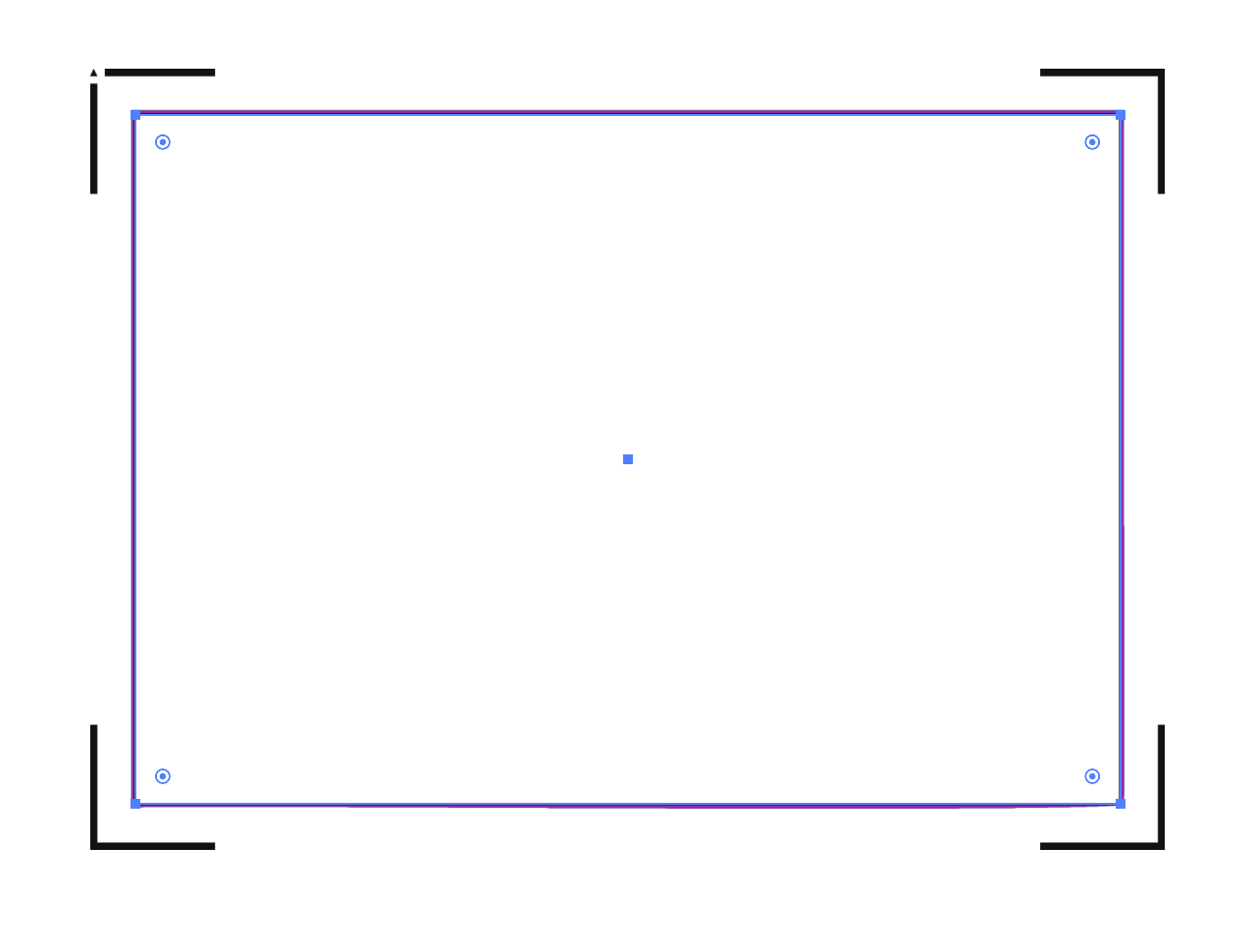
Print this file and use a craft knife and ruler to cut out the white rectangle. Try to be as accurate as you can!

PS, you could create the white void space and print the file directly from Design Space, but I like doing this because I can control a few extra things.

For example, Design Space won’t let me place my A5 graphic in landscape on an A4 page, but this way I can specify a larger paper size, then align the landscape image on the A4 page I’ll send to my printer.

Step 4: Cutting prep

Take the sheets you printed in step 1 and use your craft knife and ruler to trim them to size. Again, I’ve chosen 200⨉140mm for my sheets.

Place your template file on your cutting mat, taking note of the position of the void space.

Place your trimmed sticker sheet in your template, aligning it with the void. Use the extra border around the void to help judge how square your sheet placement is.

It’s almost time to hit Make, but we need to do one tweak in Design Space.

We don’t need to cut the outline rectangle of our sheets, because we’re trimming them to size before aligning them into the template.

Removing the rectangle, or setting it to a “Guide” line type will cause the print and cut margins to change. Instead, I denote the rectangle as a Pen line. We won’t be loading a pen, and the machine will waste a little time on this, but we’ll also be able to tell whether it’s aligned correctly while it traces the outline in thin air.

Step 5: Make

Press that make button!

Drag your graphics so that they roughly align with where you’ve placed them on the cutting mat.

Then on the next page, say “I’ve already printed” and select your paper type. The Cricut will suggest you load a pen tool and the blade – don’t bother with the pen tool

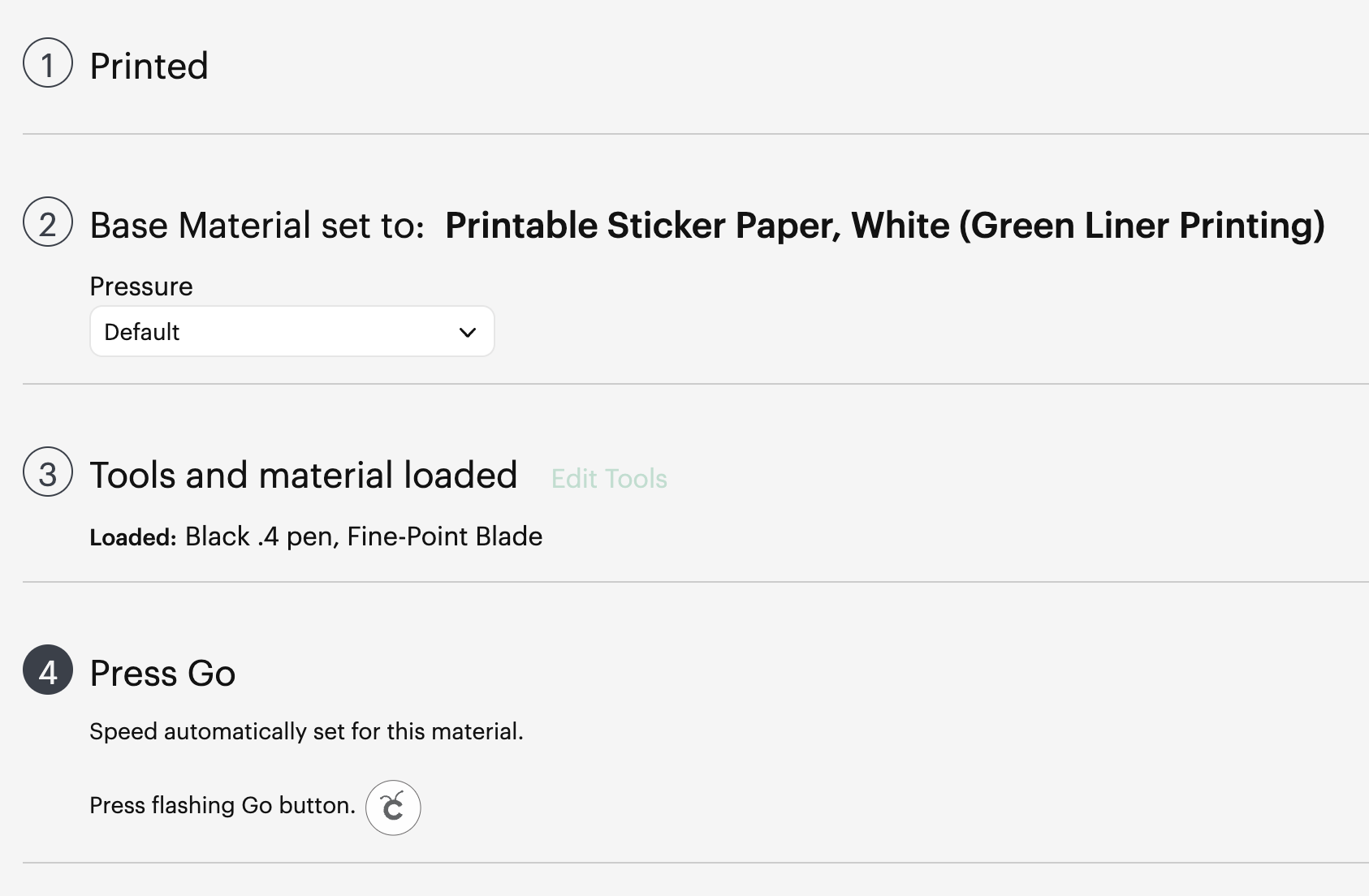
When you “Press Go”, the machine will start scanning for the registration marks.

It will then start drawing the outline of the sheet in thin air. While it does this, you can stare down the barrel of the empty toolholder to confirm that it’s aligned correctly with your page – if it appears to have misread the registration, you can cancel the job and try again. If it’s correct, your cutlines should also be correct.

And when the job is done, and all your cutlines are correct, you don’t need to unload your mat. Remove your sticker sheet from the mat by curling it away from the paper. Now you can place your next sticker sheet into the void and press the Go button again and it will cut your next sheet without reading the calibration marks again. After adding a bunch of extra steps and work into this process, it’s nice to get a little timesave!

Closing Remarks

Once you make a template for a particular sheet size, you can reuse it for all your files that share the same size. Consider cutting your template from a thicker GSM paper to extend its lifetime and make it easier to affix without skewing.

And finally, here’s the template with all its whitespace – that would have been wasted sticker paper if I cut this with the default workflow – next to the actual wasted material from my sheets. And a reminder, the sheet on the right fit two copies of the artwork vs the one on the left fitting only one!

Thanks for reading, if you found this useful please let me know!

Posted in: Behind the Art, Digital | Tagged: cricut, guide, hack, tutorial

Reflections on Tableturf

Posted on March 5, 2024 Leave a Comment

This blog post goes through a few of my Tableturf inspired artworks from 2023, ending with a quick timelapse of this painting:

With the launch of Splatoon 3 came a new game mode, Tableturf! I got quite into the idea of Tableturf, even being a part of coordinating an art collab project – Arty Siege – which paid homage to the in-game cards. I did lots of work for that – creating various design elements, having fun data merging artwork in InDesign, thinking about how the physical game would really play out, coordinating artists and creating artwork!

The art that I worked on included assets for the card backgrounds, and I illustrated one of the cards.

These background images were ink paintings traced from game screenshots. After doing a little photography tour in the game I exported the screenshots and used the Find Edges filter in Photoshop. I printed these reference lines to carbon paper and transferred them to watercolour paper.

After scanning the ink paintings, I applied some gradient map adjustments to them to adapt them into the card background.

I chose to illustrate the Splattershot Jr. as my designated card for the project. I’ve drawn the newbie squid before and as a Junior player (I became a Junior main because of having to unlock kits on many, many systems) I just feel a certain connection to the default loadout.

During initial project advertising, I used this artwork. The pose is taken directly from the pose of the original Tableturf card. With this version of the artwork, I mocked up the first version of how the cards would appear, including tweaks to the card UI and creating a 3D view of the card.

My motivations for changing the UI were to make the Arty Siege cards distinct from the in-game works, but also to think about what would make sense for a real card game. The original cards put all their important information at their base, but I wanted to make all the pertinent information visible easily from a fanned out hand of cards. So I moved the grid and special costs to the left side.

I also straightened the alignment of the block grid. The angled grid was cool, and saved a little space, but I felt that when looking down at the game board and determining how to make a move, it was easier to visualise the move you wanted to play by having an aligned grid. Maybe that was just me, it’s not like things in the real world would be completely squared anyway.

Anyhow, relatively late into the project I started feeling a bit insecure about that version of the Junior being my entry into the project. I was surrounded by an incredibly talented pool of artists and felt like I needed to step up to the standards of my peers! I still like my original artwork but I also felt inspired by the work I’d done on the backgrounds to do a piece in ink and use gradient mapping to add colour.

This time, I based the pose on some promotional artwork from Splatoon 2 – I wanted to show off the square ink tank because while the flat ink pack of Splatoon 3 features in some of the cards, many of the other ones seem to take cues from Splatoon 2’s fashion options.

Here’s the final version of the Splattershot Jr. card. Please do check out the Arty Siege website for all of the other works!

One of the things I did at the end of this project was to print out all the cards, which was a lot of fun! I felt like I built a new connection with each of the artists and their artwork in the process of printing, cutting and sleeving the cards.

While wrapping up Arty Siege I had a vague idea of running a promotional Tableturf tournament – maybe something in a casual vein, or with a bit of a team gimmick to allow a mix of player skills among drafted teams. The team angle was influenced by my favourite anime – Chihayafuru – a show that features a competitive karuta game based on the Ogura hyakunin isshu.

Chihayafuru is beautiful, and the way it depicts friendly competition really hits home. And there’s just something so great about the earnest enthusiasm of the players – they’re engaging in a pretty niche hobby so having the opportunity to play is something they’re truly grateful for. Coming from a grassroots Splatoon scene, I feel the parallels between the competition depicted in the show and some of my favourite times being a member of the Australian (and broader) Splatoon community.

I wish competitive video gaming was filled with people as kind and grateful for the opportunity to play with others as the karuta players in Chihayafuru.

— David Michael Kinne (@Mewd462) May 18, 2019
This kinda sums it up!

Although I didn’t end up running a Tableturf tournament, the imagery and the idea for an art piece stuck with me.

As much as I adore Chihayafuru, I’ve never felt brave enough to try to tackle fan art for it. The gorgeous scenes, the sense of movement, the game that I only have the most superficial understanding of… it all felt quite intimidating.

But Splatoon, I feel comfortable in that universe…

(A universe which coincidentally seems to have a version of karuta already!)

However, my painting is not an attempt to retcon that karuta into Tableturf. In my headcanon, the two coexist. I just wanted to borrow the aesthetics of karuta for my Tableturf scene. I was inspired by the glowing sunset scenes of karuta which I associated with the characters practicing in the school clubroom, but also by the tournament games played while wearing kimono.

Before starting this painting I did two “mood studies” – just getting a feel for whether I could tame the contrast of yellows, oranges and purples before I started. Watercolour can be a tricky medium, and it’d be hubris to walk into this kind of endeavour without a plan.

That first image is sort of a Chihayafuru fanart, I guess – the scene is most likely Arata sitting alone with his cards – but that wasn’t the purpose of the sketch. I wanted to get a feel for how I’d depict the trees in the windows, and the light entering the room. The second sketch really sets up the composition that I’d ultimately use for the final piece.

After deciding on that sketch, I made simple 3D version of the scene in Blender.

A digital sketch then filled in the character details

Which was then printed out and transferred to stretched watercolour paper, then painted over the span of a few weeks.

I also wrote a poem to go with this painting. It’s based on poem 77 of the Ogura hyakunin isshu. Here’s one blogger’s translation and writeup about the poem (I chose to highlight this blogger because they also have a post about the Karuta that appears in Splatoon 2!)

The translation included in that post is credited to Joshua Mostow,

Because the current is swift,
even though the rapids,
blocked by a boulder,
are divided, like them, in the end,
we will surely meet, I know

Other translations summarise the scene as

Swift waters parted by the jagged rocks are joined at river's end.	

The overall mood that I get from this poem, having only experienced it through translations, is a mix of urgency and yet steadfast certainty that comes from love. Apparently, the “swift currents” were not in the original poem, and were a later edit, but I think the imagery is certainly much stronger with the idea of rapid waters.

I felt the scenario could be mapped quite closely to the energy and movement of Turf War, and by extension, Tableturf. The rapid currents can be whirls of paint instead, and the boulder standing in the way of the lovers could well be a grey block, created in Tableturf when both players play their cards over the same squares.

I chose to write my poem following the rough syllabic rules of the original poetry, the lines having 5-7-5-7-7 syllables. But I put a western poetic spin on them as well, making use of rhyme throughout.

Our rapid advance,
Blocked by chance or wit wherefore.
Must we halt our dance?

No - surge forth in this turf war!
We'll unite our ink once more.

The rapid advance describes that rush to claim turf, as well as for the rivals/lovers to meet at the middle of the map. “Chance or wit wherefore” refers to how the grey block ended up in their way. Was it coincidence that they played in the same tile, or was it cunning strategising from one of the players? With this obstacle in place, the shape of their relationship (whether it be a rivalry or a romance) is affected.

The ending couplet describes the characters choosing to rise above (or work around) adversity – in-game the boulders would not be passable at all, so they must certainly have some grit! Like the swift waters in the original poem, they’ll be sure to meet again.

I love how this artwork and poem came together. Reflecting upon them I feel all those warm fuzzy feels from all the ways that Splatoon – and more recently Tableturf – have made their impact on me. I’m grateful to have had another great year of art, friends and community and I’m looking forward to more good times in the future.

Posted in: Art Dive, Behind the Art, Digital, Watercolours, WIP | Tagged: arty siege, fan art, splatoon, tableturf, watercolor, watercolour

Red Siskin

Posted on August 2, 2023 Leave a Comment

It is Avian August / Blaugust, the time of year when my blog rises briefly from the dead! Today I drew the first bird from Cookiedove’s prompt list; the Red Siskin.

It’s been a while since I’ve done digital art, partly because it was a bit of a pain to find a good groove to get into it. My laptop has only USB C ports so plugging in a tablet always ends up feeling like more trouble than it’s worth. There also wasn’t really a designated “tablet” space as such in the house, which would lead me to trying to draw from the couch in rather awkward ways.

I’ve recently had my PC repaired, and now have my large tablet permanently plugged into it. I had to pull out some old drivers to get it running but it works and I’m thinking that Avian August will be a great way to get back into some digital pieces without feeling any pressure about quality.

Not sure what my plans are going to be for the rest of the month, but like other years I figure I’ll start the month off on a good footing and if things take a hold from there we’ll continue, but if they don’t then again, no pressure.

Good luck to all the other artists and bloggers out there!

Posted in: Digital | Tagged: avianaugust, bird, finch

Splatoon x Mahjong

Posted on August 17, 2020 Leave a Comment

What started as a flippant remark turned into a little project! Thanks to Toad for inspiring this undertaking.

The suits are:
Eggs, featuring golden eggs from Salmon Run. This is a nice, simple substitute for the original “coin” themed suit.
Bamboo, featuring the old-men of Splatoon. While Captain Cuttlefish is represented via only his bamboozler gun, DJ Octavio stands in proudly as the 1-bam. A traditional Chinese set would depict a sparrow perched on a branch; here Octavio holds a stalk of wasabi. A Japanese set would more commonly depict a peacock – I enjoyed working some of the concentric circle details that might normally go into the peacock’s tail into Octavio’s helmet.
Snails, featuring my morphed rendition of a sea snail, doing its best to look like the character 萬 – ‘myriad’. (Toad said it initially struck him as being a boat – I guess as a nautical theme it works, though it doesn’t scream “Splatoon”). The character suit represents currency increments of 10,000 – when I was thinking about high-value stuff in Splatoon, sea snails sprang to mind!

I think these suits give us a nice little tour around some of the main areas of the game.

Super Sea Snail - Inkipedia, the Splatoon wiki
A super sea snail – a source of inspiration for one of the suits

It took a bit of brainstorming to work out the dragon tiles but John suggested tying them into their loose suit associations – the green dragon is most often associated with bamboo because of the green hand, which leaves the red dragon paired with characters and the white dragon to go with balls. Luckily by the time he suggested this I had revised the eggs suit to contain more blue, so the colour association was present when he made the suggestion – though now I want to make them even more blue!

Dragons as they may appear in a traditional mahjong set.

Following the colour patterns, John suggested a Steel Eel could be used to depict the frame of a white dragon. He also suggested using Inklings and Octolings for the remaining two suits – while I took an inkling for the red dragon, I decided to try something different for the green.

With the bamboo suit being inspired by the rivalry between Captain Cuttlefish and DJ Octavio, I preferred the idea of giving a little more limelight to Cuttlefish rather than a generic Octoling. In addition, the Octolings you encounter in Octo Canyon tend to be red, so I didn’t really feel right making them green.

Cuttlegear Logo Black" Poster by arizone | Redbubble
Cuttlegear Logo

I decided to play with the Cuttlegear logo and hint at that while also attempting to mimic the ç™¼ character. The left side of the character is meant to represent one of Captain Cuttlefish’s medals. I’m not totally happy with the current draft but it’ll do for now.

The winds are currently placeholders – I think that my handwriting is a bit ugly. I’d like to think of some thematic stuff to replace them with – so far I’m dwelling on thoughts of locations in Inkopolis Square… or something with the great Zapfish, since it got bumped from being one of the dragons…

Finally it might be fun to include a few extra tiles – perhaps the idols as season/flower tiles? Though I’m not sure how well I’d be able to pull them off with this colour palette.

Posted in: Digital | Tagged: blaugust, dj octavio, mahjong, riichi, salmon run, splatoon

Shuffling

Posted on August 28, 2019 3 Comments

Still at it. It occurred to me that the hearts on the left take 19 blocks to form.

Coincidentally, 19 is the total number of unique rotations of all the Tetris pieces, summed accordingly:
T – 4
S + Z – 2 each
J + L – 4 each
I – 2
O – 1

I wonder if there’s a solution that uses each rotation once AND avoids piece adjacency?

Posted in: Digital | Tagged: blaugust, tetris

Pixel Heart Revisions

Posted on August 26, 2019 Leave a Comment

These were tough to re-revise. Might take another crack at it tomorrow. The one on the right is starting to get closer to a good balance of colours/piece rotations…

Posted in: Digital | Tagged: blaugust, tetris

Icons

Posted on August 25, 2019 Leave a Comment

Some squids with food on their heads, in imitation of the Splatoon 2 region mascots used in the European Championships and Japanese Koshien tournaments. The style was surprisingly difficult to emulate.

Here are some rejects. The Kitchener bun was the original inspiration for the whole undertaking, so I’m sad I couldn’t make it recognisable. The Milo Dinosaur was just a hurried little fun thing.

And here are even more rejected drafts.

Posted in: Digital | Tagged: australiana, blaugust, splatoon

Shellder

Posted on August 10, 2019 Leave a Comment

Well, when in doubt for what to draw, turn to Pokémon. But which Pokémon?

Well, I remembered when the Pokéfusion site was going around again a while ago and everyone was posting the fusion that they would get from first random loading.

Well, I back then, I loaded up the site to find my assigned Pokéfusion and get….

So when I was stuck for what to draw today, Shellder seemed as good a choice as any. This little guy is actually a bit tricky to draw in ways I hadn’t expected, but lookit it, so cute!

Posted in: Digital | Tagged: blaugust, pokefusion, pokemon, shellder

Drawing Tiles

Posted on August 9, 2019 1 Comment

By chance, some dear friends (UnwiseOwl from the Leaflocker and Havra) dropped into my Tetris stream the other night so we decided to play and stream some impromptu games of Mah Jong.

After that, Havra tempted us into another game tonight, so of course we had to oblige! This left me without a lot of time to eke out some art for tonight, so I took inspiration from the game and drew what I could between hands.

Posted in: Digital | Tagged: blaugust, mah jong

Blueprint

Posted on August 7, 2019 Leave a Comment

A little while before Blaugust started, I found myself with the itch to pick up art projects. I guess I saw Blaugust on the horizon and wanted to bulk up on content.

On Twitter, I saw a bunch of animation students needing people to work on content for their animations. That was seriously tempting, then I remembered the pressure of being responsible for people’s uni assignments (something I had some experience with when doing laser cutting jobs a few years ago) and I cooled on it a bit.

After that, I saw someone in the PAX Australia Enforcer group asking for someone to draw up some maps and logos for their DnD game. That sounded pretty nifty, and would flex some skills that are somewhat weak for me.

They sent over a hand-drawn map which included descriptions of a building with a number of floors. I initially decided I’d try modelling it in 3D. Here’s a close-up of the staircase, which was a fun little puzzle to try to solve.

The 3D floorplan really wasn’t working and it tripped me up a bit. So I decided to go back to basics – draft out the floorplan in Illustrator and then draw in details in Photoshop. I improvised somewhat with the rooms as the initial sketches just described a run down interior. You’ll recognise the floorboards from an earlier post!

Eventually, working in Photoshop and making adjustments to the actual layout of the building got quite cumbersome, especially when the interior walls needed to be changed to be wooden panels rather than stone. Maintaining both the untextured Illustrator version and the textured Photoshop one became a pain, because my Photoshop layers would no longer match up to my vector outlines.

I moved as much as I could back into Illustrator. For the walls, I used a number of appearance modifiers to create the lines. A single path therefore displayed its texture and a dark outline without me needing to draw in any fills. This made readjusting stuff much easier!

Here’s the completed floor. We left these rooms bare as the players will be furnishing them.

Since this is now a vector artwork I lost the crinkled paper effects that I could achieve by using a displacement map + multiply layer in Photoshop, but there’s nothing stopping me from just doing that as an extra step at the end of the process.

I learned a lot while drafting this floor. However I’ve been quite slow in turnaround time. The requester has been very patient with me!

I’ve since asked for their permission to post the work on the blog so if we do future floors I will be able to utilise them as my daily blog posts. That way I won’t be trying to do a daily sketch AND make revisions in the same evening.

Posted in: Digital, Uncategorized | Tagged: blaugust, blueprint, map, stairs, tabletop
1 2 3 4 5 6 7 Next »

Recent Posts

  • Cricut Hacks #2 – Template frames
  • Rainbow Eagles
  • Cricut “Print and Cut” Hack – print bigger
  • Reflections on Tableturf
  • “Pearl’s Palette” custom keycaps

Archives

  • April 2025
  • November 2024
  • August 2024
  • March 2024
  • November 2023
  • August 2023
  • June 2023
  • April 2023
  • January 2023
  • December 2022
  • October 2022
  • August 2022
  • May 2022
  • April 2022
  • November 2021
  • September 2021
  • August 2021
  • August 2020
  • September 2019
  • August 2019
  • August 2018
  • May 2018
  • September 2016
  • August 2016
  • October 2015
  • September 2015
  • August 2015
  • April 2015
  • February 2015
  • October 2014
  • August 2014
  • July 2014
  • April 2014
  • March 2014
  • February 2014
  • September 2013
  • August 2013
  • July 2013
  • April 2013
  • March 2013
  • January 2013
  • December 2012
  • October 2012
  • September 2012
  • August 2012
  • July 2012
  • May 2012
  • March 2012
  • January 2012
  • December 2011
  • November 2011
  • September 2011
  • August 2011
  • June 2011
  • May 2011
  • March 2011
  • January 2011
  • December 2010
  • November 2010
  • October 2010
  • September 2010
  • August 2010
  • April 2010
  • March 2010

Blogroll

  • Hallucinfection
  • Jp's Lab
  • Leaflocker
  • Telling Stories

Copyright © 2025 Chenonetta Creations.

Theme by themehall.com.