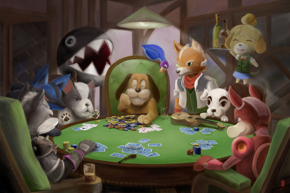
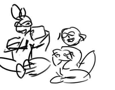
Waiting for Busso
I missed the bus on Friday and spent the time waiting for the next one doing a twee little self-portrait based on my reflection in the bus shelter ad.
Kinda lost interest in this one part way through. There was a lot I wanted to do with it that just didn’t work out. Oh well, here it is
A quick half-hour sketch. I have no idea where this one came from.
A mage transcribes single-use spells from their schoolbook. The spells are probably very basic and benign, perhaps for use when doing housework.
A variety of spells can be stored in this manner. To invoke the spell the paper is burned.
A quick and simple post – I may or may not be back on the blog wagon. Stay tuned to see if I can keep up regular posts during the month of May!
I drew the cute new Dragon Pokémon that was teased today. Drawn in FireAlpaca. Need to work on getting my line-weights consistent.
My last post for Blaugust, after a month of heavily-Splatoon weighted content.
I drew this picture for a poster I’m planning. It’s the first digital art I’ve done in ages. I think the sketch process of this one was kinda funny, the very initial sketch was way simpler than I normally do but it worked quite well for establishing the feel I wanted.
I inked this in FireAlpaca. I seriously enjoy that program more every time I use it, and not just because it’s called FireAlpaca. Everything else was done in Photoshop.
Past-me graciously supplied current-me with all of the partial steps of a tutorial. All I had to do was fill out the text. It’s not the most beautifully formatted tutorial, but I think it gets most of the main points across. Happy splatting!
Since there’s a Splatoon tournament coming up I gathered together a few friends and formed a Squid Squad. Needing a name for the Squad I tried to think of something with a ducky theme but couldn’t come up with anything on my own. So I turned to John who suggested “Duck and Cover” – I think it works quite well considering the aim of the game is to cover turf!
Based on the name, I made a logo for the team. The art is entirely vector art, traced over an initial pencil sketch.
I think I could have done a better job with the art if I thought about it as overlapping shapes rather than as lines that needed to be filled. I haven’t gotten into the correct headspace for vector art yet!
PS if you think you’ve seen this art before you’re not quite right. It’s the same lineart, but for the first draft it was vector lines only and paint-bucket fills of colour, as opposed to being filled vector shapes. This version is much cleaner.
Inkling/Octoling society is rather interesting, and we’re fed just a little info about it via single player’s Sunken Sea Scrolls.
In one of those scrolls we spot the only male Octoling to feature anywhere in the game. I tried to imagine what he might get up to in his spare time – namely, dropping some sweet taiko beats. But we’ll call them Tako beats for the neat multilingual pun.
I’ve posted this image a couple of times previously (though not on my blog) so let’s not go too much more into the Splatoon aspect and instead look at the seal in the bottom right.
Regular readers will know that I often sign my works with a seal containing the top character. That character is in fact the Chinese version of my surname (Ling in Mandarin). It features two trees and has the meaning “Forest”.
I have been toying for some time with the idea of expanding on this seal to make it even more personalised. I do have a Chinese name that I could use (Yi-Fei) but I don’t particularly identify with it, not least because I think one of my Chinese teachers for a while thought it was Zhi-Fei and I was taught my own name incorrectly. I speak the rest of the language equally poorly as I know my own name so I wasn’t keen to include it in the seal.
So that left me with my English name, Alethea, which I quite adore. I decided to take elements of the name and turn it into a Sinogram of sorts, aping the look of Chinese characters and hinting at the English alphabet.
You can see a variety of Chinese scripts here, the evolution of the language has gone through many different appearances and stylisations! I chose to experiment with seal script and standard script. I also played around with going from very simple stylisation where the letters were more obvious to more abstract interpretations. Here are some of my experiments.
At conventions I like to do free watercolour name tags, so I worked a lot on the idea with the hope of offering commissioned Sinographs as a “tier” up from the free name tags. I’m hoping to also experiment with my laser cutter to be able to offer another tier – I’ll engrave your name into a physical seal. Experimenting with this idea, I filled many pages with Sinogram drafts, challenging myself to think of the letters in various different ways and practicing to perfect the style of each character and stroke.
Obviously to be able to offer these at cons would require me to actually have time at a convention to spend on them, and time in the evening to complete overnight work if I’m making physical seals. So, that kinda leads into a little internal debate I’m having over whether to do another table at Supanova in November.
Well, that ended up going from a very lazy blog post to a much longer one that touched on more topics than I’d expected! Thanks for reading, and I’ll see you again tomorrow.