To my surprise, I found out that I never shared these mashup comics anywhere other than my Facebook profile. Now seems as good a time as any to preserve them here as well.
It began thus:
Already in the first strip I was faced with editorial dilemmas, and I ended up offering this alternate version with some of the Fred Basset dialog preserved:
Egged on by enthusiastic friends to continue the series, I found more excellent mashup candidates.
It took a little longer for the next candidate to appear, and even then I was breaking more rules! And once again the editor in me couldn’t choose which way to present the strip.
My final entry to the series came in December.
It came with the following essay:
Newspapers across Australia, and indeed across the world, feature these strips on a daily basis. Both Fred Basset and The Phantom are long-running syndicated comics that have entertained readers for generations.
Many readers look upon Fred Basset somewhat derisively – the attempts at humour can seem strained – and sometimes, there’s seemingly no attempt at humour at all. There is however something enjoyable about Fred’s daily adventures. He seems to be a dog that enjoys life and takes simple pleasure in just existing and observing the world around him.
The Phantom is a comic with an esteemed history. In its newspaper incarnation, it tells long-form stories three-panels at a time. The Phantom carved out his place as the first costumed hero, and loyal fans in Australia have been following his adventures for decades in both newspapers and comic books.
Nestled among other comics on the “funnies” page of the newspaper, both the Phantom and Fred Basset have one thing in common – neither comic tends to end with a punchline. However the pacing between each panel still leads to an ending “beat” to each strip. This brief crescendo, usually played out over three panels or less, causes the characters in each comic to seem somewhat melodramatic.
So of course it was only natural to mash these two worlds together. Fred Basset has no continuity, so it works as a canvas onto which The Phantom’s dialogue can be projected. I hope you find the resulting Fred character strangely familiar – after all, he’s still intrepid, inquisitive and incapable of forming a punchline.
Not long ago, both strips were dropped from Australian newspaper syndication. Perhaps one day I will pick up this project again in their honour.
EDIT: It never ceases to amaze me how exceedingly compatible these strips are – I checked the latest aligned comics for both Fred and The Phantom and they go perfectly together to create this gem.
When I was in high school I experienced an impactful loss of “someone I didn’t really know”.
There was a player in an online game I played that went by the handle Blythe; a person I looked up to as a level-headed role model. He was older than me, married with a couple of kids, and that’s probably about all I remember of him. He was probably not far from the age I am right now, writing this.
I think I did a stick figure drawing of his character that I would like to include in this blog post but I can’t find it right now.
Along with Blythe, I was a chat moderator, which put us in some shared circles. Still, I wasn’t close to him.
It was nevertheless earth shattering when I learned that he passed suddenly from an aneurysm.
I wrote a letter to him, “Dear Blythe” to process his loss. And in the years following, every now and then I would write another “Dear Blythe” as a diary entry of sort. Life updates or things that I needed to angst over. They went into the same notebook.
I often think about Blythe, in the same way that one thinks about faraway internet “friends” that one has fallen out of touch with. It’s just that in this instance, I know why we fell out of touch.
I actually wrote my most recent “Dear Blythe” a couple of months ago. It might have been ten years between that and the prior entry. It was a happy one, as I feel like I’m in a most incredible stage of life right now and it felt right to “let him know” after angsting to him in the past! I suspect I will write again to him in the future, but my most recent letter felt like the end of a long chapter.
About three months ago we received our first visit from a cat that we have come to call “The Stranger”. I was in Melbourne at the time but received word from John that our indoor cat had observed and interacted with the Stranger in the window. I got to meet it perhaps a week later, and one day when I was working from home it hung around for quite some time, eventually deciding to use an awkward box of painting supplies to sit in.
We allocated it a cat bed instead; we welcomed its intermittent visits and the unpredictability of our relationship perhaps makes it even more endearing.
We don’t know if it’s a stray or if it’s someone else’s cat. A week or two ago we spotted it trotting around with some neighbours, and asked them if it was theirs. “No, it just sleeps in our garden in the afternoon”.
Perhaps soon we will try tying a message to its neck or bundling it off to the vet to check for a microchip (I didn’t notice any microchip tattoos). For now though, it continues to pop by and use the bed at our front door overnight, sometimes making a point to say hi and sometimes just appearing and disappearing, the only trace being an indent left in the cushion.
When it doesn’t come for a couple days, our indoor cat starts getting whiny at the window for it, and so do I. “I wonder when the stranger will visit,” we say.
Last night I said to John, “One day, the Stranger will stop coming and we won’t know why”. The idea made me a little sad, but only a little bit. I told myself that I could handle the comings and goings of life with with acceptance and grace.
This morning I learned of the passing of Belghast, prolific blogger and founder of the Blaugust blogging festival. I first crossed paths with Belghast many years back because he picked the same name for his Blog-fest as we had, around the same time. I believe we first met on Twitter; hashtags and micro-communities linking up in their own ways.
Belghast was another person that I did not interact with much and didn’t know well, but who I saw as a role model and stand-up human being. I had learned of his significant life updates in the past few years, including his cancer diagnosis, but it was still a shock to find out that he’s no longer with us.
I think I will think about Bel often now too – another internet figure that I’ve fallen out of touch with. I am thankful to have closure and to know where his story ended, and I know he will leave behind a tremendous legacy. Still, I have shed many tears through this post – I am as gutted now thinking of Bel as I was for Blythe; all of their warmth and potential cut short.
I didn’t know how to process this news but a blog post seemed most appropriate. Rest well, Bel.
If you enjoy these box templates, please considering leaving me a tip! I have set up a tip jar on my Patreon which you can access here.
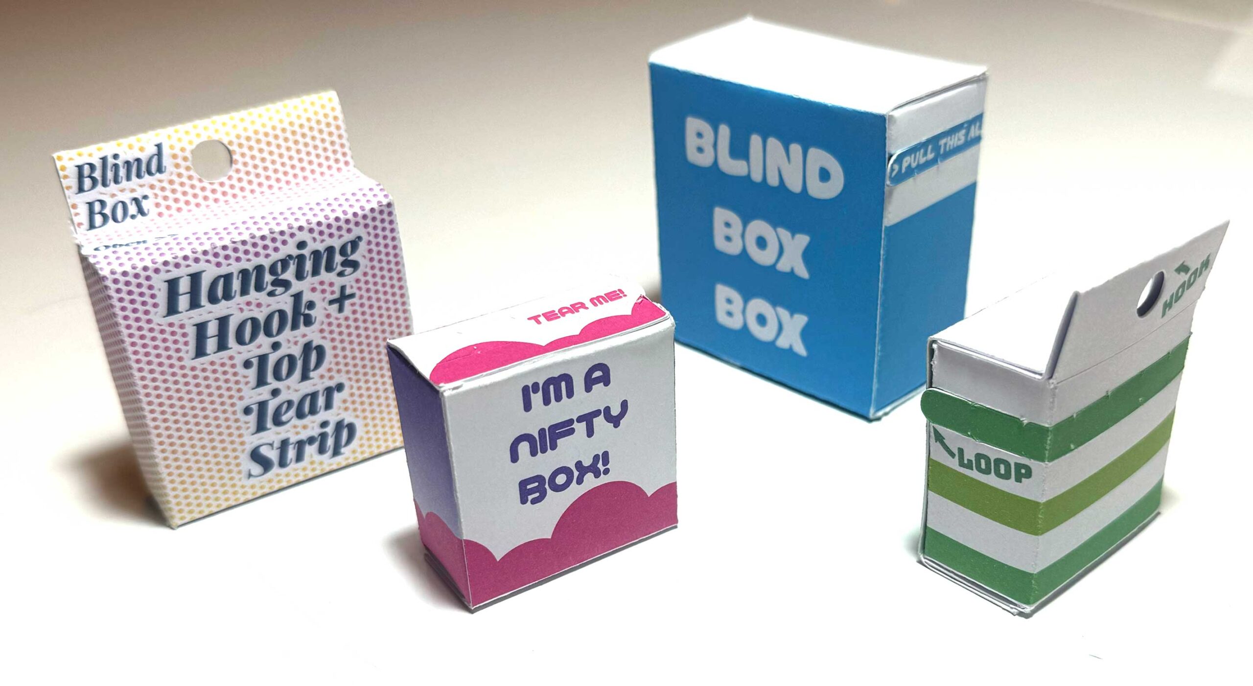
Today’s post is a sort of follow up to the previous double-walled box template. I wanted to design a box to replace the packaging for the bags that I’d previously sold at events.
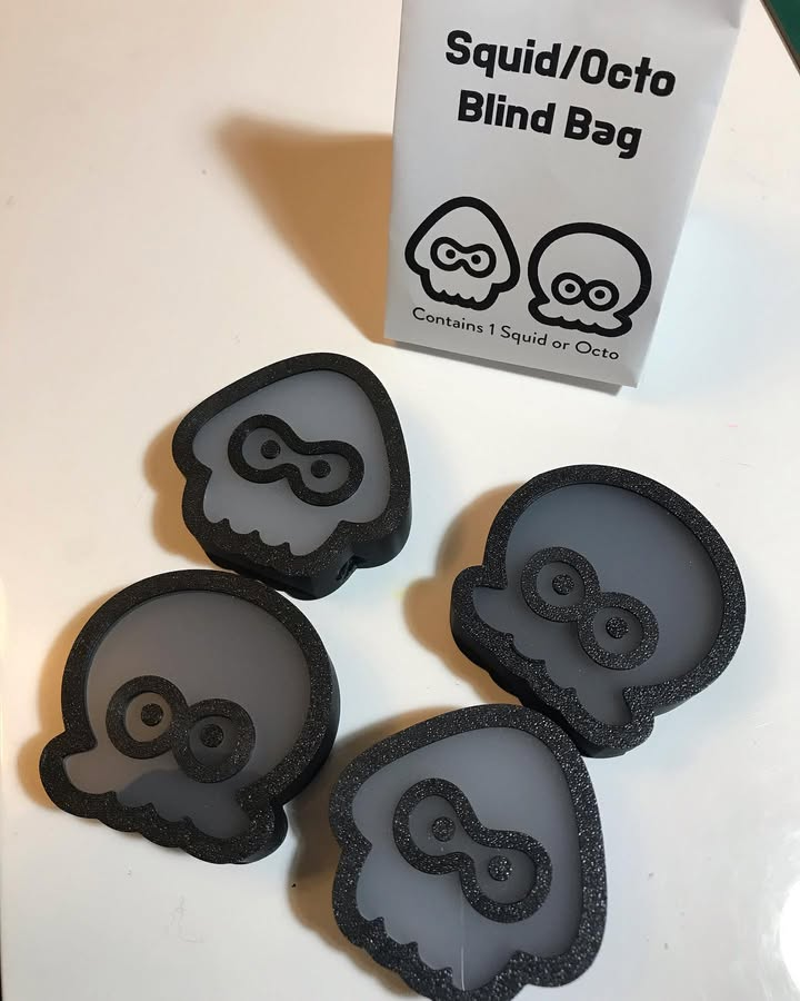
These were really great as a last-minute packaging – they can be quickly and easily folded from an A4 piece of paper and fit my little squids and octos perfectly. However, for series 2 of the blind boxes I wanted to create packaging that could be stacked for transit and have a bit less of (the perfectly truthful) “last-minute” appearance.
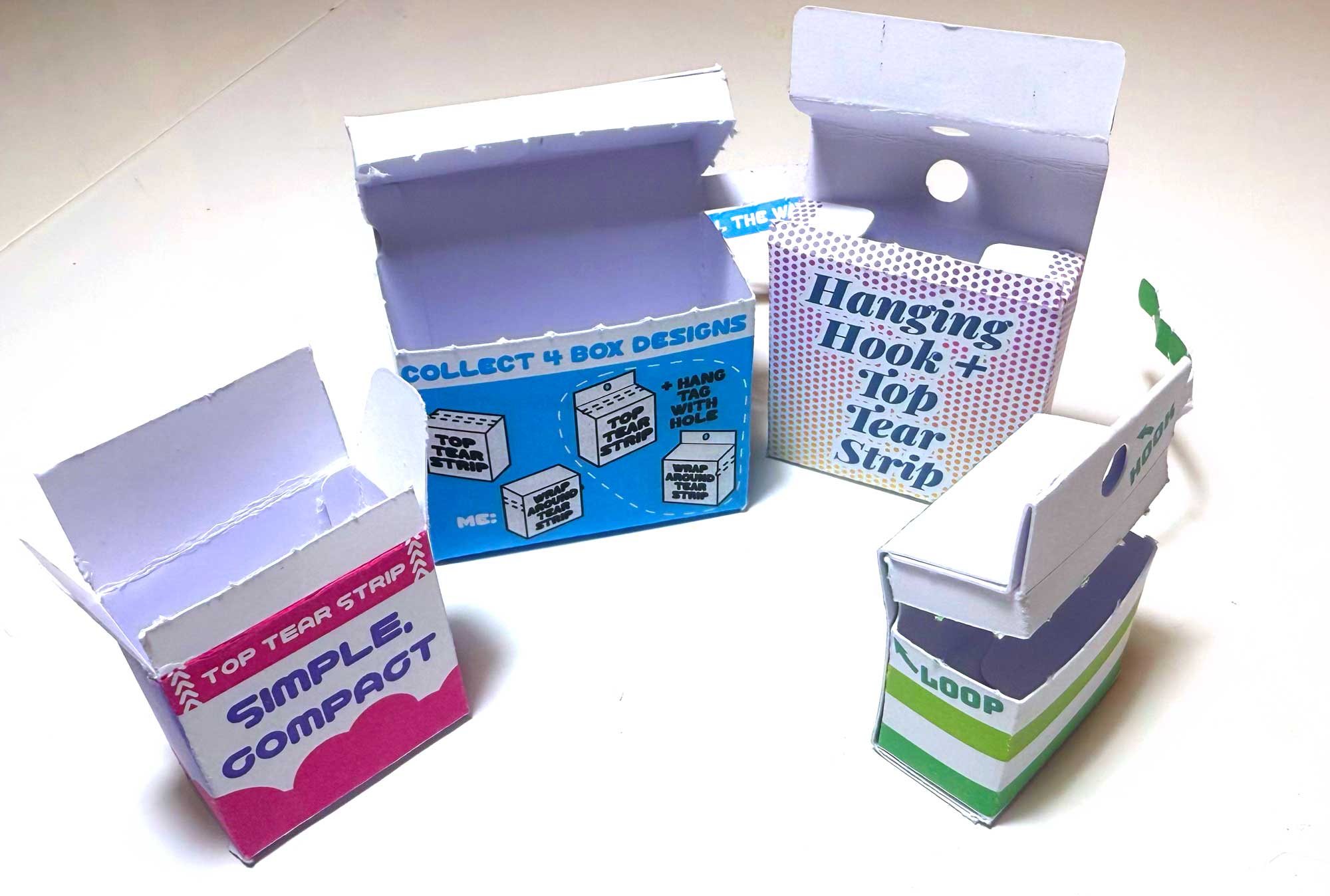
I settled on the idea of a box with a fun tear strip!
Template File
The templates are available via OnShape – you don’t need an OnShape account to view or export the files, but creating an account will allow you to modify my files and update the parameters to your liking.
OnShape is a parametric design tool, and the files are designed so that almost all of the features can be controlled via “variables”.
If you don’t want to use OnShape, you can support me with a one-off purchase on Patreon to get pre-prepared template files. I’ll continue adding files to that page as I receive requests for various sizes.
Navigating OnShape
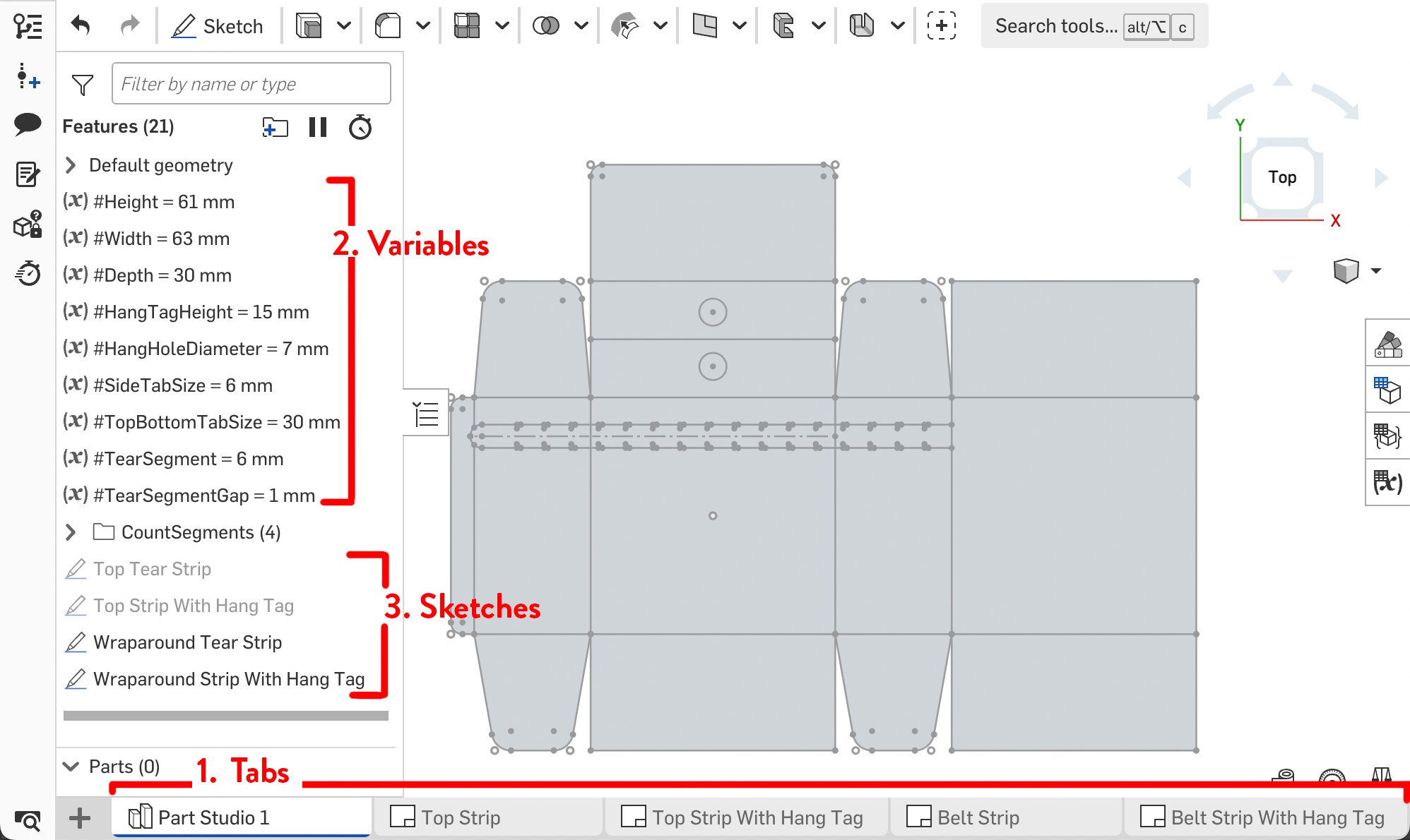
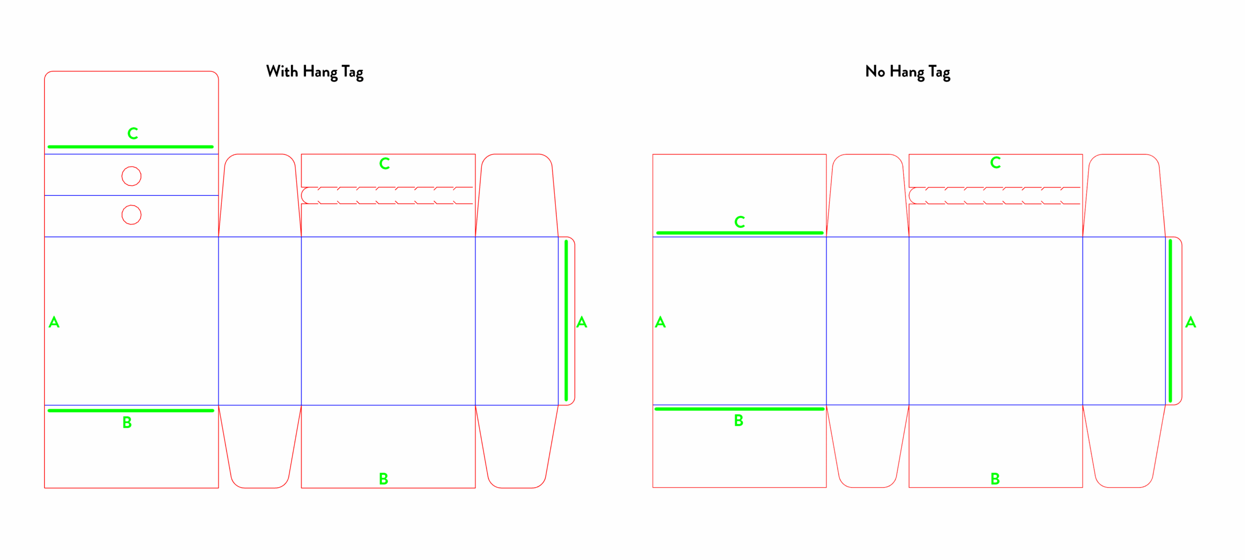
Tabs – these allow you to change views between the design area and the exportable drawings. There are four drawings with variations of the tear strip location and whether or not the box includes an extra flap that can be used for hanging from a display hook.
Variables – visible in the “Part Studio” tab. These control the dimensions of the box and its features.
Sketches – these are the “working” versions of the drawings.
How to Export
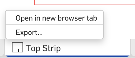
To export a template, select the tab corresponding to the box that you want to make. Right click on the tab and select “Export…”
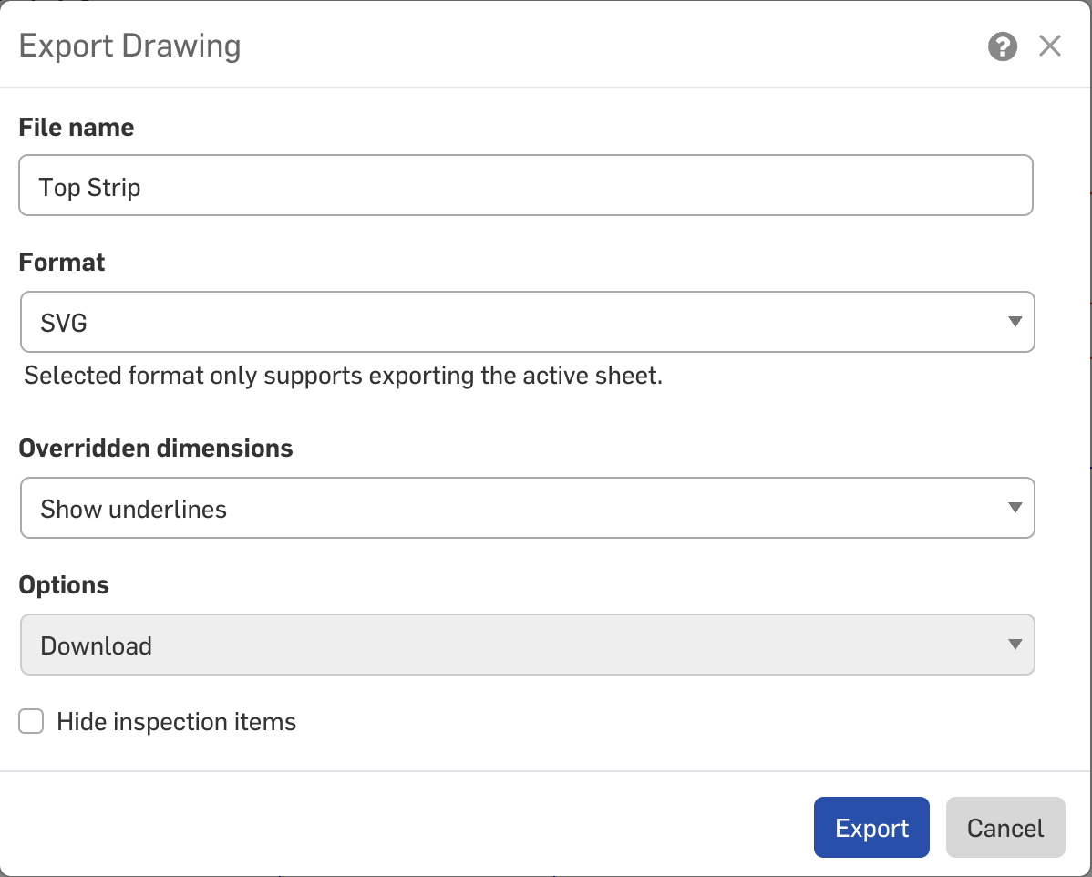
An option dialog will pop up. Select the file type you want. I’ve tested SVG exports for use with my Cricut. This export option preserves the line colours that I’ve denoted – red for cuts and blue for scoring.
Clicking the Export option will trigger a download – it may take a little while for the file to be ready so be a bit patient if it doesn’t appear in your download folder immediately.
Post-Export Tips
I like to do some minor modifications to the SVG after it’s exported to better adapt it for cutting. These steps are optional but you may find the notes here useful.
Firstly, I like to join the red cutlines. OnShape exports every edge as a separate path, and for many of the paths it’s desirable to connect them.
I start by selecting all the red lines and running the very useful “Join Reasonably” script by Hiroyuki Sato.
You may prefer to do some strategic cuts to the lines again at the sharpest angles – these are areas where the dragging of the cutting machine blade could tear the paper. Breaking the cutline will allow the machine to lift the blade between cuts.
Additionally, I find that the file may need to be grouped to make handling easier. I select all the red lines and add them to a group and all the blue lines and put them in their own group. Then I group the groups together so that the relative positions are maintained; without this step Design Space sometimes misaligns the elements.
When imported into Cricut Design Space, I can then easily select the group for the score lines and mark the machine operation as Score.
Assembly
All of the fold marks are marked in blue. All of the folds are done in the same direction except for the C line on the “With Hang Tag” template.
You will need to use glue or double sided tape in three spots to hold the box together. I like to start with gluing on the side tab before the top and bottom.
Customising the template
You will need an OnShape account to copy the file and make your own modifications
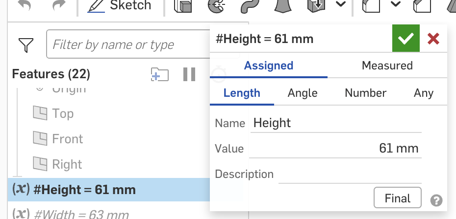
Once you have done so, you can modify the variable values to automatically update the box.
Double click the variable to open a dialog. Change the “value” to your desired value and then the green tick button. All the sketches will automatically update.
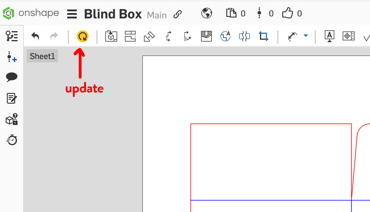
Although the sketches have updated, the drawings do not update immediately.
You need to open the tab for the template that you want to use and click the yellow update button. Then you can export the file and your updated template.
Variables
Box dimensions:
Height
Width
Depth
Flaps (the side flaps are the “wings” at the top and bottom of the box):
FlapSize – by default this automatically calculates to be about half of the box width, plus a little gap
FlapAngle
Hang tag: (optional, used only for the “With Hang Tag” templates)
HangTagHeight
HangHoleSpacing – the gap between the top of the hang tag and the hole
HangHoleDiameter
Assembly tabs:
SideTabSize – the width of the tab that runs vertically up the box
TopBottomTabSize – the depth of the flaps that fold on the top and bottom of the box to support the outermost flap. This has been set to use #Depth, but it doesn’t need the full depth (make it smaller if you need to save space when fitting multiple boxes on a page)
Tear strip:
TearStripWidth – width of the tear strip
TearSegment – length of the perforation
TearSegmentGap – gap size between perforations
TearStripBeltGap – distance from the top of the box to the top of the tear strip (belt style tear strips only)
If you enjoyed this post and found it useful, please consider leaving me a tip. Thank you!
I’ve been using these boxes from AliExpress to package some of my items but I wanted to have a go at making a version of the boxes for myself so that I could more freely customise them.
Having my own files means that I can change the box dimensions and can design prints to go directly onto the box.
There’s a great website – https://www.templatemaker.nl/ – that provides templates for a wide variety of boxes, all for free. You can set the desired dimensions for your box and it’ll generate a vector file that you can use with a paper cutting (Cricut/Silhouette/Siser) or laser engraving machine to cut the files for you. If you don’t have a machine, you can still print the files to cut by hand.
Unfortunately, I wasn’t able to find the matching box template on the site. The closest file is the passepartout template which is assembled from two pieces. I wanted to try making my own template file, and I wanted to contribute to the free template space to give back to others the same way that sites like TemplateMaker gives to the community. I decided to make my own parametric design in OnShape to achieve this.
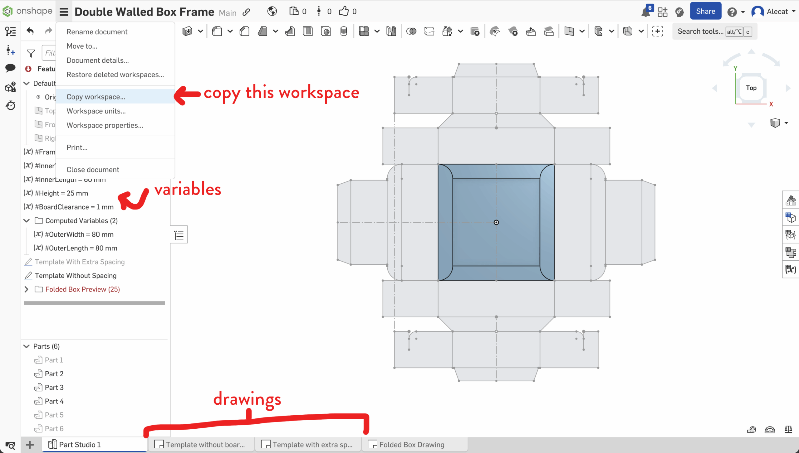
If you have your own OnShape account, you can copy the workspace and update the file to set the dimensions to whatever you want.
In your copy of the file, double click the variables in the left side, which appear with the cursive “x” symbol next to them.
This will bring up a little dialogue allowing you to change the values – once you update them make sure to click the green click to confirm your change.
Repeat this for each variable. If you are using paper or light card, you probably won’t need to edit BoardClearance.
The template will recompute based on the values you chose.
You can export the templates from the drawing tabs, accessible at the bottom of the screen. There are two drawings – one that has extra spacing for thicker cardboard and another that has flush cuts, ignoring the BoardClearance value.
To ensure that the dimensions of your file update to match the variables that you chose earlier, make sure to click the refresh button at the top left of the Drawing view. It’ll be highlighted when there are changes to load in, and dimmed out when the changes are synchronised.
Right click the drawing tab and select “Export…” to view export options. For using with all common cutting machines, you can export the file as an SVG. It will put the graphics inside of a clipping rectangle which you can ignore when cutting the files.
Set the blue lines to score and the red lines to cut in your cutting machine software. To assemble, almost all the blue lines fold inwards (valley folds) except for the four arms that have the slots in them – they fold away (mountain folds).
I don’t yet have a source/plan for the sleeves – let me know if you have any ideas!
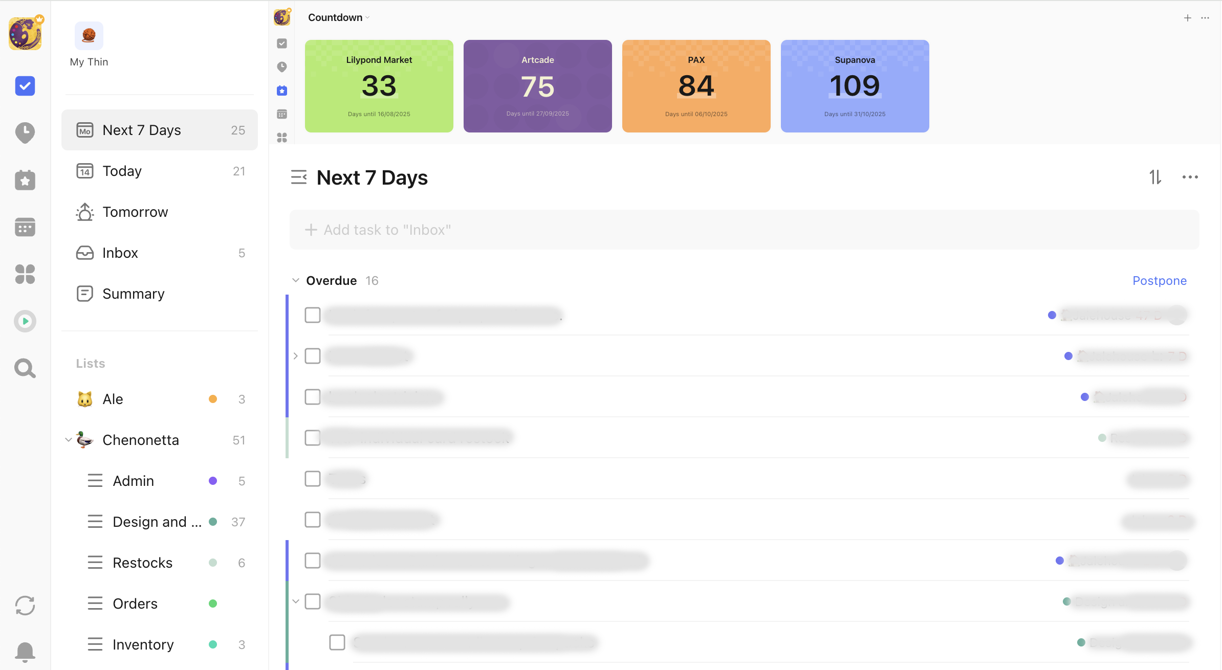
I’ve been using TickTick as my todo list and it’s been working nicely. Recently, they added the countdown feature, which is great but it’s also off in its own tab so hidden away. I personally find the presence of the numbers to be a great motivator so I wanted to place them above my todo list so it could help me focus and prioritise what needed to be worked on before the milestone dates come to pass.
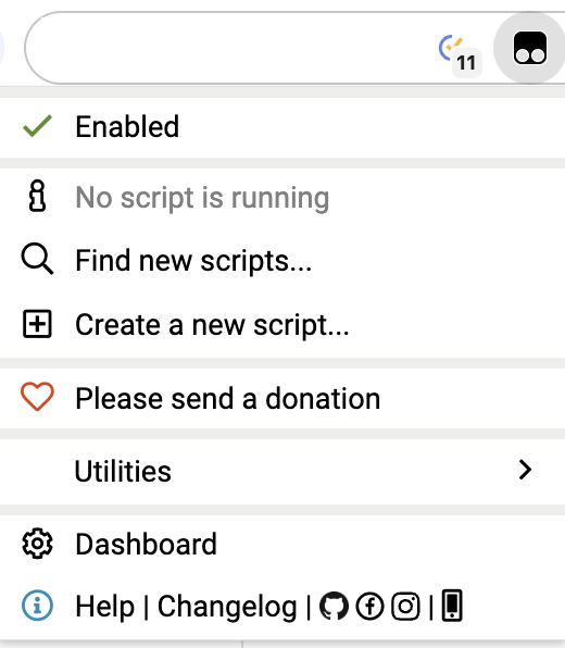
To achieve this, I’m running a TamperMonkey script which allows me to run additional Javascript on the page. It inserts an iFrame with a second instance of TickTick above the task list. It’s a janky solution but I didn’t feel the need to refine it any further, especially as I hope that TickTick will continue to add enhancements to the countdowns themselves so that the script is not necessary.
I have submitted feature requests to TickTick to have countdowns above the task list officially incorporated and suggest that you also contact them if you think this is a useful feature!
[Edit 5 January 2026: it appears that countdowns can be flagged to appear on Smart Lists, it seems this has been present since the introduction of the feature and I simply didn’t notice as I primarily live in a custom filter]
Last time on Cricut Hacks we took advantage of Cricut’s scaling calibration to cut our graphics at a larger size than they were actually designed at in Cricut Design Space.
This time we’re going to use a template with registration marks to tell the Cricut where to perform cuts on a separately printed sheet of paper.
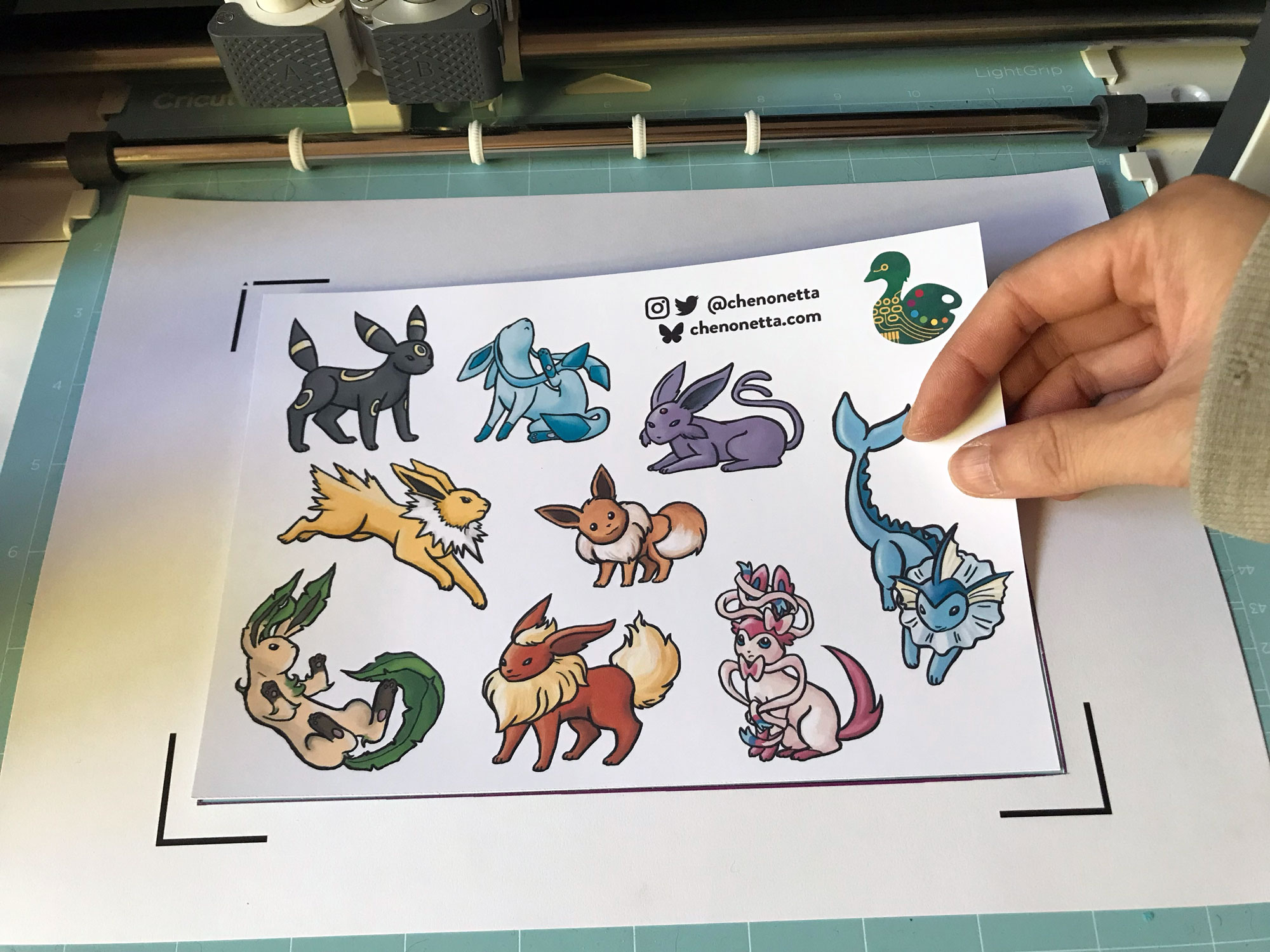
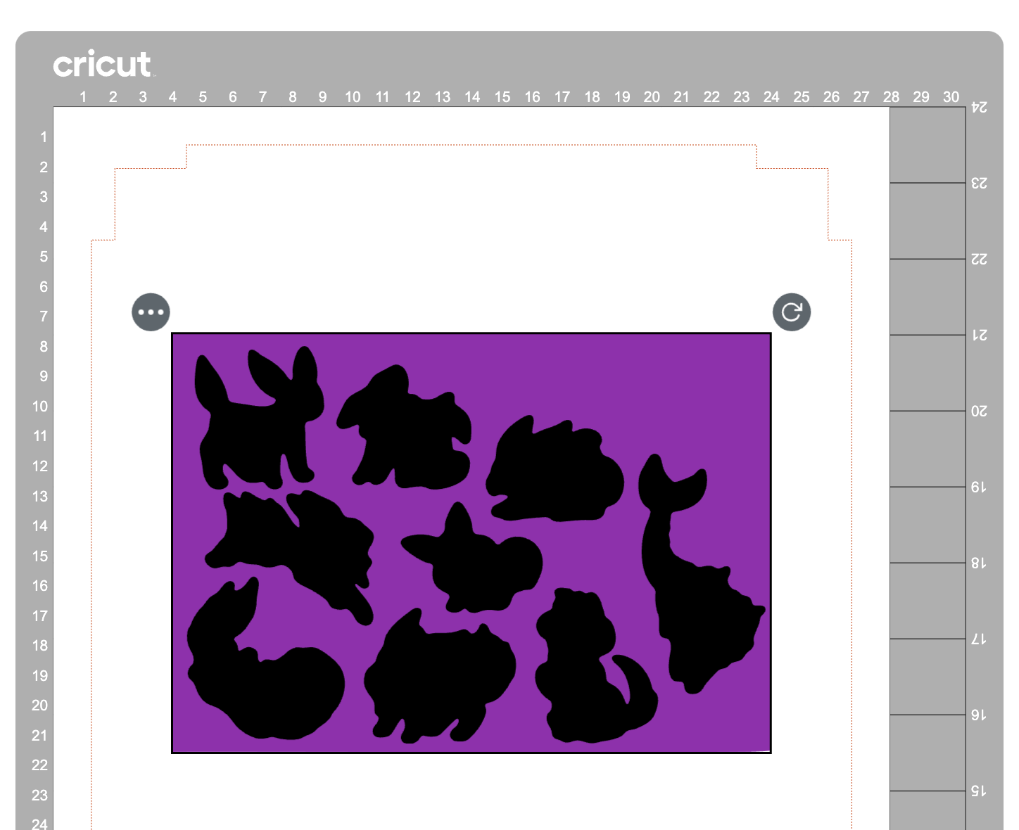
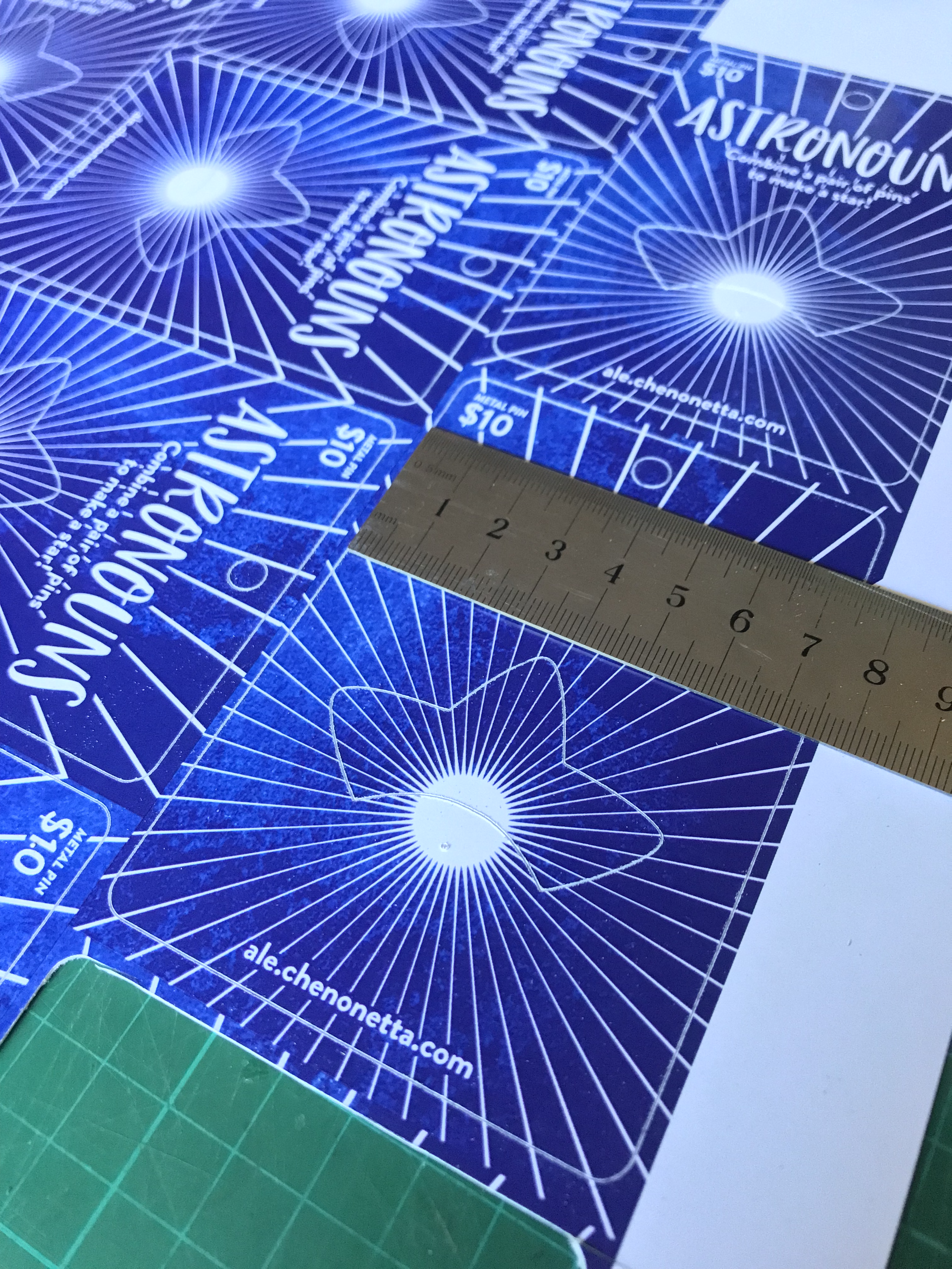
If you’re familiar with your Cricut, you probably see the below photo and have an immediate intuition about how to go about this hack! But I’ll share my method regardless.
Why?
Once again, we’re trying print larger than Cricut wants us to. This time, our reason for doing so is to avoid having to lose as much material to the registration marks as Cricut demands we sacrifice. It’s nearly 2cm around each edge, and if your printer already can’t print borderless-ly, you’re losing so much material!
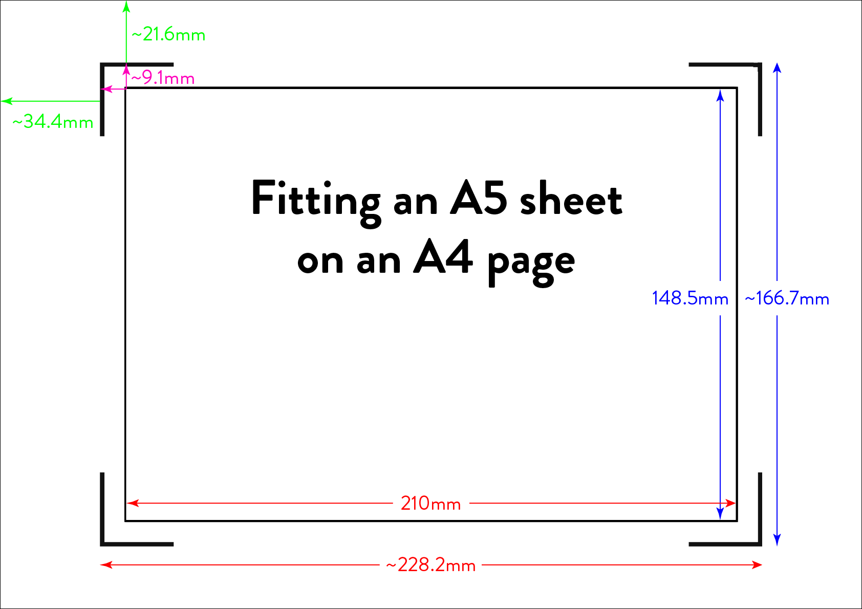
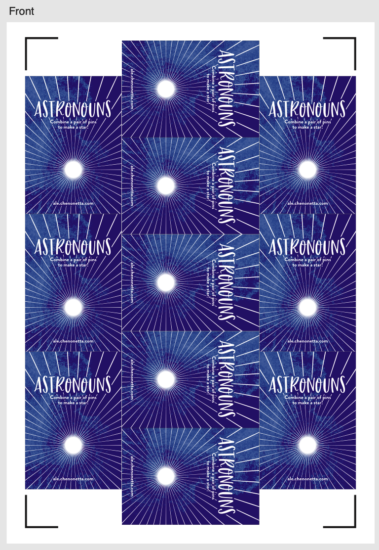
Practically speaking, if you want to make A6 sticker sheets, you’d fit two on an A4 page, and if you wanted to make A5s you’d fit one, as shown in the diagram below.
I’m willing to reduce my sticker sheet to 200⨉140mm, but Cricut still won’t let me fit two of those on a page. So let’s get hacking.
Drawbacks
Before we launch into the method, here’s some things to keep in mind:
You’re no longer going to get perfectly aligned cuts, as the manual alignment introduces room for error.
If your printer has a skew, this will become particularly noticeable as you might be rotating graphics in a way that exacerbates the skewing.
You’ll have more manual overhead for preparing your sheets.
I’m pretty fast at preparing my files now, but you still need to cut out each sheet to give to your cutting machine, which feels a little silly because the machine was meant to take that work away from us.
You need more software than just doing everything in Design Space.
I mention Adobe Suite software here, but others will be able to do most of this fine! I’m just indentured to Adobe. Don’t be like me, learn your hotkeys and workflows in the Affinity Suite and support perpetual licensing in software!
Method
Step 1: Prepare your sticker graphics
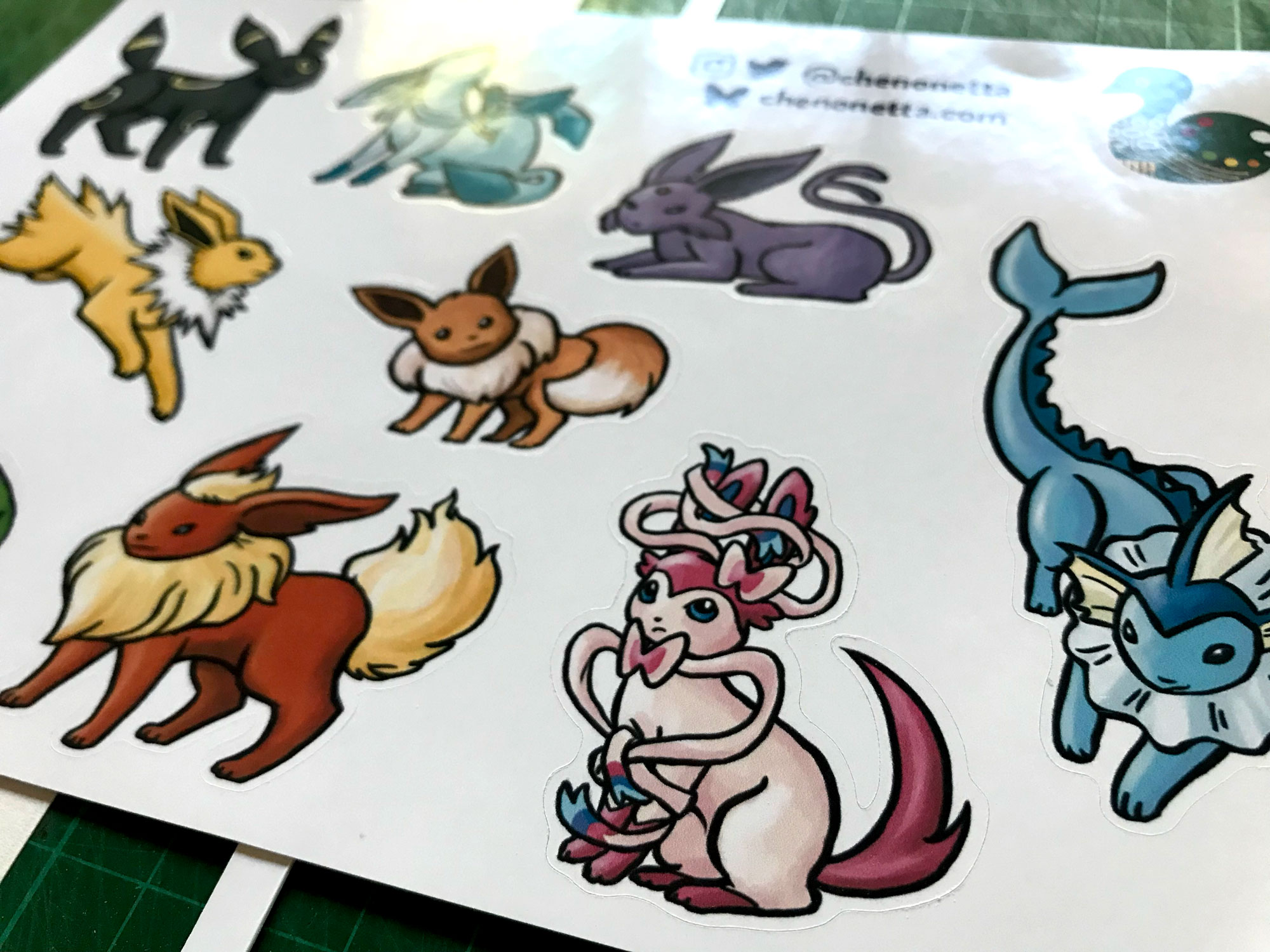
I prepare my images and vector cutlines outside of design space. This means I can have areas of the sticker sheet that aren’t cut out, like my logo and social media links.
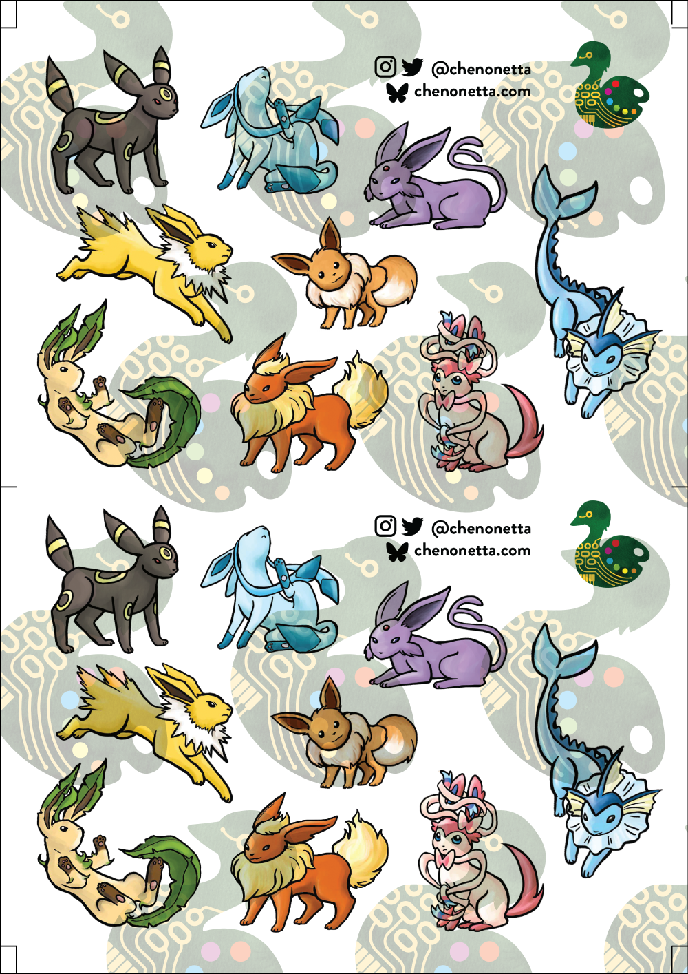
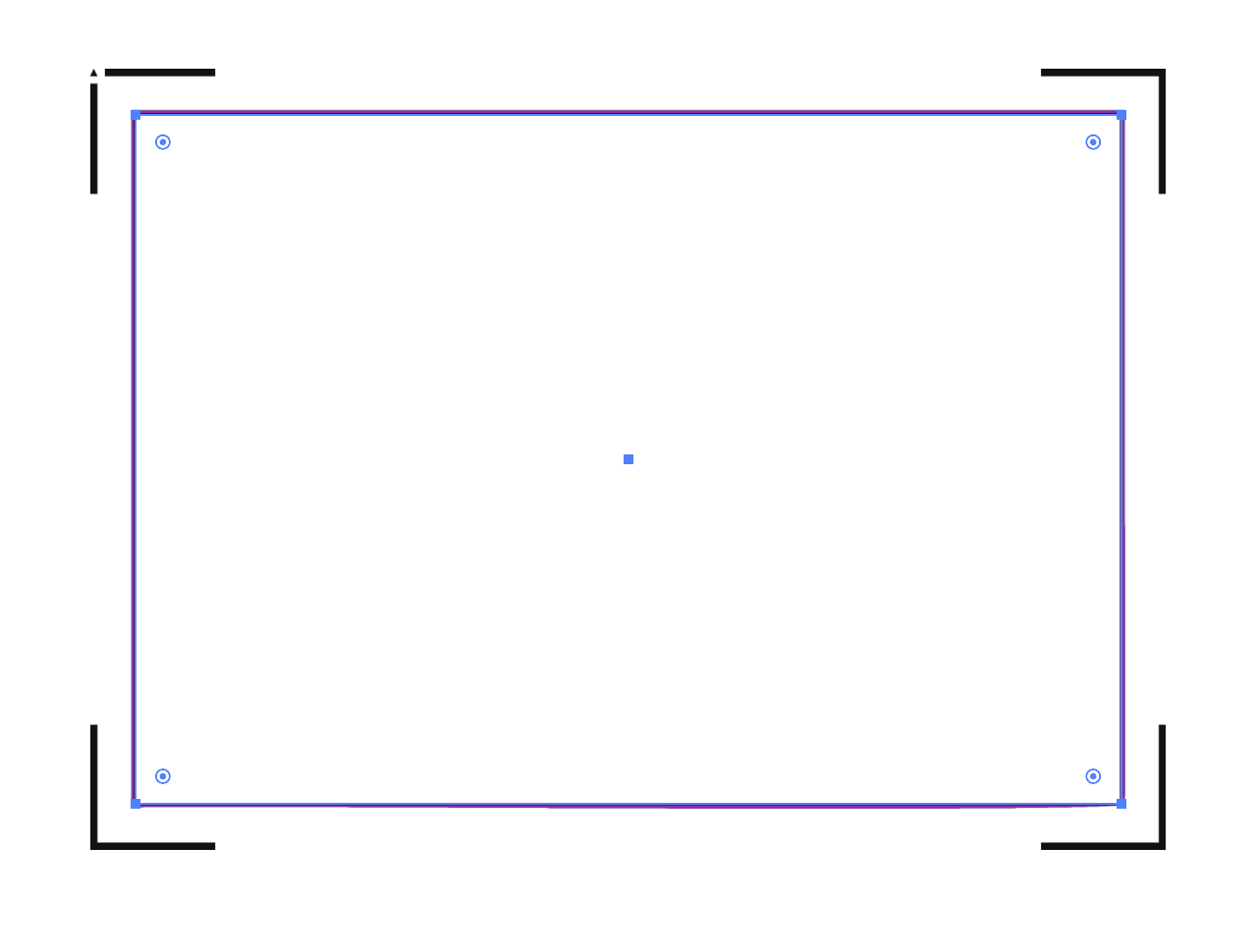
The first file you need is the one you’ll be printing. Repeat your design on your page as many times as you can fit, and then also place some marks for manual trimming. Here’s my example file (sorry about the watermarks). Notice the black lines in each corner of the page, and the lines in the middle of the page.
Print this file at 100% scale. Your printer might try to automatically scale your graphics to comply with your printer margins. Make sure that doesn’t happen!
Step 2: Prepare the cutlines
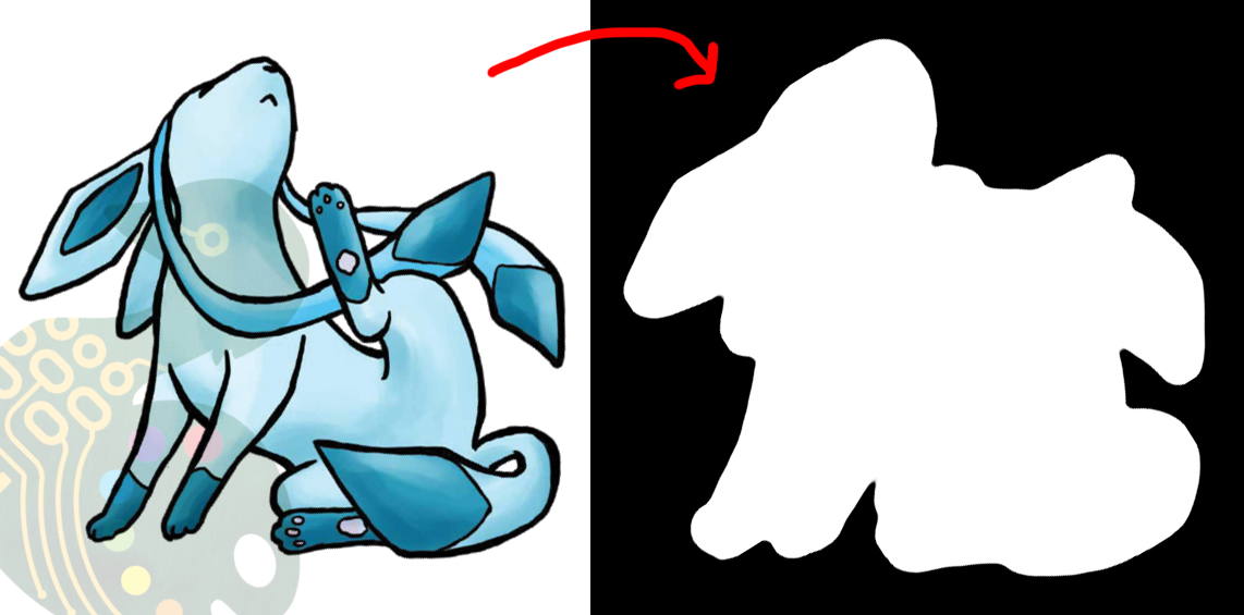
I generate the shape for each sticker by selecting the character in Photoshop, then use the Select => Modify => Expand menu item to add a border. I usually go with 20 pixels, which is a little more than 1.5mm at 300dpi.
I then pull the black and white shapes into Illustrator and use the Image Trace tool to generate the vector outlines that will be used for cutting. I generally use the “Silhouette” preset, and then apply some smoothing to the lines (Object => Path => Smooth…).
Make sure to have the outline rectangle for your graphics as a separate image object as the rest of your graphics (you may need to “release compound path” or delete the outline and replace it with a rectangle, this will also get rid of any wibble that might have come from the image trace)
After these tweaks, I have a file ready to import into Design Space. Export it as an SVG (In my experience, the scale will be accurate if you use the Export menu item rather than the Save As, but other methods can cause scaling issues so just check the size once imported)
Step 3: The Template
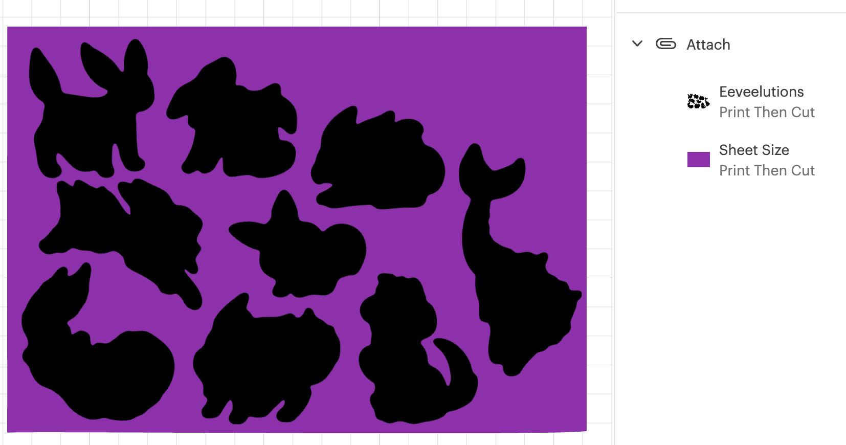
Import your SVG into Design Space. Then, make sure all objects are grouped in an “Attach” group so that they’ll print and cut with your pre-prepared arrangement, and mark them all as Print and Cut.
Click Make, but we’re not going to be sending this file to your Cricut yet.
In the alignment page, move your graphic about 3 inches down the page, which will be enough clearance so that you can place and remove the sticker sheets into the templates without needing to unload the cutting mat.
Then in the “Send to Printer” dialog, choose to “Add Bleed” and “Use System Dialog”. The system print dialog will pop up (or under, if you’re on macOS – drag the Cricut window away to find it) and you can print your file to a PDF.
Open your PDF in a graphics editor and make a white rectangle in the middle that matches your sheet size – in this case 200⨉140mm.
Print this file and use a craft knife and ruler to cut out the white rectangle. Try to be as accurate as you can!
PS, you could create the white void space and print the file directly from Design Space, but I like doing this because I can control a few extra things.
For example, Design Space won’t let me place my A5 graphic in landscape on an A4 page, but this way I can specify a larger paper size, then align the landscape image on the A4 page I’ll send to my printer.
Step 4: Cutting prep
Take the sheets you printed in step 1 and use your craft knife and ruler to trim them to size. Again, I’ve chosen 200⨉140mm for my sheets.
Place your template file on your cutting mat, taking note of the position of the void space.
Place your trimmed sticker sheet in your template, aligning it with the void. Use the extra border around the void to help judge how square your sheet placement is.
It’s almost time to hit Make, but we need to do one tweak in Design Space.
We don’t need to cut the outline rectangle of our sheets, because we’re trimming them to size before aligning them into the template.
Removing the rectangle, or setting it to a “Guide” line type will cause the print and cut margins to change. Instead, I denote the rectangle as a Pen line. We won’t be loading a pen, and the machine will waste a little time on this, but we’ll also be able to tell whether it’s aligned correctly while it traces the outline in thin air.
Step 5: Make
Press that make button!
Drag your graphics so that they roughly align with where you’ve placed them on the cutting mat.
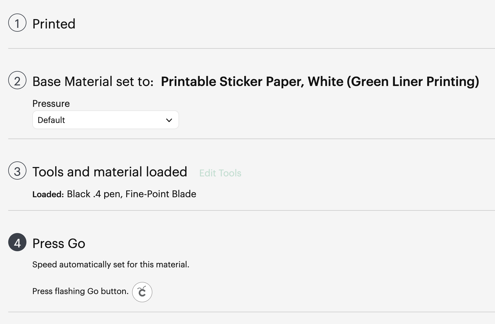
Then on the next page, say “I’ve already printed” and select your paper type. The Cricut will suggest you load a pen tool and the blade – don’t bother with the pen tool
When you “Press Go”, the machine will start scanning for the registration marks.
It will then start drawing the outline of the sheet in thin air. While it does this, you can stare down the barrel of the empty toolholder to confirm that it’s aligned correctly with your page – if it appears to have misread the registration, you can cancel the job and try again. If it’s correct, your cutlines should also be correct.
And when the job is done, and all your cutlines are correct, you don’t need to unload your mat. Remove your sticker sheet from the mat by curling it away from the paper. Now you can place your next sticker sheet into the void and press the Go button again and it will cut your next sheet without reading the calibration marks again. After adding a bunch of extra steps and work into this process, it’s nice to get a little timesave!
Closing Remarks
Once you make a template for a particular sheet size, you can reuse it for all your files that share the same size. Consider cutting your template from a thicker GSM paper to extend its lifetime and make it easier to affix without skewing.
And finally, here’s the template with all its whitespace – that would have been wasted sticker paper if I cut this with the default workflow – next to the actual wasted material from my sheets. And a reminder, the sheet on the right fit two copies of the artwork vs the one on the left fitting only one!
Thanks for reading, if you found this useful please let me know!
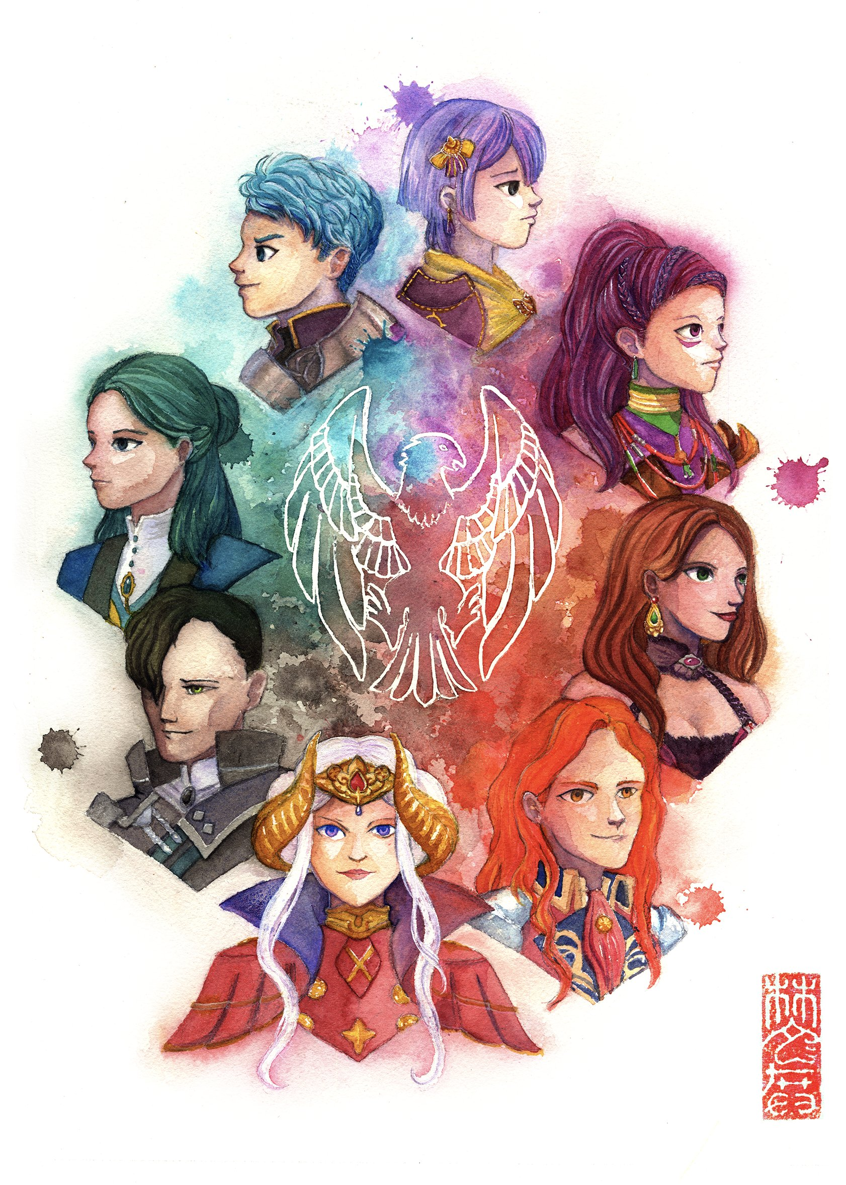
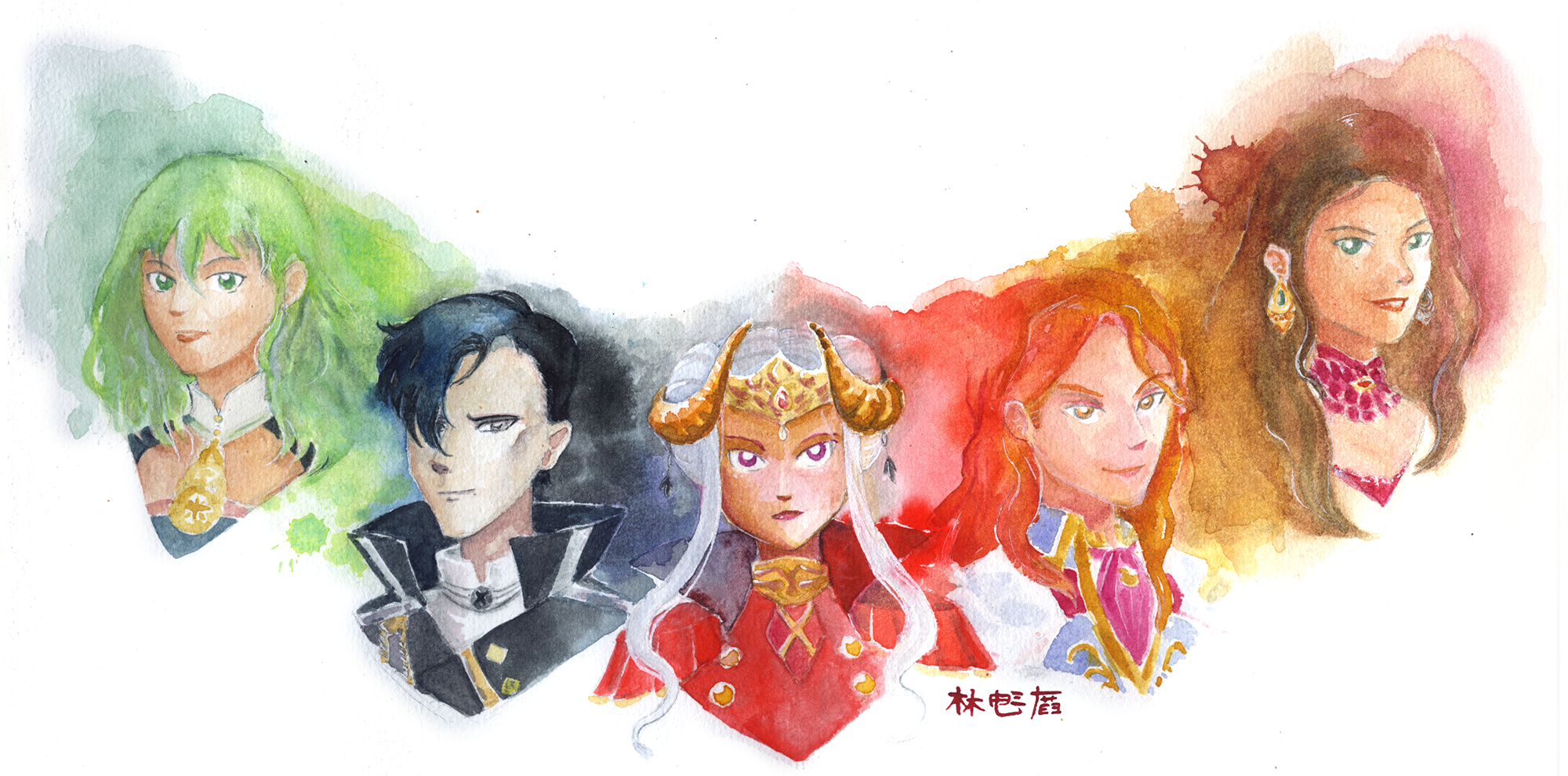
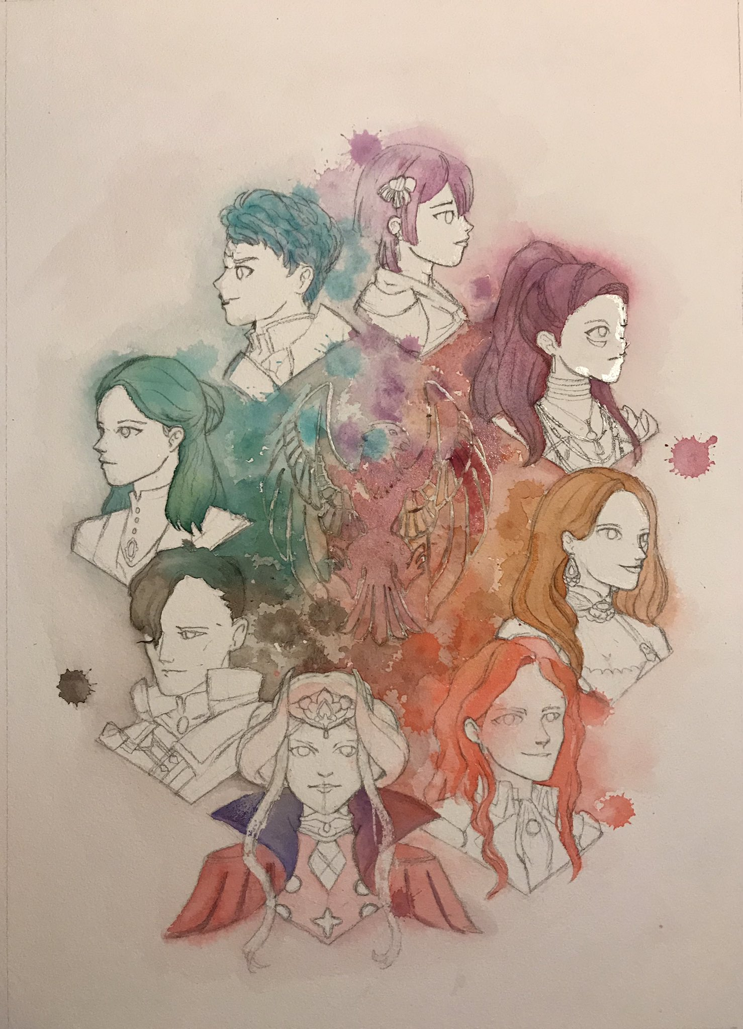
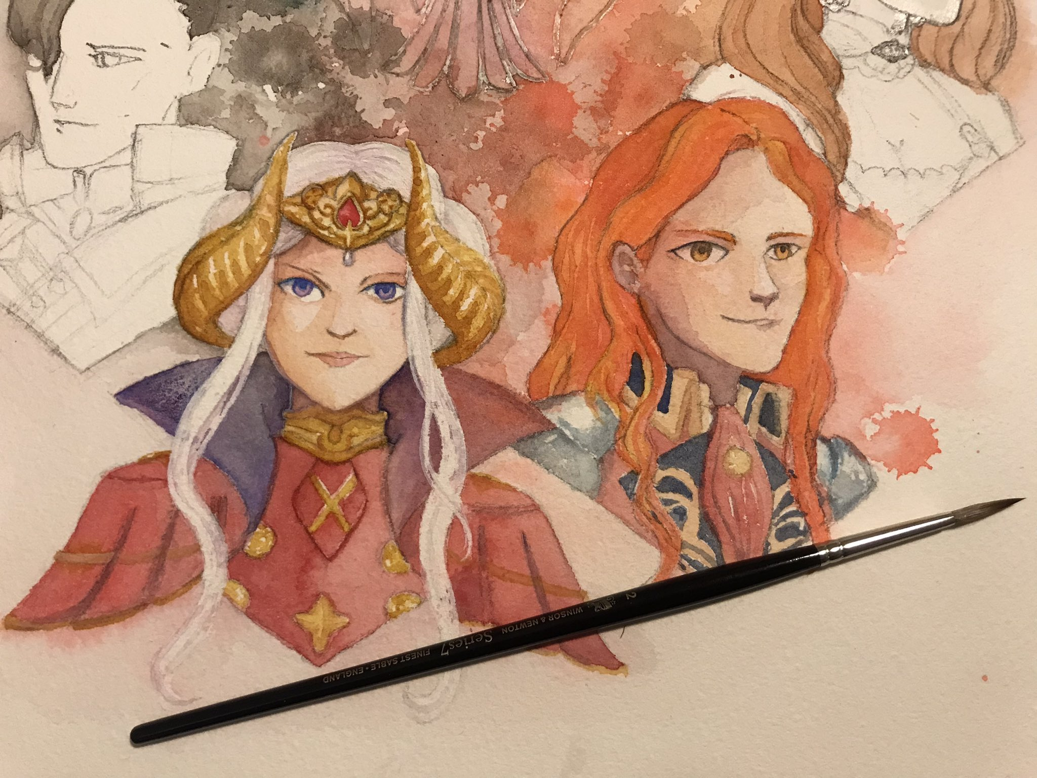
A Fire Emblem: Three Houses fan piece that took me over a year to take from concept to final painting.
I’m documenting this one here now because all the WIPs are in a Twitter thread and actually a blog post is probably a better medium for chronicling things and adding some thoughts.
I’ll start with thoughts on the final piece. I’ll admit, I’m not fully happy with how it came together. The colours are nice, but looking at it three years later, many of the faces are a bit weak. I think I was torn between how much detail to put into various parts of the image when working with watercolours, which can be temperamental – and I was trying to deliberately incorporate unpredictable elements like paint splatters to boot. I was probably too afraid of messing things up further with the faces to work them much more, including adjusting skintones. Some of this fear is justified – watercolours are not a medium that afford a lot of flexibility for adjustments or fixes.
Still, I think it’s fair to say the final piece suffers for my fearful approach.
I’m going to take you through all the test pieces that went into this piece and I think you’ll understand my disappointment after you see them – when there’s great elements in a test piece, their absences in the final artwork feel like a letdown.
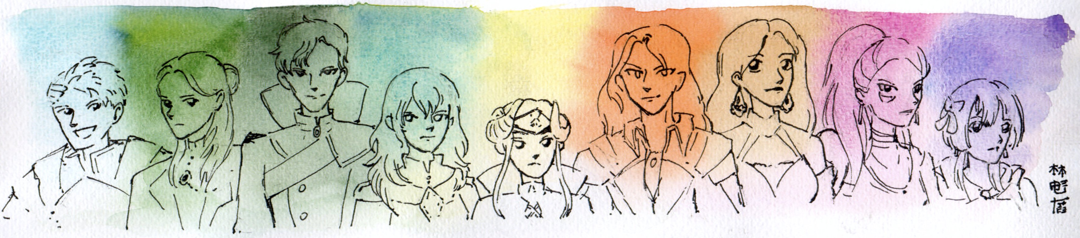
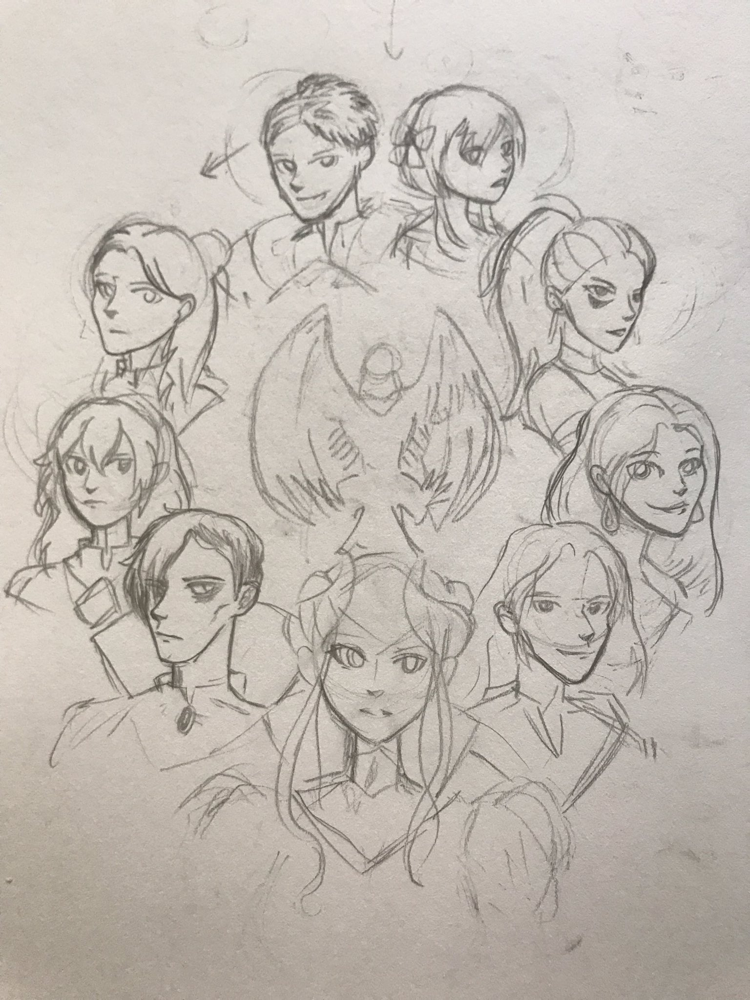
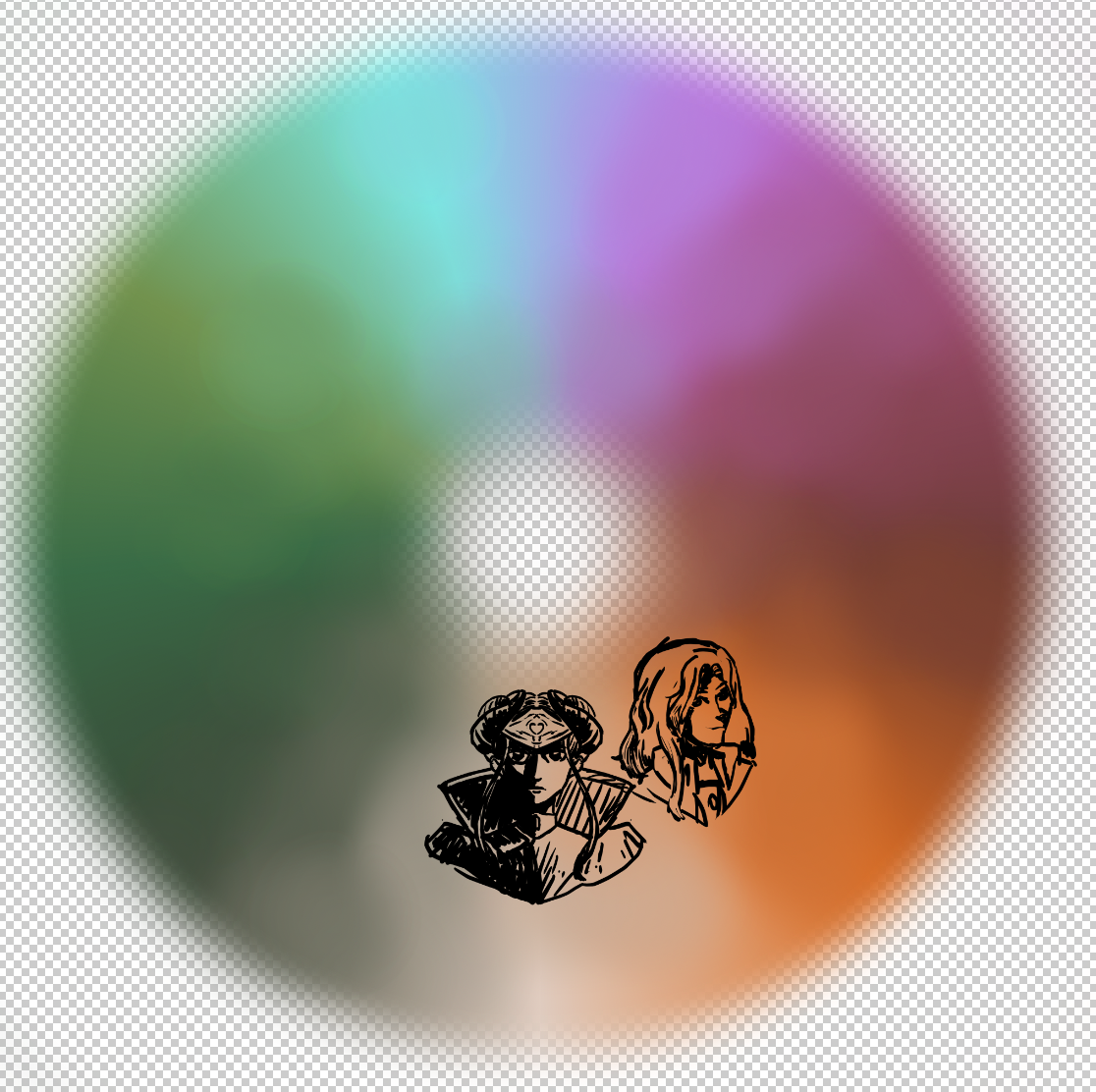
We’ll start with the very first scribble, which apparently was the product of insomnia. I think it was pen scribbled straight over a watercolour gradient.
After that, the idea for the full painting quickly formed – a circle to span the whole rainbow.
I was torn on whether to include Byleth or not in this – partly because I was unsure whether I’d try my hand at the other Houses as well. In the end, they didn’t make the cut.
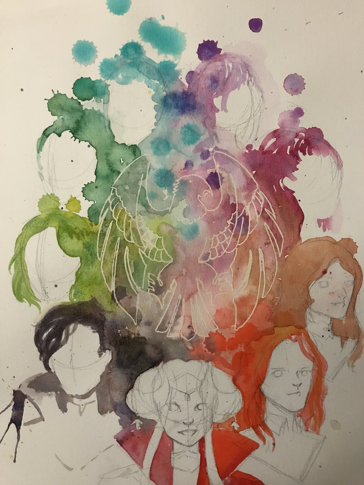
After this, I did a ton of experiments for the colour bleeds.
I LOVE how this one was coming together. Unfortunately, I didn’t have enough space on the test paper to continue it. I think I spent the entirety of the rest of this undertaking trying to chase what I’d done in this piece. Argh!
Some style experiments. The paint splatters came out great in this one and the one below.
I think what I didn’t appreciate in my test pieces was how little space there’d be for splatters to not collide in the middle. I then tried to lean into it, placing the eagle logo in the centre where all the colours converged.
There was a lot of time between the test pieces and before I was finally ready to undertake the final piece. I think in the intervening time, I considered doing the entire painting digitally, and experimented with how that would look.
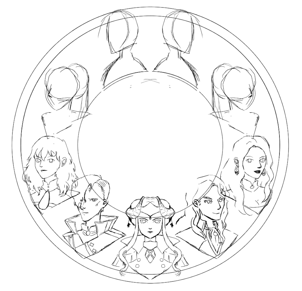
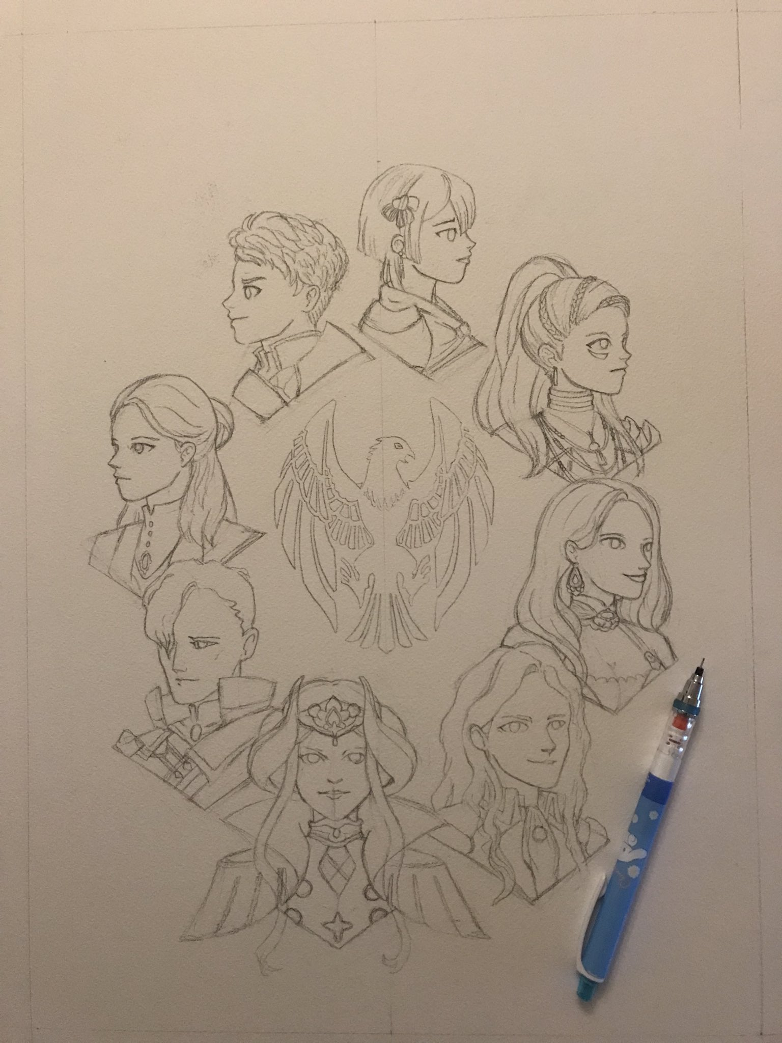
But eventually, I got back on track to do things in watercolour. That didn’t mean throwing out the digital tools! Instead, the composition was drafted digitally for tracing. Of course, it went through a couple iterations too.
I think this tracing has made the sketch feel quite rigid as a result. Byleth was officially excommunicated.
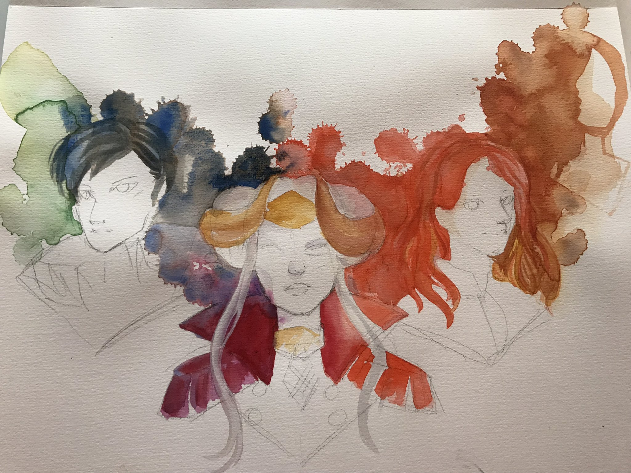
Here was how things were looking after the paint splatters were done. I definitely went into that scared.
Looking at this progress photo, I think I definitely oversaturated the scan. Maybe things could be helped somewhat with a colour retweak… ok, let’s look at these files.
Hang on a moment… what the heck? Looking at the files in my art folder… I already did a re-scan! It’s dated February 2022, about seven months after I originally posted the painting online. But I never posted the rescan? Or at least, not in the Twitter thread. Another reason why using Twitter as a digital archive is a bad idea…
Anyhow, here it is. I think there’s some definite improvements in the colours, and it looks like I adjusted some of the skintones. I wasn’t able to fix Dorothea’s dark blotchiness, but at least Petra doesn’t look so pale in comparison. I think one of the issues I had with the original painting was how dark the paper scanned, so when trying to eliminate the paper textures and shadows I ended up really pulling the colours in weird directions.
So I’ll present this version without trying to wash out the background to white. Still not perfect, but an improvement, I think. Maybe I should go in for a third try, sometime…
I’ve frequently felt constrained by the registration marks that the Cricut uses.
Understandably, they need to be bold and have a quiet region around them so that the cutter can determine where to line up its cuts.
Cricut also currently only provides 4 preset page sizes to print on, and again seems to assume rather generous print margins.
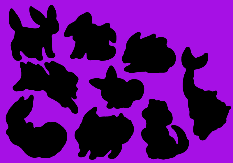
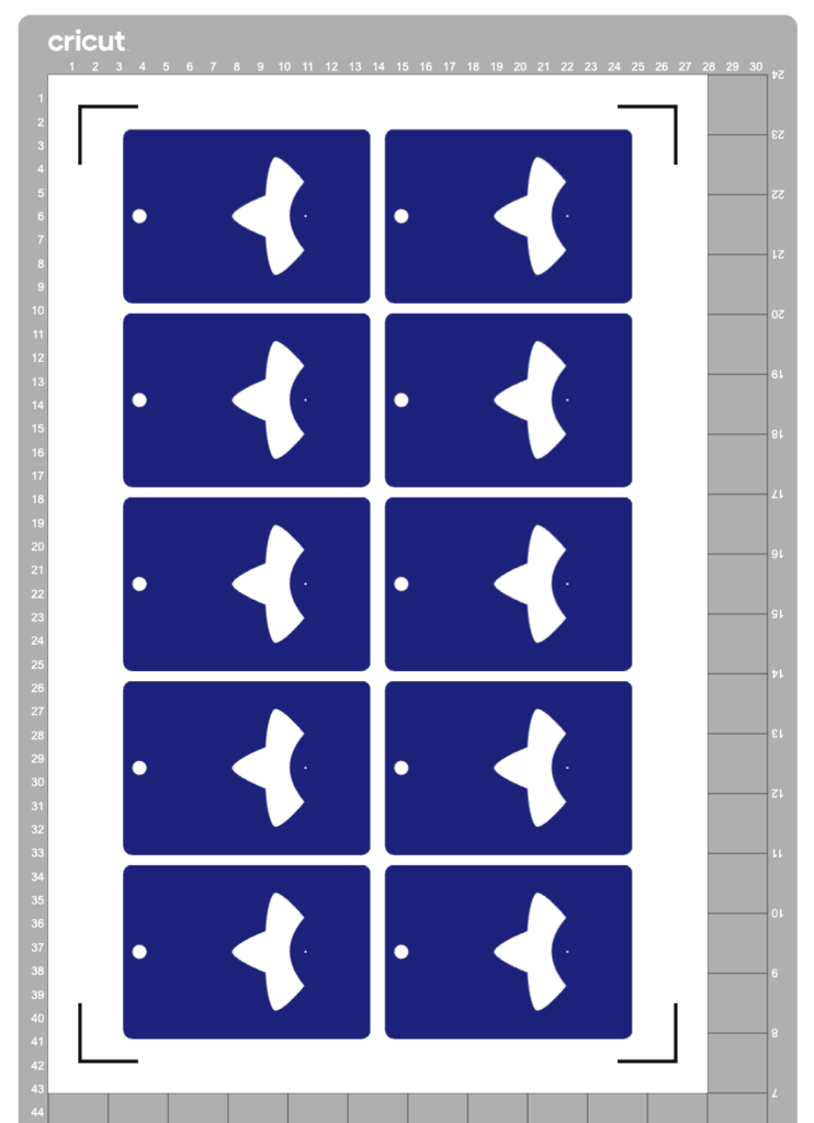
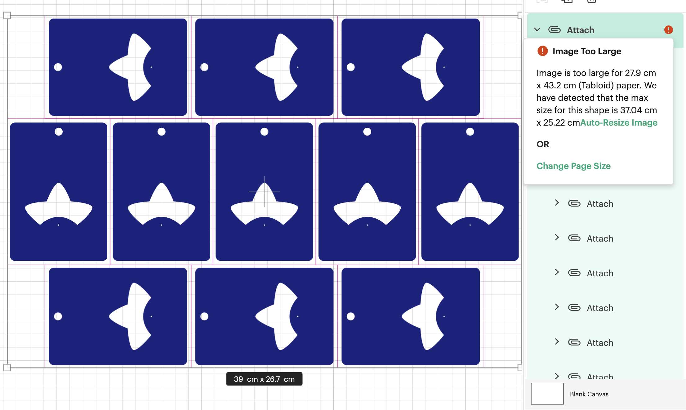
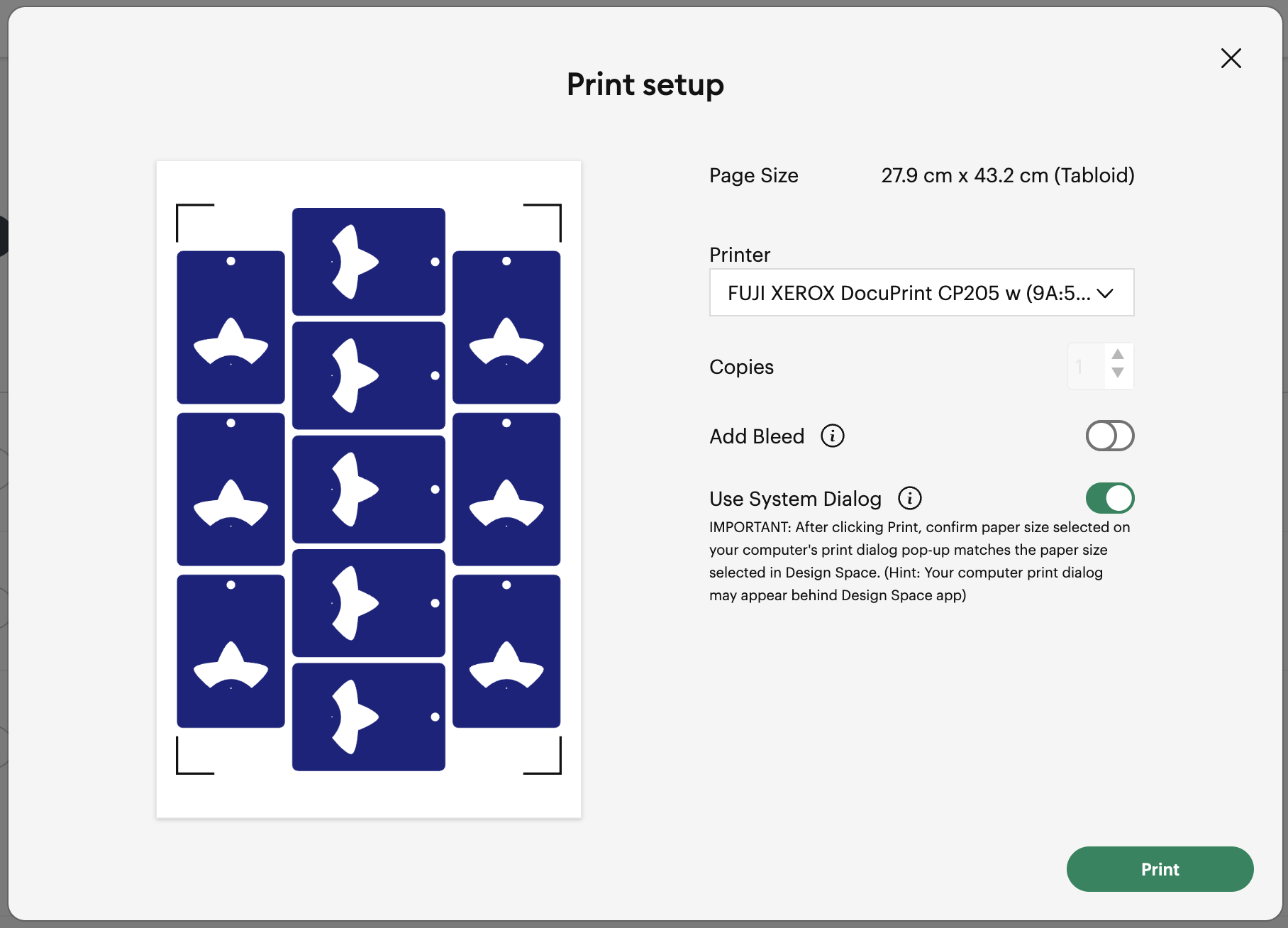
All these things added up mean that sometimes it’s not possible to place as many pieces on a page as you want. In the example above, I had to use a Tabloid paper size to convince Cricut to let me place the ten objects.
I reckon I should be able to fit even more of them in, and I should be able to do it on an A3 page. But Cricut says this layout is too large, despite the design itself being comfortably smaller than an A3 sheet.
(I’d actually love to fit even more than 11 onto an SRA3 page but making that layout work has so far eluded me, so let’s start with this hack first before trying anything more extreme.)
I discovered this hack by accident. I had taken my sheets to be printed at a print shop and they messed up the scaling. My pages came out about 3% smaller, but my Cricut didn’t complain. It happily executed the cutlines 3% smaller too. Evidently, there’s a generous margin of error for scaling.
So let’s use that to our advantage.
Step 1: Downsize the design in Cricut Design Space
Let’s humour Cricut by scaling the offending design to its recommended size.
(I suggest also keeping a copy of your original design to the side, in case you want to make changes at the original scale. To prevent the app from blocking you from proceeding to the “Make” step, hide the oversized objects.)
Step 2: Print to PDF
Click the “Make” button to proceed to the mat preview.
Do not move the designs on the mat – leaving things in their default position makes for the easiest alignment if you want to exit the Make step and return back to it again. Click “Continue”.
Open the “Print Setup” panel by using the “Send to Printer” button.
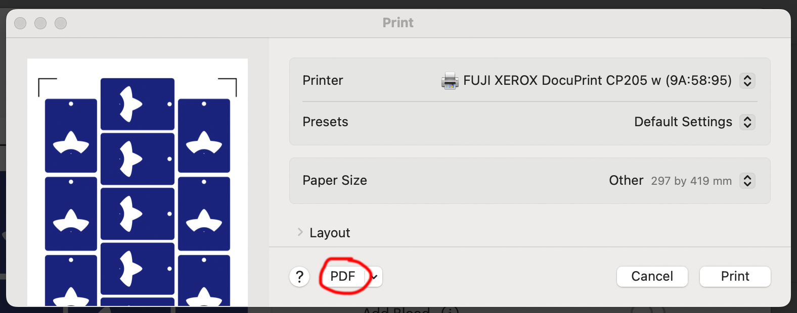
In this panel, select “Use System Dialog” to print your file to a PDF
On MacOS, the print dialog always appears behind the Design Space app, so drag the Design Space window out of the way when the “Preparing Print” spinner appears. Now save your file as a PDF instead of printing it.
Step 3: Scale up the PDF
It’s time to do some maths.
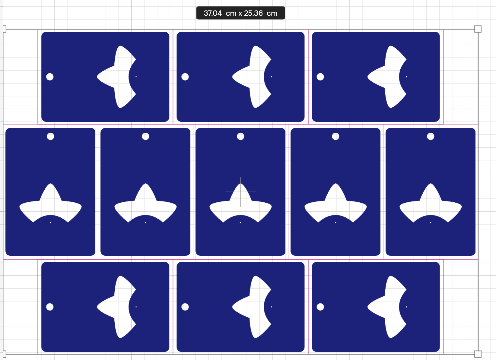
We originally had a design that was 39cm on its long edge, but we scaled that down to 37.04.
That means we now want to scale this file up again to be 39cm.
39 / 37.04 = 1.05291576674
This is a little more than 5% larger, which so far I have been able to make work. I don’t know what the upper limits of this technique are.
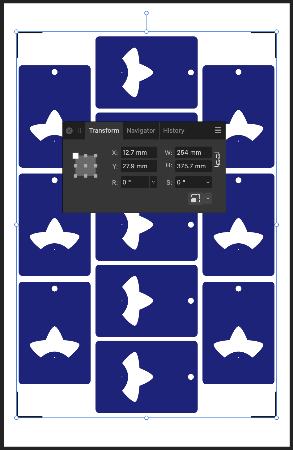
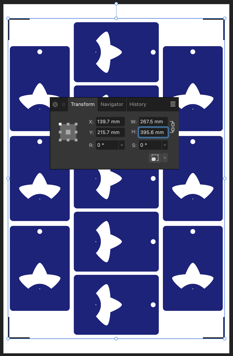
I’m editing the output file in Affinity Designer. The file that Cricut output has a long edge of 375.mm, so let’s type 375.7mm * 1.05291576674 into the H dimension field to get a new image of size 395.6 * 267.5mm.
While I’m here, I’m also going to set up my print graphics, allowing me to have better control of the bleed than using the normal Print & Cut workflow.
Step 4: Print
Print the file – I don’t have an A3 printer at home so I take my files to a print shop.
Step 5: Cut
Back in Cricut Design Space, choose your material. (You may need to select “I’ve already printed” so that the app lets you do so).
Affix your printed sheet to your cutting mat and load the mat. Press “Go” on your Cricut machine and let it do its cutting magic!
Another tip: If you’ve put graphics too close to the registration corners, you can temporarily place a sheet of white paper over them while the machine does its calibration. I usually just slide the white paper around by hand so I can remove it before the cutting begins. Coincidentally, the layout I’m demonstrating doesn’t use the edges so there’s plenty of “quiet” space to distinguish the registration marks from the artwork.
All done!
Here’s my cut pieces, at the scale that Cricut claimed I couldn’t have.
Actually, the vertical axis is a little bit off but this is good enough for my purposes and the bleed areas did their job. If I wanted to be a bit fussy about things, I would try moving around some of the cut lines, but do not move any cutlines that would change the outer bounds of the print, otherwise you’ll need to update your print file and recalculate its sizing too.
In summary:
Big Cricut wants to stop you from printing big. But follow these steps to break out from their boundaries!
Step 1: Downsize the design in Cricut Design Space
Step 2: Print to PDF
Step 3: Scale up the PDF (optionally, update any graphics)
Step 4: Print
Step 5: Cut
Please let me know if this guide was useful to you! Happy cutting!
This blog post goes through a few of my Tableturf inspired artworks from 2023, ending with a quick timelapse of this painting:
With the launch of Splatoon 3 came a new game mode, Tableturf! I got quite into the idea of Tableturf, even being a part of coordinating an art collab project – Arty Siege – which paid homage to the in-game cards. I did lots of work for that – creating various design elements, having fun data merging artwork in InDesign, thinking about how the physical game would really play out, coordinating artists and creating artwork!
The art that I worked on included assets for the card backgrounds, and I illustrated one of the cards.
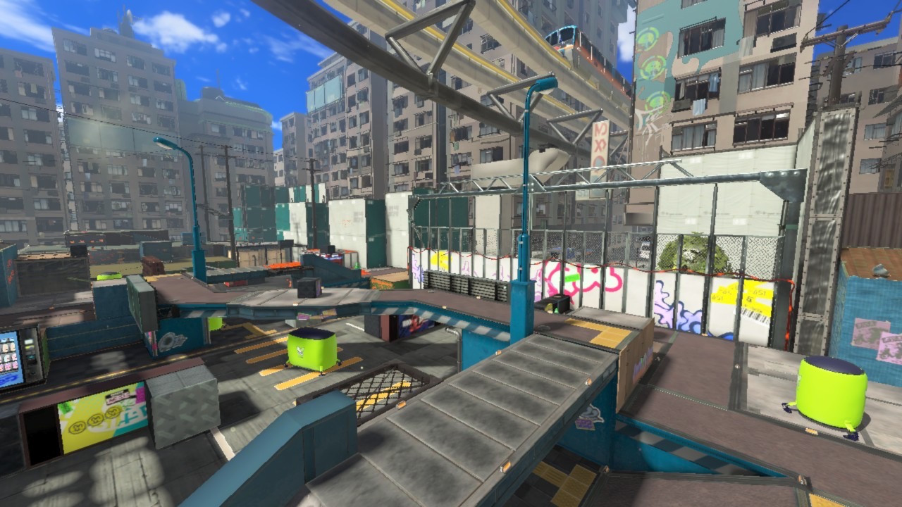
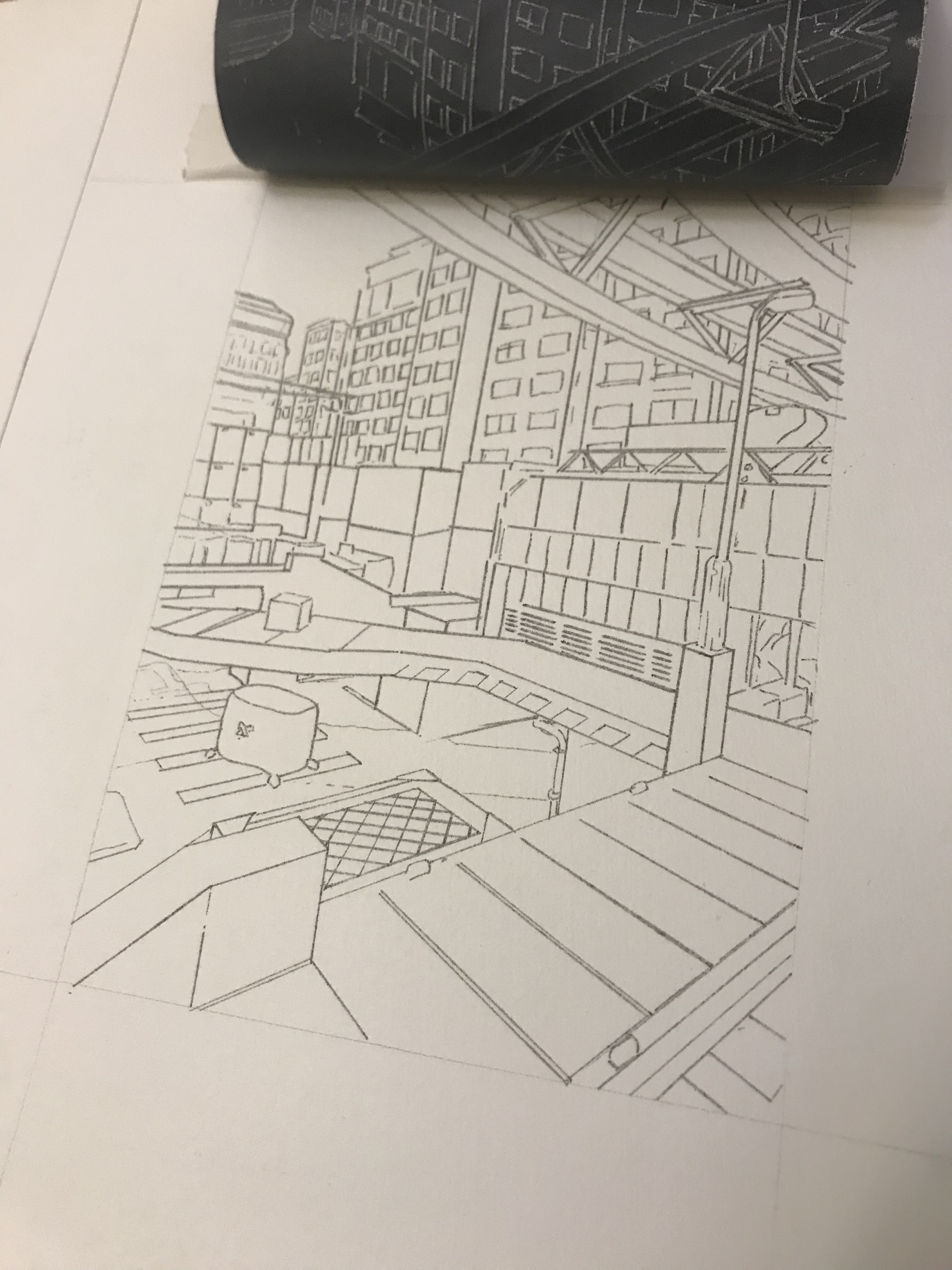
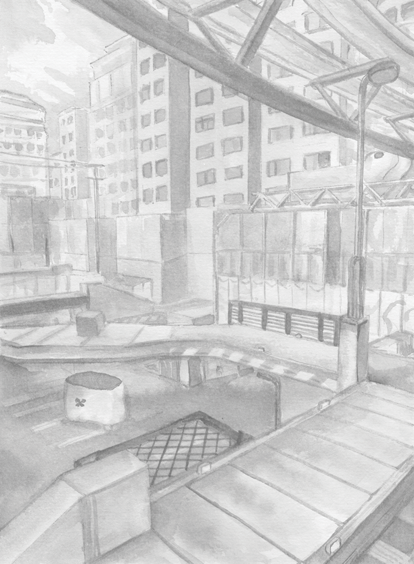
These background images were ink paintings traced from game screenshots. After doing a little photography tour in the game I exported the screenshots and used the Find Edges filter in Photoshop. I printed these reference lines to carbon paper and transferred them to watercolour paper.
After scanning the ink paintings, I applied some gradient map adjustments to them to adapt them into the card background.
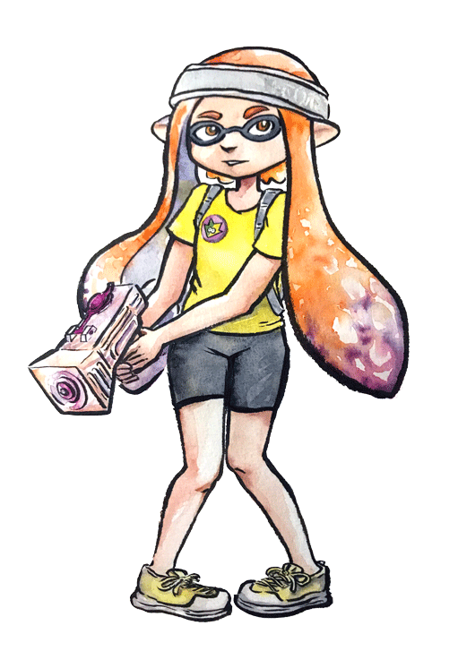
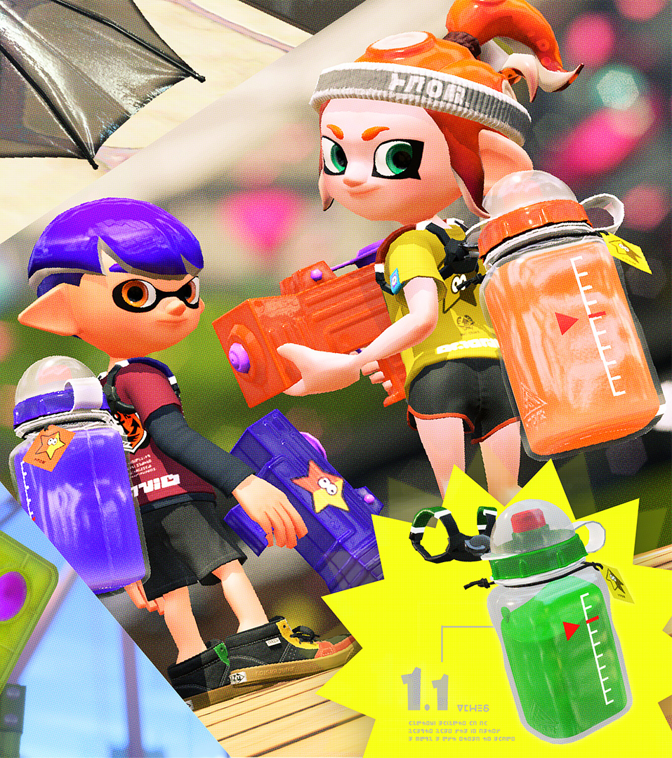
I chose to illustrate the Splattershot Jr. as my designated card for the project. I’ve drawn the newbie squid before and as a Junior player (I became a Junior main because of having to unlock kits on many, many systems) I just feel a certain connection to the default loadout.
During initial project advertising, I used this artwork. The pose is taken directly from the pose of the original Tableturf card. With this version of the artwork, I mocked up the first version of how the cards would appear, including tweaks to the card UI and creating a 3D view of the card.
My motivations for changing the UI were to make the Arty Siege cards distinct from the in-game works, but also to think about what would make sense for a real card game. The original cards put all their important information at their base, but I wanted to make all the pertinent information visible easily from a fanned out hand of cards. So I moved the grid and special costs to the left side.
I also straightened the alignment of the block grid. The angled grid was cool, and saved a little space, but I felt that when looking down at the game board and determining how to make a move, it was easier to visualise the move you wanted to play by having an aligned grid. Maybe that was just me, it’s not like things in the real world would be completely squared anyway.
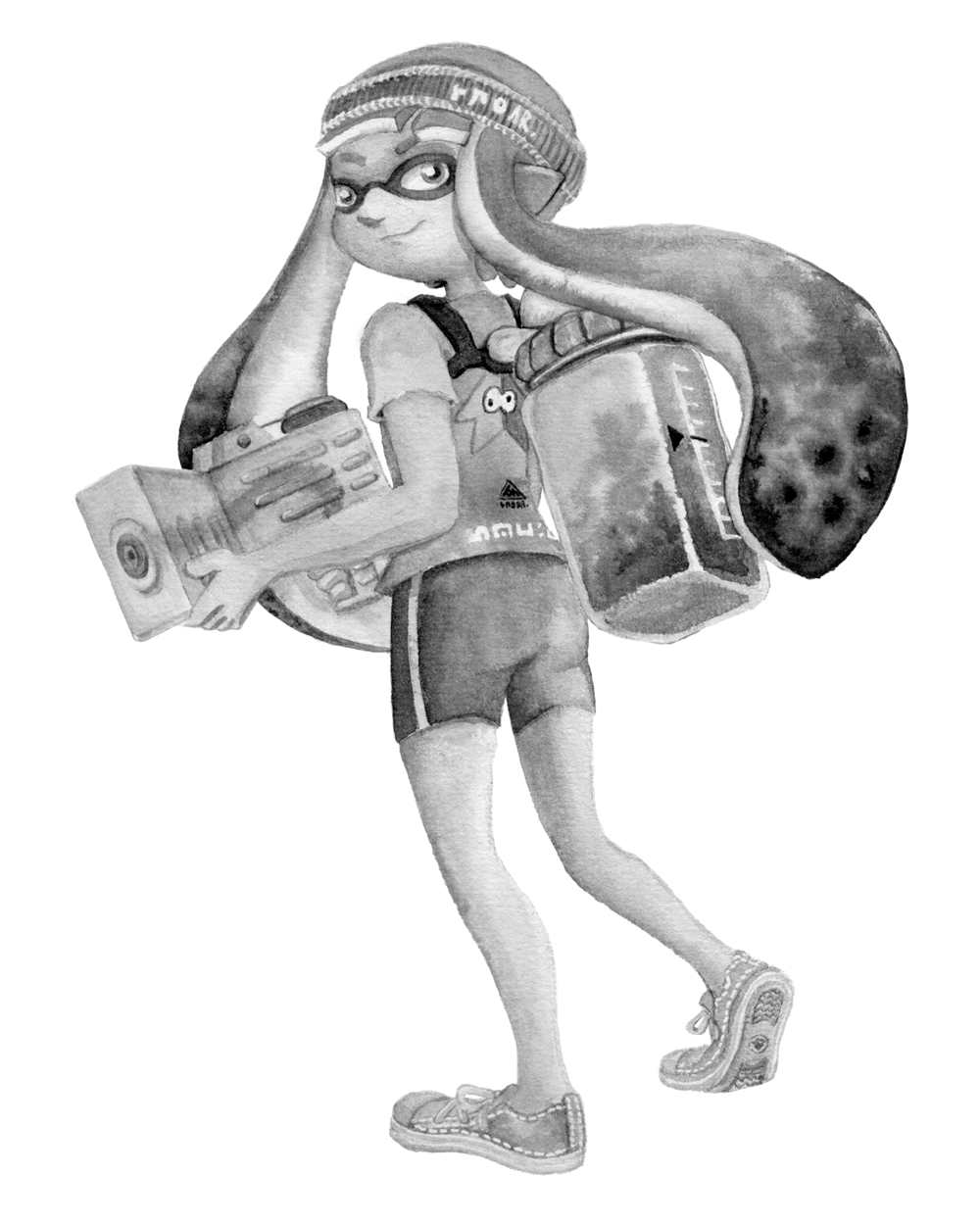
Anyhow, relatively late into the project I started feeling a bit insecure about that version of the Junior being my entry into the project. I was surrounded by an incredibly talented pool of artists and felt like I needed to step up to the standards of my peers! I still like my original artwork but I also felt inspired by the work I’d done on the backgrounds to do a piece in ink and use gradient mapping to add colour.
This time, I based the pose on some promotional artwork from Splatoon 2 – I wanted to show off the square ink tank because while the flat ink pack of Splatoon 3 features in some of the cards, many of the other ones seem to take cues from Splatoon 2’s fashion options.
Here’s the final version of the Splattershot Jr. card. Please do check out the Arty Siege website for all of the other works!
One of the things I did at the end of this project was to print out all the cards, which was a lot of fun! I felt like I built a new connection with each of the artists and their artwork in the process of printing, cutting and sleeving the cards.
While wrapping up Arty Siege I had a vague idea of running a promotional Tableturf tournament – maybe something in a casual vein, or with a bit of a team gimmick to allow a mix of player skills among drafted teams. The team angle was influenced by my favourite anime – Chihayafuru – a show that features a competitive karuta game based on the Ogura hyakunin isshu.
Chihayafuru is beautiful, and the way it depicts friendly competition really hits home. And there’s just something so great about the earnest enthusiasm of the players – they’re engaging in a pretty niche hobby so having the opportunity to play is something they’re truly grateful for. Coming from a grassroots Splatoon scene, I feel the parallels between the competition depicted in the show and some of my favourite times being a member of the Australian (and broader) Splatoon community.
I wish competitive video gaming was filled with people as kind and grateful for the opportunity to play with others as the karuta players in Chihayafuru.
Although I didn’t end up running a Tableturf tournament, the imagery and the idea for an art piece stuck with me.
As much as I adore Chihayafuru, I’ve never felt brave enough to try to tackle fan art for it. The gorgeous scenes, the sense of movement, the game that I only have the most superficial understanding of… it all felt quite intimidating.
But Splatoon, I feel comfortable in that universe…
(A universe which coincidentally seems to have a version of karuta already!)
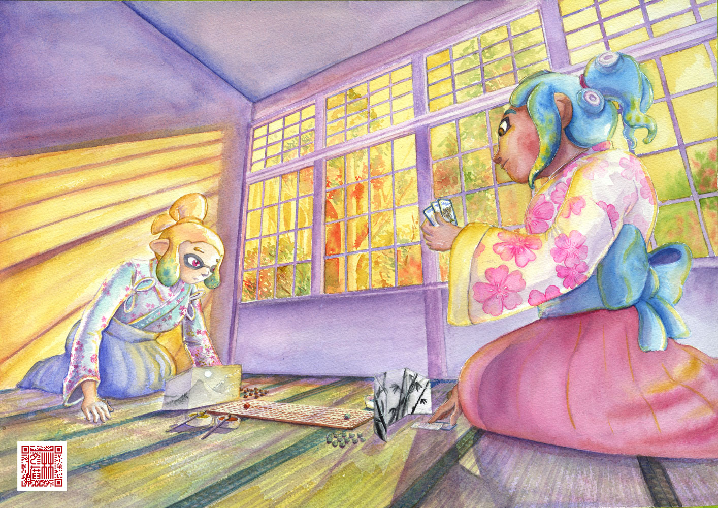
However, my painting is not an attempt to retcon that karuta into Tableturf. In my headcanon, the two coexist. I just wanted to borrow the aesthetics of karuta for my Tableturf scene. I was inspired by the glowing sunset scenes of karuta which I associated with the characters practicing in the school clubroom, but also by the tournament games played while wearing kimono.
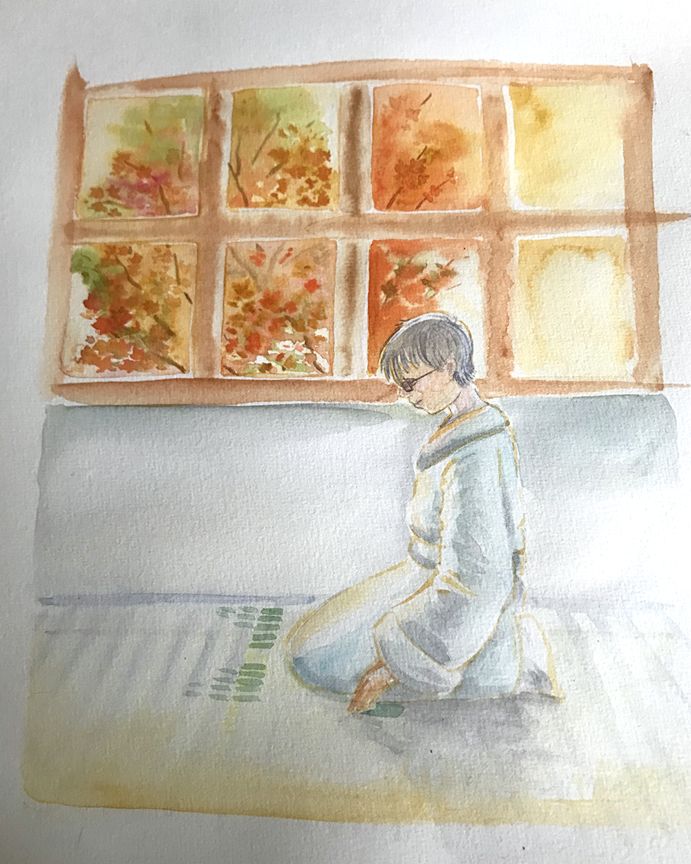
Before starting this painting I did two “mood studies” – just getting a feel for whether I could tame the contrast of yellows, oranges and purples before I started. Watercolour can be a tricky medium, and it’d be hubris to walk into this kind of endeavour without a plan.
That first image is sort of a Chihayafuru fanart, I guess – the scene is most likely Arata sitting alone with his cards – but that wasn’t the purpose of the sketch. I wanted to get a feel for how I’d depict the trees in the windows, and the light entering the room. The second sketch really sets up the composition that I’d ultimately use for the final piece.
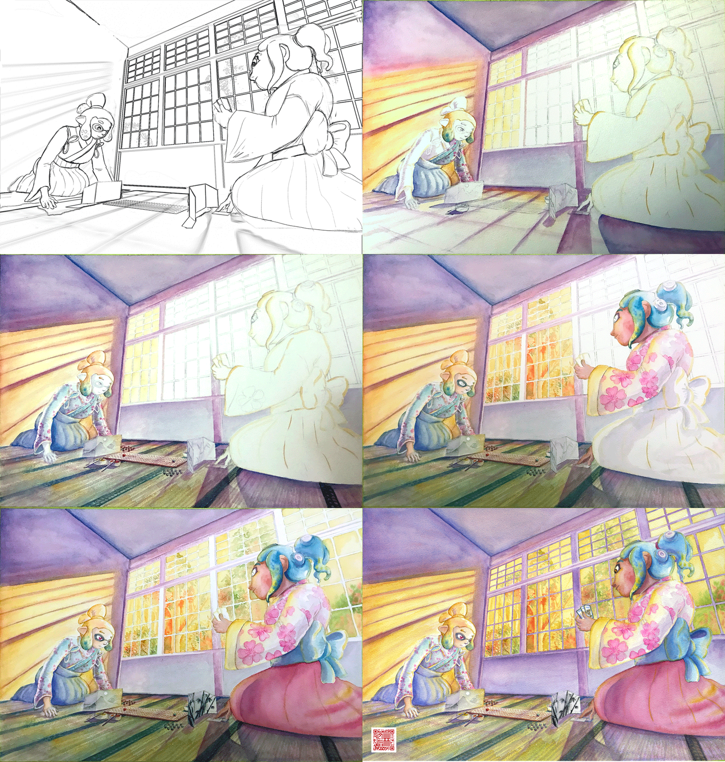
After deciding on that sketch, I made simple 3D version of the scene in Blender.
A digital sketch then filled in the character details
Which was then printed out and transferred to stretched watercolour paper, then painted over the span of a few weeks.
I also wrote a poem to go with this painting. It’s based on poem 77 of the Ogura hyakunin isshu. Here’s one blogger’s translation and writeup about the poem (I chose to highlight this blogger because they also have a post about the Karuta that appears in Splatoon 2!)
The translation included in that post is credited to Joshua Mostow,
Because the current is swift,
even though the rapids,
blocked by a boulder,
are divided, like them, in the end,
we will surely meet, I know
Swift waters parted by the jagged rocks are joined at river's end.
The overall mood that I get from this poem, having only experienced it through translations, is a mix of urgency and yet steadfast certainty that comes from love. Apparently, the “swift currents” were not in the original poem, and were a later edit, but I think the imagery is certainly much stronger with the idea of rapid waters.
I felt the scenario could be mapped quite closely to the energy and movement of Turf War, and by extension, Tableturf. The rapid currents can be whirls of paint instead, and the boulder standing in the way of the lovers could well be a grey block, created in Tableturf when both players play their cards over the same squares.
I chose to write my poem following the rough syllabic rules of the original poetry, the lines having 5-7-5-7-7 syllables. But I put a western poetic spin on them as well, making use of rhyme throughout.
Our rapid advance,
Blocked by chance or wit wherefore.
Must we halt our dance?

No - surge forth in this turf war!
We'll unite our ink once more.
The rapid advance describes that rush to claim turf, as well as for the rivals/lovers to meet at the middle of the map. “Chance or wit wherefore” refers to how the grey block ended up in their way. Was it coincidence that they played in the same tile, or was it cunning strategising from one of the players? With this obstacle in place, the shape of their relationship (whether it be a rivalry or a romance) is affected.
The ending couplet describes the characters choosing to rise above (or work around) adversity – in-game the boulders would not be passable at all, so they must certainly have some grit! Like the swift waters in the original poem, they’ll be sure to meet again.
I love how this artwork and poem came together. Reflecting upon them I feel all those warm fuzzy feels from all the ways that Splatoon – and more recently Tableturf – have made their impact on me. I’m grateful to have had another great year of art, friends and community and I’m looking forward to more good times in the future.
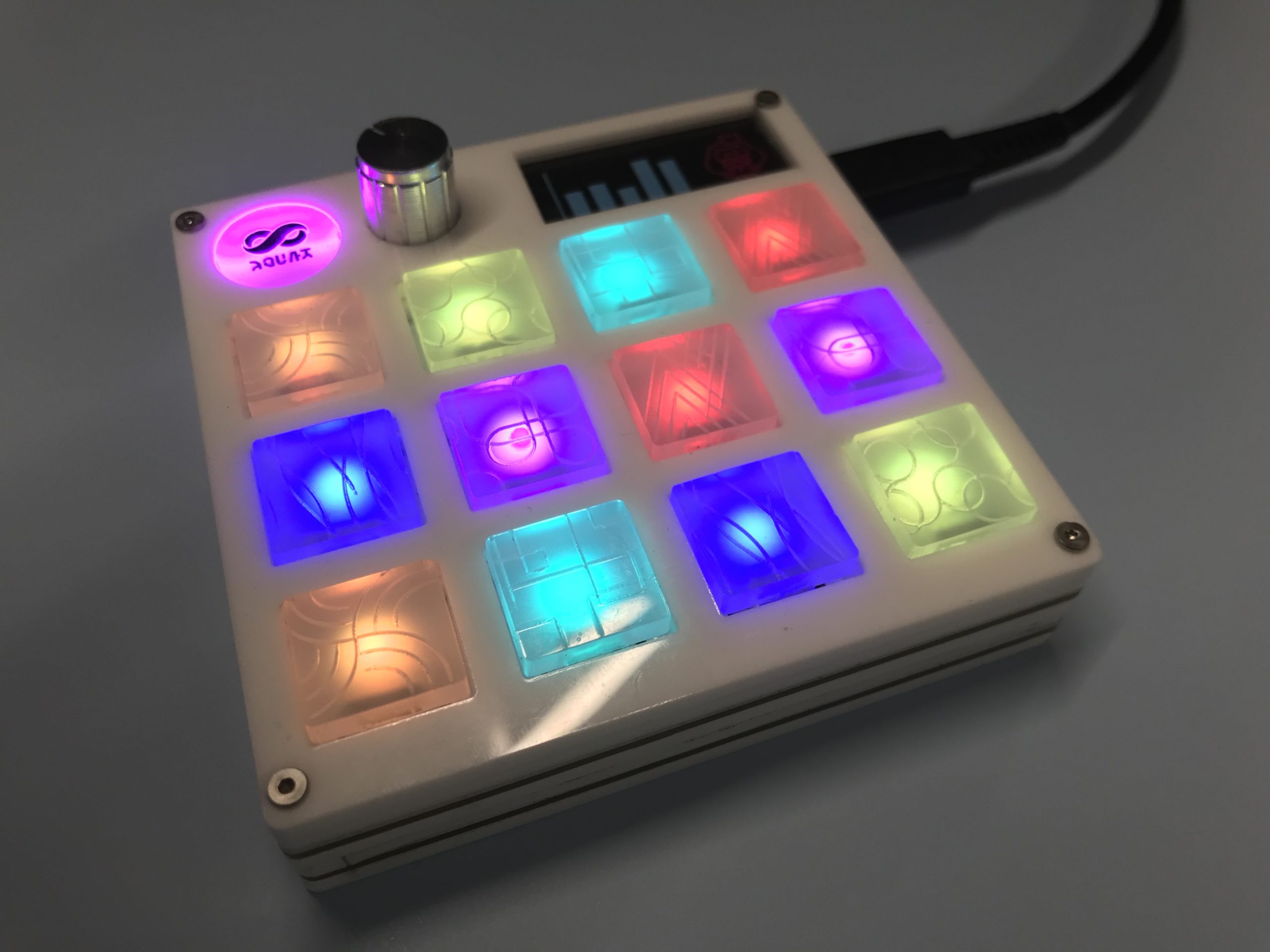
I recently built myself a macropad inspired by the Palette from the upcoming Splatoon 3 Side Order DLC.
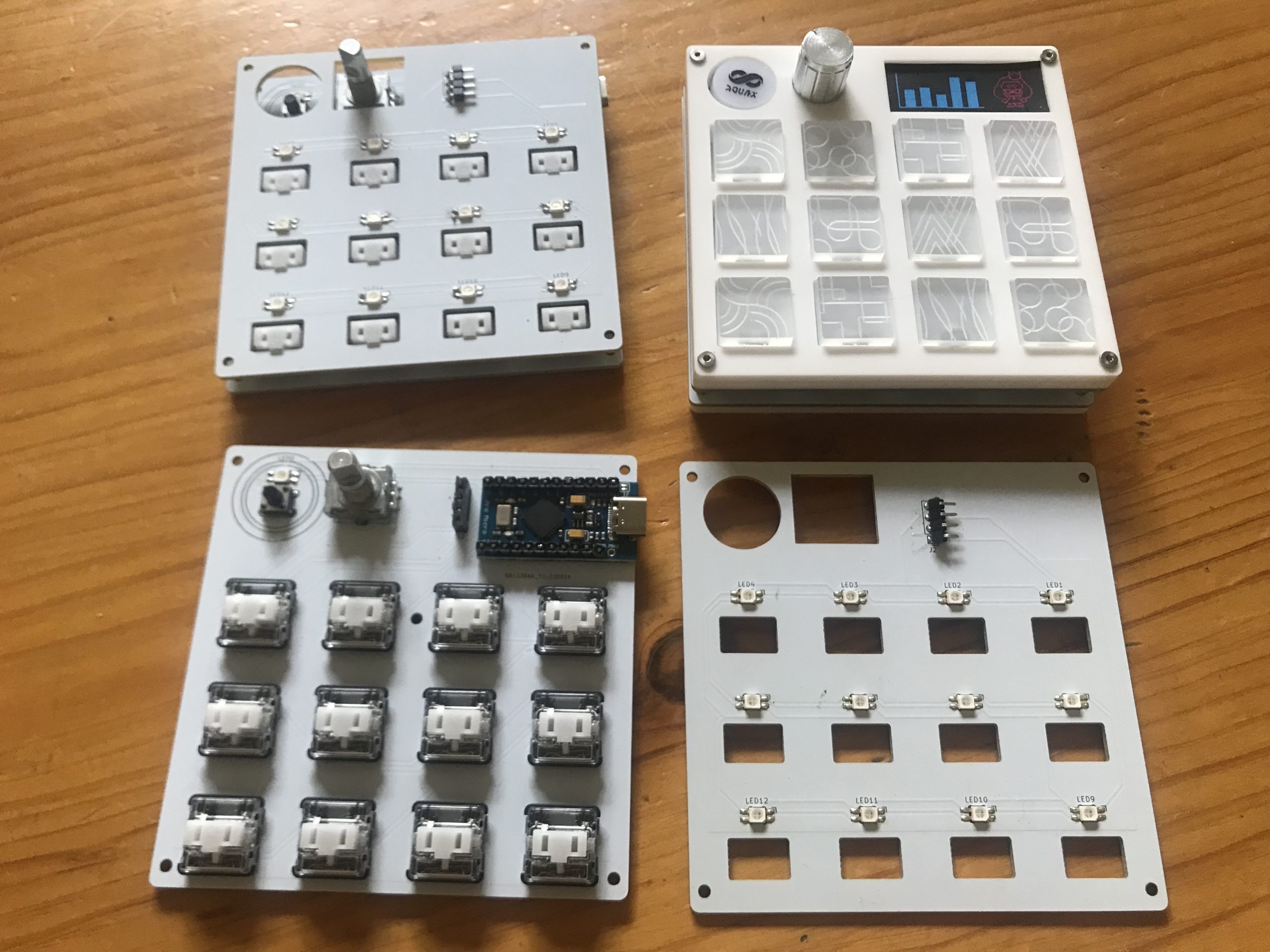
Doing so required making some custom keycaps. The tops of the keycaps were cut from 3mm translucent acrylic and the stems were cut from 3mm clear acrylic, which was then sanded slightly to fit into a kailh choc switch.
I’ve attached the files I used to make the keycaps. Note that they’re designed to be aligned off-center from the middle of the switch; you can see from the PCBs above that the LED is placed immediately below the keycap allowing the colour to illuminate directly through.
You could certainly try designing your own board to use a centered keycap though you may need to consider how to lay out the LEDs for even illumination.
The keycaps DXF file comes with black, red and green lines. The black lines are set as a lower power cut, defocused so that the line comes out wider. The red and green lines are normal cut power/speed.