Giant Catan
Let’s finish Blaugust with a bang. This post was initially going to be a week’s worth of posts, then I felt that was a cop-out so decided I should make it all one post. Then I kept putting off the post because it felt too big to tackle. With the end of the month rapidly approaching, it’s time to bite the bullet.
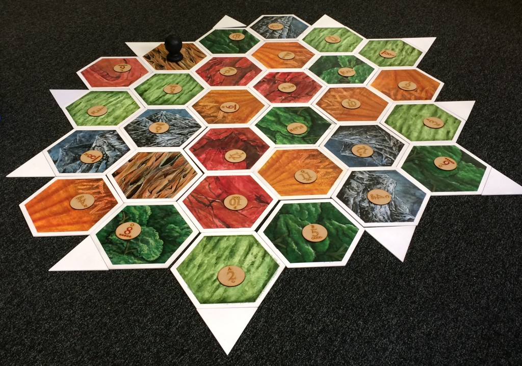
I built a set of Catan. (The game formerly known as Settlers of Catan)
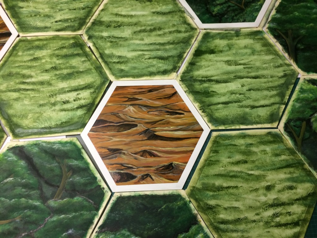
In case it’s not obvious from that photo, I built a giant set of Catan.
Here’s how.
Cutting The Hexes
I started this project back in November of last year. While I am personally not a huge fan of Catan, it’s an iconic board game that served as introduction to the hobby for many people. It’s also quite aesthetically pleasing, so I planned that if at some point I failed to complete the project or if there was no interest in playing the game I would still have a series of nice-looking tiles that could be used for display.
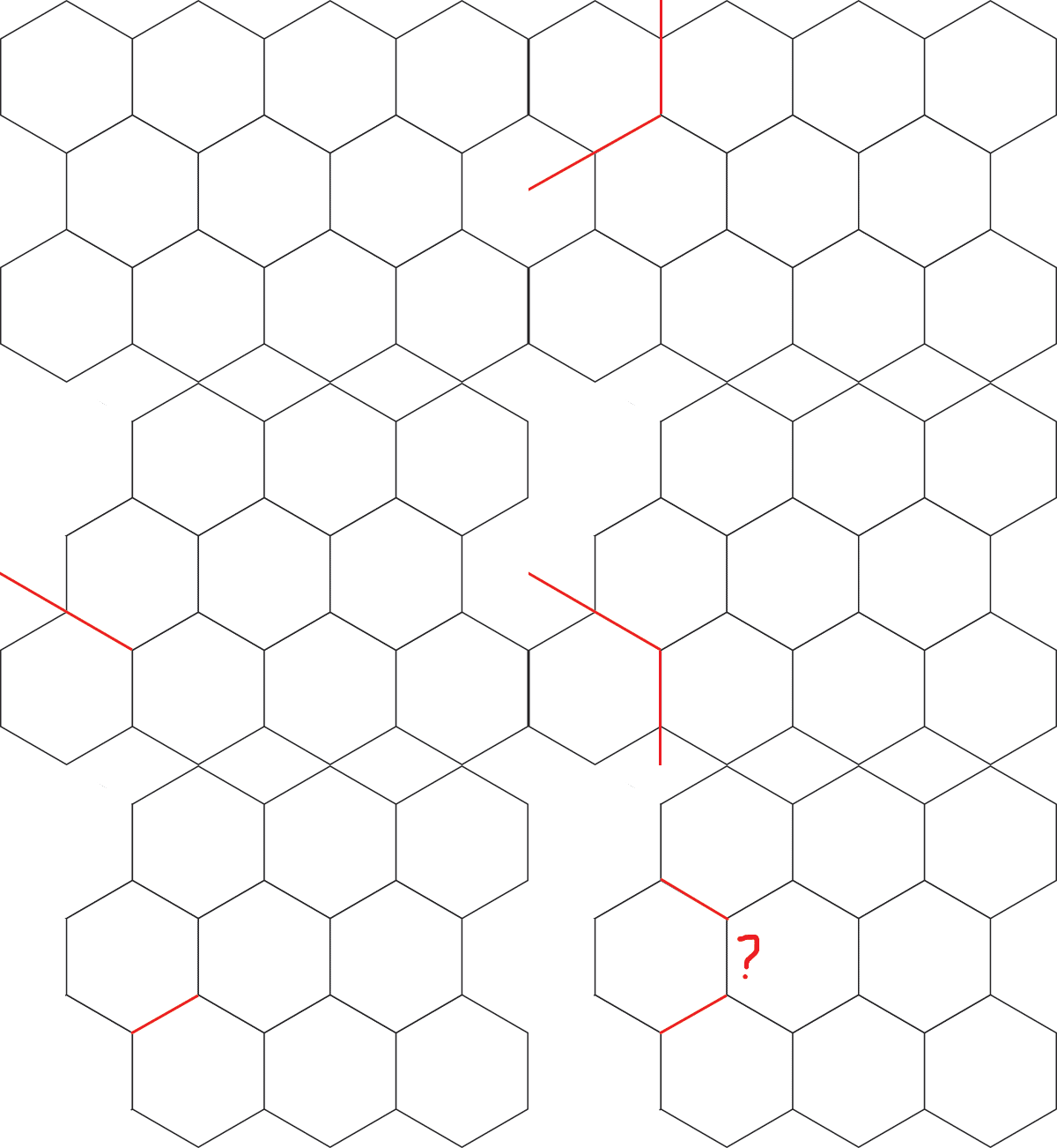
I started by cutting the hexes from 3mm MDF. From a 1200mm x 900mm board, I initially thought that I’d be able to get 11 hexes per board, cutting them like so:
As you can see from the animation, I was not sure how to release the third piece from the group. I asked my dad for help cutting the pieces out using his table saw and mitre saw. He suggested that if we were to cut all of the hexes in bulk it would be easier to do the following:
Each board was sized to the width of three hexes. The strip off the end was used to make the port triangles.
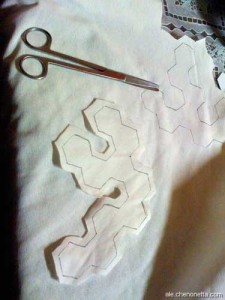
From those strips, rectangles were made. The corners of each rectangle were then taken off to make the hexes.
By doing things this way we minimised the times we needed to change the settings on the saws and better ensured that the pieces would be uniform. However we ended up with a little more waste as we were only able to yield 9 hexes per board. There are lots of the right-angled triangles left over, but I have ended up using the scrap material for laser-cutting all of my small pins and brooches.
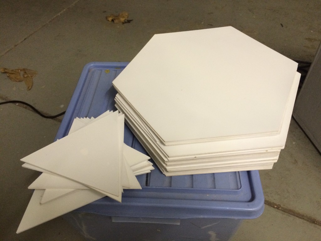
Here’s the cut hexes and ports after they were primed in white.
Painting the Hexes
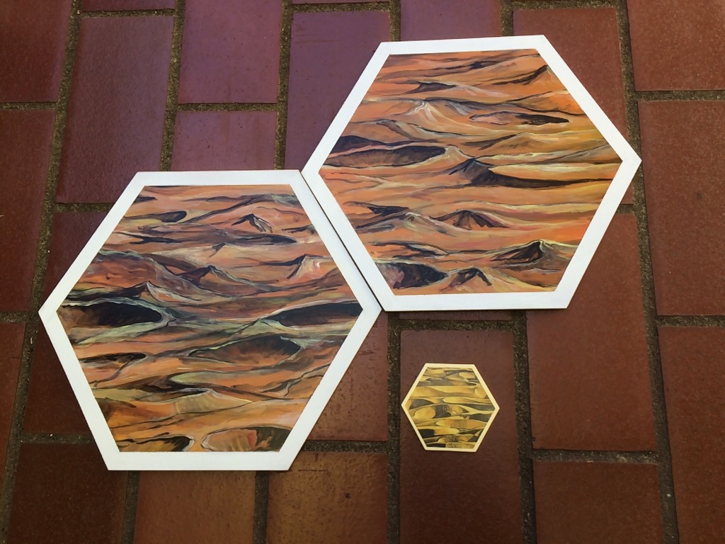
Desert Tiles
There are 30 tiles, and I planned to hand-paint them all. Most tiles have five or six of the same design (fields for wheat, forest for wood, quarries for brick, mountains for ore and pasture for sheep) however the Desert tiles are only repeated twice. I figured they’d be a good start for testing the painting process out.
I established a style that used a mix of acrylic paints and a black water-based ink. To protect the borders, I masked off the sides of the tiles with masking tape.
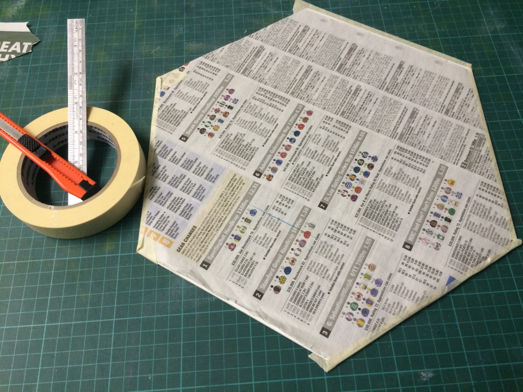
After doing these first couple of tiles I also decided to use newspaper on the back to protect the back of the tiles
At the time, I was hoping to create a double-sided game with Catan on one side and Takenoko on the other. I think I will end up creating a separate set of hexes for Takenoko.
I am very pleased with these tiles. They are recognisable but still have my personal flair to them. A bit of satin spray varnish serves to protect the tiles against light scuffing.
I was so chuffed with the art on these I was tempted to turn one of them into a clock…
Forest Tiles
After declaring the desert tiles a success, I moved onto the forest tiles.
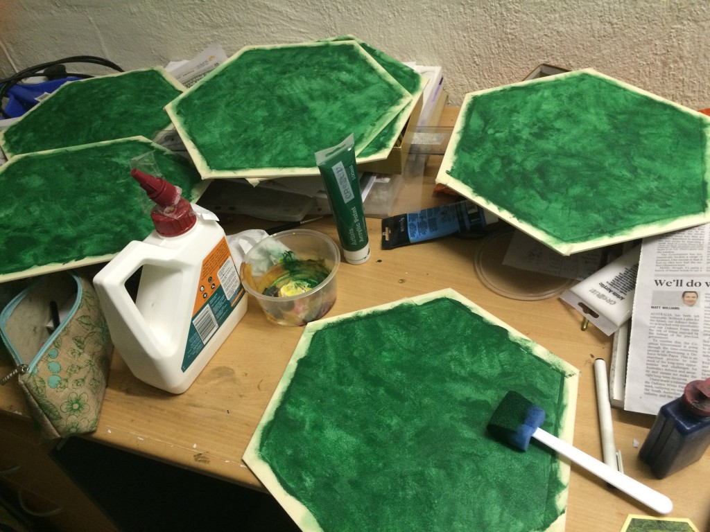
I painted all of the forest tiles green at once to ensure they had a consistent colour throughout.
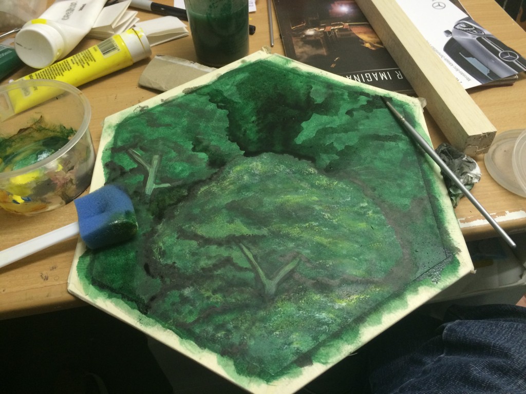
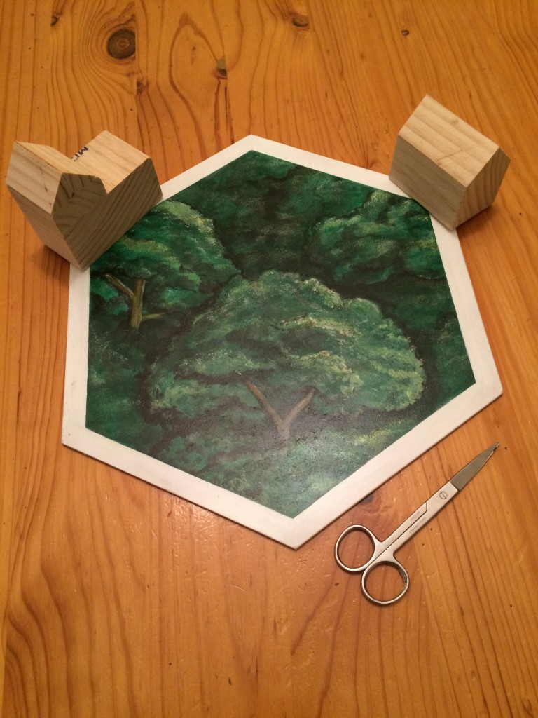
I then spent almost a month on the first forest tile, experimenting with using washes of ink to establish the forms of the trees.
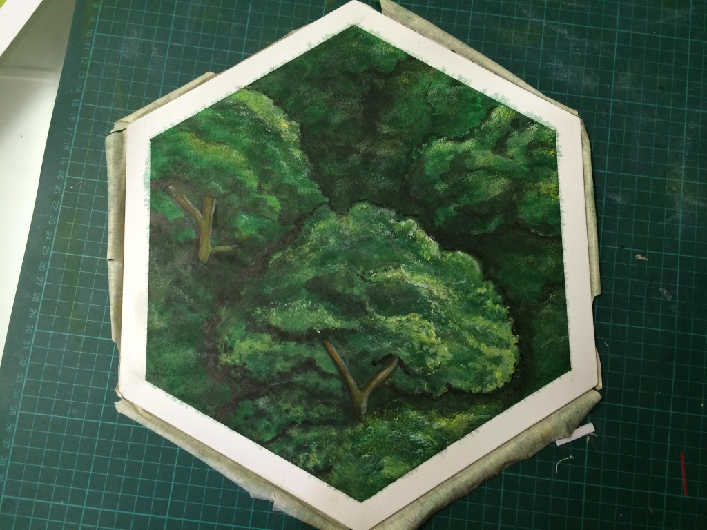
Once the forms were in place, I sponged on green, yellow and white paint to represent the foliage. Balancing the highlights and blacks proved to be tricky. This tile took so long because I kept trying to layer things on, and I ended up going around in circles. Finally I decided the tile had enough time spent on it and I finished it off with some brown on the trunks and declared it done.
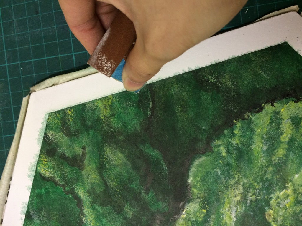
Disappointingly, once un-masked it turned out that the edges were not sufficiently protected from the paint. A little bit of sandpaper and touch-up paint fixed this, but the paint bleeding proved to be a nuisance throughout the project and when I ended up against the clock most of the tiles didn’t get this touch-up treatment.
It took another three months for me to complete the rest of the forest tiles.
Pasture Tiles
Filled with despair about how slowly progress was being made on the hexes, I decided to tackle the pasture tiles. I knew that they would be quite simple to execute.
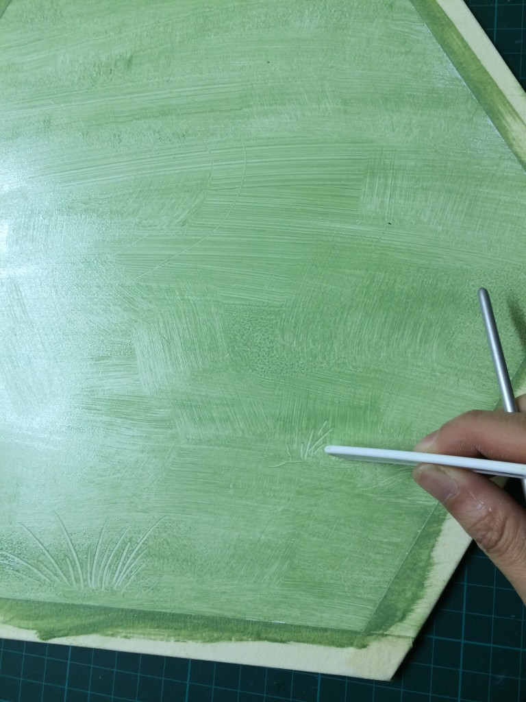
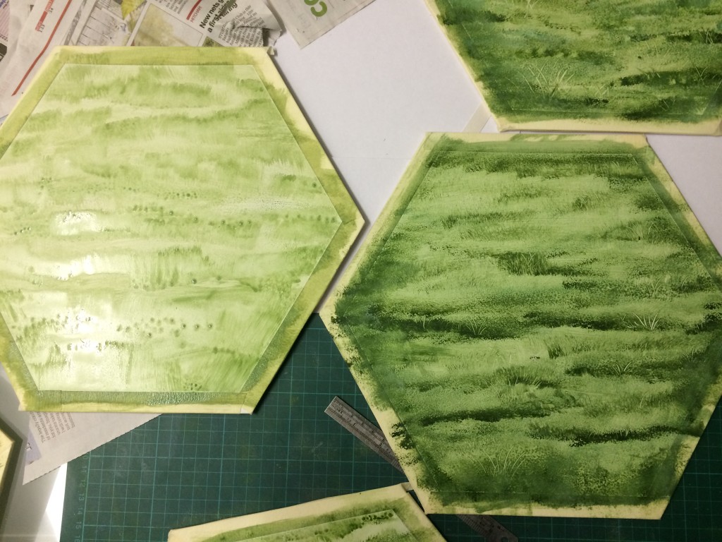
I brushed on a light mix of green and while the paint was still wet I used the plastic handle of the sponge to scrape out blades of grass.
Once the grass was in place I sponged in darker patches to create interesting patterns, scraping out a few more blades of grass as I went.
All six of the tiles were completed over two days. I had some momentum back.
Mountain Tiles
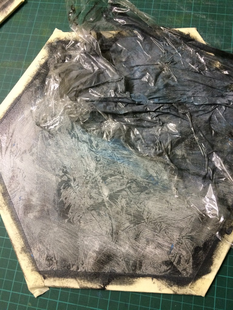
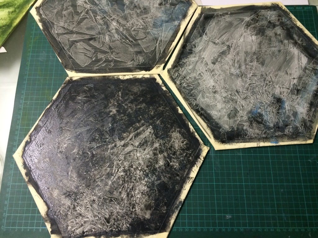
I launched straight into the mountain tiles, after having the idea of using glad wrap to create some of the rocky texture.
Each tile was painted with a mix of greys and blues and the glad wrap was laid into the still-wet paint.
On lifting the glad-wrap, all sorts of crazed-like textures are created.
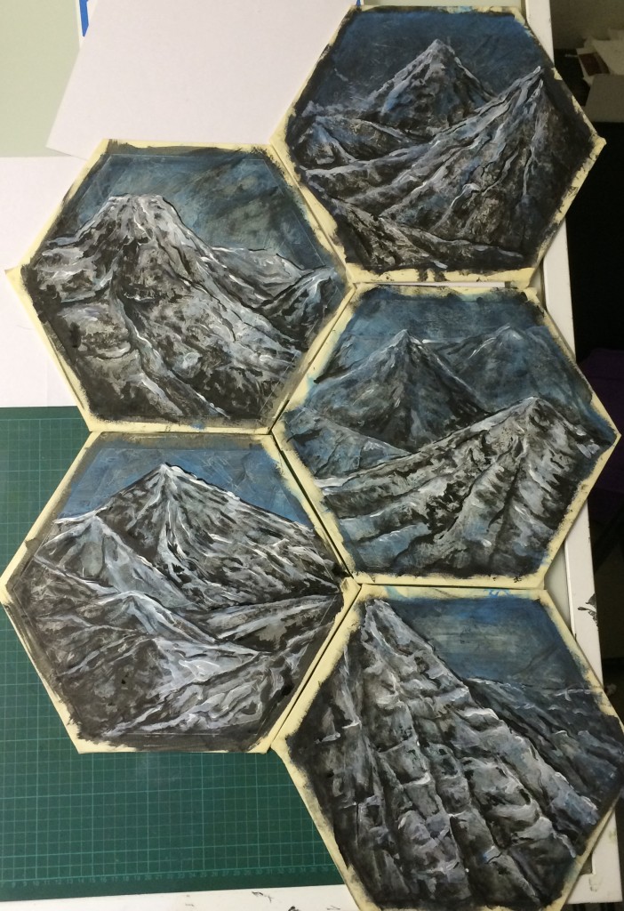
After letting the textured layer dry, I painted in white cliff faces. I tried to pick out shapes in the textures to guide what shapes the mountain tops would take.
The tiles were finished off with greys, blacks and blues.
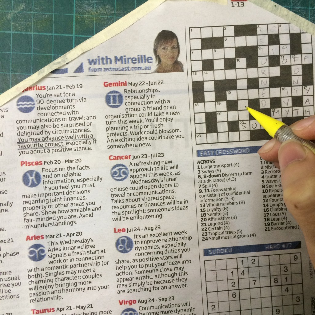
PS always save the crosswords.
Field Tiles
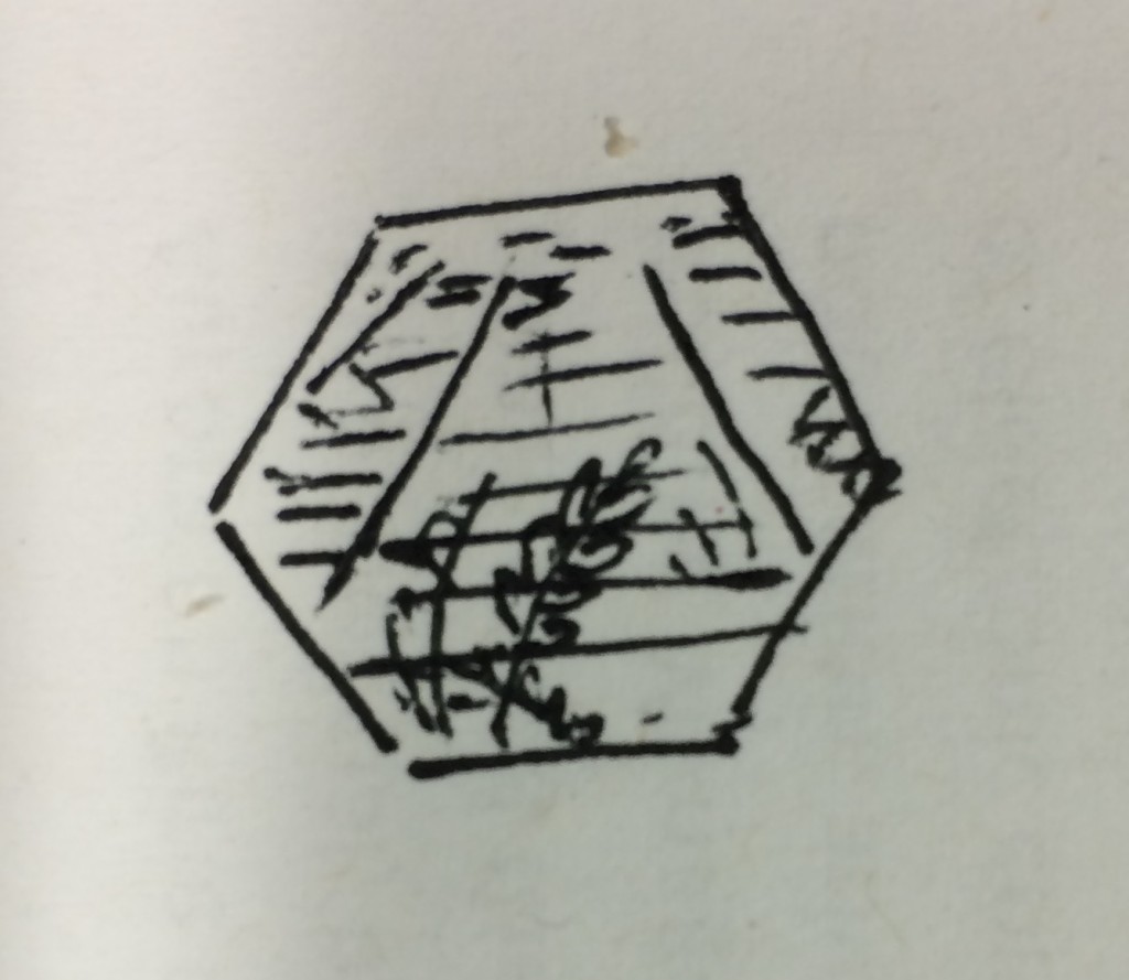
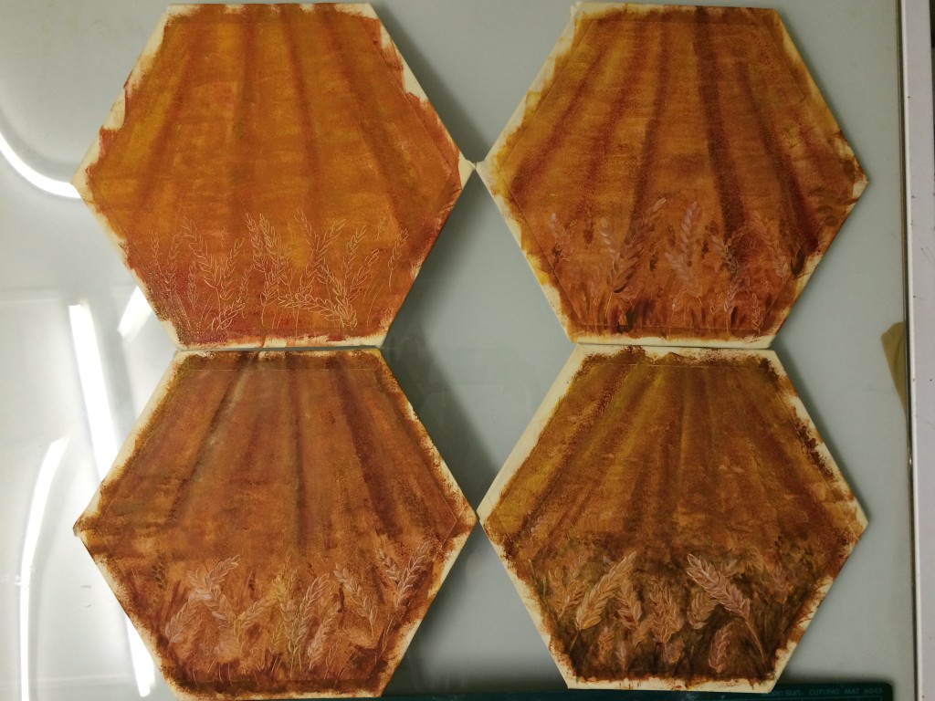
I had a lot of trouble deciding what these tiles would show on them. The colour would easily make them distinct from the other tiles, but how was I meant to represent the fields of grain without going mad from painting hundreds of wheat stalks? This idea popped into my head at work and I quickly scribbled it down.
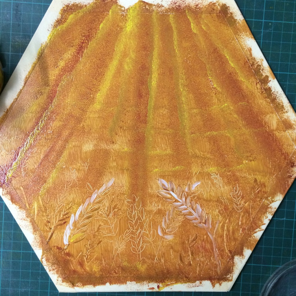
The background fields were sponged in with a few colours, Vertical brush strokes gave a hint at the stalks while the occasional horizontal interruptions to the receding rows of grain implied heads of wheat. While the paint was still wet, I used the back of a paintbrush to scrape out the shapes of some wheat stalks. I also brushed in a little white into the top sides of the stalks and some brown into the bottom sides.
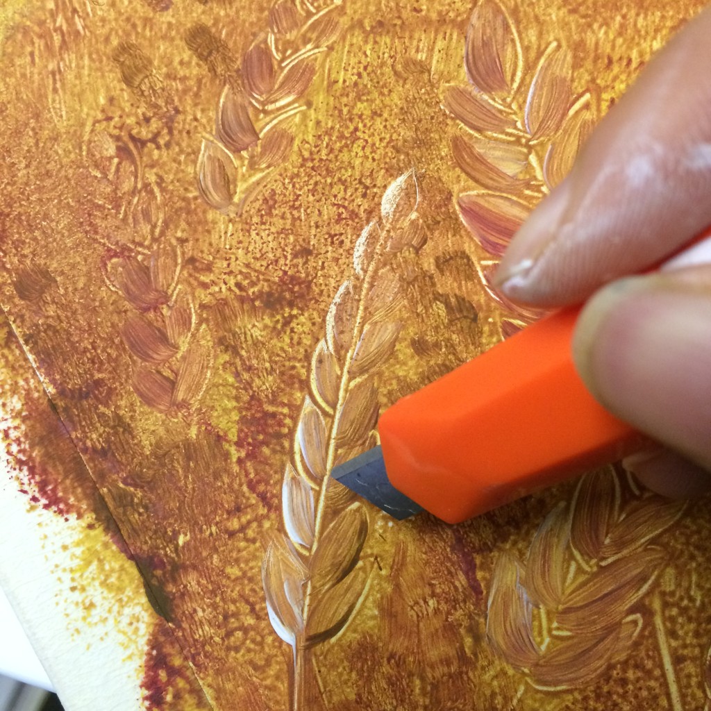
Once the paint was dry, I used a blade to scrape back even more of the paint.
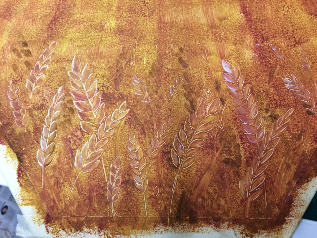
Finally, some additional depth was added with darker paints and ink. This set of tiles show the progression from initial painting to final detailing.
Quarry Tiles
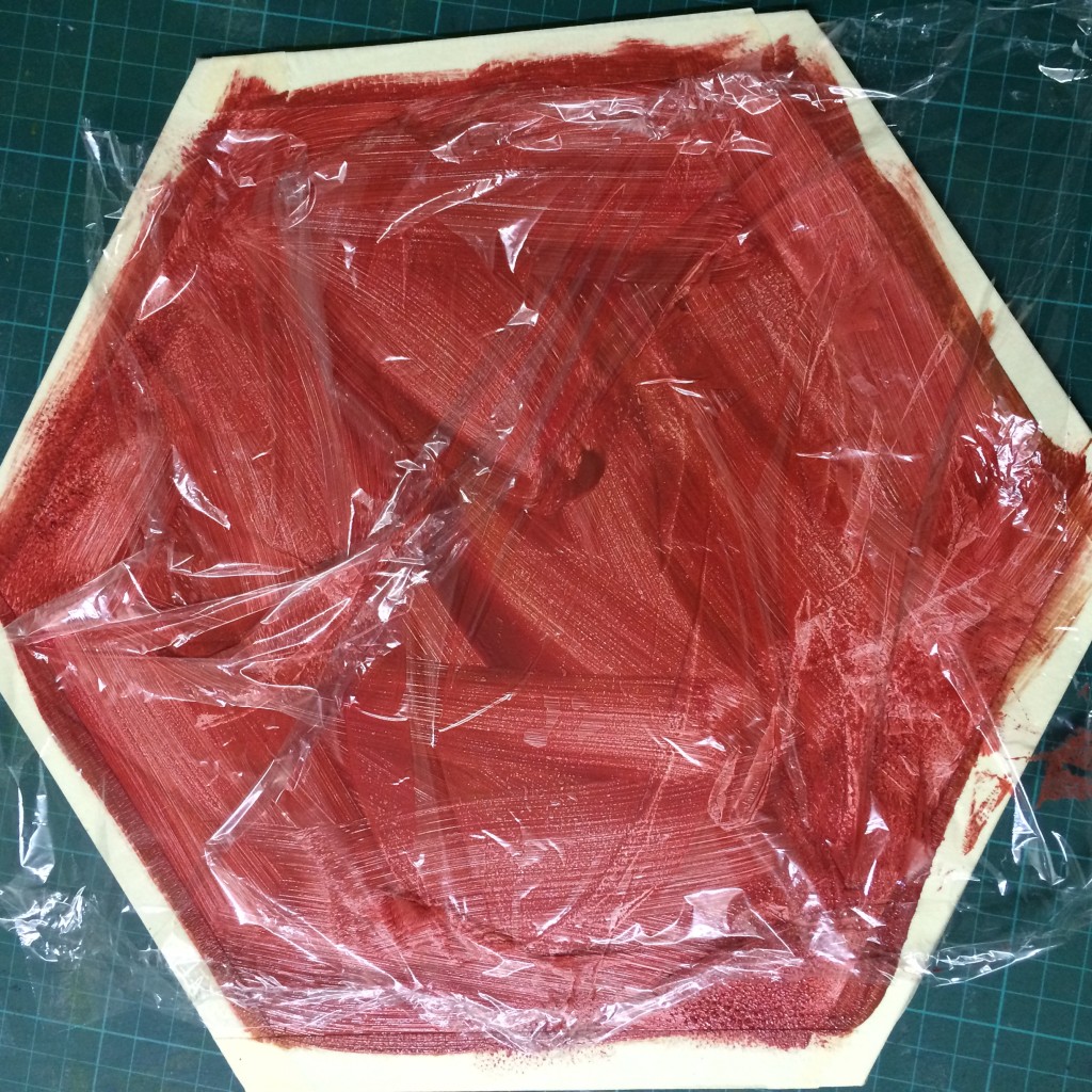
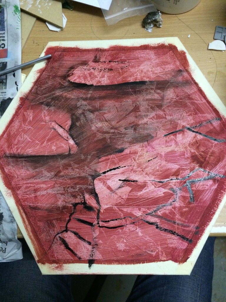
These guys are technically incomplete. I used up all my steam on completing the pastures, mountains and fields in a four day period. While I was painting those tiles, I got started on creating the texture with glad-wrap in the same way as the mountains.
I only got as far as adding some vague hilly shapes with black ink.
I’ve now gotten stuck thinking about how to finish them off. From a distance they look great – the red colour makes them stand out, but I’m not sure how to paint them up without interfering with how the awesome bold red appears from a distance.
Roads and Buildings
I spent a few days with my dad planning and making these.
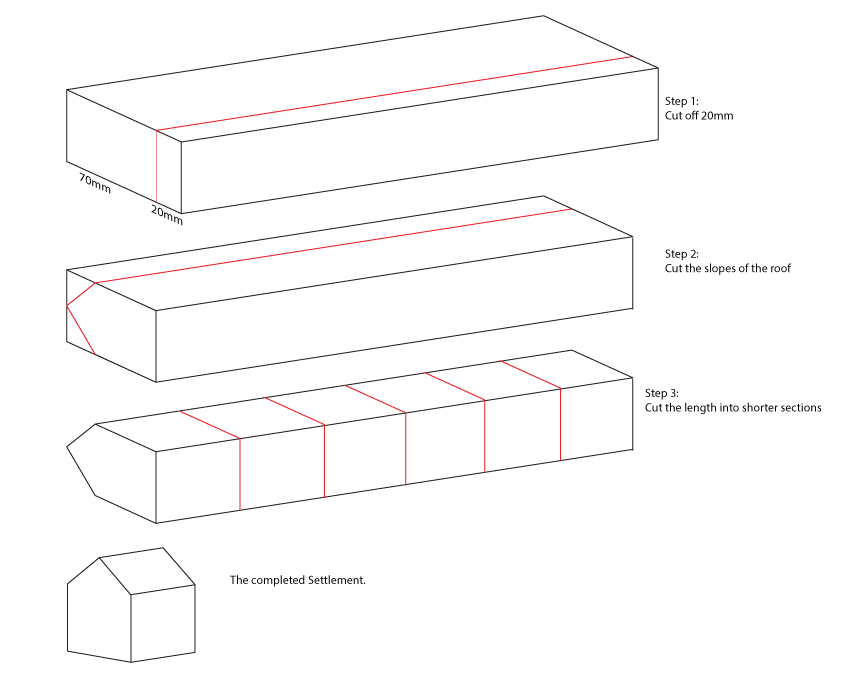
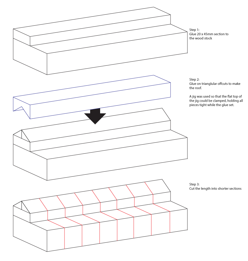
Timber can be pretty expensive. Nice timber would have easily broken the bank, so I looked around at Bunnings and ended up grabbing a single 4.8m x 90mm x 45mm length of decking pine for around $20. I had it cut into 120cm and 60cm lengths to be able to fit into my car.
From these lengths, I hoped to yield 30 settlements, 24 cities and 90 roads.
I found working on these really interesting but unfortunately I forgot to take photos for most of the process! I’ll do my best to explain with some diagrams.
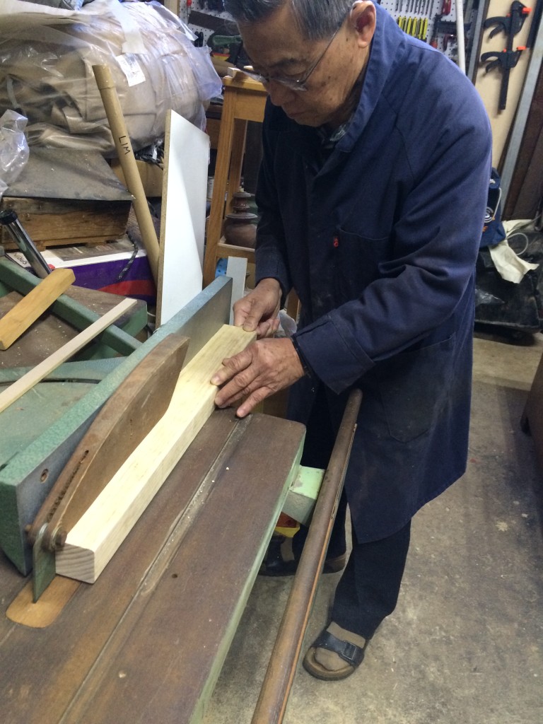
Here’s my dad ripping a length of timber.
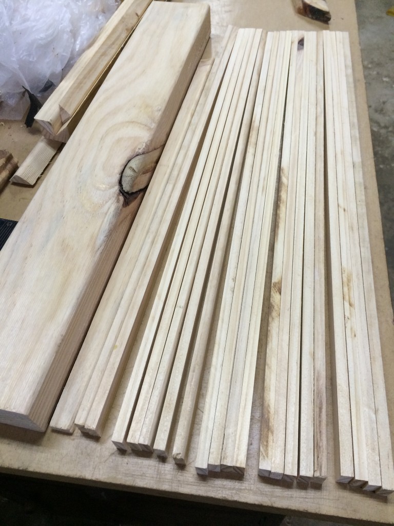
Here’s how many road-sized lengths of wood I got from a single 60cm length. I ended up with the 90 roads I needed and tons more to spare.
The Robber
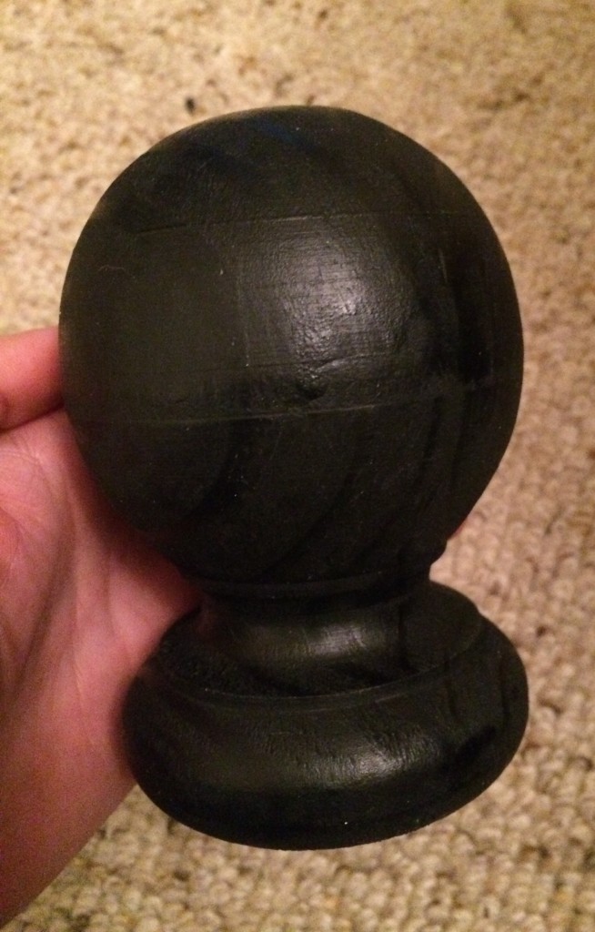
The robber is just a fence-post capital with the little post cut off.
As with all of the other timber bits, it was finished with a coat of enamel spray paint.
Chits
The chits were laser etched and cut from 3mm MDF.
The little dots at the bottom of each chit represents the probability that the number will be rolled. Although it wouldn’t take too long to hand-create those circles, I had a a neat little inDesign script (that I first wrote for a Lords of Waterdeep re-theme) that saved me lots of time. The script expands a numeric value, X, paired with an image and instead turns that into an image repeated X times.
I initially forgot that I would need to paint the 6s and 8s red. Luckily I realised before removing the freshly-etched pieces from the machine. Without moving the pieces, I put masking tape over the relevant areas and re-etched the outlines of the numbers and the dots. I then removed the masking over the cut-out areas and painted them red before removing the rest of the masking.
The Dice
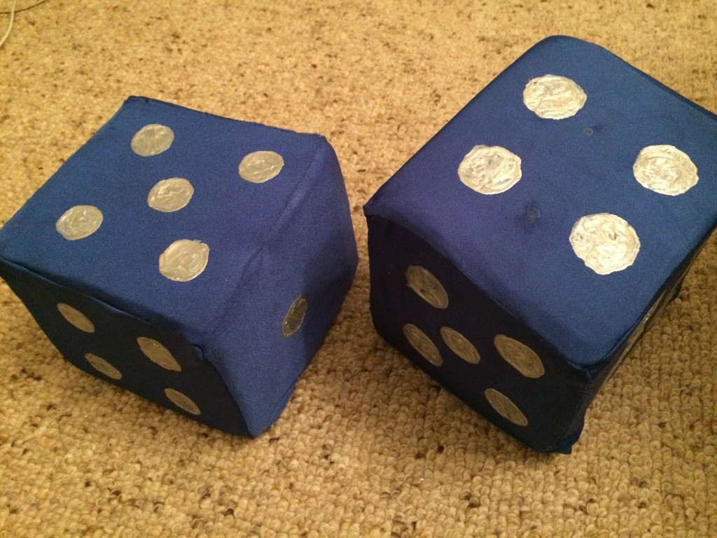
The dice are made of blocks of foam covered in fabric. The foam was bought from a 30x30cm offcut – the guy at the store told me it was 15cm tall so we cut the blocks into 15x15cm squares. Turns out however that the offcut was actually around 12cm tall. I tried trimming the blocks when I got home using a serrated bread knife, but that ended poorly. As a result the dice aren’t perfect cubes.
I was short on time and my sewing skills are lacking. So I gave the foam and lycra that I’d planned to use to make the dice to my friend Laura and she worked through illness and gave me these. She even painted the dots on them! Thank you so much Laura!
Still to Come…
Obviously the unfinished quarry tiles could use some attention.
I’d like to add felt to the base of each of the buildings and the robber, to reduce the chances of scratching the painted surface of the hexes.
Currently I’m using a triangle to distinguish each port location and using the hexes from the regular-sized game to provide the actual trade-value information. I may yet make proper art for the ports directly on the triangles, but I’m unsure how I’ll do the art for the resources.
No, I’m not intending to super-size the cards. ; )
Thanks for joining me for a month of Blaugust posts, and thanks for reading through this build-log of giant Catan. At some point I’ll finish off giant Tsuro…
…and maybe even get to work on Takenoko… but that’s for another blog post, another time.

