Chenonetta Creations

Find Me On...

  • deviantArt
  • Twitter
  • Mastodon
  • Instagram
  • Facebook
  • Bluesky
  • Home
  • About
  • Selected Works
  • Shop

WIP

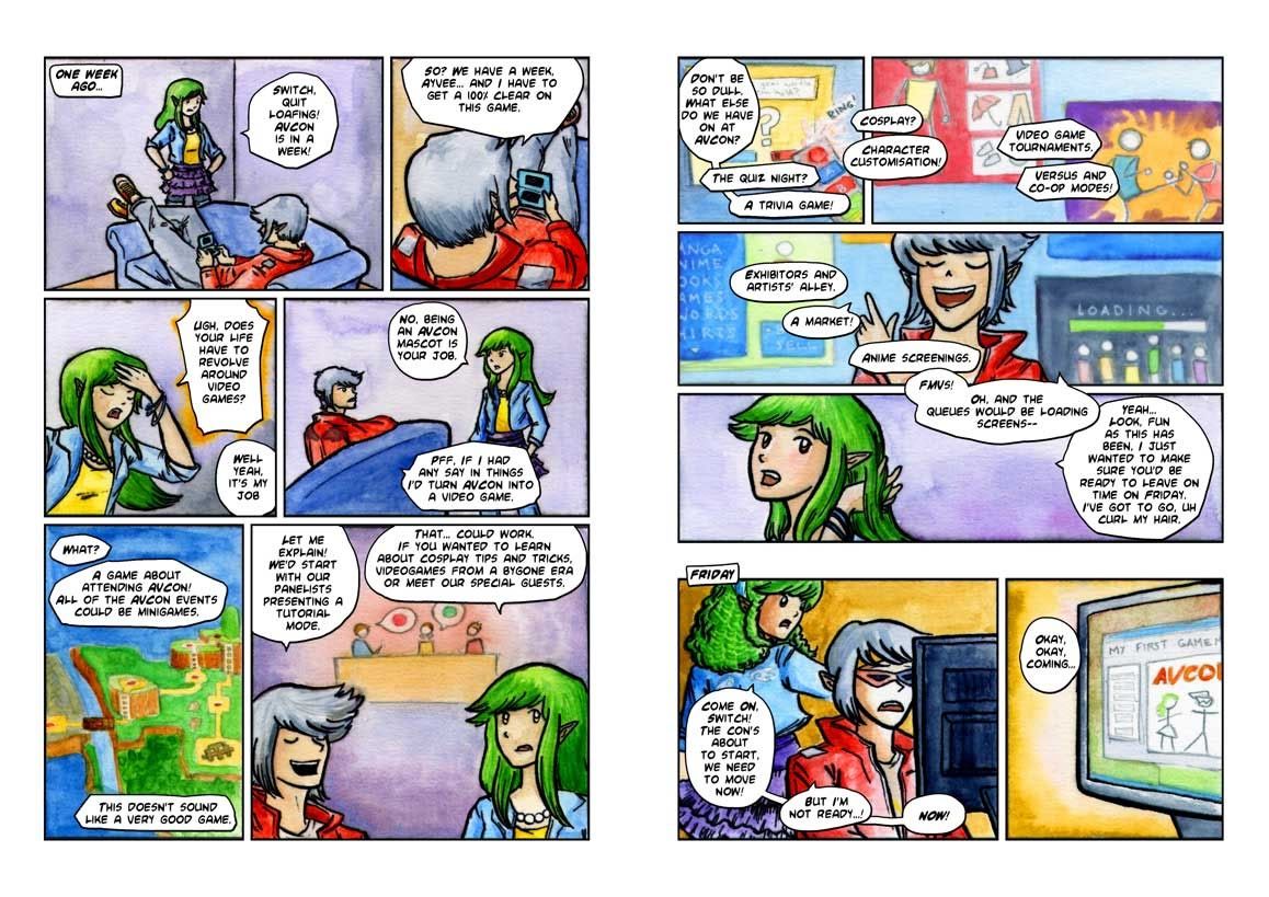
The AVCon Booklet Comic: The Making Of

Posted on August 11, 2011 Leave a Comment

A step through of the creation of the booklet comic.

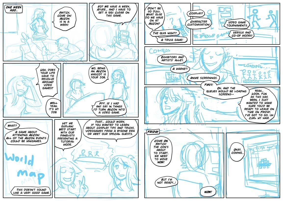
Step 0: I write a script. It starts from a bit of stream of consciousness as I play around with what the characters would say. I then split the script into scene and dialogue transitions – working out the pacing. Where would be the best spot to move the panel focus? How do I fit all this text onto the page? My original script gets sliced in a way that needs four pages. I revise and re-revise on this, now that I have an idea of the tone of the comic.

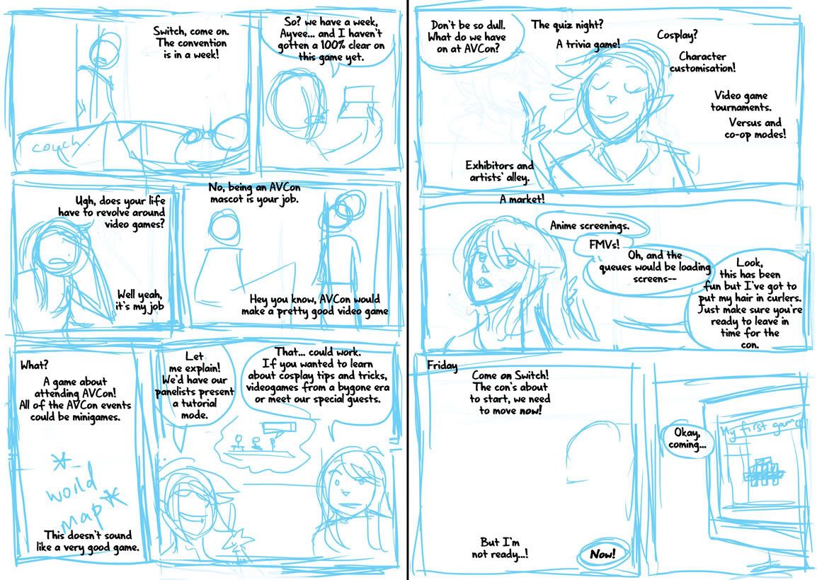
Step 1: Once I’m happy with the script (ie, once I realise that time is short and there’s no point in rehashing it if I’m not going to be able to draw the comic by the print deadline), I rough the panels. This really happens in tandem with step 0, as sometimes it isn’t clear how the dialogue is going to work and how the characters are going to feel on the page without doing some thumbnails.

I drew myself into a corner on my first attempt at the comic exactly because I’d failed to take into account the dialogue when initially imagining my panels. I’ll put up the failed page tomorrow.

Step 2: I’m fiddling with the speech bubble style. I want to give off a bit of a manga feel, so I do some font-hunting and find one that looks good in all caps and has a lenient publishing/royalty policy. I also put some thought into the design of my word balloons – instead of going for perfectly rounded ones I emulate the dynamic shapes seen in manga. I also choose tall word balloons where possible, like those used to accommodate the vertical dialogue in Japanese works.

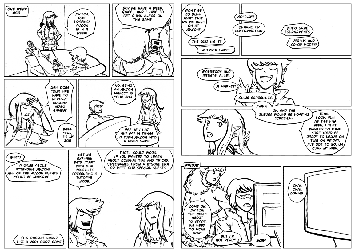
Step 3: Inking. I’ve taken the blue roughs, printed them onto watercolour paper, and inked over them using a dip pen. I enjoy using the dip pen to create the lineart as it’s easy to manipulate line weights and I get a really crisp line. I’m also coming up against time – so my choice to go with real media is to force myself away from obsessiveness about perfection. There are flaws in this lineart, but at least I’ve gotten it done.

Step 4: Corrections. Errors and untidy lines are tweaked in Photoshop.

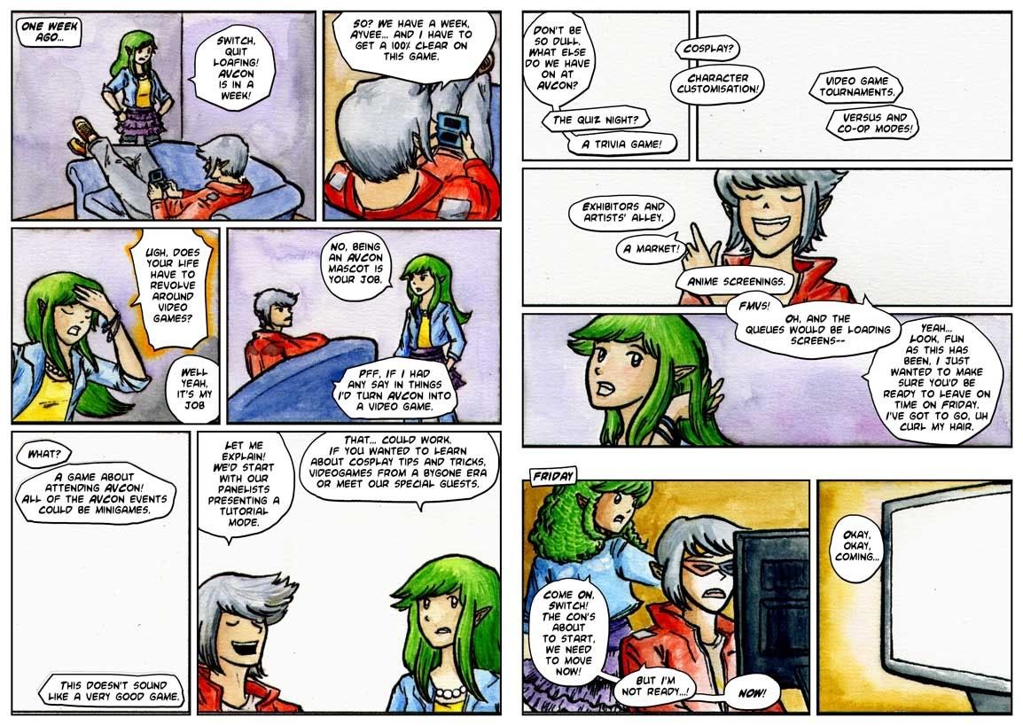
Step 5: I’ve printed out the new lineart again. The mistake? Doing it on my inkjet printer, which I’d previously found to be acceptably waterproof when working over light print like pale blue, but which has obvious bleed issues when using black ink. I’ve also lost a fair bit of detail in the lineart.

I’d used my inkjet to save time and because I’d had other issues with painting on laser printed lineart in the past. The answer is probably to just work on the one piece of paper from start to end, but I did need to make corrections throughout this piece so it wouldn’t have been the right solution in this case either. Perhaps I should do colours first and lineart last?

Initial colour choices here. The important one was making the distinction between the first and second scenes. My panel layout shows a passage of time through the wide gap between the third and fourth rows of the comic in the second page. The colours serve to further emphasise that the characters are in a different setting.

Step 6: I’ve finished most of the colours, and this isn’t so much a step as an experiment. Here I’m trying to restore the original lineart that got ruined by the poor print quality and the bleeding of the inks that happened when I was watercolouring over them. I’ve done some Photoshop magic to try fill the blacks in based on the colours around them and have laid the original lineart over the top. It looks crisper, but the colours that were evident where the colour meets the black are lost, and many areas appear washed out or to have a weird rim around them.

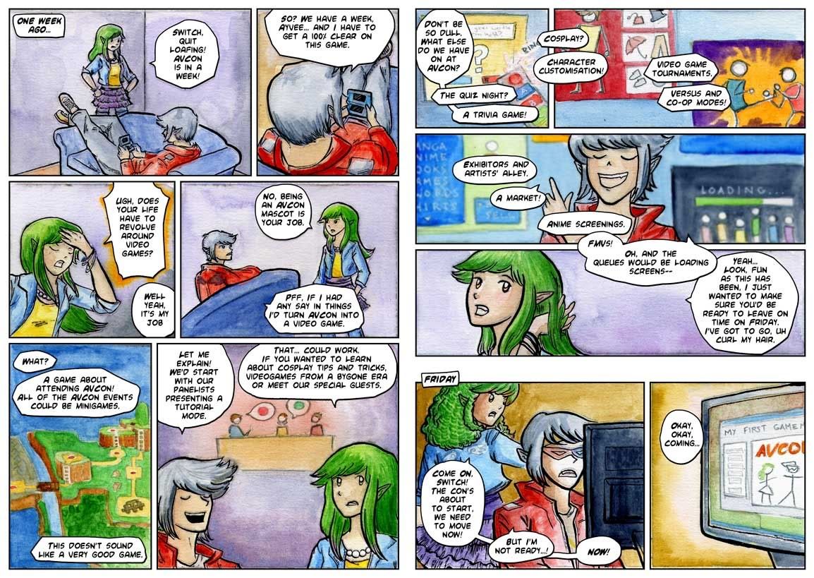
The finished comic
I decide to not bother with a perfect lineart restoration as some areas where the colour meets the lineart actually rather appeal to me. I focus on cleaning up the areas of highest detail and where the restorations are easier. Also, I’ve added Ayvee’s bow in the second-to-last panel digitally, making sure to get the texture of the colouring consistent.

Posted in: Behind the Art, Watercolours, WIP | Tagged: avcon, process, watercolor

Sunday Sketch Summary

Posted on August 7, 2011 Leave a Comment

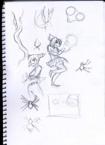
Some pages from my sketchbook, spanning just over a week of stuff. Some rough ideas for an arcade stick design (nothing usable…) some meandering thoughts and some Zodiac related scribbles.


Posted in: WIP | Tagged: black and white, brush pen, dragon, ink, juri han, street fighter

Dragon Dance

Posted on May 11, 2011 Leave a Comment

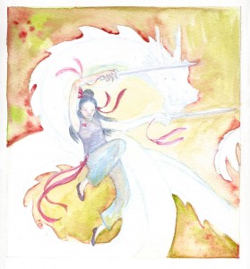
WIP: now I’m stuck deciding what colours to use for the dragon!

Posted in: Watercolours, WIP | Tagged: characters, colour, dragon, legend, myths, watercolor

Yu Long’s development

Posted on November 20, 2010 Leave a Comment

A couple of WIP scans. Click for biggenning.

I’m trying to push the colours and depth of tone in this one. Usually I get a bit wussy and hesitant about adding more and more glazes over bits that I’ve already spent so much time on. It’s going to be interesting trying to emphasise the whites.

Posted in: Watercolours, WIP | Tagged: dragon, horse, legend, myths, watercolor

Yu Long’s Transformation

Posted on November 5, 2010 Leave a Comment

In the famous Monkey story, the Monk spends most of his time travelling on a white (okay, grey for you horse enthusiasts) horse. This horse was actually a dragon – Yu Long, the third son of the Dragon King of the West. He was sentenced to death for burning his father’s pearl and saved by the Goddess of Mercy in order to fulfil the role of the Monk’s steed. (Which was actually quite unnecessary until he accidentally ate the Monk’s horse on their first encounter).

Anyhow, Yu Long then earns a bit of a beating from Monkey and joins the group, after which he spends most of his time stuck as a horse and devoid of personality. I’ve always held an interest in the White Dragon Horse. There’s such potential there that I’d love to see explored. I think in the original story he only gets a couple of opportunities to shed the horse disguise during crises and although he gets to pull some neat tricks I don’t think he actually has much success with his contributions.

Now that you know all about him, maybe you’ve got an idea of why I wanted to draw him.

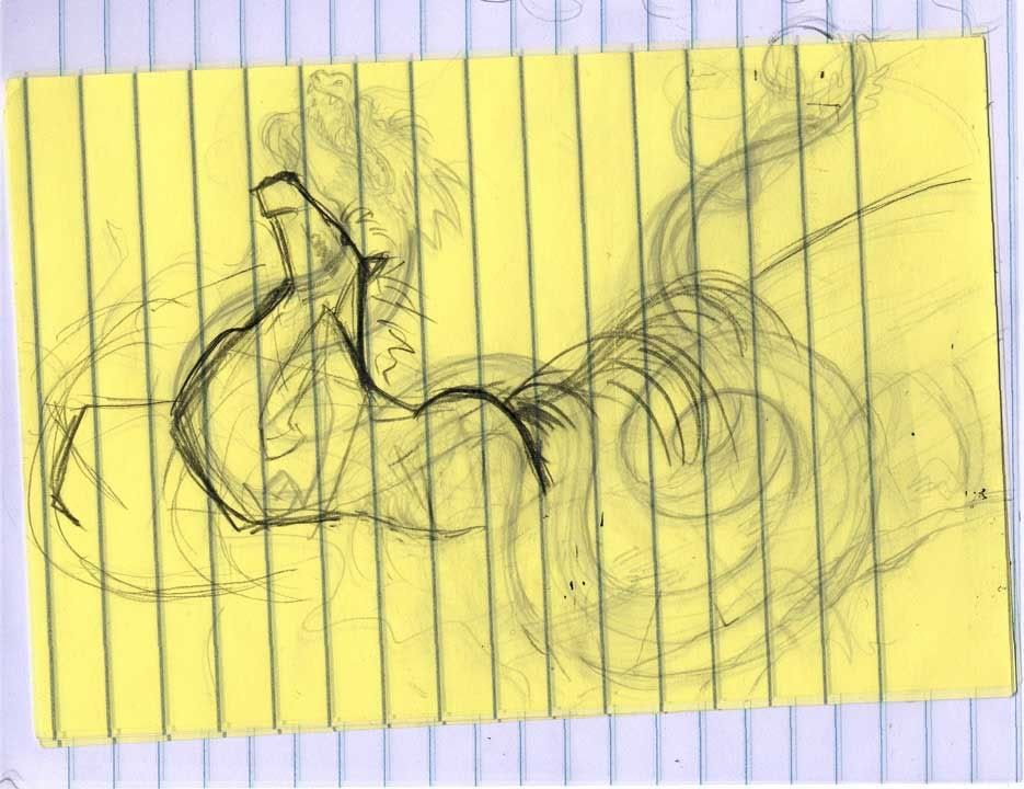
The latter stages of thumbnailing:

Thumbnails

Post it notes were kind of handy for seeing through to the previous sketch layer

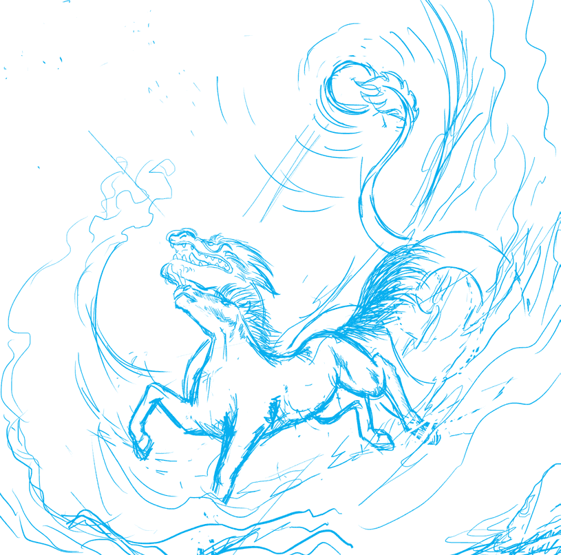
And a more developed sketch. I wanted to add more things to hint at his involvement in the story (however limited that involvement was). The orb in the sky with his tail wrapped around it is supposed to represent the great pearl. I was thinking of putting in some birds to represent where he was found (Eagle Sorrow River), and his brief stint disguised as a princess during which he sang and sword danced for the amusement of a demon lord (and as an attempt to assassinate him). However I think the top left where I’d planned to put them is better left open.

Yu Long leaps from the waves

Water manipulation is easy for a dragon.

Posted in: Digital, Line Drawings, WIP | Tagged: dragon, horse, legend, myths

You Promised Me Wings

Posted on September 30, 2010 3 Comments

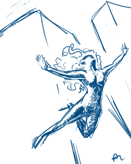
Y’know I think I’ve attempted something like this a few times before but this time I was a bit more persistent and I’m pleased with the result so far.

Here’s the “thumbnail”.

You Promised Me Wings

I had fun with the scratchy shading.

Next: to work out the background! While I’m in a persistent mood I’ll tackle that important element I always avoid…

Posted in: Digital, Line Drawings, WIP | Tagged: angel, composition, Digital, flight, jump, sketch

Juri, continued…

Posted on September 20, 2010 2 Comments
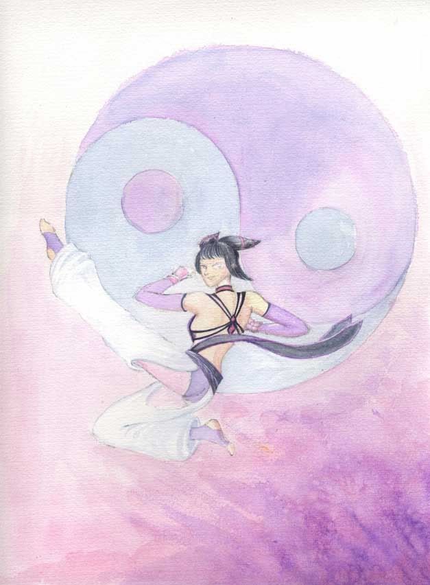
Juri Flies

It's coming together now!

This was why I was redrawing the image with pencils – it’s going to be a watercolour painting. Here’s most of the flat colours down and some areas in a near complete state – I will probably leave those until the image is closer to completion. Uncompleted bits include most of the purples and pinks. These will get deepened with progressive layers of pigment. I’ve also yet to start trying to detail her face.

It’s kind of interesting to note that when I work digitally I feel as though I should start the image with some pencil scratchings to get into the groove. Similarly, when I want to do a painting or drawing I often want to play around digitally to get a feel for the image. Really I think it’s all about finding a happy medium 🙂

Posted in: Watercolours, WIP | Tagged: colour, fan art, juri han, process, street fighter, video games, watercolor

Pencils

Posted on September 19, 2010 Leave a Comment

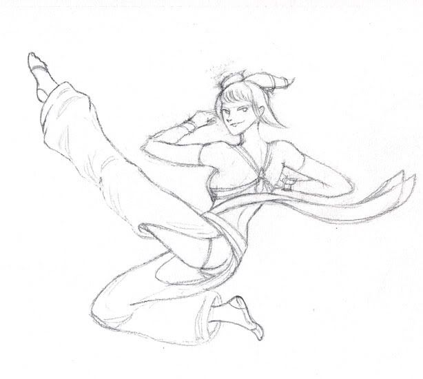
Wait, pencils now? What’s going on here?

Juri Pencils

Sketched out again.

Posted in: Line Drawings, WIP | Tagged: fan art, juri han, process, street fighter, video games

A Compositional Sketch

Posted on September 4, 2010 14 Comments

Maybe this will become a fully fledged picture?

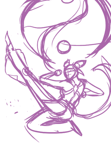
The goal here was to have some interesting action with the character but to not lead the viewer’s eye ‘out’ of the image, rather, have their eye land back in the focal points of the image.

Juri Kicks

Ready to inflict some inJURIes. Hurr Hurr.

To be honest, I like the way that outstretched leg looks… even though it leads the eye out of the picture frame. I had experimented with tipping her toes to bring the flow of the image back towards the middle but that made the foot look a little odd. So, forcing the viewer’s eye back onto the image might not be the right approach. What do you think?

Posted in: Digital, WIP | Tagged: characters, Digital, fan art, juri han, street fighter, video games

Pink

Posted on August 31, 2010 1 Comment

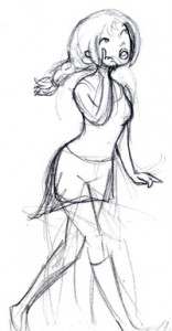
Character development and design:

EDIT: Very first draft added.

First Draft

The first draft - all I had in mind was the pose

Final Pencil Sketch

"Huh?"

Colour Test

Basic colour decisions - lots of pink!

I wanted to make her a blonde bimbo but apparently being cliche is dull.

As thoughtful as can be

Lots of charm, not so much going on upstairs...

Missing one image here actually, I’ll edit it in later if I can find it.

Posted in: Characters, Colour, Digital, WIP | Tagged: ariel, colour, Digital, ikea
« Previous 1 2 3 4 Next »

Recent Posts

  • Cricut Hacks #2 – Template frames
  • Rainbow Eagles
  • Cricut “Print and Cut” Hack – print bigger
  • Reflections on Tableturf
  • “Pearl’s Palette” custom keycaps

Archives

  • April 2025
  • November 2024
  • August 2024
  • March 2024
  • November 2023
  • August 2023
  • June 2023
  • April 2023
  • January 2023
  • December 2022
  • October 2022
  • August 2022
  • May 2022
  • April 2022
  • November 2021
  • September 2021
  • August 2021
  • August 2020
  • September 2019
  • August 2019
  • August 2018
  • May 2018
  • September 2016
  • August 2016
  • October 2015
  • September 2015
  • August 2015
  • April 2015
  • February 2015
  • October 2014
  • August 2014
  • July 2014
  • April 2014
  • March 2014
  • February 2014
  • September 2013
  • August 2013
  • July 2013
  • April 2013
  • March 2013
  • January 2013
  • December 2012
  • October 2012
  • September 2012
  • August 2012
  • July 2012
  • May 2012
  • March 2012
  • January 2012
  • December 2011
  • November 2011
  • September 2011
  • August 2011
  • June 2011
  • May 2011
  • March 2011
  • January 2011
  • December 2010
  • November 2010
  • October 2010
  • September 2010
  • August 2010
  • April 2010
  • March 2010

Blogroll

  • Hallucinfection
  • Jp's Lab
  • Leaflocker
  • Telling Stories

Copyright © 2025 Chenonetta Creations.

Theme by themehall.com.