watercolor
Fan-Art Friday #2: Ranma 1/2
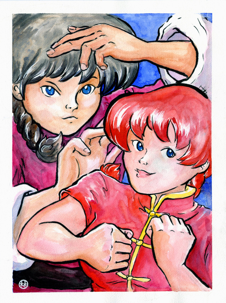
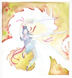
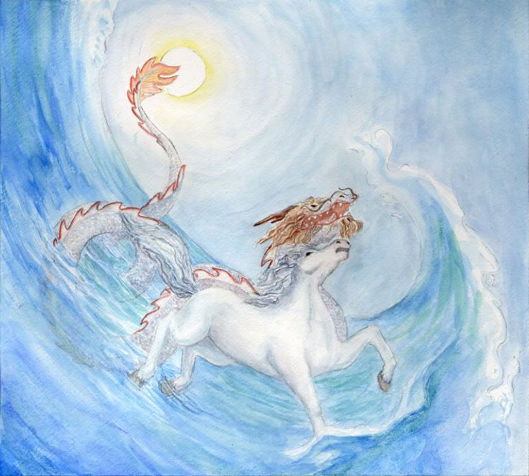
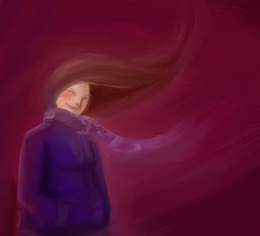
Is it any secret that I love Ranma 1/2? Ranma is the first anime that I watched, way back when. I believe it was the OVA How to Boil Water. Good times.
This painting has a way closer camera than I normally ever use. It put me quite out of my comfort zone – not a bad thing, but there are definitely issues with it as a result. Well, it’s practice!
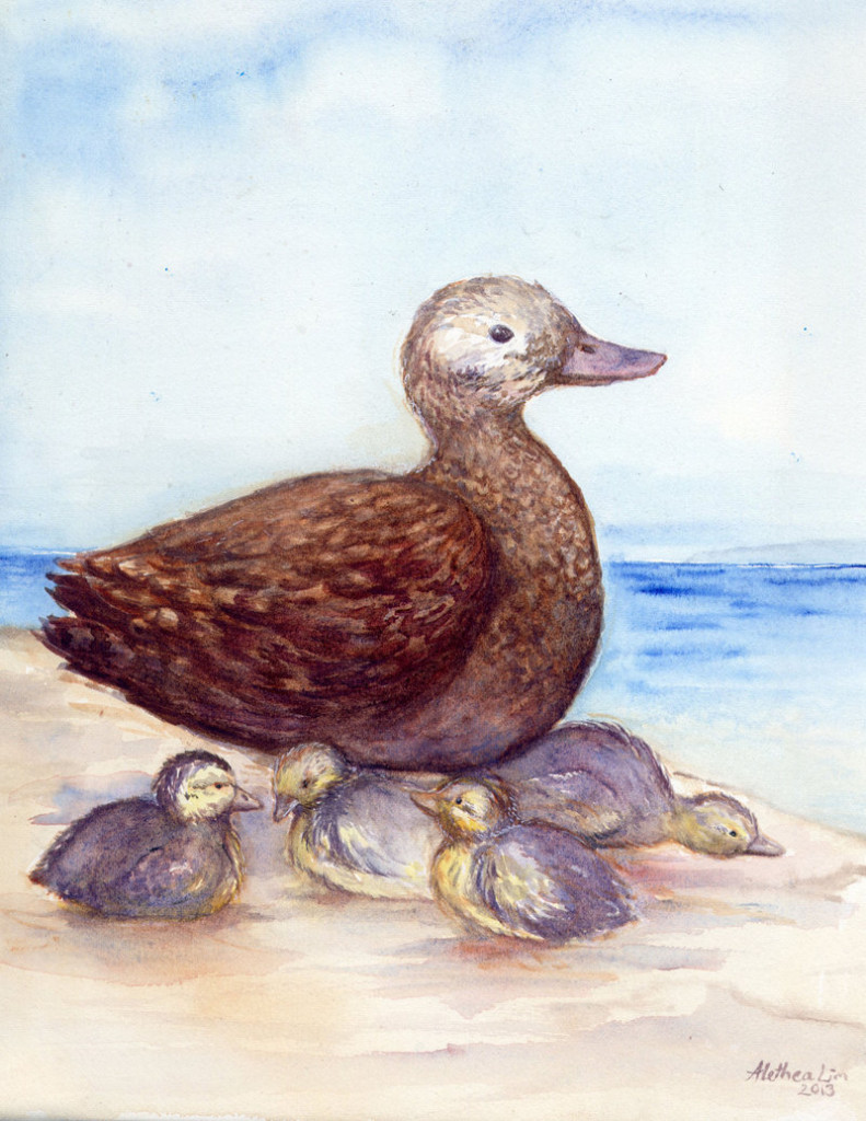
Midway
This is my submission for the Losing Altitude collaborative art book, featuring endangered bird illustrations from a ton of talented artists.
Since I like ducks, I chose to paint the Laysan Duck for the book. The Laysan was at one point in critical danger of extinction with a population of only 7 adults and 5 juveniles. By the 1950s they had recovered to around 500 individuals and later a small population was moved to Midway Atoll to ensure that any disasters on Laysan would not result in the extinction of the species. My painting is named “Midway” for Midway Atoll – it also makes reference to the fact that conservation is a continually ongoing process.
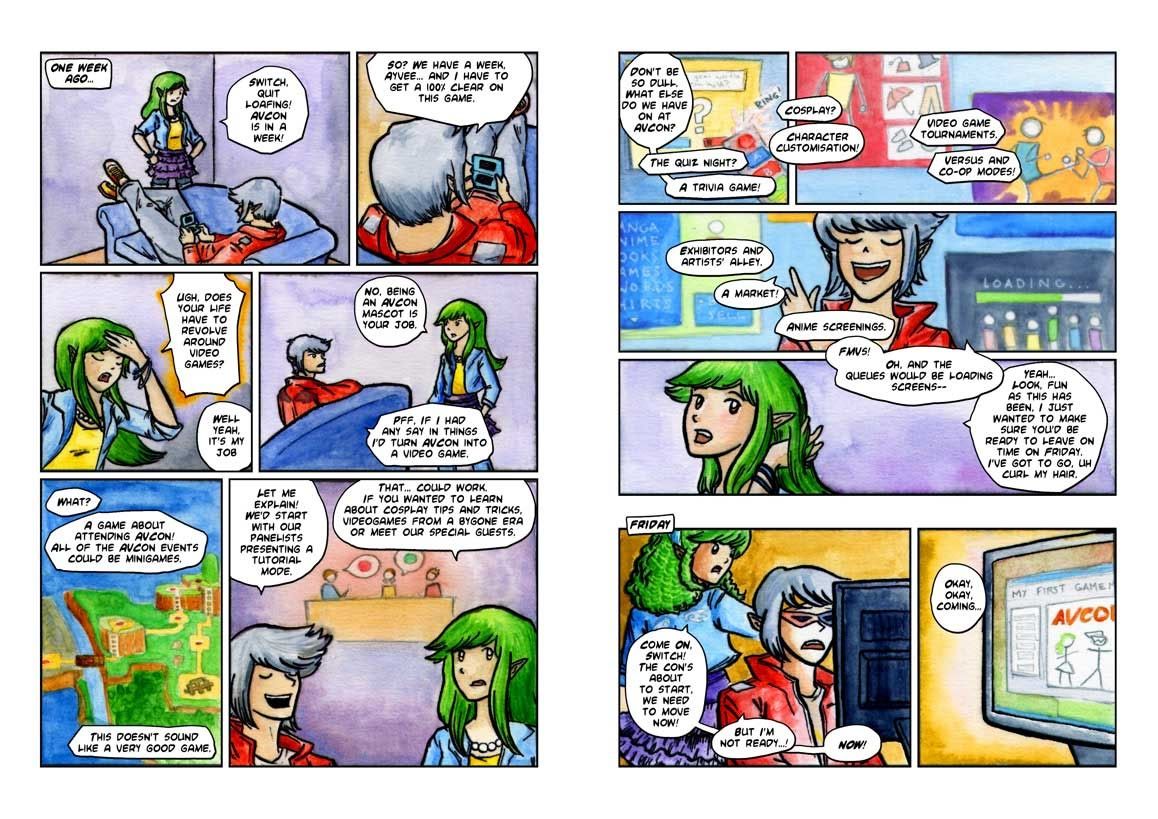
The AVCon Booklet Comic: The Making Of
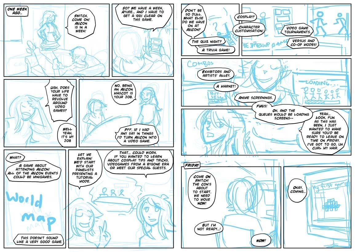
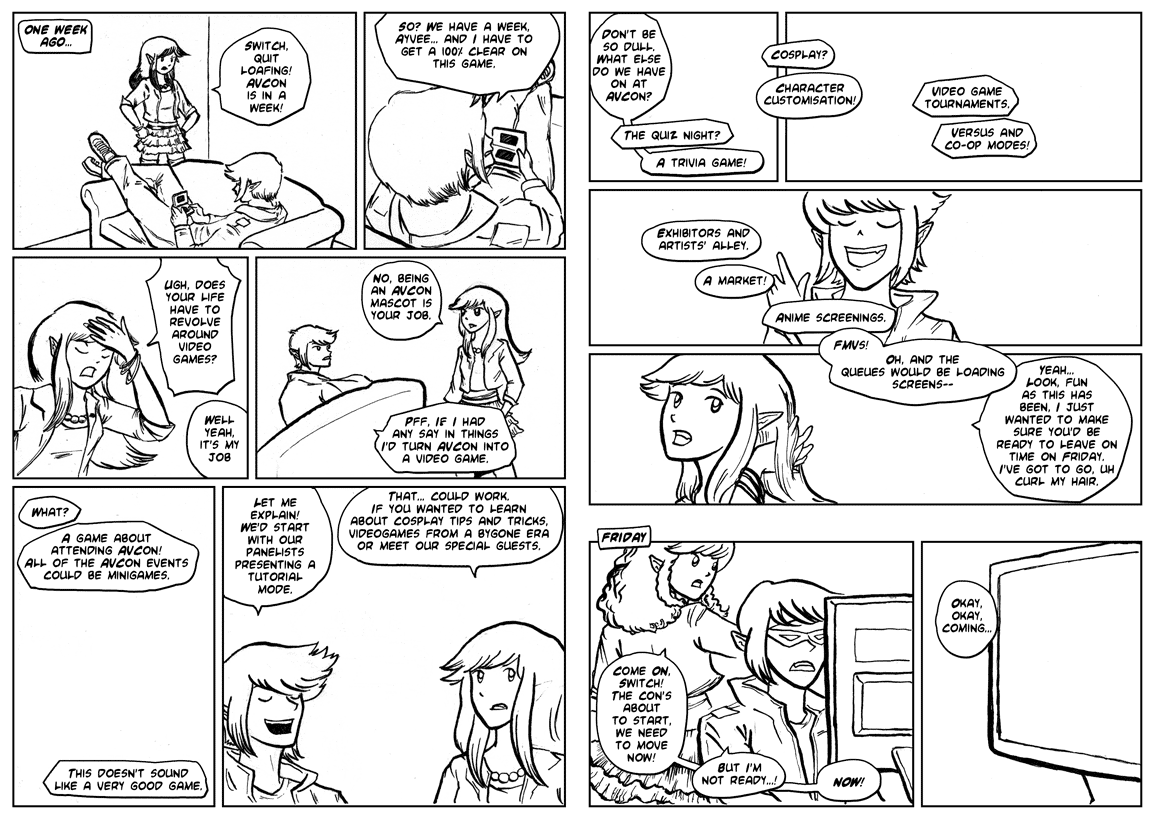
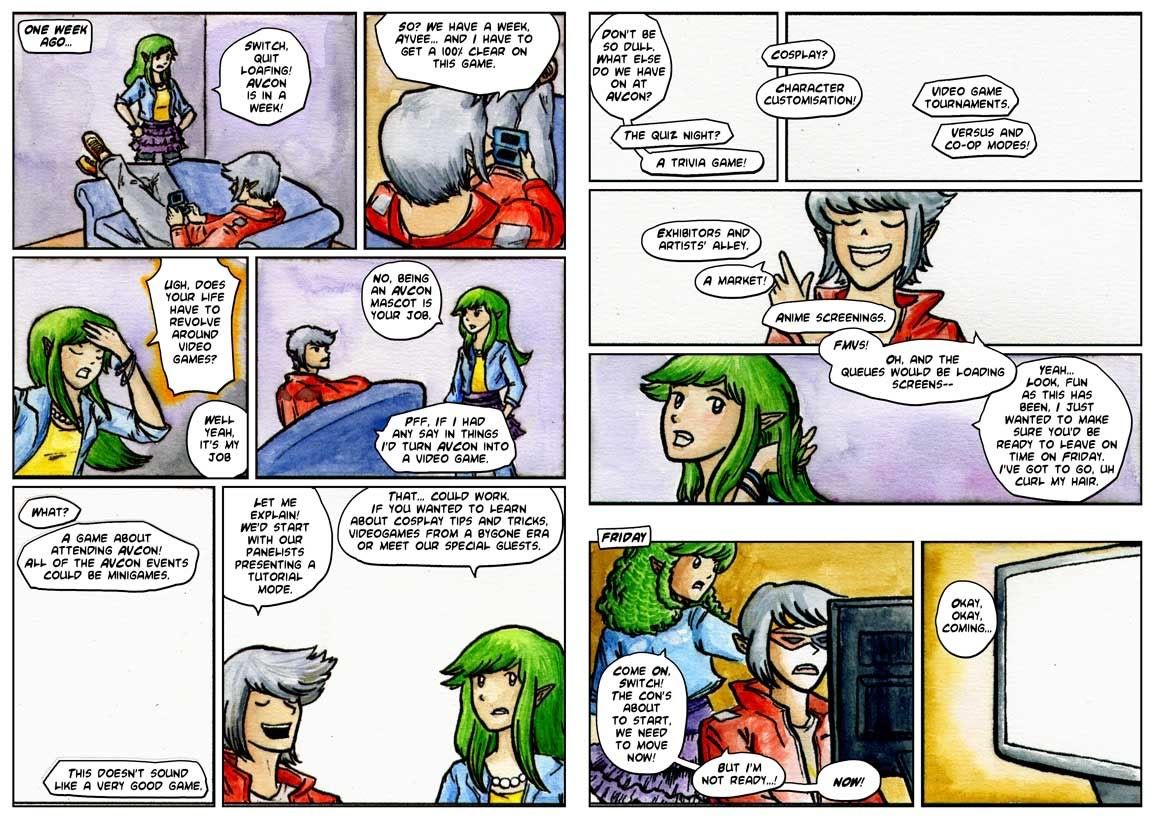
A step through of the creation of the booklet comic.
Step 0: I write a script. It starts from a bit of stream of consciousness as I play around with what the characters would say. I then split the script into scene and dialogue transitions – working out the pacing. Where would be the best spot to move the panel focus? How do I fit all this text onto the page? My original script gets sliced in a way that needs four pages. I revise and re-revise on this, now that I have an idea of the tone of the comic.
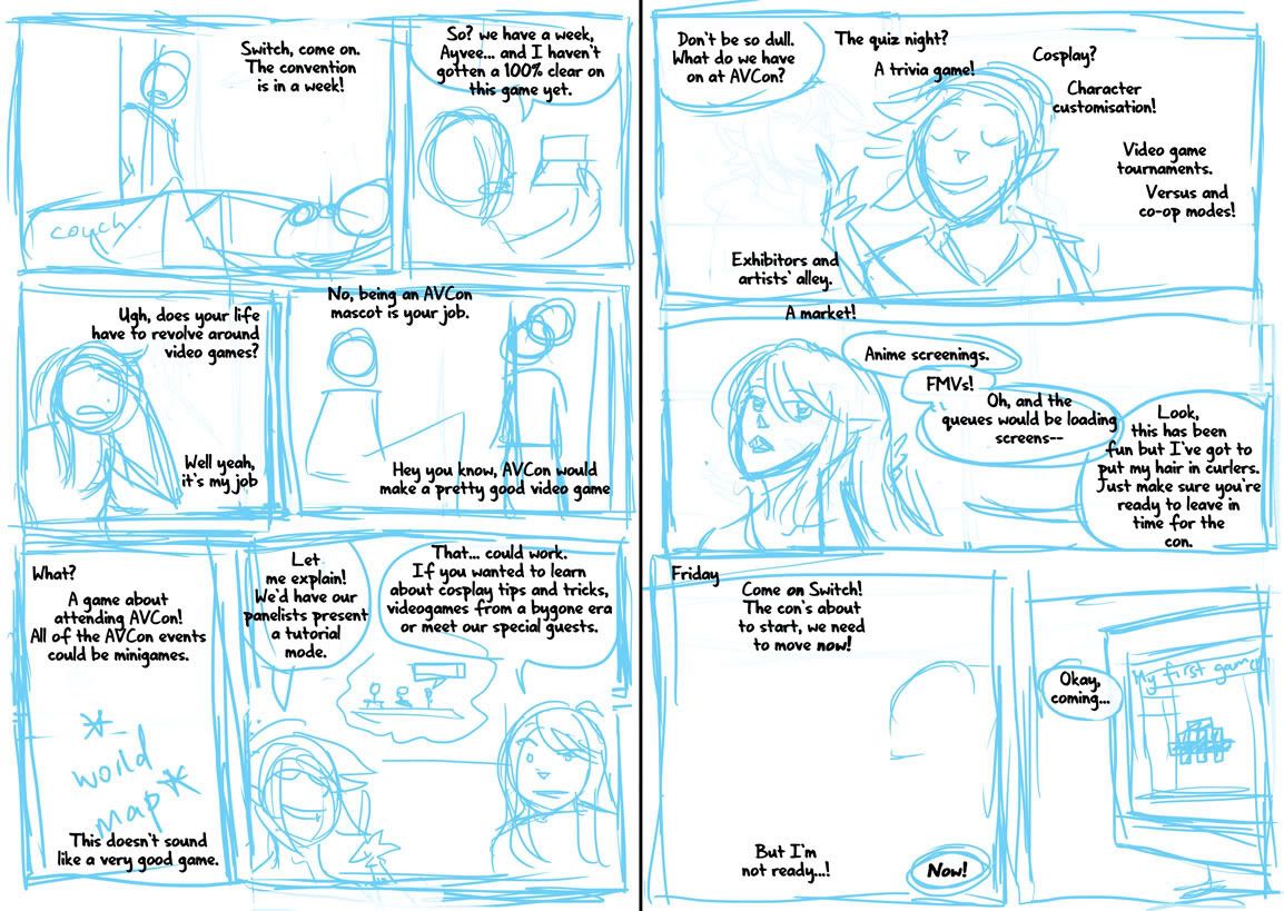
Step 1: Once I’m happy with the script (ie, once I realise that time is short and there’s no point in rehashing it if I’m not going to be able to draw the comic by the print deadline), I rough the panels. This really happens in tandem with step 0, as sometimes it isn’t clear how the dialogue is going to work and how the characters are going to feel on the page without doing some thumbnails.
I drew myself into a corner on my first attempt at the comic exactly because I’d failed to take into account the dialogue when initially imagining my panels. I’ll put up the failed page tomorrow.
Step 2: I’m fiddling with the speech bubble style. I want to give off a bit of a manga feel, so I do some font-hunting and find one that looks good in all caps and has a lenient publishing/royalty policy. I also put some thought into the design of my word balloons – instead of going for perfectly rounded ones I emulate the dynamic shapes seen in manga. I also choose tall word balloons where possible, like those used to accommodate the vertical dialogue in Japanese works.
Step 3: Inking. I’ve taken the blue roughs, printed them onto watercolour paper, and inked over them using a dip pen. I enjoy using the dip pen to create the lineart as it’s easy to manipulate line weights and I get a really crisp line. I’m also coming up against time – so my choice to go with real media is to force myself away from obsessiveness about perfection. There are flaws in this lineart, but at least I’ve gotten it done.
Step 4: Corrections. Errors and untidy lines are tweaked in Photoshop.
Step 5: I’ve printed out the new lineart again. The mistake? Doing it on my inkjet printer, which I’d previously found to be acceptably waterproof when working over light print like pale blue, but which has obvious bleed issues when using black ink. I’ve also lost a fair bit of detail in the lineart.
I’d used my inkjet to save time and because I’d had other issues with painting on laser printed lineart in the past. The answer is probably to just work on the one piece of paper from start to end, but I did need to make corrections throughout this piece so it wouldn’t have been the right solution in this case either. Perhaps I should do colours first and lineart last?
Initial colour choices here. The important one was making the distinction between the first and second scenes. My panel layout shows a passage of time through the wide gap between the third and fourth rows of the comic in the second page. The colours serve to further emphasise that the characters are in a different setting.
Step 6: I’ve finished most of the colours, and this isn’t so much a step as an experiment. Here I’m trying to restore the original lineart that got ruined by the poor print quality and the bleeding of the inks that happened when I was watercolouring over them. I’ve done some Photoshop magic to try fill the blacks in based on the colours around them and have laid the original lineart over the top. It looks crisper, but the colours that were evident where the colour meets the black are lost, and many areas appear washed out or to have a weird rim around them.
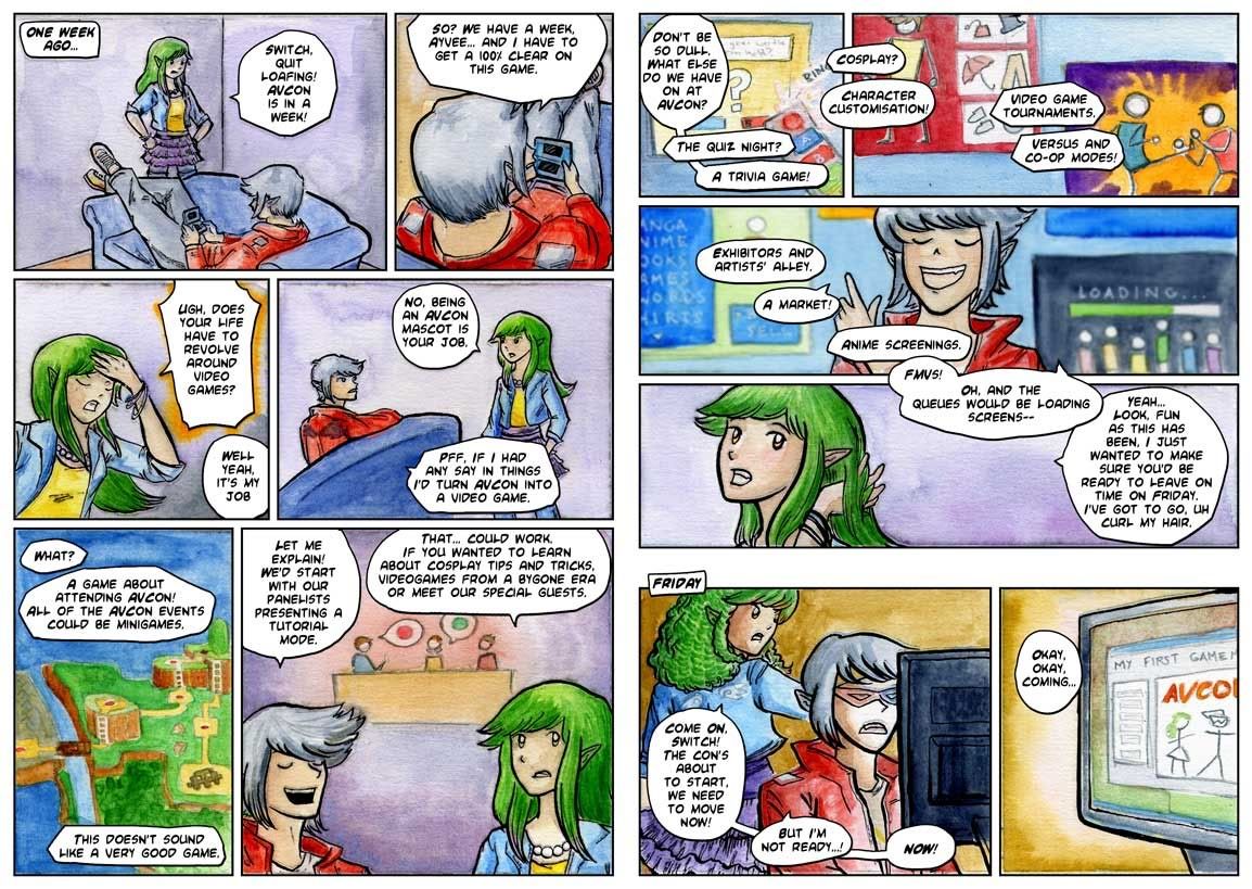
The finished comic
I decide to not bother with a perfect lineart restoration as some areas where the colour meets the lineart actually rather appeal to me. I focus on cleaning up the areas of highest detail and where the restorations are easier. Also, I’ve added Ayvee’s bow in the second-to-last panel digitally, making sure to get the texture of the colouring consistent.
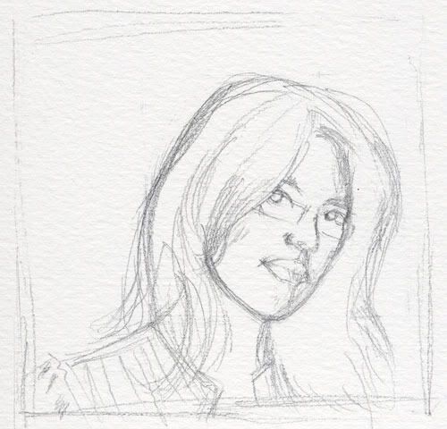
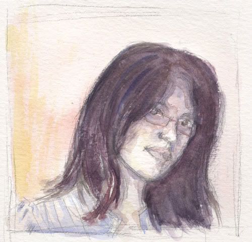
Simple Self Portrait
I was inspired after attending the ACSA’s 2010 graduate exhibition. Today was the last day of the exhibition so I was glad to catch the show before it ended.
Since I’ve been dabbling in watercolours lately, the watercolour portraits by Ruby Chew were really awesome to see. When I’d caught glimpses of the graduates putting up their work I had no idea that there would be her 52 marvellous mini portraits included alongside her large canvas paintings.
With Ruby’s works fresh in my mind I thought about restricting my palette to just the three primary colours to depict myself. I’m no master in watercolours or portraiture, but this was a fun exercise that I’ll probably try out some more over the weekend.
The Cutting Room Floor
Yesterday I completed the more-difficult-than-expected task of selecting a number of images to feature in my portfolio. I set a limit of ten images and tried to gather a set of images that gave a rounded representation of what I can do.
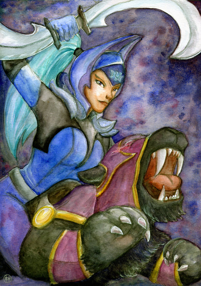
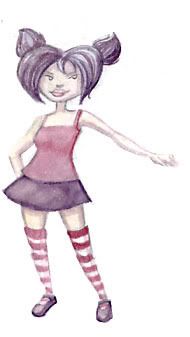
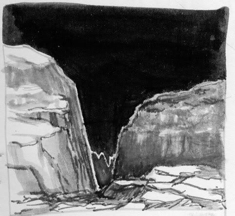
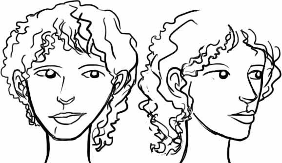
While trawling through work recent and old, I found a number of pictures that never got the chance to see the light of day. Here’s a few that I rather like.
There’s plenty more! When I started this blog I had an idea of diving into old work to examine what I’ve been doing in the past. Maybe this is the start of bringing that idea to life.

