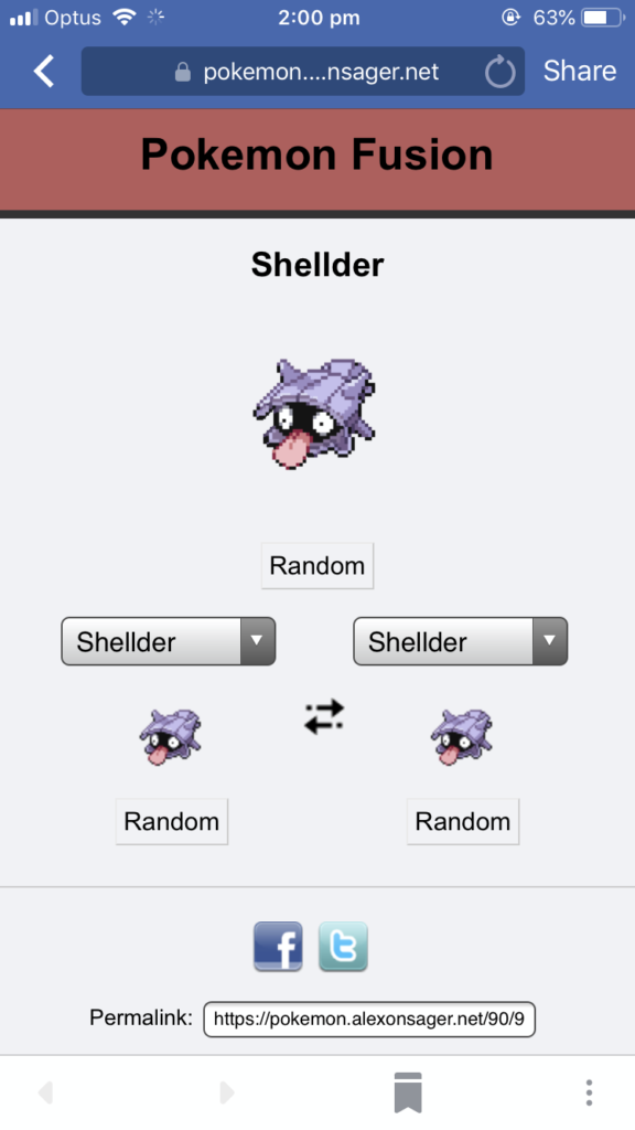
So when I was stuck for what to draw today, Shellder seemed as good a choice as any. This little guy is actually a bit tricky to draw in ways I hadn’t expected, but lookit it, so cute!
By chance, some dear friends (UnwiseOwl from the Leaflocker and Havra) dropped into my Tetris stream the other night so we decided to play and stream some impromptu games of Mah Jong.
After that, Havra tempted us into another game tonight, so of course we had to oblige! This left me without a lot of time to eke out some art for tonight, so I took inspiration from the game and drew what I could between hands.
A little while before Blaugust started, I found myself with the itch to pick up art projects. I guess I saw Blaugust on the horizon and wanted to bulk up on content.
On Twitter, I saw a bunch of animation students needing people to work on content for their animations. That was seriously tempting, then I remembered the pressure of being responsible for people’s uni assignments (something I had some experience with when doing laser cutting jobs a few years ago) and I cooled on it a bit.
After that, I saw someone in the PAX Australia Enforcer group asking for someone to draw up some maps and logos for their DnD game. That sounded pretty nifty, and would flex some skills that are somewhat weak for me.
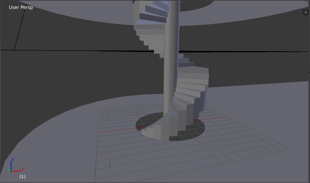
They sent over a hand-drawn map which included descriptions of a building with a number of floors. I initially decided I’d try modelling it in 3D. Here’s a close-up of the staircase, which was a fun little puzzle to try to solve.
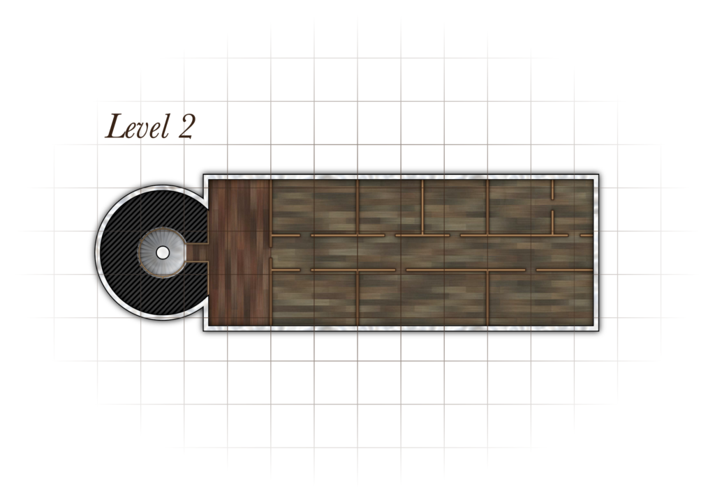
The 3D floorplan really wasn’t working and it tripped me up a bit. So I decided to go back to basics – draft out the floorplan in Illustrator and then draw in details in Photoshop. I improvised somewhat with the rooms as the initial sketches just described a run down interior. You’ll recognise the floorboards from an earlier post!
Eventually, working in Photoshop and making adjustments to the actual layout of the building got quite cumbersome, especially when the interior walls needed to be changed to be wooden panels rather than stone. Maintaining both the untextured Illustrator version and the textured Photoshop one became a pain, because my Photoshop layers would no longer match up to my vector outlines.
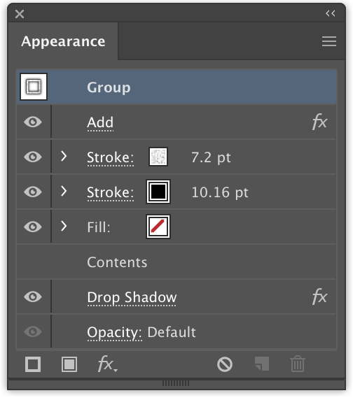
I moved as much as I could back into Illustrator. For the walls, I used a number of appearance modifiers to create the lines. A single path therefore displayed its texture and a dark outline without me needing to draw in any fills. This made readjusting stuff much easier!
Here’s the completed floor. We left these rooms bare as the players will be furnishing them.
Since this is now a vector artwork I lost the crinkled paper effects that I could achieve by using a displacement map + multiply layer in Photoshop, but there’s nothing stopping me from just doing that as an extra step at the end of the process.
I learned a lot while drafting this floor. However I’ve been quite slow in turnaround time. The requester has been very patient with me!
I’ve since asked for their permission to post the work on the blog so if we do future floors I will be able to utilise them as my daily blog posts. That way I won’t be trying to do a daily sketch AND make revisions in the same evening.
Lately we’ve been streaming our board game misadventures.
With the webcam set up over our table, we can capture a reasonable amount of the play area, but things are quite hard to read. So I’ve been experimenting with some overlays to convey pertinent game information.
Here’s a demo of the overlay in action – the popup in the top left only appears for a little while when I change the “last tile visited” variable, and the player information allows us to track all of the different resources and upgrades that the players pick up along the way.
I think keeping the overlays updated is quite the distraction though – I guess that’s my excuse for John going 3-0 undefeated tonight!
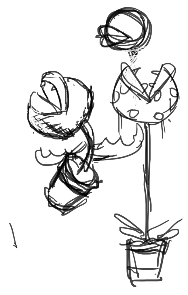
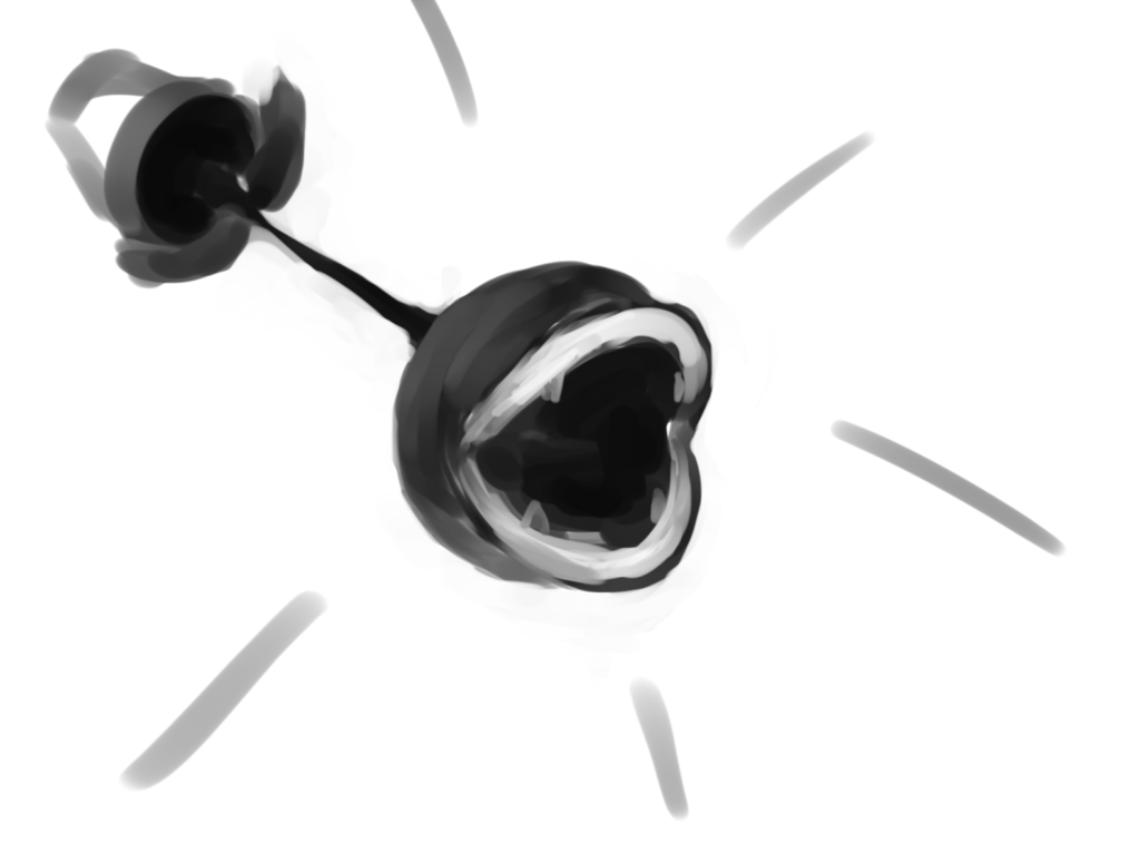
Currently working on some stuff I can’t post (taking my own advice and *not* using Blaugust as an excuse to put off major projects) so here are some sketches from my bus ride today.
Piranha Plant is my new Smash Bros main. I was hoping maybe I’d be able to put up some more complete pieces but I’m sure this won’t be the last we see of it this month.
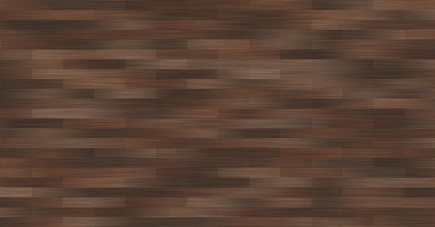
I had a bit of fun yesterday trying to create a floorboard texture – I wasn’t feeling like drawing because my hands were a bit sore so I set myself the goal of doing things with just photoshop filters! Here’s a guide of how I achieved the look using just the Add Noise and Motion Blur filters.
Here are the ones I made yesterday. Below I try recreating the method and providing a walkthrough. I think today’s recreation is a little less successful (I started too dark) but the concepts applied can be experimented with endlessly to create a variety of different fun textures!
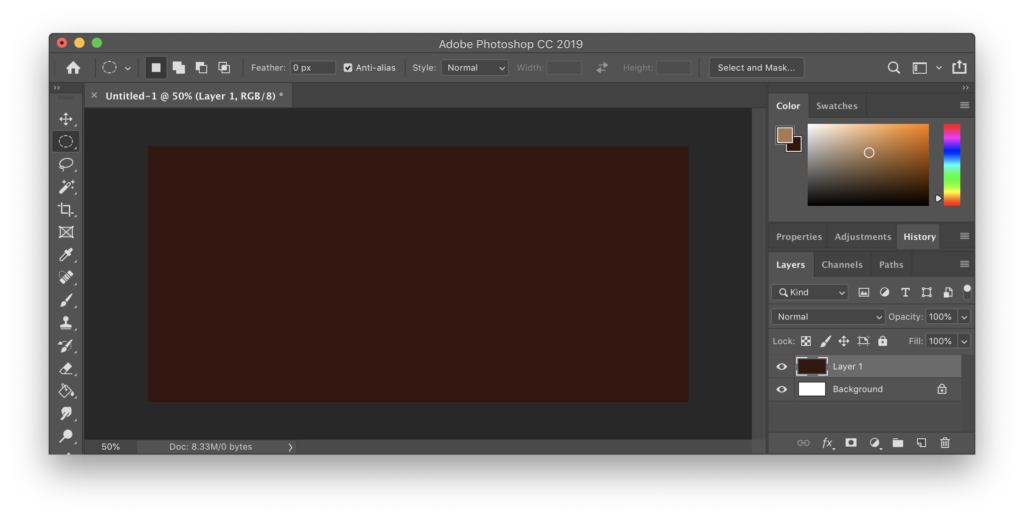
Step 1: Fill the canvas with brown
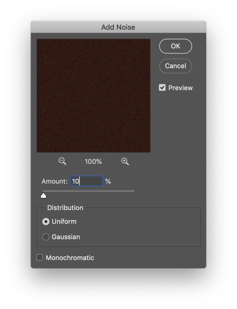
Step 2: Add noise – Leaving Monochromatic unticked at this point will provide a bit of colour variety. A low Amount % will still allow the brown to be the dominant colour.
Step 2.5 (optional): Select the whole area and enlarge it – this one has been scaled to about 400% of its original size. In this step the interpolation mode doesn’t matter as much, in later steps we want to use Nearest Neighbour interpolation to do enlargements.
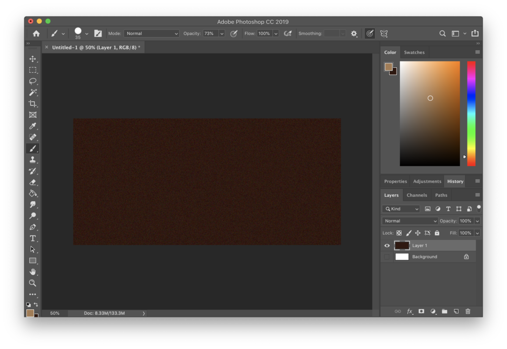
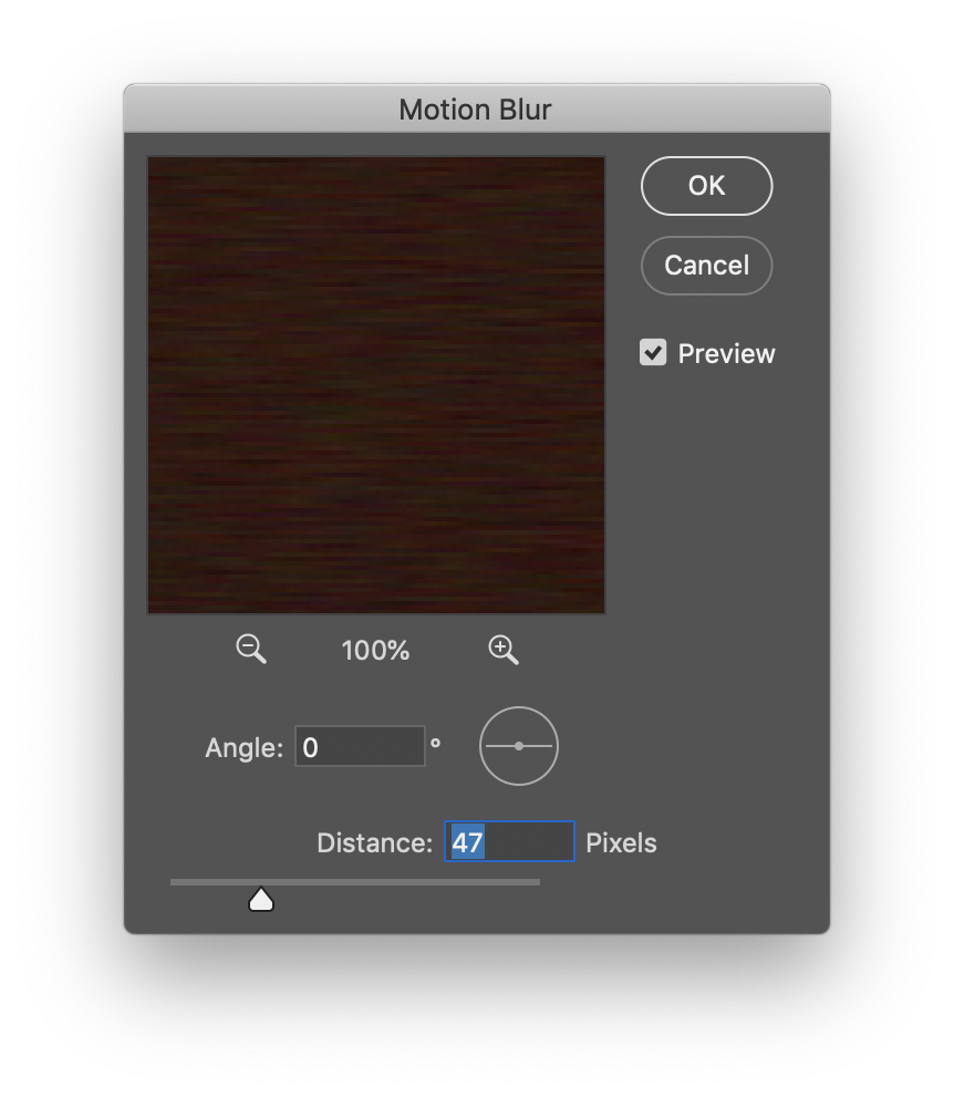
Step 3: Motion Blur. The distance of the blur will affect the grain of the “wood” 🙂
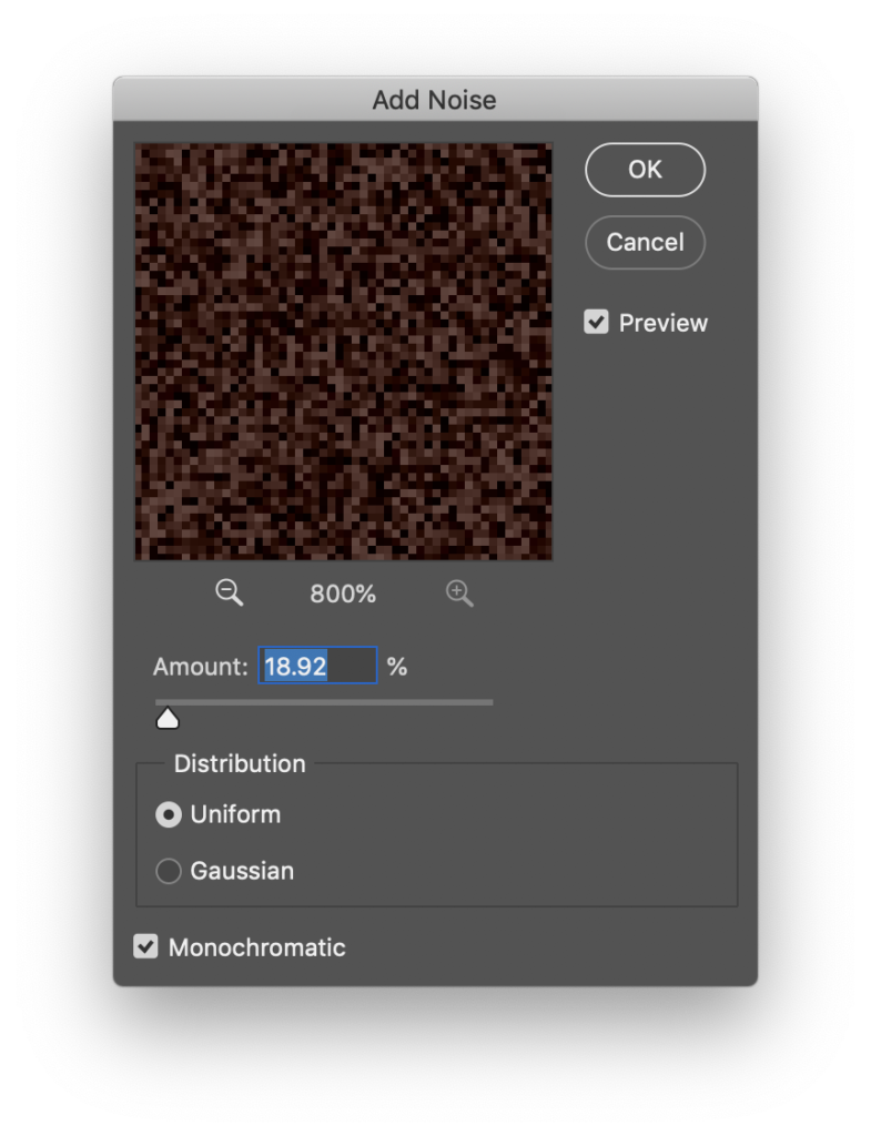
Step 4: Starting on the planks. Fill a new layer with brown again and then enter the add noise menu. This time I create select the monochromatic option
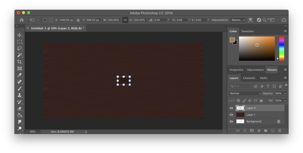
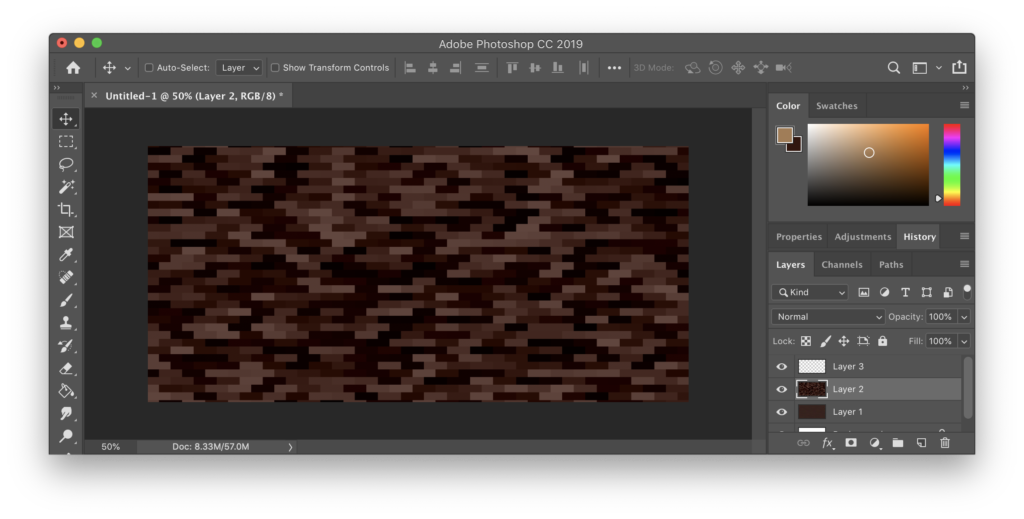
Step 5: Making blocky shapes. Select a small area of the pixels and then enlarge them to 200% of their original size, making sure to use Nearest Neighbour interpolation.
Step 6: Offsetting blocks Select every second row and displace them horizontally by one pixel.
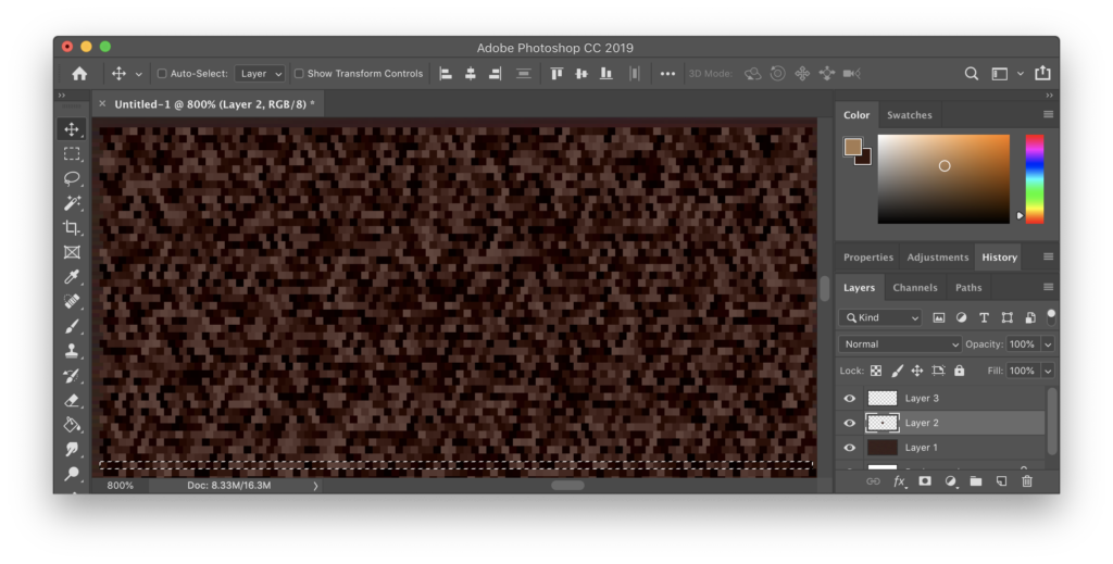
Step 7: Enlarge the planks. Using nearest neighbour interpolation again, enlarge the planks. You want them to be wider than they are tall.
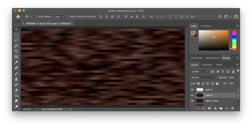
Step 8: Take a copy of this layer, then apply a motion blur to it.
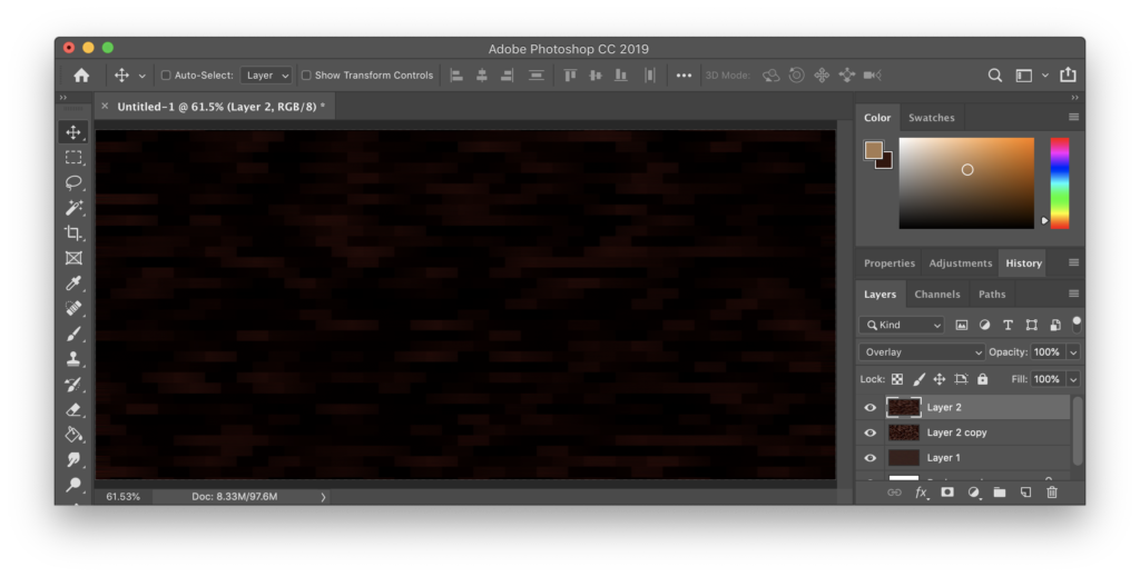
Step 9: Change the blend type on the layers. I recommend experimenting with overlay and multiply! I started this example using very dark colours so I now need to adjust them!
Step 10: Colour adjustments done. For this example I’ve just set the bottom layer to 50% opacity, the middle one to an Overlay blend with 20% opacity and the top layer to Overlay with 60% opacity. I’ve also stretched the middle planks layer so that the floorboards are much longer.
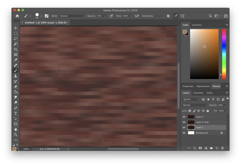
At this point you’re basically done. The edges of your generated floorboards will need to be trimmed, so make sure to plan for that.
You can adjust a few things to tweak the overall look of the floorboards – the lengths of the motion blurs, scaling the noise before the first motion blur, whether or not you add noise with the Monochromatic option ticked, and the pixel offsetting (try offsetting the overlay layers from one another so they don’t have the same highlights and shadows, or even use two completely different noise maps for each overlay layer!)
It’s worth also adjusting the colour balance of the two overlay layers too – the floorboards usually look better if there aren’t some really highlighted or dark ones sticking out.
And of course you can still do some manual adjustments to add more detail to your floorboards – maybe add shadows between them or add irregularities and whorls to the woodgrain.