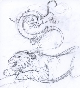
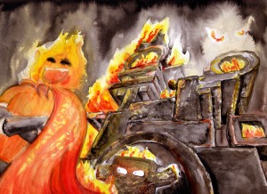
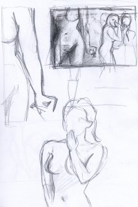
Chenonetta Creations

Find Me On...

  • deviantArt
  • Twitter
  • Mastodon
  • Instagram
  • Facebook
  • Bluesky
  • Home
  • About
  • Selected Works
  • Shop

Watercolours

Set Your Goldfish Free

Posted on October 29, 2012 Leave a Comment

This isn’t the painting I set out to paint, but I forced myself to see it through once it got going. The whole reason why I started this one is because I was dissatisfied with the way one of my other paintings was working out, so leaving yet another work abandoned seemed silly.

I don’t think it’s finished yet, but I’m not sure if I’ll push it much further either.

Posted in: Watercolours, WIP | Tagged: tmbg, watercolour

Mambray Creek

Posted on October 18, 2012 Leave a Comment

We spent the last weekend camping up at Mambray Creek. It’s the first time I’ve been camping in a long while, and it was such a lovely place. The wildlife was a highlight.

Although I took my paints with me, I forgot to bring my usual brushes! That caused a bit of panic, but I found that I had a Chinese calligraphy brush on me. I usually only use the calligraphy brushes with black ink, so I decided to make the best of matters and create a painting in greyscale.

When I finished the above painting I realised that I’d probably done myself a favour by forgetting the other brushes. Working in just black ink meant that I didn’t need to juggle the complexities of colour. I was able to work things up in tones, and if I got something in the wrong spot I was able to water it down or build up the things around it in order to make up for the mistake. That would be much harder to correct if I put the wrong colour down!

My suspicions were confirmed when I made an attempt at painting a vista scene over the hills using my watercolours. I ran into problems of managing colour, depth of field, and the problem of picking subject matter that didn’t have well defined forms. I abandoned that painting after not too long.

On Sunday I felt a desire to draw rocks.

At first I started this painting with a view straight into a wall of rock, and not long in I was going a little crazy. John however pointed out this view, just facing a little further up the track from where I was seated, which made for a much easier composition. With the shape of the left tree and the negative space around the rock edges it made it much easier to work out what I was looking at when I looked up and down between my painting and the reference.

Overall, a fun weekend with some nice art to boot. And I might even be convinced to go out and walk and enjoy the great outdoors more often now that I have some confidence that I can get some worthwhile paintings done.

Posted in: Tone, Watercolours | Tagged: watercolour

Ruby Slippers

Posted on October 18, 2012 Leave a Comment

Here’s some fan art for the marvelously fun and kitschy webcomic I Was Kidnapped By Lesbian Pirates From Outer Space! Lots of comics seem to be having planned breaks in the last week or so, and I was hoping to do fanart for other titles. I only got one done – I’m glad it was this one.

This was going to be a fan-comic to fit in with where the story was up to when it ended the last chapter. Then I realised my punchline had already been used in the comic, so I went on to just make that punchline into a nice painting.

Posted in: Comics, Watercolours | Tagged: comics, fan art, lesbian pirates, lpfos, watercolour, webcomics

Watercolour Exercises

Posted on September 9, 2012 Leave a Comment

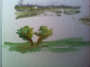
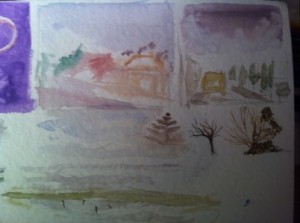
Some paintings based on examples and exercises from David Bellamy’s Watercolour Landscape Course.

Posted in: Watercolours | Tagged: watercolour

Watercolour scribbles

Posted on August 21, 2012 Leave a Comment

Painted on the way to Melbourne.

Posted in: Watercolours | Tagged: avcon

Balance

Posted on August 18, 2012 Leave a Comment

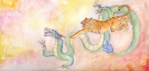
I painted this picture as a Christmas present for John back in 2010. When I uploaded it to deviantArt, I promised, “I’ll upload concept and progress sketches to my blog after Christmas.”

Wel’p Christmas came and went and another one too, and it’s finally time for me to fulfil that promise.

The Idea

I wanted to paint a picture that could be quite personal but would also be quite ‘accessible’ to the casual viewer as just a pretty illustration. Based on this I discarded the possibilities of doing portraits and looked instead to find suitable avatars of myself and John. The answer was quite simple – Zodiac animals. What fortune that I had such a great pair of animals to work with, too!

Rawr!

Conflict

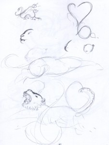
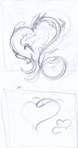
Do a google search for ‘dragon tiger’ and you’ll immediately find images of the two locked in combat. Frequently poised over a Yin-Yang symbol, the two animals represent balance.

My first concept sketches attempt to riff on this idea.

Finding my feet with drawing tigers…

<3

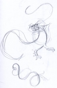
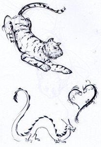
Finding nice flowing lines is easy when working in ink.


Purpose

The hearts felt hackneyed and the composition uncomfortable. I decided that I wanted to portray the dragon and tiger as an exuberant and harmonised pair. For this I decided to move them in the same direction, as though they were running toward a common goal.

A very tiny thumbnail with the new composition scribbled out. I think I’d intended originally to have the animals in some kind of setting, possibly clouds or a mix of cliffs and flames to go with the elemental years we were born in.

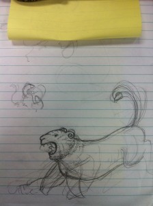
Scribbles to work out the tiger’s pose.

I wanted to present a quite stylised tiger. I had been inspired by a piece of art that had recently been printed on the back cover of ImagineFX.

More experimenting with the style and pose of the tiger.

Unfortunately my laptop was stolen around March 2011 so I’m missing all the Photoshop sketches and any progress scans I took. But for a quick run-down of my process I think it went something like this…

  • Sketches were scanned into Photoshop and composed into a rough arrangement.
  • The sketch was worked on in Photoshop, correcting awkward anatomy and finalising details.
  • The final lines were traced to the watercolour paper (probably straight from my computer screen, as I can’t find a paper-trail (hur hur) to indicate I printed the lines).
  • I laid down washes and underpainting, sprinkling in rubbing alcohol to create texture (it’s most effective in the little bubbles at the top left). I don’t think I used any salt for this painting, and if I did it wasn’t very effective!
  • Lastly I worked up the Dragon and Tiger in a series of layers. The dragon’s scales and the tiger’s stripes were probably added last. I also used a white gel pen to add texture (along the dragon’s hair and in the tiger’s mane).

Like many of my paintings, this one doesn’t have a lot of tonal depth as I was timid about laying down too much paint and being unable to correct mistakes. When choosing a frame and mounting board for the painting I kept this in mind and went for a light mount and a dark, rich frame to bring the viewer’s eye to the painting and complement the tiger’s stripes.

The framed painting now hangs above our bed.


Posted in: Sketches, Watercolours | Tagged: dragon, tiger, watercolour

Flameface: Process and Progress

Posted on August 11, 2012 Leave a Comment

With the KoL calendar contest deadline extended by a week, I had just one weekend to put together a new painting. Here’s some pics from the working process and some explanations of choices I made along the way.

Thinking in 3D

Once I knew that my piece was going to be based on the fire-fighting world event, I knew I had to illustrate Lord Flameface’s castle. And I needed to do so from an awesome angle, showing off the foreboding, smouldering fortress. Lord Flameface’s abode was a delightfully simple assortment of blocks so I knew I’d be onto a good thing if I created a model of the fortress in Google SketchUp first. I’d then use the 3D model to experiment with perspective and composition.
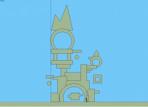
Straight-on view of the fortress model.

The camera angle chosen for the painting.

The Draft

Using my lightbox drafting table, I traced the SketchUp lines onto a sheet of watercolour paper for a test-run. Since this was my first watercolour piece in many months I wanted to get to grips with the paints again, as well as identify any potential problem areas in the image.

I initially planned to place an adventurer at the base of the fortress all kitted out in firefighting gear.

I learned that anywhere I wanted to put the flames down I’d need to leave the white of the paper to shine through. I fiddled with basic portrayals of depth by shading surfaces differently but felt that I’d need something extra for the final thing to make the fortress look hot and fiery.

The draft taught me a bunch of valuable things and particularly helped in setting the pace for the final painting. I realised that I’d have to be patient with use of the blank ink and not hurry with getting the smoky greys in otherwise I wouldn’t be able to paint effective flames.

Additional Elements

I identified some of the areas in the draft that I felt were really lacking and areas I wanted to portray better. I then googled images of fire and hot coals as reference and practised these elements on another spare sheet of watercolour.

Onto the Real Deal!

With the title for my painting decided, I opted to swap out the adventurer for Lord Flameface himself. On a new sheet of watercolour paper I marked out my margins and bleed margins, then sketched in Lord Flameface. I also traced in the fortress. Then, it was onto painting!

Underpainting in yellow.
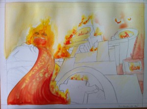
 

Introducing Reds.

I used Chinese calligraphy ink for the black, allowing me to drop in a lot of pigment at once and let it bleed about on the page.
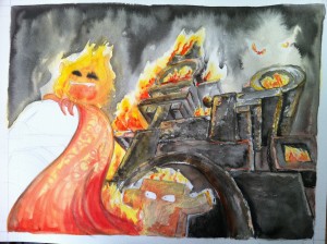
I let the sky dry before working on the fortress, to reduce the chance of the paint bleeding from the fortress into the sky. You can see the sky has dried a bit lighter than it was when the paint was first dropped in.
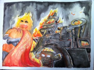
 

Final pass to finish off Lord Flameface and make changes to produce a cohesive image.

Finally, I scan the image and balance the colours a bit in Photoshop. The final result can be seen in Tuesday’s post.

Posted in: Watercolours, WIP | Tagged: fanart, kingdom of loathing, kol, watercolour

Lord Flameface Was Here

Posted on August 7, 2012 1 Comment

My entry into the 2013 KoL Calendar contest. My allocated month was June, so I chose to depict Lord Flameface from the June 2012 fire-fighting world event. Also, his fortress.
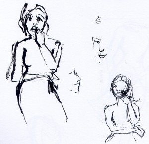
Saturday: All the bits that went into making this painting.

Posted in: Watercolours | Tagged: kingdom of loathing, kol, watercolour

Doubt – Concepts and Experiments

Posted on August 4, 2012 Leave a Comment

Saturday is concepts/walkthroughs day!

Here are the sketches and scribbles that went on to become the painting I posted on Wednesday.

The original concept was all about the raaaage in the foreground character and didn’t focus so much on the background pair.

A first play with the ink.

Building on the composition and the characters.

Final thumbnail.

Some different style experiments.

Posted in: Behind the Art, Watercolours | Tagged: acsa, homework, life drawing, process

Doubt

Posted on August 1, 2012 3 Comments

Blaugust is back, which means more blogging! I’m hoping to be able to provide lots of content this time, with the crutch of “old art” to help me fulfill that goal.

Click for larger view!

This piece is from my life drawing classes last year. The assignment involved drawing a self-portrait involving three figures composed in some kind of narrative. We were also supposed to take stylistic lead from another artist.

I chose to emulate Marlene Dumas’ ink drawings as I was at the time experimenting quite heavily with watercolours and inks. I combined her use of unpredictable washes with the sharply defined edges that can be attained by using masking fluid.

I got quite wrapped up in the narrative and the symbolism. I think our lecturer was specifically addressing me when she cautioned us against turning the assignment into an illustrative work. And although the assortment of (mostly) round shapes in the background on the right seem quite arbitrarily chosen, there is a meaning attached to each.

Posted in: Watercolours | Tagged: acsa, ink, life drawing
« Previous 1 2 3 4 5 6 7 8 9 10 11 Next »

Recent Posts

  • Cricut Hacks #2 – Template frames
  • Rainbow Eagles
  • Cricut “Print and Cut” Hack – print bigger
  • Reflections on Tableturf
  • “Pearl’s Palette” custom keycaps

Archives

  • April 2025
  • November 2024
  • August 2024
  • March 2024
  • November 2023
  • August 2023
  • June 2023
  • April 2023
  • January 2023
  • December 2022
  • October 2022
  • August 2022
  • May 2022
  • April 2022
  • November 2021
  • September 2021
  • August 2021
  • August 2020
  • September 2019
  • August 2019
  • August 2018
  • May 2018
  • September 2016
  • August 2016
  • October 2015
  • September 2015
  • August 2015
  • April 2015
  • February 2015
  • October 2014
  • August 2014
  • July 2014
  • April 2014
  • March 2014
  • February 2014
  • September 2013
  • August 2013
  • July 2013
  • April 2013
  • March 2013
  • January 2013
  • December 2012
  • October 2012
  • September 2012
  • August 2012
  • July 2012
  • May 2012
  • March 2012
  • January 2012
  • December 2011
  • November 2011
  • September 2011
  • August 2011
  • June 2011
  • May 2011
  • March 2011
  • January 2011
  • December 2010
  • November 2010
  • October 2010
  • September 2010
  • August 2010
  • April 2010
  • March 2010

Blogroll

  • Hallucinfection
  • Jp's Lab
  • Leaflocker
  • Telling Stories

Copyright © 2025 Chenonetta Creations.

Theme by themehall.com.