Watercolours

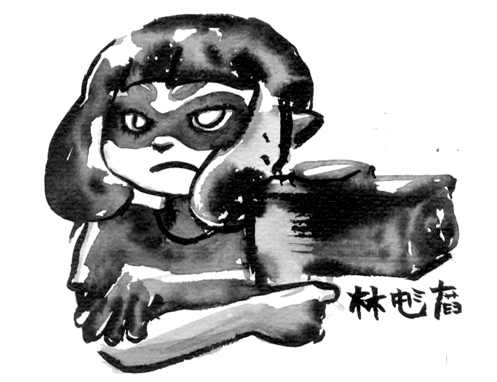
Gulp Missile
I’m happy with this sketch but not really very excited by how the colours ended up. Might have to take another crack at it sometime.

Bonus: here’s how things looked while masked up.
Just some squares
They look simple but I tried masking these with sticky tape and cutting the square stencils from that, which was fiddly. Tore the paper a bit on lifting the masking though, which makes me wary of using sticky tape again in the future. Might just need some more practice or to use slightly different tape.

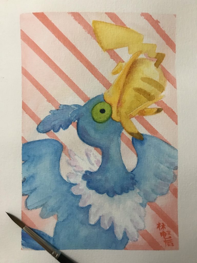
Scenes from ‘A Short Hike’
Two paintings inspired by “A Short Hike” – one from last year, one from more recently. I really love this game and recommend it wholeheartedly! Maybe at some point I’ll draw Claire doing something other than sitting and taking in the sights.

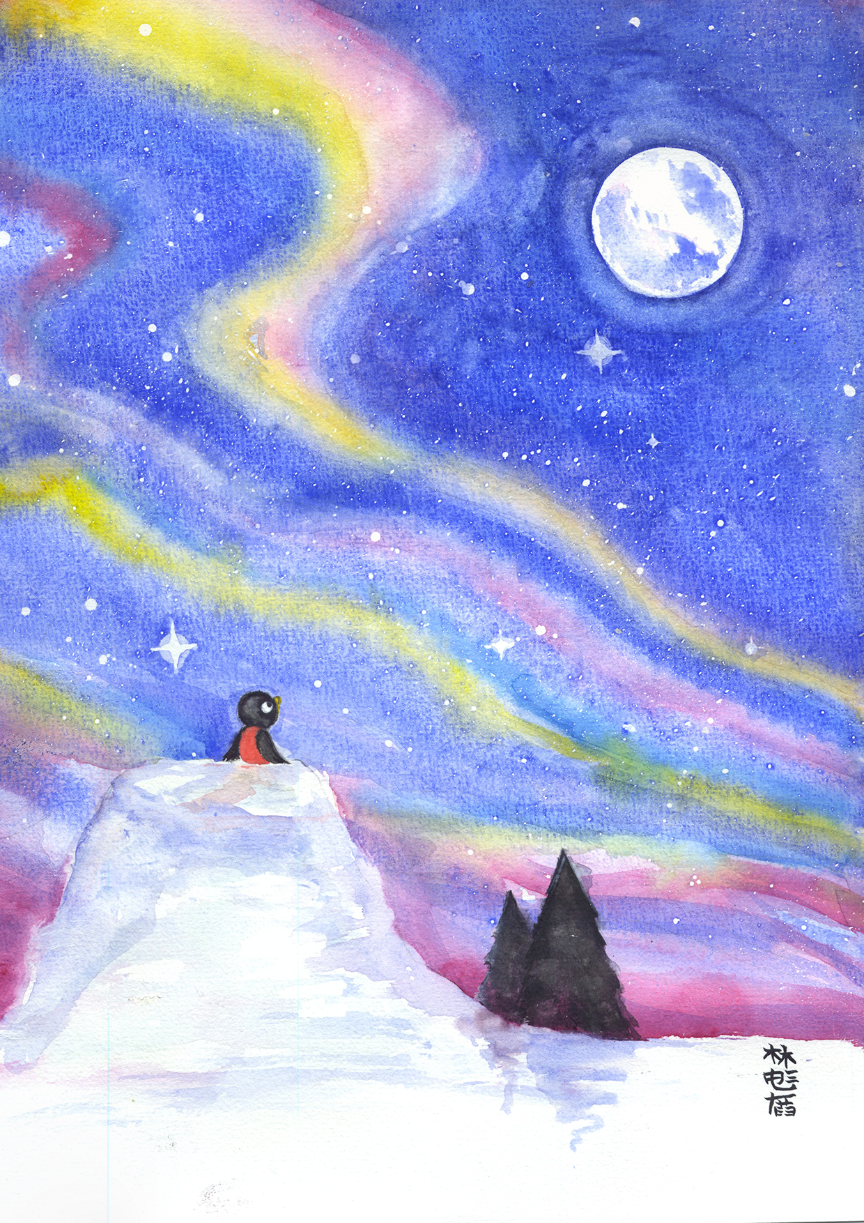


Rooted in the Stars
I was a little stumped last night for art ideas. There were a lot of random concepts floating around my head – we’d played some silly translation of Pokemon Silver that could have made for lots of interesting material. One idea came from the translation of “Vine Whip” as “Bean” and that made me want to draw vines and beans and Beanslingers.
But there was another pull, to draw the stars. And I couldn’t really settle. So with my sights on the stars I pulled out my tarot deck, the Tarot of the Silicon Dawn (Some cards are NSFW, individual cards I link should be fine) for guidance.
I haven’t looked at this deck at ages, and I didn’t want to rifle through the cards and overwhelm myself with concepts. So I shuffled and drew a card – the Ace of Wands
“The Root of the Powers of the Earth”. Honestly I glossed over the title of the card (though it might have stuck in the subconscious) and skipped to the description. I chuckled and rolled my eyes at “Here’s the blank canvas sitting in front of you”. The sketch followed soon after, a magnificent vine, rooted in a murky smoke of ink.
But I had trouble with it. It wasn’t quite right. I had trouble rendering the vine, and one mistaken leaf became a bunch of mistaken leaves. Things bloated into a mess of brushstrokes.

It was time to step back. I doubted the strength of the concept. So I pulled another card from the tarot deck. The next card I pulled from the deck was Vulture Mother (did I mention this was an unconventional deck?)
I wasn’t really sure how to apply the concept of the card into the illustration, but the idea of scavenging for the right thing seemed to apply in this search for direction in the image itself. I decided to stick with the idea and start over.
This time I worked carefully, drawing an arc of the night sky around a halo for my vine. I painted in the shape of the vine faintly first, before committing to dark tones. But for the night sky I went straight to undiluted ink, letting it flood the page with more certainty than the first draft.
Finally, splatters and small details in white complete the image.

With the painting done I took the time to rifle through the deck. I feel this isn’t too far from the Princess of Wands illustration actually. I doubt this is what I’d have ended up with if I’d pulled that card though.
Ok that’s me caught up for Friday, time to see if I can wrangle any more ideas for Saturday and Sunday posts!