Mah Jong Scoring
In an effort in getting my head around the scoring rules of Japanese Mah Jong (which are generally more restrictive than the rules I’m accustomed to playing with) I’ve been putting together a few scoring sheets. Here’s one, listing the Yaku (valid winning hands). It’s a simplified table comprised of the information from Wikipedia’s page designed to fit on one A4 page.
Excel crashed part way through me formatting this and although it auto-recovered the file, when I saved that auto-recovered file over the old one it corrupted it! Argh. At least I had an older branched version of the file saved so I didn’t have to start over from scratch.
Guest Post #5 by Connell Wood
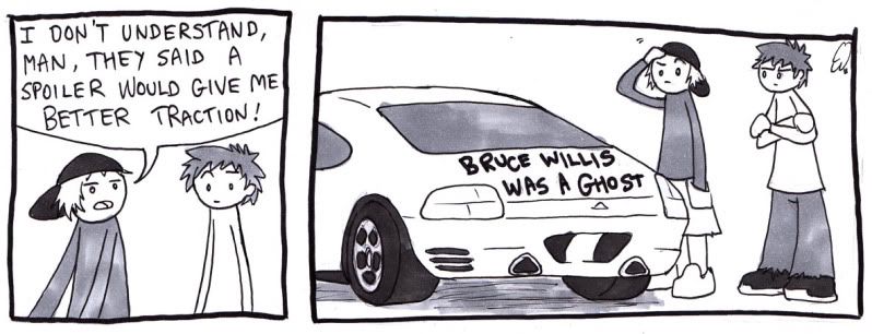
blAugust may be over, but Connell reminds us all that sticking by our goals is important! I suppose I’ll have to get some stuff up for this week, too.
As a guy who made a webcomic for over 5 years, I managed to make all the usual mistakes, some of them several times over. Hopefully the 5th comic won’t be late. And actually be funny
Thanks Connell! It’s been great having you along for the blAugust ride, and I’m keen to continue having your stuff continue into blogtember! Hm, I feel like going out and reading some Scott McCloud now though…
Caress – Step-by-step
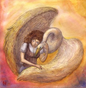
I’ve been trying to do a phoenix picture for a while, but none of my concept sketches were working. Late last night I started on this piece though, and quite liked it. The bird isn’t a phoenix but oh well. Here’s some pictures I took during the painting process.
After doodling some concepts for the painting, I choose one I like and working from that concept, draw the image straight onto watercolour paper. I’ve included some shading to give me some information about light and dark areas. I struggled with the face planes for a bit but was able to scribble tests of what looked good for the fall of light by scanning the sketch and putting shadows down digitally in a trial and error manner. Once I was happy with the stark shadows on the girl’s face I copied these shadows over to the sketch.
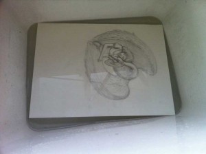
Here’s the drawing submerged in our laundry sink. This is to stretch the paper – something I don’t normally do but wanted to trial this time. The idea is to get the paper to expand by soaking in all the water…
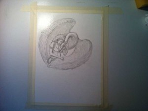
…Then tape it down securely to a board so that it remains stretched. When reapplying water during the painting process, the paper will not warp, or at least if it does warp, it will subsequently dry flat as the tape is keeping the paper stretched.
Once I have the image taped down, I put down some initial colours:
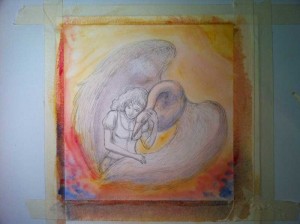
Then I let the picture dry (well, force it to dry with some encouragement from a hairdryer) and work mostly wet-on-dry for the rest of the painting process. I have problems with my tape – the paper pulled itself free from the tape as it shrinks and ended up cockling. I use this opportunity to take a progress scan:
I then soak the back of the painting to make the paper expand again and try taping it to my board again. It works okay but the painting still gets unstuck from the tape as it dries. Guess I need stronger tape. I’m not a fan of the gum tape stuff but maybe it’s the way to go…
Here’s the finished picture:
My big mistake in this painting was trying to use bruising and scratching techniques to get the feathers done. It really didn’t work out and I spent some time trying to work out how to heal over the paper. Well, that wasn’t going to happen. I’ve also done a pretty dodgy scan, the colours and contrast really didn’t come out great on my scanner. Come visit me and see it in person some time!
Epic Swords (Guest Post #5 from Connell Wood)
No comic #4 yet, but! Here’s an arts I have come up with for a competition.
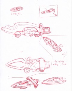
I had to draw an “epic” sword for a videogame (yes, that word is completely ruined now, but not my choice). To start with I thought:
well, we’ve gotten swords that are guns now, how can I take that further? And then thought that perhaps I could combine it with a mode of transport…
But it kept looking somewhat silly, with the airship looking least dumb, but… well, it looked too much like way too many other fictional airships and spaceships.
And then, an idea!
Pity I spelled poisonous wrong 🙁
Kai Progress
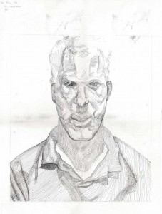
Progress on the Lucian Freud reproduction, first posted about here.
Apart from just doing more shading, I’ve moved his eyes down a bit.
Guest Post #4 by Connell Wood
Connell got this one to me early, but you guys get it the same time as usual. Also, he hints that there might be a second bonus update from him this week…
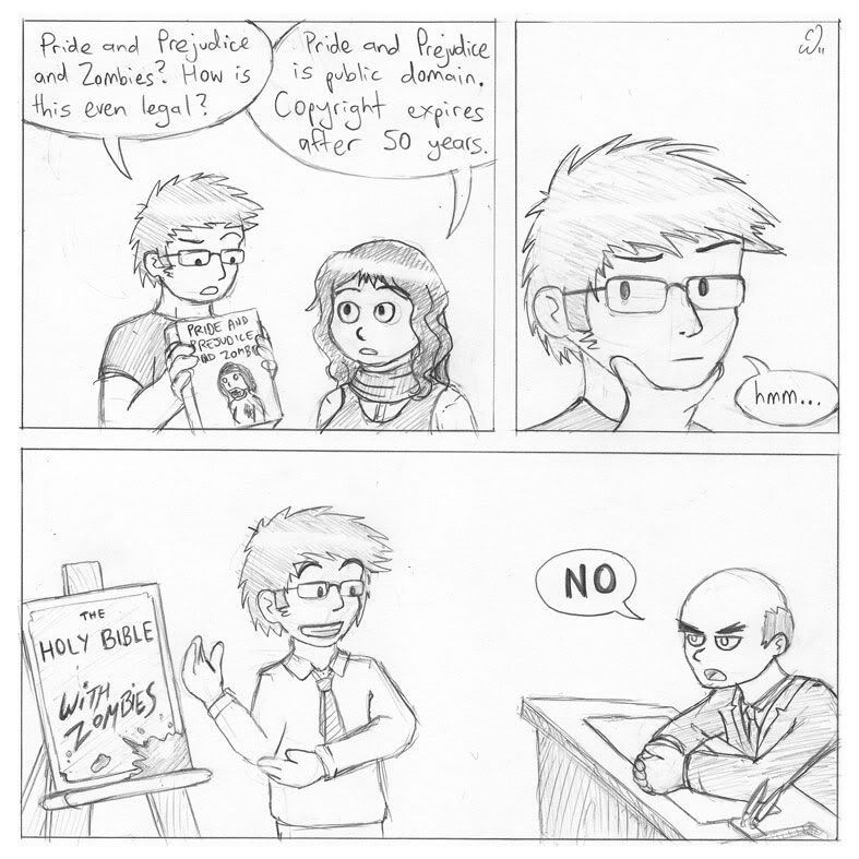
I was somewhat hesitant to make this comic with myself and Helena as the characters (again), but it is always easier to use characters I am familiar with!
I originally planned a comic which would have shared the first two panels, but then the guy has himself frozen for fifty years so he can write “Twilight with Predators”, with the warrior aliens from the Predators films hunting down sparkly vampires. But when I explained the concept to someone, the response was “….OK”, so I thought maybe with snappier writing and a different punchline the setup could still work. Also, I like the comic instead ending with the rejection, and that could be an interesting running gag to go with, where my character is seen having one idea or another knocked back for being silly or offensive. Or both!
Also, I know not all english translations of the Bible are public domain. Pretend it is the King James Version, or something.
Colour swatches
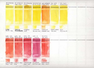
I’m making paint swatches!
These swatches are modelled after the ones described here. The basic idea is to test the paint’s behaviour and characteristics.
The tests are:
- Opacity – black lines near the top. The first is drawn before the paint is applied, the second after.
- Staining – the white band below the black lines – this area was swabbed after a day to see how much paint would lift
- Backrun – the band near the bottom was created by swiping a brush with clean water over the swatch.
- Tinting – The narrow band between the two blocks – tests the characteristics of a rather diluted pigment and can be compared against the main swatch to determine the ‘strength’ of the pigments.
- Wet-in-wet – the bottom band. The block is brushed with clear water then paint is applied in the left. The test is to see how much of the paint bleeds into the wet patch and how it behaves when it does so.
In addition, the top labelling indicates the colour code in its brand range and the pigments used in the colour. The bottom is obviously the colour’s name.
The swatches I’ve made so far:
These swatches aren’t totally reliable as they’re made from pan colours – so the ratio of paint to water can’t be controlled in a methodical manner as described in the handprint guide. It’s also why I’ve yet to put in the tint lines for the blues as I’m pondering a better way to control them. Even considering that they might not be totally reliable as a standardised set of information about pigments, however, the swatches are still useful as a guide to the way I use my paints.
Model Movements
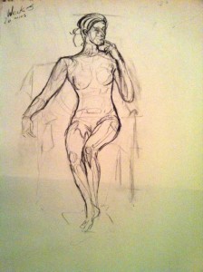
This year I’ve been taking life drawing classes. Unlike still life setups from my general drawing class last year, life models aren’t able to hold the exact same pose for the entire time they’re needed as reference. Sometimes, they “sag into the pose”, and sometimes we come back from a break and they aren’t able to quite return to the same pose as prior.
So what do you do when a model hasn’t returned to the same pose? Well, the easiest thing to do is to direct them back into the right one. If the pose is only slightly off, then sometimes the differences can be ignored – especially if the drawing itself is complete and the artist is on to the next stage, like toning or colouring. This time, we didn’t catch the differences, and my nearly-complete sketch was quite off. With nine minutes left for the pose my art teacher advised me to redraw the areas that were off – mostly the arms and curve of her back.
Image previews tiny so you can decide whether they’re safe for work or not. There’s very little detail but it’s still a nude. In an artistic context! An artistic nude, if you will.

