Some things I’ve learned about depicting objects using tone:
- Work from light to dark, covering the whole image with each layer of tone.
- Use circular movements to apply pencil strokes, so that the direction of the strokes don’t interfere with the shading.
- The human brain is capable of filling in lots of information. There’s no need to use a line to define an edge when the viewer can imagine it.
- Squint! Let the shapes blur into each other and then work out what the main tones throughout the piece are.
Here are my last three homework pieces, all focused on practising the correct application of tone:

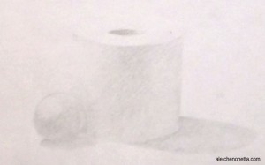
A polystyrene ball and toilet paper roll. Glamorous stuff.
Quite a light application overall, but the shapes are still readable (though my camera might try to convince you otherwise). It was a bit light in the room when I did this one, but it might have been that I was using an HB pencil that resulted in the lightness.

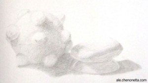
Katamari, soap and mini-dish
Well, my prototype Katamari was an excellent matte white object to draw. Part of me wishes that I composed this differently, with all the objects stuck to the Katamari, but I think this turned out really well. The Katamari was described as a “mutant tennis ball” during last week’s homework review, and other than the soap appearing to tilt upwards a bit (I wasn’t able to erase the pesky lines in the back corner), I got a good response for this one.

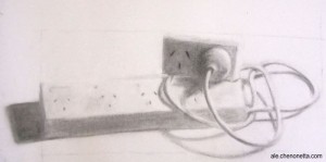
Powerboards in charcoal
I like the composition in this one. It has a little more narrative than random objects put together. The plug caused me lots of troubles and the sockets were no walk in the park either! After taking this photo I tweaked the far left shadow and the shape of the top power block. Taking a step back from things really helps to point out errors and inconsistencies. I’m eagerly waiting to hear my art teacher’s critique tonight!

