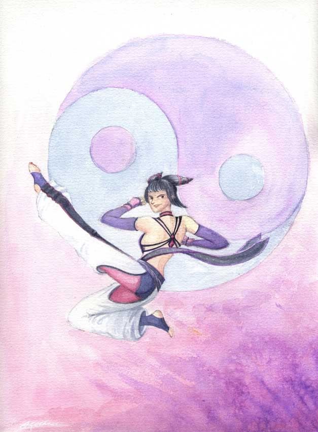
Here’s the finished-for-now Juri:
Kind of hurried it towards the end, I always have a tendency to do that! I’ll probably have a few more tweaks to make later, but I think I ought to get my ideas moving for my next picture.
On my monitor this looks more subdued and less pink than it does in real life. I will have to play around with the colour balance in Photoshop and check it out on some other monitors… I’ll probably also do some other digital tweaks like clean up the fuzzy edges of the circles. I’ll learn to paint more tidily with practice, I swear!


Well looks like it turned out quite nice in the end. There is something about the composition I still don’t like but it’s hard to point a finger on anything that’s obviously wrong about it. I think it’s just because there really isn’t much to look at other than the person doing the jump kick and she’s kind of small compared to all the empty space around her. It may also be that fact that the yin and yang still isn’t centered – when there is a single meaningful symbol prominently displayed like this in an image I would expect it to be centered on at least one axis. It’s particularly ironic where the symbol signifies ‘balance’.
The shading on the pants is quite good and is my favourite part of the painting.