Alola, Starters!
Today’s second post is a painting of the starting Pokémon from Sun/Moon’s new Alola Region. I painted this one shortly after the starters were announced.

Today’s second post is a painting of the starting Pokémon from Sun/Moon’s new Alola Region. I painted this one shortly after the starters were announced.

whoa, I nearly fell off the Blaugust [band]wagon, which is a shame as I’m pretty sure I still have enough old art to post to get me through the month.
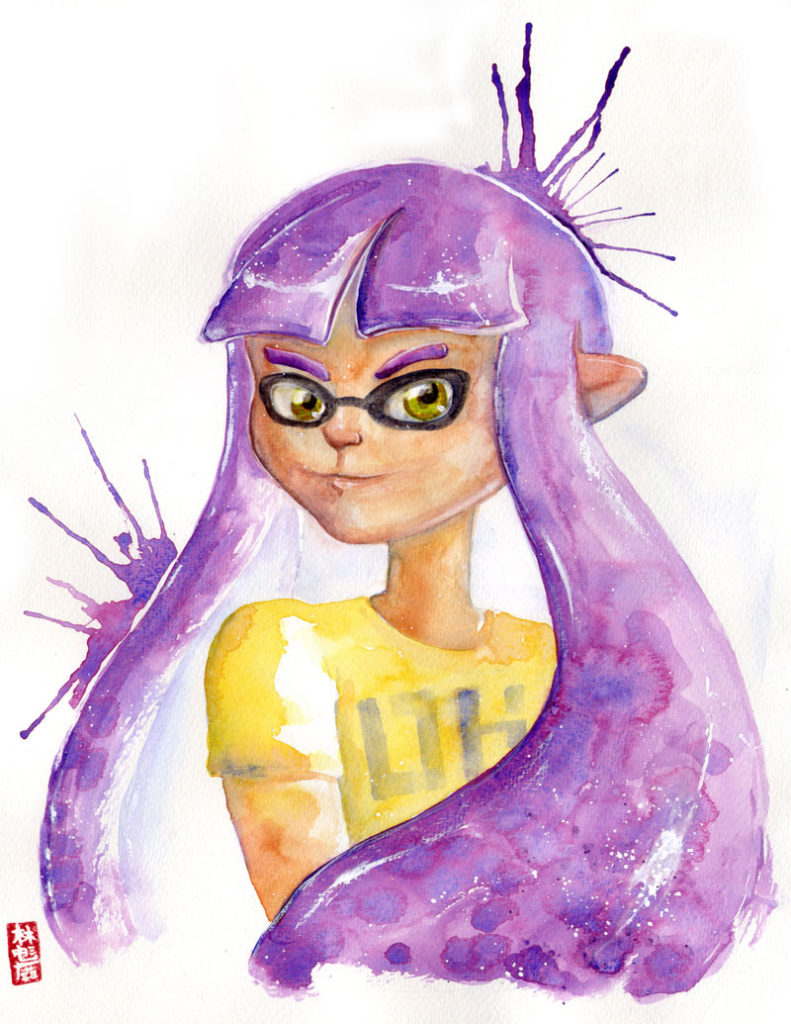
Here’s yet another picture of a squidkid! This was the first painting I did after purchasing some new white paints. When painting with watercolour, it’s generally advised to avoid using white paint. To maximise that magical watercolour look, an artist should aim to have white highlights represented by the white of the paper. The shoulder and arm highlights for example, are parts of this painting that I’m pleased about as those highlights were made by leaving the paper unpainted.
For small rim highlights I generally use a white gel pen, but the lines usually only come out at a certain width – I want to instead get lively looking highlights that integrate with the rest of the image. The paint I’ve used is Dr. Ph. Martin’s Bleed Proof White – it’s very good at blocking colours and is good at making lovely striking splatters.
I like the way I painted the forms of this face, but the anatomy freaks me out a bit. Also I “tidied” this scan on a monitor with bad contrast, I need to fix it up again. Once again, whites being troublesome!
This is a substitute post for my missing Friday post.
If the last picture was all about the weapon, then this one is all about the sub-weapon! I started sketching this one out before checking what gear the player wanted. I had the squid posed with a raised left hand, which I didn’t really have an idea for how it would fit into the picture. Maybe the character was taunting? After checking that the weapon was going to be a .96 deco I decided I’d depict the character as throwing a Splash Wall and making a hasty retreat behind it.
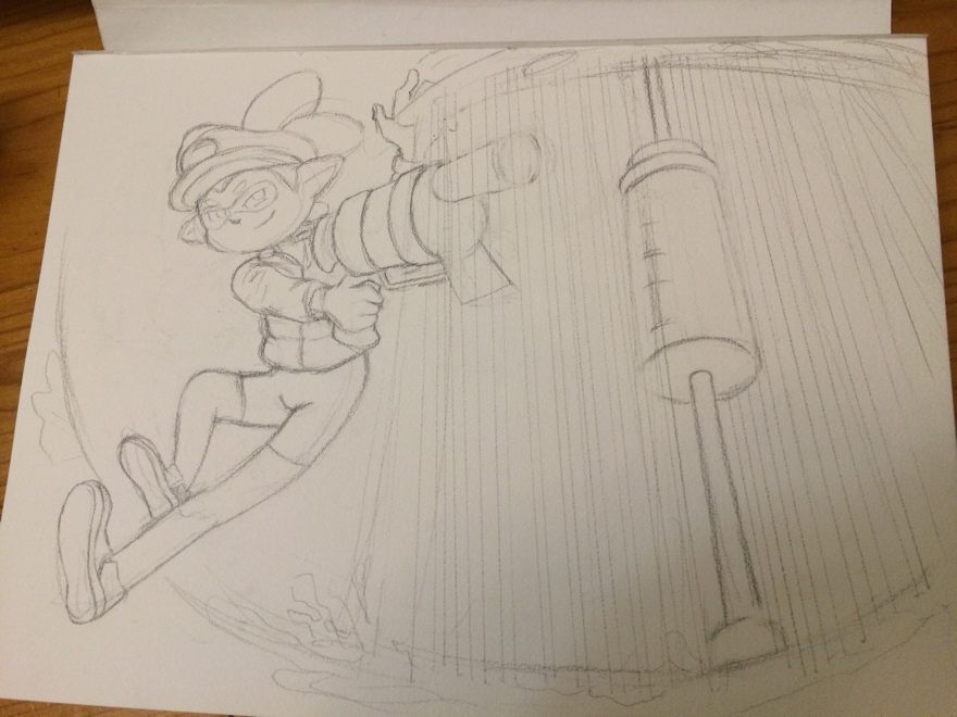
Unfortunately there wasn’t really the space for the splash wall, so I erased the original portrait sketch and restarted in landscape. Even then I didn’t leave enough space at the top of the page for the splash wall to fit but I think the idea is there.
Maybe it’d be a better picture without the Splash Wall at all, but I want to draw one so there! Next part is to decide on a style to paint this up in.
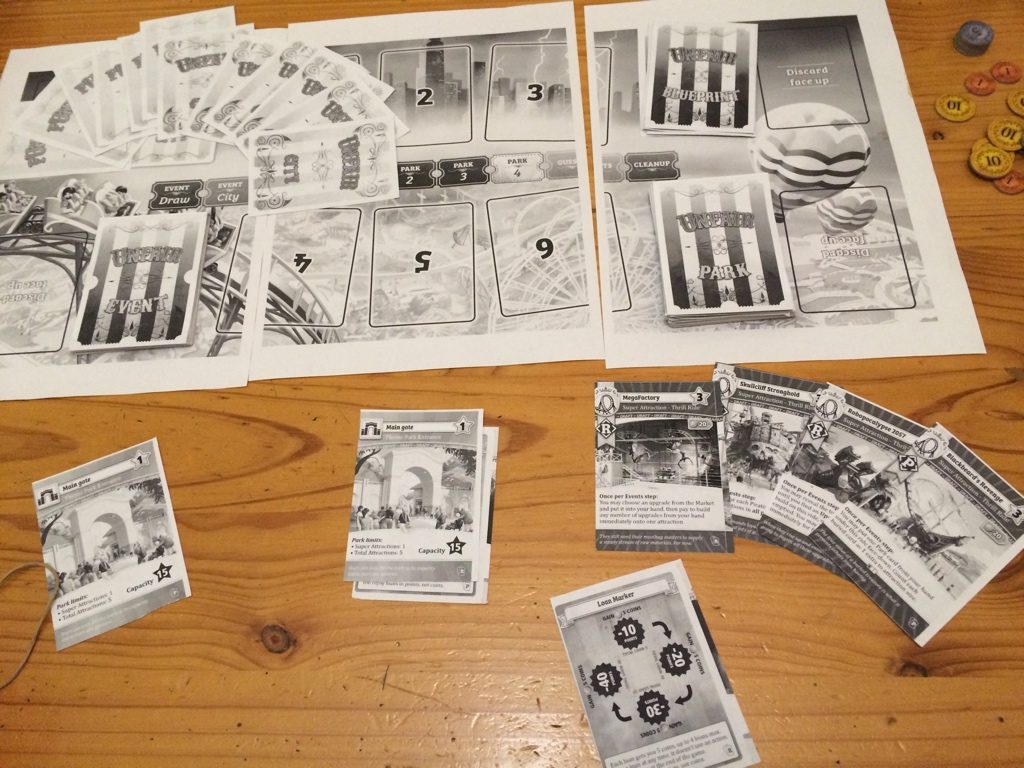
Unfair is a game that came up on Kickstarter a couple of days ago. It was brought to my attention when the organiser of ConCentric made a little noise about it on Facebook. This put the game in a favourable light right off the bat as I consider Ben a trustworthy source when it comes to board games. Not only because he organises ConCentric, but also because he’s worked with the team behind Unfair on their previous game project – Monstrous.
The Unfair team have made the full draft files for the game available for print-and-play, so I felt it prudent to give the game a go before jumping into backing it. To be honest, the art had already won me over so it was with some nervousness that I suggested we try the game. I was afraid that the mechanics would not hold up.
It took a little bit of convincing, but tonight I managed to get John to sit down and play the game, and I can safely say it’s solidly crafted. Relevant information on the cards is laid out quite orderly-like, so I took a chance on printing it in black and white. By keeping things black and white I also made sure that I’d still have an incentive to purchase the game even if the mechanics weren’t so strong – I’d need to back the game to get the full-colour art!
Spending an hour with the grayscale cards did get kind of tiring after a while. We had no issues telling the cards apart but a lot of the fun, vibrant cues weren’t there. The wonderful colour gradients translate especially badly to grayscale so things that you just know look great on the complete cards become bothersome in the black and white context.
Anyway, to the game itself! The game is centred around creating theme parks with all the shnazzy attractions, and includes themed decks, each with a slightly different emphasis on mechanics. We played the recommended decks for a first-time two-player game: Robots and Pirates. The game is played in eight rounds, and global events make things rosy for the first half, but meaner for the second half. There’s a suggested “First Date” set of rules that reduce the number of “Unfair” rounds but since often when playing games we talk about needing more turns, extra time to explore mechanics or time to make up for newbie-mistakes we decided to play out all eight rounds. I think this was the right decision.
There’s a strict-ish order to things, and while Event cards can be gained freely during the “Park” stage of the game, they cannot be played until the next “Event” stage rolls back around. Combined with a hand-limit that gets enforced between the rollover of game rounds and a fluctuating game situation between the opportunities to actually play the event cards means the number of events that can be played are moderated. The events tend to be situationally powerful, even occasionally useless. Each event card has two choices on it however so you can usually pick something to do.
We didn’t use the attacking events terribly liberally, but with the coming of the second half of “Unfair” global-event cards we did start attacking each other. This was interesting in the context of the two-player game as there was only one rival to keep track of. Most nastiness goes away on its own by the next round, but it’s also possible to build defenses around yourself.
Money is an interesting thing in the game, and is mostly only earned at the end of a round. Fortunately there’s no upkeep costs as I spent much of the game on not a lot of money. John however managed to put together a nice engine, and ended the game on well over 100 coins. Quite a handsome bounty considering the two-to-one coins to points conversion.
My overall impressions right now are positive, and I have backed the game, but I’m trying very hard to *not* do a “review” (with only one playthough I don’t think I can do a good review). That said, I’m sure I’m not giving a decent enough overview of the gameplay itself for it to be useful to anyone reading it in deciding if they want to back the game so I’ll wrap things up here.
Tell you what, EVACers – if people are interested I will print the additional theme decks to allow up to four players to play and we can give it a go tomorrow. You’ll just have to put up with the cards being in black and white.
Hey I actually did a thing I said I was gonna do! Today’s post is the completed painting of Team Altaira’s captain, Phlox.
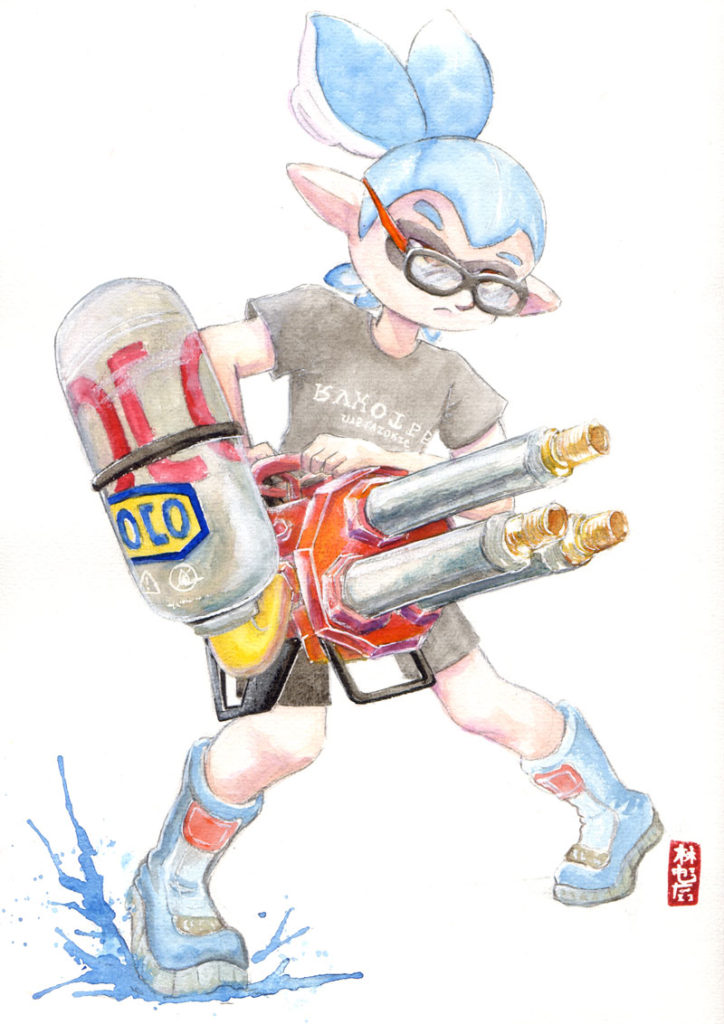
I used masking fluid to mask out the lettering on the shirt and the warning icons on the weapons. Other highlights were done with white gel pen and paint. The splatter on the right boot was created by blowing on ink patches; this time I tried using a straw to more tightly control the direction of the splatters. Additional splatter effects were created by tapping on a paintbrush held above the paper.
Another piece of Oceanink Offensive prize-art, this time featuring II Phlox.

Drawing weapons from Splatoon is always fun, and working out how they fit together is part of the challenge. I actually had an “aha” moment when I worked out the handle for the Hydra Splatling is a valve wheel.
Since the previous one was inked I’m debating whether to ink this one before painting it – I’m not sure how much I want to have the entire set fit together visually. Currently leaning towards not-inking it. I’ll wait a day and look at it with fresh eyes later. I can already see some bits that I’d like to fix up before proceeding.
No I’m not delaying the painting to drag out another day of Blaugust content, what an outrageous suggestion!
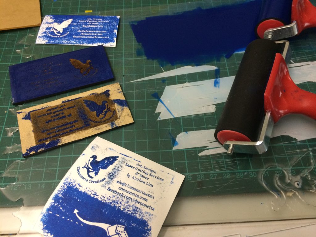
For a while now, I’ve been making my own business cards. I like making my own cards as I’m able to make them with paper of my choice – usually a watercolour paper. This means I can give away little watercolour sketches or scribbles.
However as of late my printer has not been sealing the toner very well on the watercolour stock, so the prints have been coming out rather poorly. So I thought I’d have a go at engraving plates using my laser cutting machine and taking relief prints off those plates. I’ve had pretty mixed results so far. I don’t think it’ll work in the long run for something like business cards, but I’m interested now to see about making gift cards or similar using the same ideas.
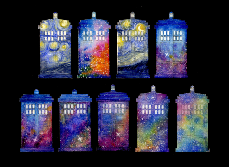
I painted this series of TARDIS inspired brooch designs! They’re one-of-a-kind watercolour pieces. I had a lot of fun working on the colour washes for each of them. The impressionist Van Gogh-ish designs were suggested by a friend, I mixed gouache with my watercolours to give a more oil-painty feel to them.
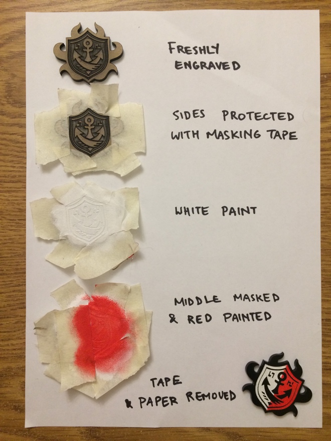
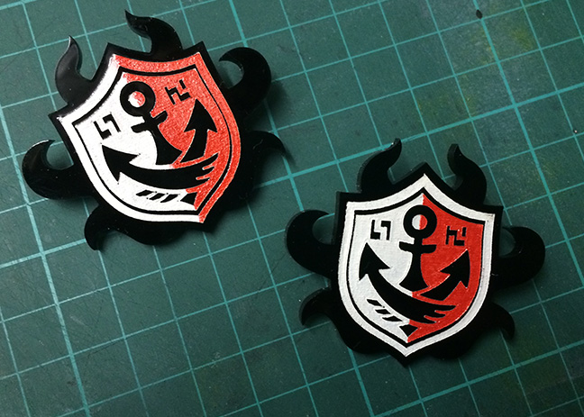
Here’s a simple picture showing how I made my Splatoon-based Anchor Badges! They’re laser-cut acrylic with paint in-fills. These first ones were made the whole right side painted red. I fixed that for following ones by masking around the border before painting in the red.
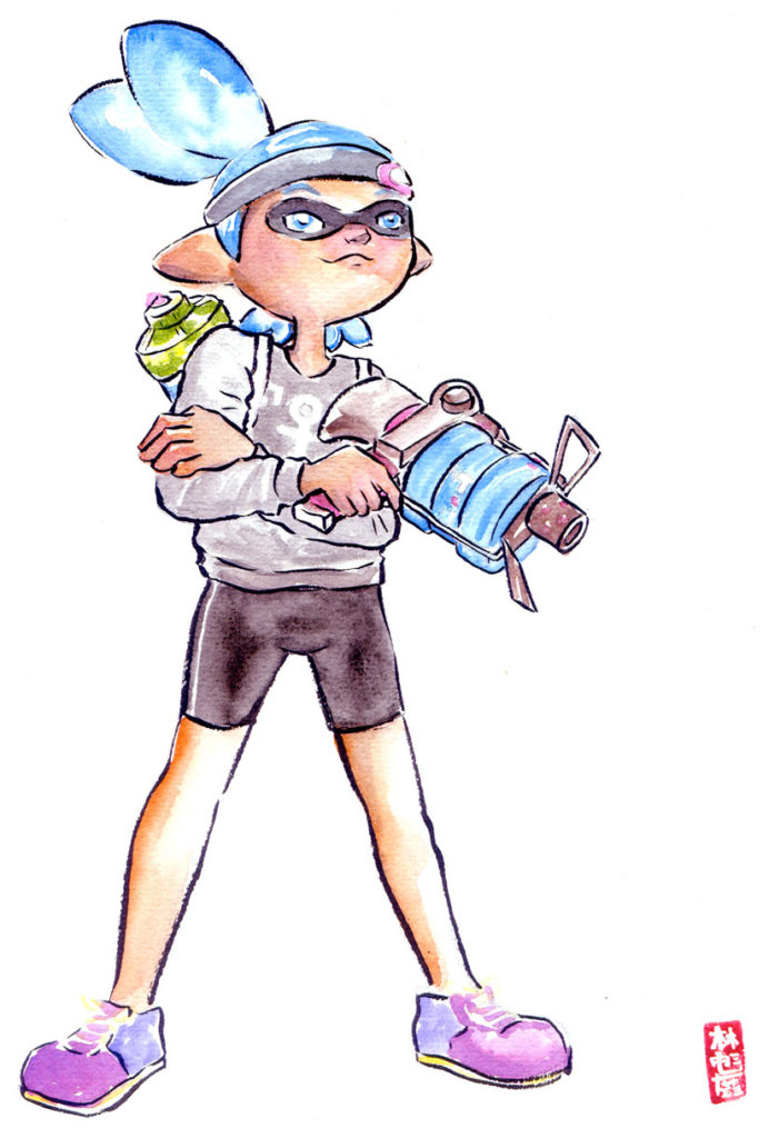
The player described his squid thusly: “He’s very cocky”. I did my best to get that across in his portrait.
The face seems to have picked up a bit of splotchiness, not sure if that’s from the scan or if the art did just turn out like that. I did have trouble deciding how to tone the skin as it was described as being “tan”.