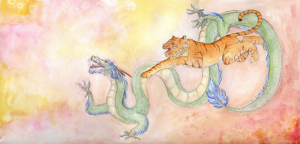
I painted this picture as a Christmas present for John back in 2010. When I uploaded it to deviantArt, I promised, “I’ll upload concept and progress sketches to my blog after Christmas.”
Wel’p Christmas came and went and another one too, and it’s finally time for me to fulfil that promise.
The Idea
I wanted to paint a picture that could be quite personal but would also be quite ‘accessible’ to the casual viewer as just a pretty illustration. Based on this I discarded the possibilities of doing portraits and looked instead to find suitable avatars of myself and John. The answer was quite simple – Zodiac animals. What fortune that I had such a great pair of animals to work with, too!

Rawr!
Conflict
Do a google search for ‘dragon tiger’ and you’ll immediately find images of the two locked in combat. Frequently poised over a Yin-Yang symbol, the two animals represent balance.
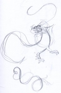
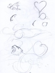
My first concept sketches attempt to riff on this idea.

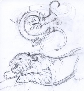
Finding my feet with drawing tigers…

<3

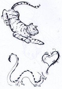
Finding nice flowing lines is easy when working in ink.
Purpose
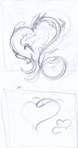
The hearts felt hackneyed and the composition uncomfortable. I decided that I wanted to portray the dragon and tiger as an exuberant and harmonised pair. For this I decided to move them in the same direction, as though they were running toward a common goal.

A very tiny thumbnail with the new composition scribbled out. I think I’d intended originally to have the animals in some kind of setting, possibly clouds or a mix of cliffs and flames to go with the elemental years we were born in.

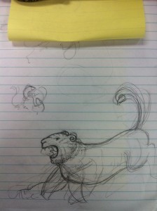
Scribbles to work out the tiger’s pose.

I wanted to present a quite stylised tiger. I had been inspired by a piece of art that had recently been printed on the back cover of ImagineFX.

More experimenting with the style and pose of the tiger.
Unfortunately my laptop was stolen around March 2011 so I’m missing all the Photoshop sketches and any progress scans I took. But for a quick run-down of my process I think it went something like this…
- Sketches were scanned into Photoshop and composed into a rough arrangement.
- The sketch was worked on in Photoshop, correcting awkward anatomy and finalising details.
- The final lines were traced to the watercolour paper (probably straight from my computer screen, as I can’t find a paper-trail (hur hur) to indicate I printed the lines).
- I laid down washes and underpainting, sprinkling in rubbing alcohol to create texture (it’s most effective in the little bubbles at the top left). I don’t think I used any salt for this painting, and if I did it wasn’t very effective!
- Lastly I worked up the Dragon and Tiger in a series of layers. The dragon’s scales and the tiger’s stripes were probably added last. I also used a white gel pen to add texture (along the dragon’s hair and in the tiger’s mane).
Like many of my paintings, this one doesn’t have a lot of tonal depth as I was timid about laying down too much paint and being unable to correct mistakes. When choosing a frame and mounting board for the painting I kept this in mind and went for a light mount and a dark, rich frame to bring the viewer’s eye to the painting and complement the tiger’s stripes.

The framed painting now hangs above our bed.

